Salesforce Customer Portal User Manual (Legacy)
You are reading the legacy manual, an older version. Screens and steps can differ from the current product. Open the current manual (v6.3.0).
CRMJetty Portal- Salesforce Customer Portal
CRMJetty Portal:
A customizable Salesforce Customer Portal
Version: 4.0
Salesforce Compatibility:
Professional (API Should be enabled), Enterprise, Unlimited, Developer, Performance
Introduction
Salesforce-CRMJetty Portal is a Salesforce Customer Portal that enables businesses to manage their operations. For the admin(s), it simplifies the management of Objects and customers. For customers, it simplifies the access to the relevant data as per their actions and roles specified by the admin.
Benefits of Customized Customer Portal
-
Seamless synchronization between Salesforce and portal
-
Lower operational costs with all the Objects managed centrally
-
Configure and Select the Design Layouts (style) are provided for the widgets
-
Flexible page builder with easy-to-use drag and drop dynamic widgets
-
Create a Menu to customize the menu for the customer portal
-
Role-based access for enhanced and streamlined user management
-
Two-factor authentications
-
Enable Notes/Attachments accessibility into the Edit/Detail page of the record
-
Multi-language support in CRMJetty Portal
-
Payment Integrations
-
Email Respondent as per Add form submission
-
Visualize Records in Data Card (Grid view)
Prerequisites
Following points must be followed before starting Installation.
- You should log in as an Administrator in Salesforce CRM.
- Check that your Salesforce CRM instance is compatible with CRMJetty Portal.
You will require a Product License Key to activate the Plugin. To obtain the License Key just drop us a mail at support@crmjetty.com along with your Domain Name.
Installation & Authentication
-
After purchasing the “CRMJetty Portal” plug-in for the SalesforceCRM, you need to install the package. You will get the link to install the package in your email ID.
-
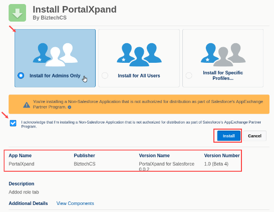
After clicking on the link, you will be redirected to the Salesforce login page. Log in using your Salesforce credentials. Now, from the Installation page, you need to select the “Install for Admins Only” option.
-
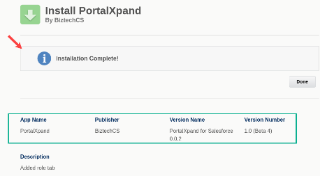
Tick the “I acknowledge ..” checkbox and click on the Install button to install the “CRMJetty Portal” package. Once the installation process is completed, you will see the “Installation Complete” summary in the popup.
-
To complete the installation, click on the Done button to finish the installation process.
-
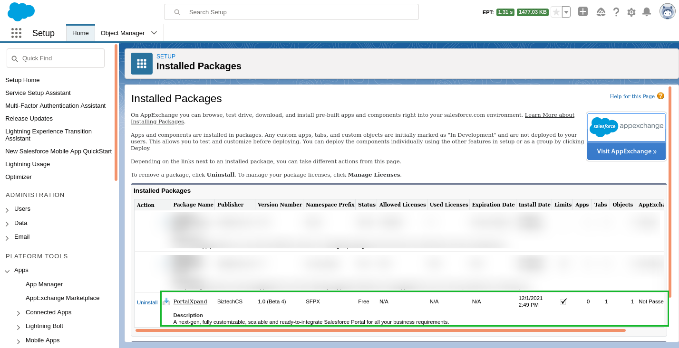
By clicking on the “Done” button, you will be redirected to the Installed Packages page. Here, you will see the installed CRMJetty Portal listed in the ‘Installed Packages’ table.
-
After successfully installing CRMJetty Portal package in salesforce, you need to create a Connected App, Auth. Provider, and a Named Credential. This is the required process by CRMJetty Portal package.
1. Create a Connected App
-
From Setup, enter Apps in the Quick Find box, and select App Manager.
-
Click New Connected App.
-
Enter the connected app’s name. Example: CRMJetty Portal CallMeBack
-
(Optional) Enter the API name used when referring to your app from a program. It defaults to a version of the name without spaces.
-
Enter the contact email for Salesforce to use in case we want to contact you or your support team.
-
In the API (Enable OAuth Settings) area of the page, select Enable OAuth Settings.
-
Select these OAuth scopes, which are required for asset tokens. Select “Manage user data via APIs (api)”, “Full access (full)”, and “Perform requests at any time (refresh_token, offline_access)”.
-
After you configure all settings for your connected app, save your changes.
-
Once your connected app is created, click on the Manage Consumer Details button.
-
You will be asked for verify yourself with OTP. After verification, you will be provided with Consumer Key and Consumer Secret.
2. Create a Auth. Provider
-
In Setup, navigate to Security Controls > Auth. Providers and click the “New” button in the related list.
-
Give your Auth. Provider a name. Example: CRMJetty Portal CallMeBack – AuthPro
-
Paste in the Consumer Key and Consumer Secret from your Connected App. Example: from CRMJetty Portal CallMeBack
-
Enter the scopes as specified before: full refresh_token offline_access
-
Leave all other fields blank and click Save.
-
Copy and paste the Callback URL, edit the Connected App we created earlier, and paste into the Callback URL under the OAuth section.
3. Create a Named Credential
-
In Setup, navigate to Security Controls > Named Credentials.
-
Give your Named Credential an exact Label and Name as below. This name is used in package and it should not be different than below.
– Label: CRMJetty Portal CallMeBack – Named Credential
– Name: CRMJetty Portal_CallMeBack_Named_Credential
– URL: Enter the hostname part of the Callback URL from Auth. Provider. (paste the Callback URL and remove the part starts with “services/authcallback/CallMeBack_AuthProvider”) Example: https://mycompany.my.salesforce.com
-
Under Identity Type, choose Named Principal.
-
Choose OAuth 2.0 for Authentication Protocol.
-
Choose the Auth. Provider you created earlier for Authentication Provider. Example: CRMJetty Portal CallMeBack – AuthPro
-
In the Scope field, specify “full refresh_token offline_access”.
-
Tick the “Allow Merge Fields in HTTP Body” checkbox.
-
Clear the checkbox “Start Authentication Flow on Save” and click Save.
-
Click Edit, make sure the checkbox “Start Authentication Flow on Save” is checked now and Save again. (Why did I not set the checkbox the first time? Because if you make some mistakes saving this you’ll have to restart the form!)
-
You will be prompted to log in to your org. After you log in, you will see the connected app authorization screen.
– Allow access to this app (your app). Once complete, you should be redirected back to the Named Credential screen and see that the status is now set to “Authenticated as….”
Now, you can go ahead with the CRMJetty Portal authentication from the portal admin area.
- But firstly, To use PortalXapnd with the Salesforce you need to make a connection by authentication in salesforce.
– Authentication Methods: There are two methods to do authentication with salesforce. You can use any of this method to do authentication in salesforce from PortalXapand.
1. OAuth 2.0 Username-Password
To do authentication with this method, you need below credentials from salesforce.
– Consumer Key: Connected app consumer key.
– Consumer Secret: Connected app consumer secret.
– Username: Username of Salesforce user you want to authenticate with.
– Password: Password of Salesforce user you want to authenticate with.
– Security Token: Security Token of Salesforce user you want to authenticate with.
To get Consumer Key and Consumer Secret, you need to create a connected app in salesforce. But as you have already created a connected app when CRMJetty Portal package configuration in Salesforce, you can use Consumer Key and Consumer Secret from the same connected app.
However if you want to create a different connected app for CRMJetty Portal authentication, follow these steps to create a connected app.
-
From Setup, enter Apps in the Quick Find box, and select App Manager.
-
Click New Connected App.
-
Enter the connected app’s name. Example: CRMJetty Portal Connection App
-
(Optional) Enter the API name used when referring to your app from a program. It defaults to a version of the name without spaces.
-
Enter the contact email for Salesforce to use in case we want to contact you or your support team.
-
In the API (Enable OAuth Settings) area of the page, select Enable OAuth Settings.
-
Select these OAuth scopes, which are required for asset tokens. Select only “Manage user data via APIs (api)”.
-
After you configure all settings for your connected app, save your changes.
-
Once your connected app is created, click on the Manage Consumer Details button.
-
You will be asked for verify yourself with OTP. After verification, you will be provided with Consumer Key and Consumer Secret.
To get Security Token, follow below steps.
-
From your personal settings, in the Quick Find box, enter Reset, and then select Reset My Security Token.
-
Click Reset Security Token. The new security token is sent to the email address in your Salesforce personal settings.
-
You also receive a new security token email when you reset your password. So you will need to update it in CRMJetty Portal and you will need to re-authenticate.
2. OAuth 2.0 JWT Bearer
To do authentication with this method, you need below credentials and keys.
– Consumer Key: Connected app consumer key.
– Username: Username of Salesforce user you want to authenticate with.
– Private Key (server.key): The private key used to sign the certificate.
– Public Key (server.crt): The digital certification. You upload this file when you create the connected app required by the JWT bearer flow.
To generate private key and digital certificate, create a directory in your computer to store the generated files and inside this directory open terminal and run below commands.
-
openssl genpkey -des3 -algorithm RSA -pass pass:SomePassword -out server.pass.key -pkeyopt rsa_keygen_bits:2048
-
openssl rsa -passin pass:SomePassword -in server.pass.key -out server.key
-
openssl req -new -key server.key -out server.csr
-
openssl x509 -req -sha256 -days 365 -in server.csr -signkey server.key -out server.crt
To get Consumer Key, you need to create a connected app in salesforce. Follow below steps to create a connected app.
-
From Setup, enter Apps in the Quick Find box, and select App Manager.
-
Click New Connected App.
-
Enter the connected app’s name. Example: CRMJetty Portal Connection App
-
(Optional) Enter the API name used when referring to your app from a program. It defaults to a version of the name without spaces.
-
Enter the contact email for Salesforce to use in case we want to contact you or your support team.
-
In the API (Enable OAuth Settings) area of the page, select Enable OAuth Settings.
-
Enter https://login.salesforce.com/oauth2/callback in Callback URL.
-
Select Use digital Signatures Checkbox.
-
Click on Choose File and Select ‘server.crt’ generated in the above step.
-
Select these OAuth scopes, which are required for asset tokens. Select “Manage user data via APIs (api)” and “Perform requests at any time (refresh_token, offline_access)”.
-
Select Require Secret for Web Server Flow and Require Secret for Refresh Token Flow checkboxes.
-
After you configure all settings for your connected app, save your changes.
-
Once your connected app is created, Click Manage > Click Edit Policies.
-
In the OAuth Policies section, for the Refresh Token Policy field, click Expire refresh token after: and enter 90 days or less.
-
In the Session Policies section, set Timeout Value to 15 minutes.
-
In the OAuth Policies section, select Admin approved users are pre-authorized for permitted users, and click OK.
-
Click Save.
-
Once your connected app is created, click on the Manage Consumer Details button.
-
You will be asked for verify yourself with OTP. After verification, you will be provided with Consumer Key and Consumer Secret.
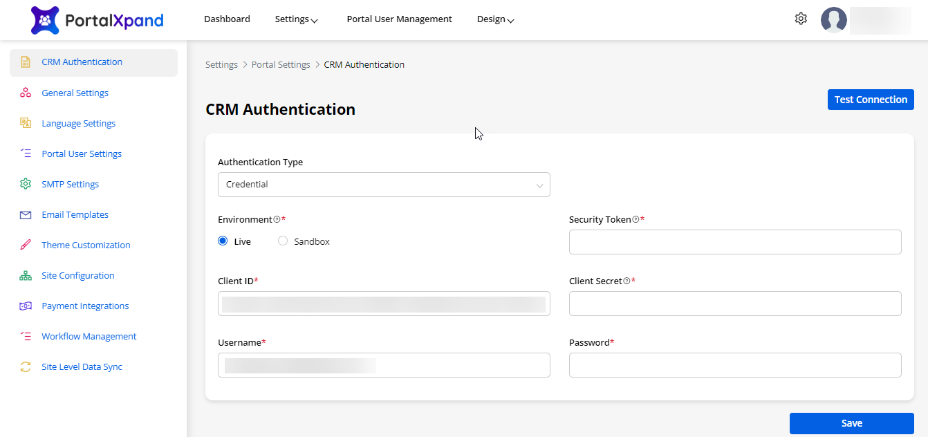
Once you completed the Installation and Authentication, log in to CRMJetty Portal and you must configure CRM Authentication to start syncing the data with Salesforce.
CRMJetty Portal Admin Login
Admin Login
-
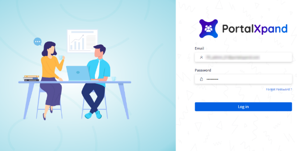
Login to your CRMJetty Portal Admin login.
-
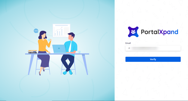
When the Super admin logs in the first time, enter the email that is registered with CRMJetty Portal and click on verify to set the password. The super admin will get the link on the registered mail and by clicking on the link, the super admin will be redirected to set the password.
Forgot Password:
-
Admin users can reset the forgotten password. They need to insert the registered email with the portal to get the password reset link.
-
The new users will get the mail of the reset password only on the registered email id.
Profile
- Update your portal profile details, change the password, and check the plan details.
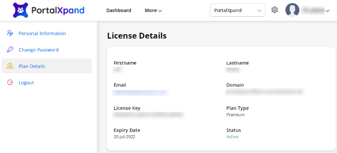
Plan Details
- Check your plan details of the portal.
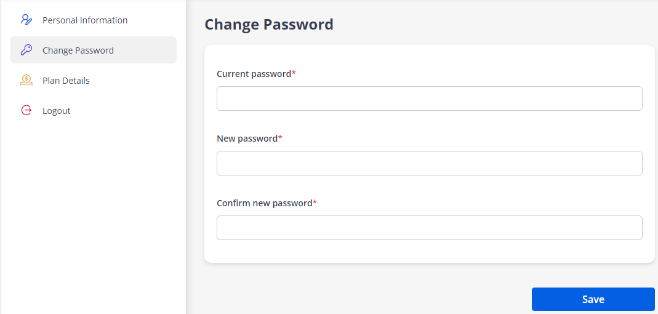
Change Password
- Update your password whenever you need.
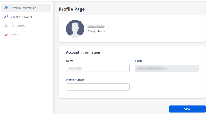
Personal Information
- You can update your portal profile by uploading your profile.
Admin Dashboard
-
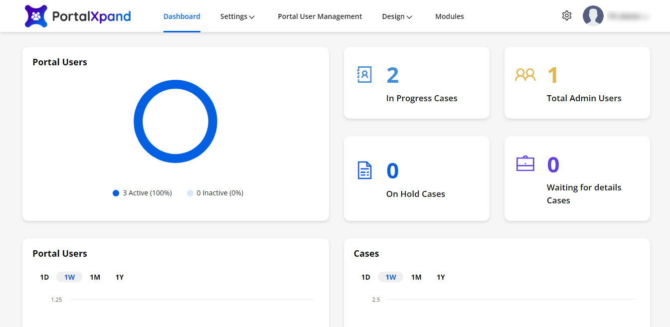
When you log in to the portal being a super admin, you will navigate to the static dashboard from where you can check all the activities in the form of graphs and counters as per the given rights.
-
You can check the active & inactive portal users from the chart.
You will get the counter for ‘In Progress Cases’, ‘Total Admin Users’, ‘On Hold Cases’ & ‘Waiting for details Cases’.
– In Progress Cases: You will get the no. of cases that are in Progress state till the current day.
– Total Admin Users: You will get the no. of the total admin users.
– On Hold Cases: You will get the no. of On Hold cases till the current day.
– Waiting for details Cases: Get the no. of waiting for details cases for the till the current day.
-
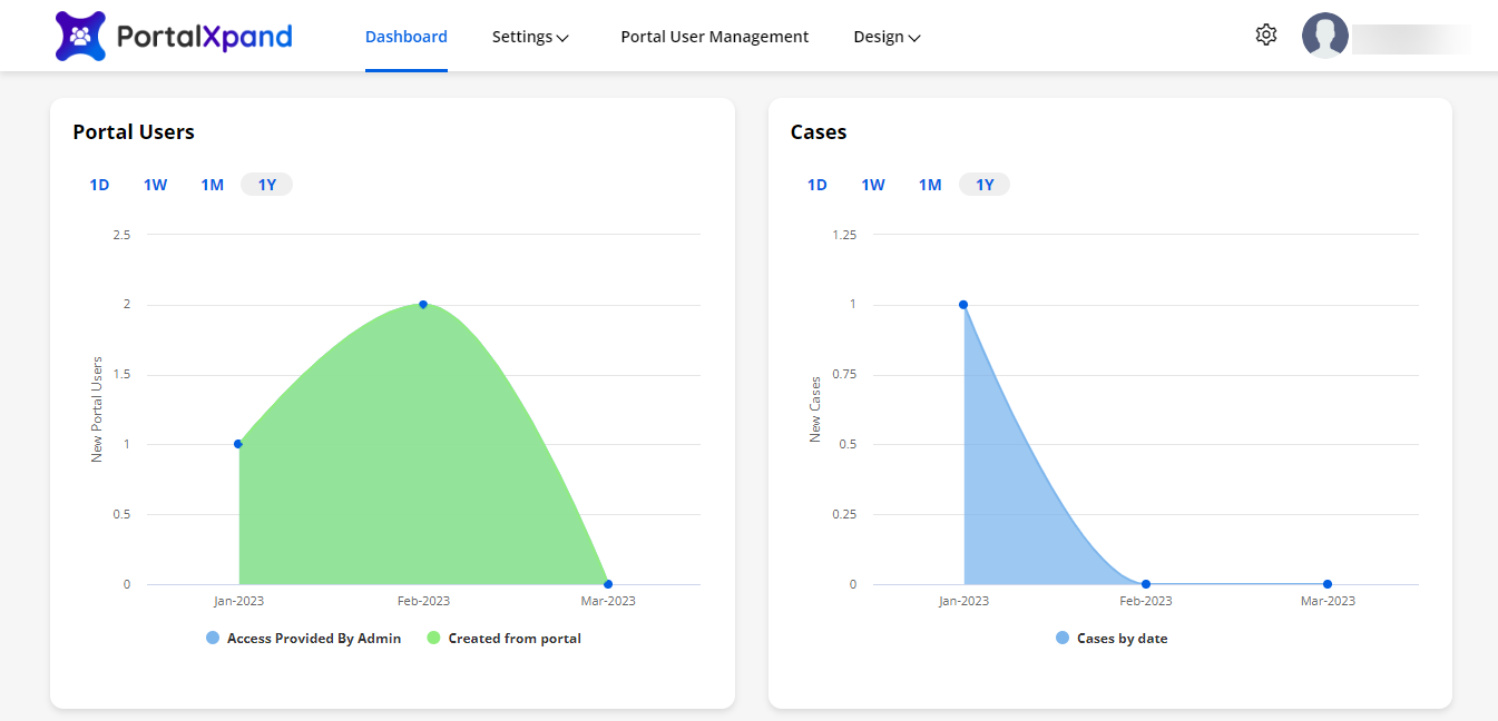
You will get the charts for 1 day. 1 week, 1 Month & 1 Year. By hovering the mouse on the specific chart, you will get the detail as a popup.
-
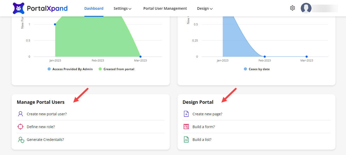
You will find the “Quick links” for Manage Customers & Design Portal to perform quick actions from the Dashboard.
Portal General Settings
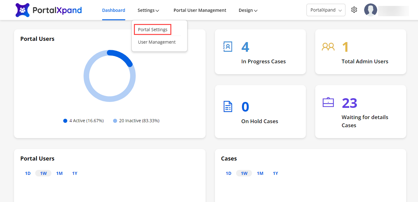
- You can configure your “General Settings” for the admin users and manage the other admin users from “Settings”. By clicking on Settings, you will find “Portal Settings” & “User Management”.
User Management
Roles (for Admin Users)
-
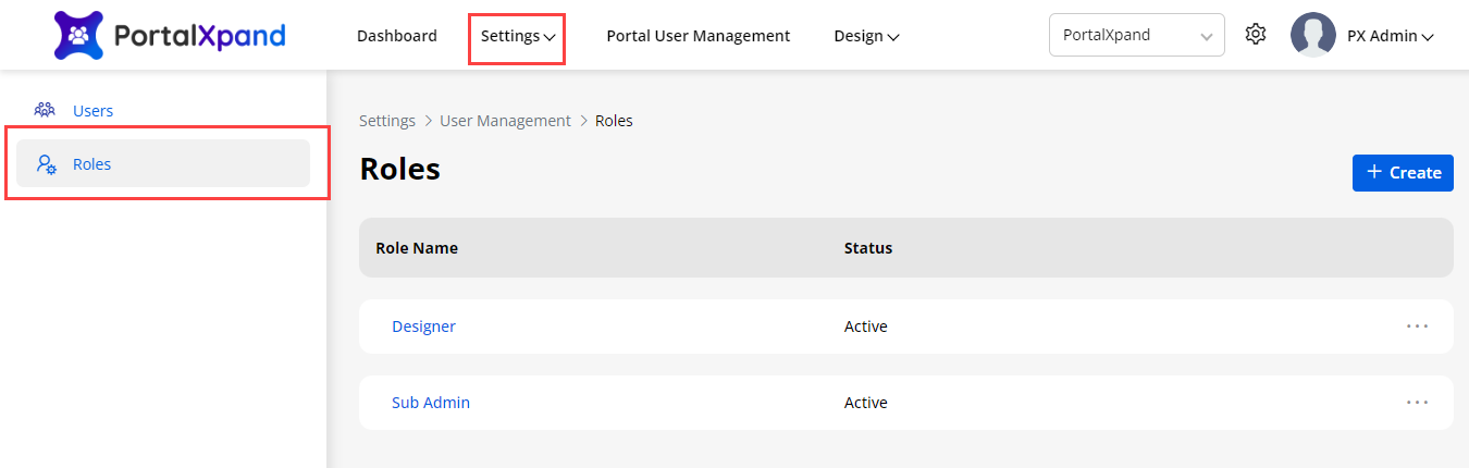
You can add and manage the Admin Roles from the Settings → User Management → Roles.
-
Under “Roles”, you can check the added roles. Other Admin /sub-admin users can also add the user’s role as per the rights.
-
To create a new role for the admin users, click on Create button.
-
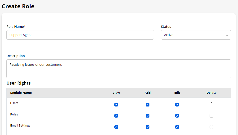
Insert the Role details and provide the user rights for the different roles from the Role matrix.
-
From here, once you enable the Module’s view, you can assign the rights to Add/Edit/Delete as per requirement.
-
The admin users can access only those modules for which the rights are given here.
Note: if the super admin user has assigned the rights to add the roles, only the other admin user will get the right to add the user’s role.
Users
-
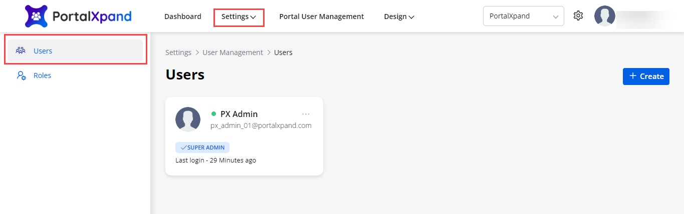
You can add and manage the Admin users from the Settings → User Management →Users.
-
Under the “Users”, check the admin users with their details like name, role, and the last login details on the User cards.
-
By clicking on the Create button, you can add the other admin users for the specific roles.
Note: If the super admin user has given the rights to the other admin users to add more users for the specific roles, only then other admin users will be able to add the new users.
-
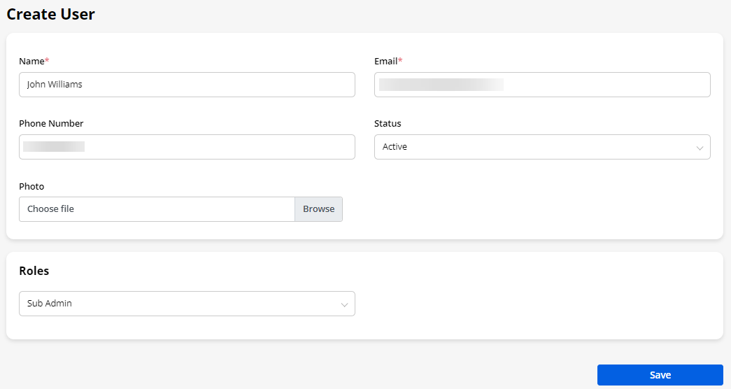
You can add the users by assigning the relevant role and the email details. You can add the portrait photo or logo for those users to identify.
-
The admin users will get the list of the roles if the roles are added and can manage them under the “Roles” settings.
-
Once a user is created, an email will be sent to that user to configure their password and access the portal as per their given rights.
Portal Settings
- From Portal Settings, you can configure all the portal-related settings and manage Portal Admin Users. You can configure the following settings under Portal Settings:
– CRM Authentication
– General Settings
– Language Settings
– Portal User Settings
– SMTP Settings
– Email Settings
– Theme Customization
– Site Configuration
– Payment Integration
– Workflow Management
– Site Level Data Sync
Site Level Data Sync
-
You will get the two different instances for the live and for the sandbox (testing purpose). You can manage both instances separately and the settings will be common for both as per Portal Settings. You can manage the live site and sandbox site separately from their domains, respectively.
-
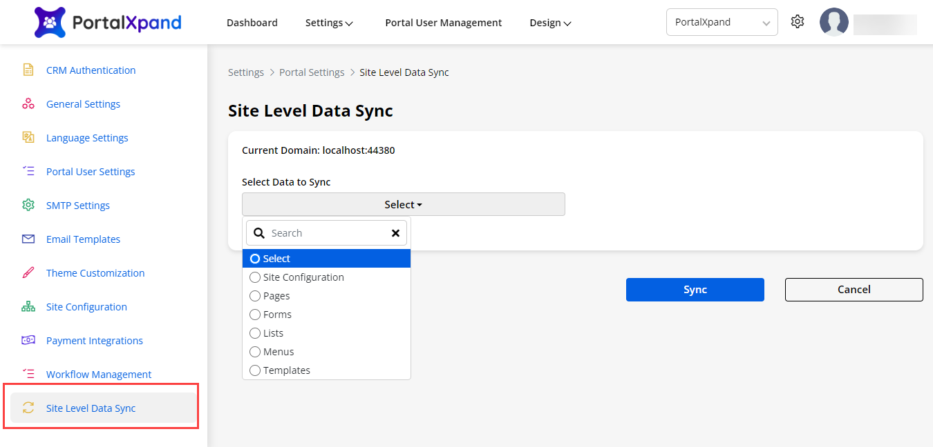
You can Sync data from Live to Sandbox or Sandbox to live by navigating to the Settings → Portal Settings → Site Level data Sync. Here you will find the Sync Data section where you can select a module to sync data like pages, forms, lists, etc.
-
If you have made any changes by creating a new record or editing an existing record, you will get the option to sync the data.
-
When you select any module, you will get the records for that module that are changed/updated, you can select the required data to sync and all related data to those records.
-
If you have made any changes by creating a new record or editing an existing record, you will get the option to sync the data.
– Select Data to Sync: Select any data (Module) from the drop-down selection to sync the recently added/updated data.
- When you select the data (module), you will get all the records of the selected module in the Tabular format which will also get synced with the added data on live or sandbox instances.
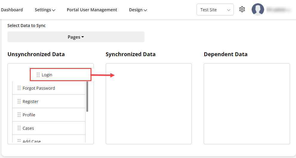
– Unsynchronized Data: You will get the records of the selected module in a tabular format that needs to be synced.
– Synchronized Data: You need to simply drag and drop the data from the “Unsynchronized Data” table and add it to the “Synchronized Data” table.
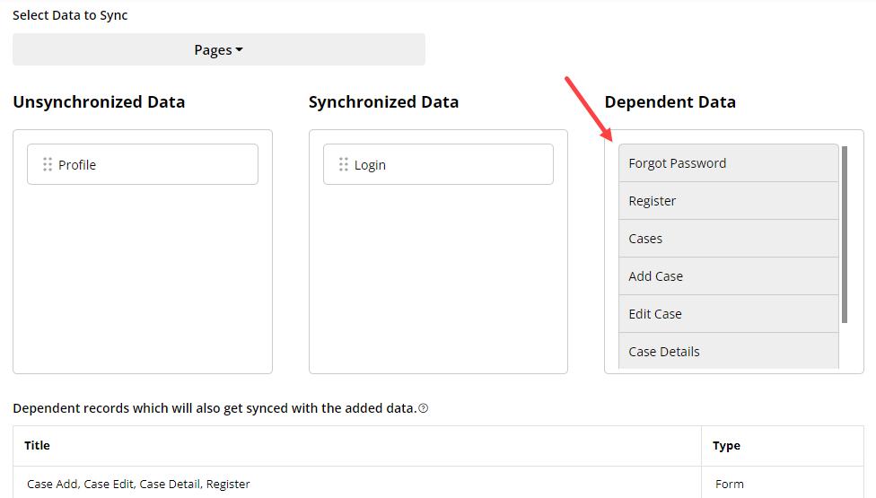
– Dependent Data: Once you drag and drop data to sync, you will get the dependent data for the same module that will be listed in the “Dependent Data” table.
- You will see all the “Dependent Records” in full detail in the tabular format that will be synced.
When you click on the Sync button, all the selected data and dependent records will be synced to the other instance (Live or Sandbox).
Workflow Management
-
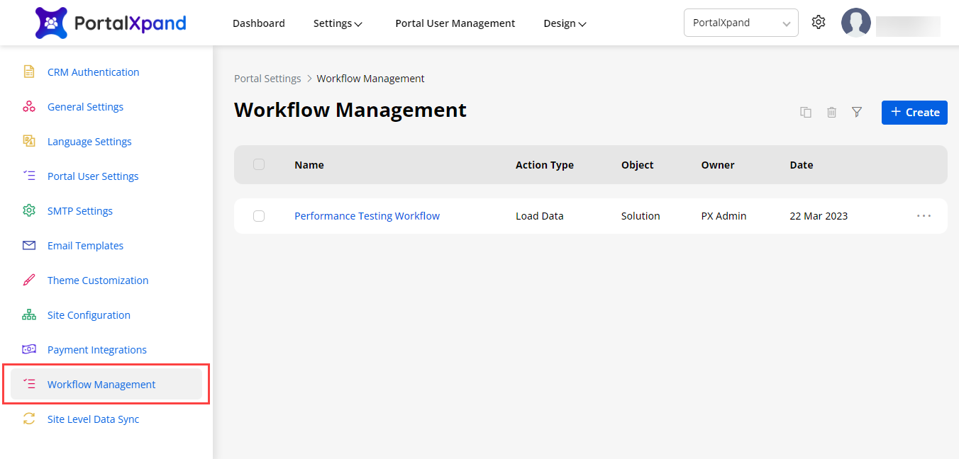
You can add the rules and set the conditions if you want to show the specific object data in the customer portal or allow the portal users to access the specified object data. For that, navigate to the Workflow Management under the “Portal Settings” (Portal General Settings).
-
By clicking on the “Workflow Management”, you will be navigated to the listing page of the workflow management. You can see the added workflow if already added.
-
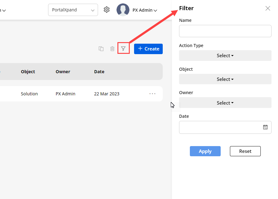
You can search and filter the workflow records if there are more records. You can search the specific workflow by inserting the text caption. You can filter the records by selecting the Action Type, Object, Owner, and Date.
-
By clicking on the “+Create” button, you will be navigated to the Create Workflow page. From here, you can configure and set the conditional rules for the workflow to sort and filter the specific object data or allow customers to access the object data for CRUD operations (Edit, Detail, and Delete rights).
-
You need to configure the following options for the workflow:
– Title: Insert the relevant name to identify the workflow.
– Roles: Select the Roles on which you want to make this workflow function.
– Object: Select the object for which you need to create the conditions
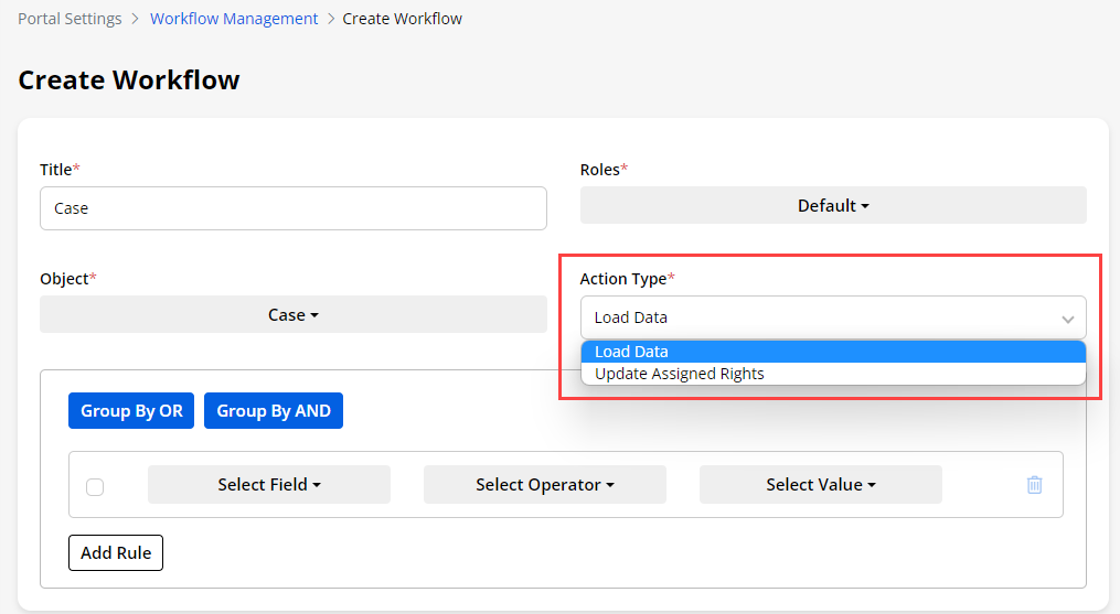
– Action Type: You will get two options to act on the data in the customer portal: Load Data and Update Assign Rights.
– Load Data: If you have selected the “Load Data” action, you can filter the object data in the customer portal and show only those object data that you want to show to the portal users.
- The data will be sorted and filtered in List view, Data card, Recent Activity, Counter, Chart, etc. as rule(condition) is set for the “Load Data”.
– Update Assigned Rights: If you have selected the “Update Assigned Rights”, you can manage the access rights for portal users to perform CRUD operations (Edit, Detail and Delete) by adding the conditional rules.
- The portal users will be able to access the user access rights for the object data only if the conditions are fulfilled.
Note: This workflow condition for rights will be only applied if the user has those rights from the user’s role. (Portal User Management → Roles)
Load Data
-
If you have selected the “Load Data” in the Action Type of the workflow, you can sort and filter the object data in the customer portal. You can display the object data as per the specific date range or based on the status of the object data.
-
Once the object is selected, you will get the options to set the conditions for the selected object . You will get the list of the Fields as per the selection of the object . As per the field selection, you will get the operators and selected field values. You can also create a group of conditions with AND and OR.
-
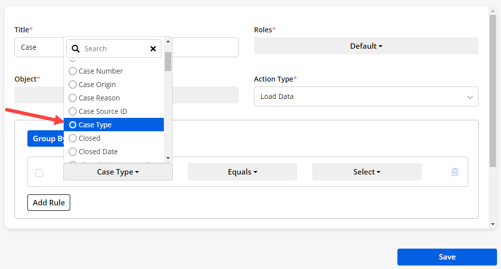
Now, you need to select the ‘Field’ from the drop-down selection to filter the object data based on that.
-
You will get the fields of the selected object as per configuration in the Salesforce.
-
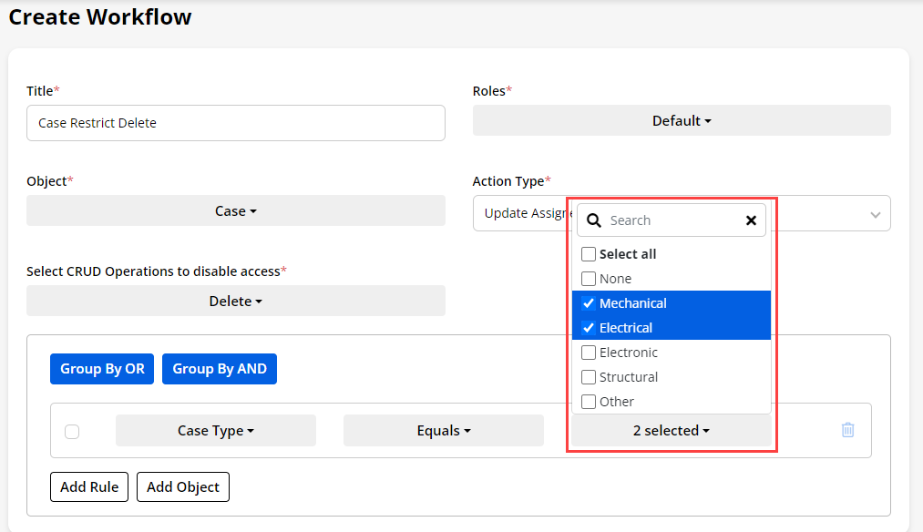
Here, the field is selected (i.e. Case Type). It means the object data will be accessible to the portal users as per the condition has set.
-
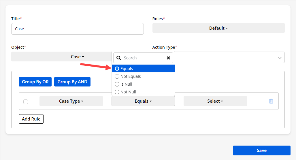
Once the field is selected, you need to select the ‘Operator’ option to match with the field’s value (attribute).
-
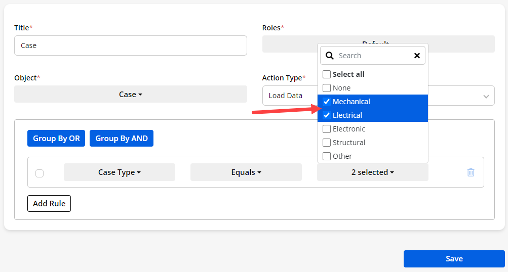
Once the operator is selected, you need to select the field’s value (attribute). You can select multiple values for the field. Here, the “Mechanical” and “Electrical” field’s value is selected.
Note: You will get this option as per the selection of the Field. If you have selected the Account field, you will get a case related to the selected account. So, it depends on which field is selected.
-
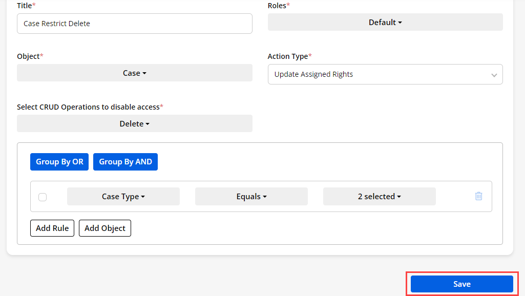
Once the conditional rule is added, click on the Save button.
-
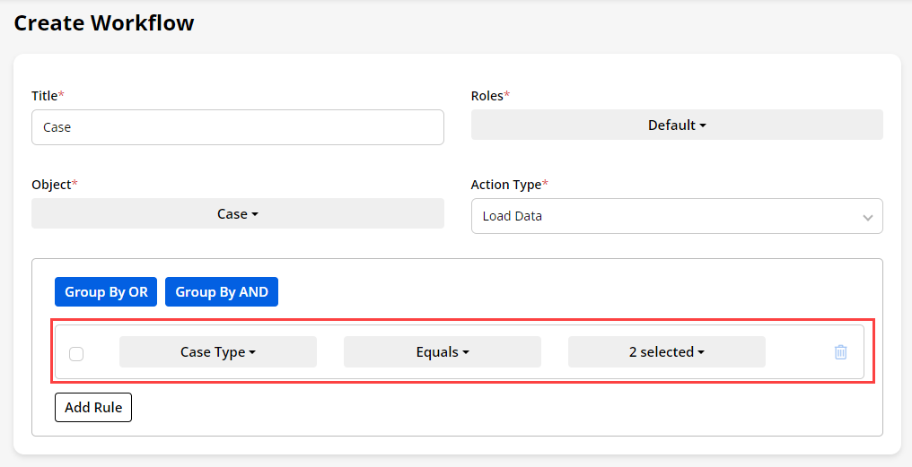
The following condition is set for the Case object :
– Object : Case
– Field: Case Type
– Operator (match): Equals
– Field’s value (attribute): Mechanical and Electrical
Note: Here, you can also select the multiple values as per your requirement. You will get the field’s value selected based on which field you have selected. In some of the fields, you will get only one option to select (radio button).
- So, based on the condition, the portal users can see only those records of the Case object whose Case type is” Mechanical” and “Electrical”.
Update Assigned Rights
-
If you have selected the “Update Assigned Rights” in the Action Type of the workflow, you can restrict or allow the portal users to Edit, View, and Delete actions for the portal users.
-
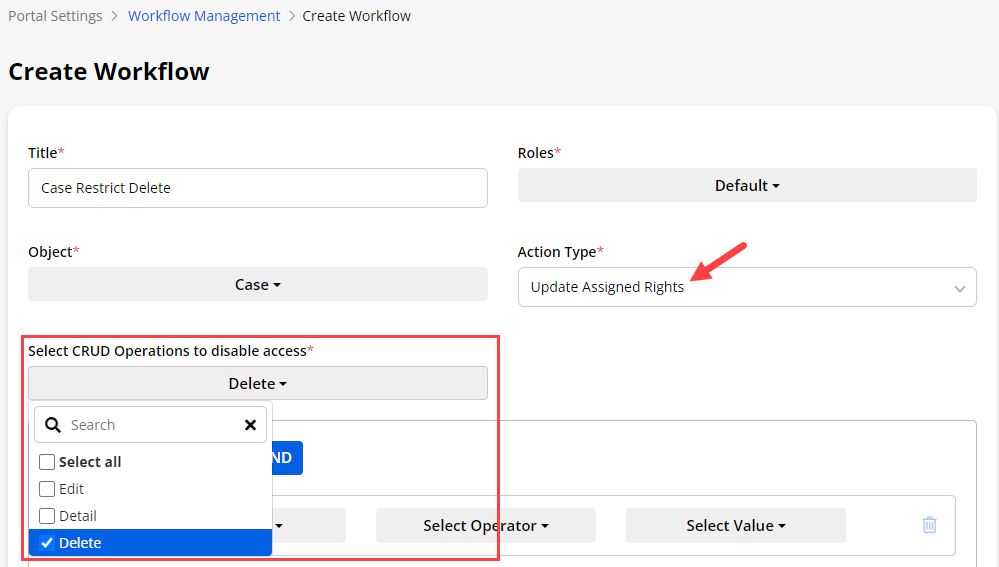
When you select the “Update Assigned Rights” action type, you will get the Select CRUD Operations to disable access option.
-
You need to select the CRUD operation which you want to disable for the selected role. For example if you want to restrict the delete access then select “Delete”.
-
You need to select the ‘Field’, ‘Operator’, and the Field’s ‘Value’ (attribute) to set the condition based on that. You will get the operators and field’s value as per the selection of the field. Here, the “Mechanical” and “Electrical” field values are selected.
-
It means that the portal users will not get the delete option if the Case Type is “Mechanical” and “Electrical”.
-
Now, by clicking on the Save button, the condition of the user access rights of Edit, Detail, and Delete will be applied to the customer portal.
Multiple Rules and Grouping
-
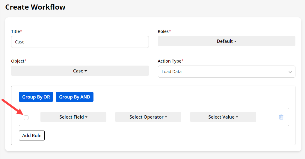
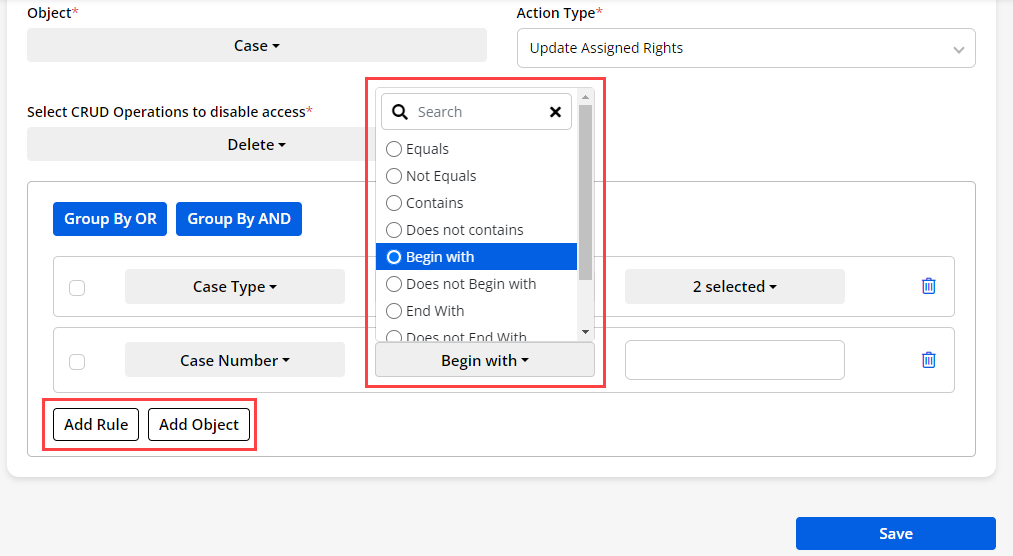
You can also add more conditions to sort and filter the object data in the customer portal. By clicking on the Add Rule/Add Object button, the new row will be added to set the condition.
-
You will get the operator (match) options as per the selection of the field.
-
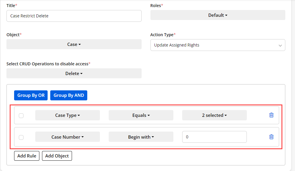
Here, you have added two Rules (conditions) to sort and filter the Case object data in the customer portal.
-
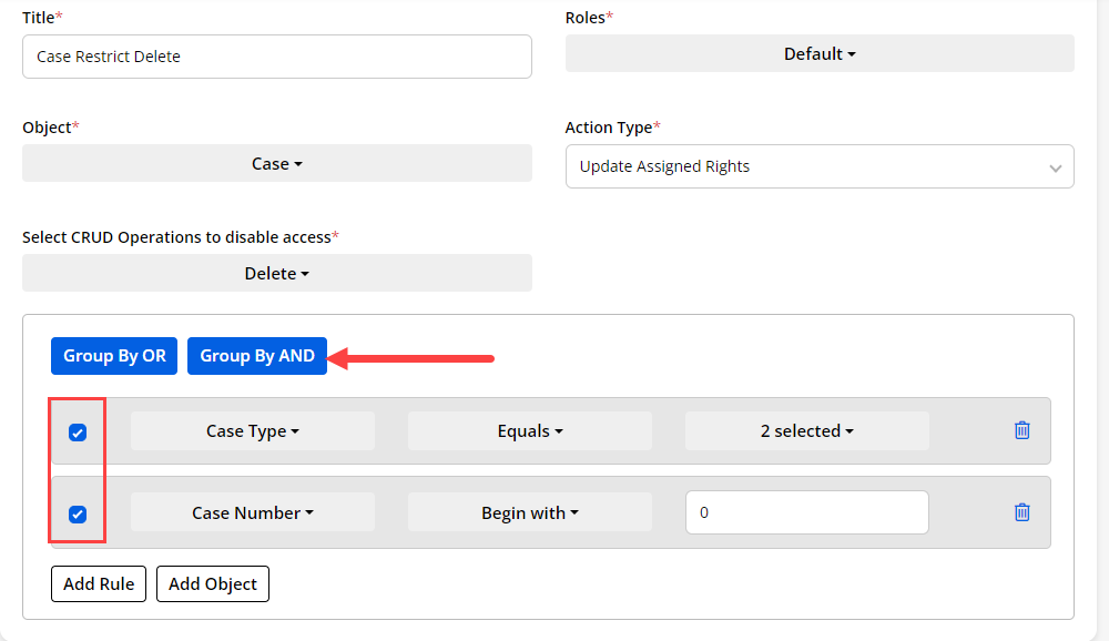
Both conditions work individually. But, if you want to apply together, you can group both conditions. You can group the conditions by AND / by OR as per your requirement.
-
To group the conditions, you need to select the conditions and then click on the button that you want to group (By OR / By AND).
-
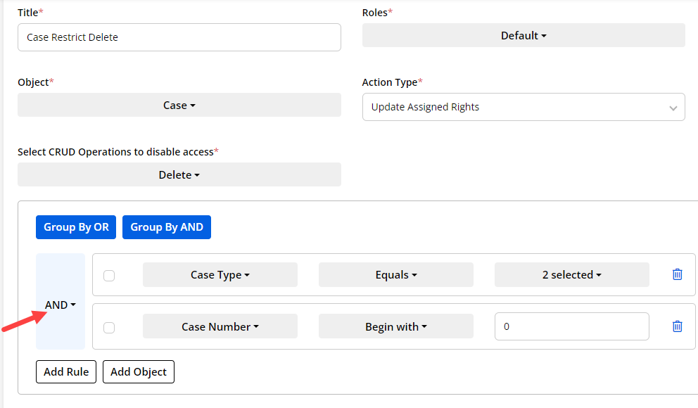
Here, both conditions are grouped with AND. It means that the portal users will get the filtered data when both conditions are fulfilled.
-
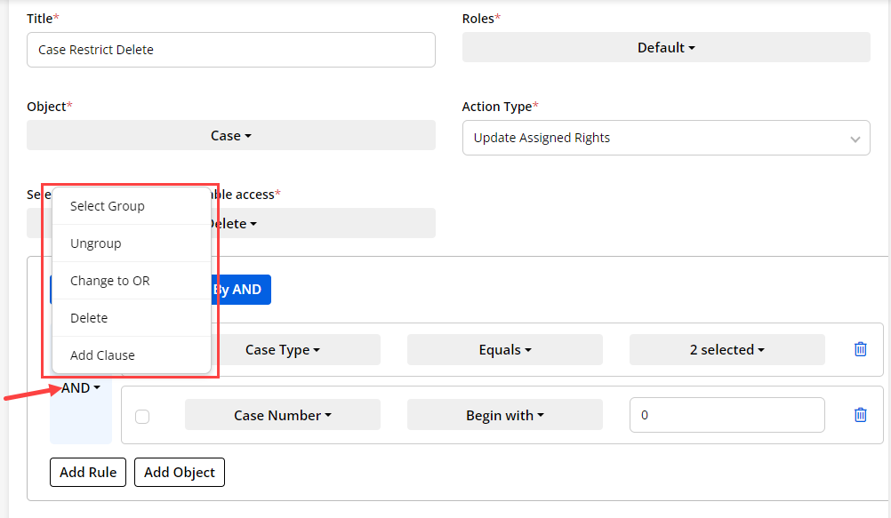
You will get the option for the grouped conditions. By clicking on the down arrow icon, you will get the options for the group.
-
You can ungroup the conditions and change the group type from “OR to AND” and “AND to OR” as well. If you want to add a new condition into a group, you can add it by clicking on the Add Clause option.
-
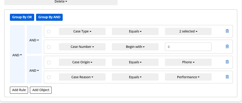
You can add the conditions and group them into multiple groups as per requirement.
-
Even groups can be configured with the option to select the whole group.
Enable Workflow
-
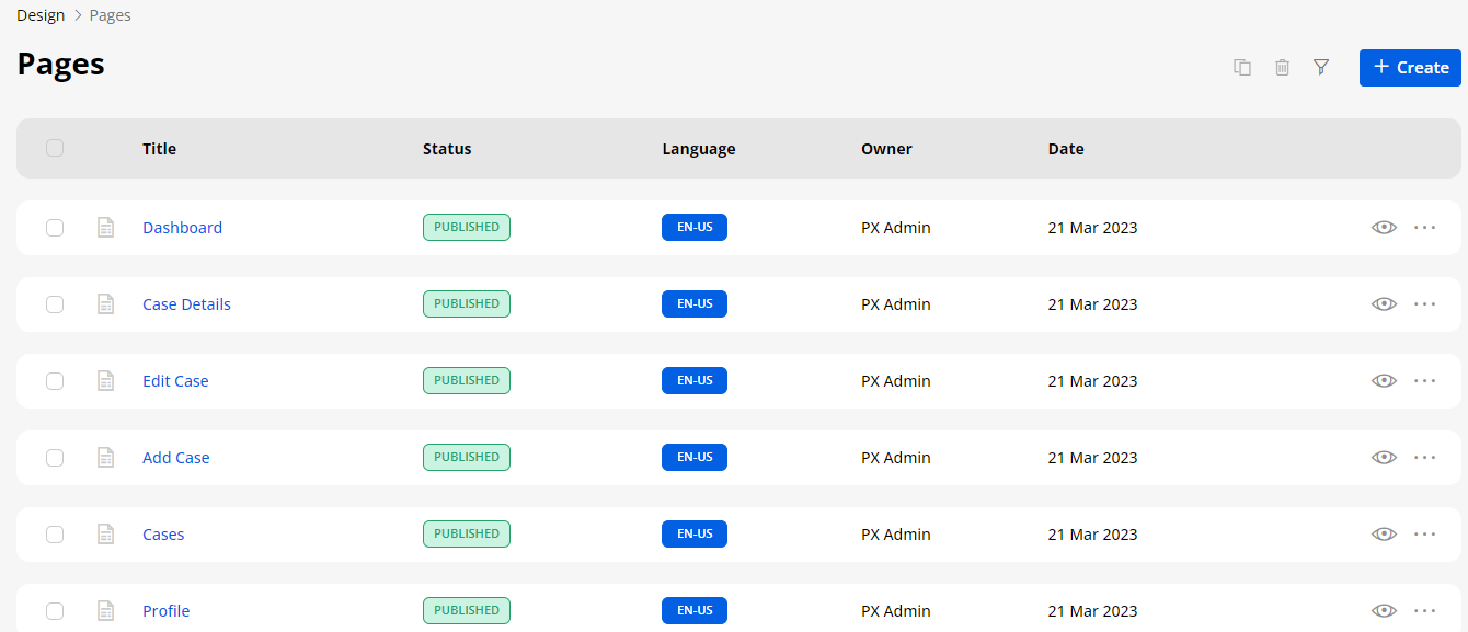
Once you have created workflow, you need to assign it to the particular page. Navigate to the Design → Page, you will get the list of created pages.
-
Now open the page in the Edit mode, for which you want to apply the workflow.
-
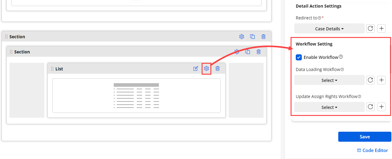
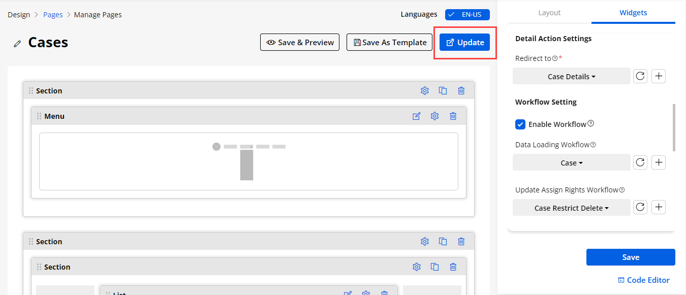
Now click on the Configure Widget Icon and tickmark the Enable Workflow field. Select the Data Loading and Update Assign Rights Workflow, click on the Save button and Update the page to apply the workflow.
-
Widget-wise workflows are added for these widgets.
– Case Deflection
– Chart
– Counter
– Data card
– Form
– Knowledge base
– List
– Recent Activity
-
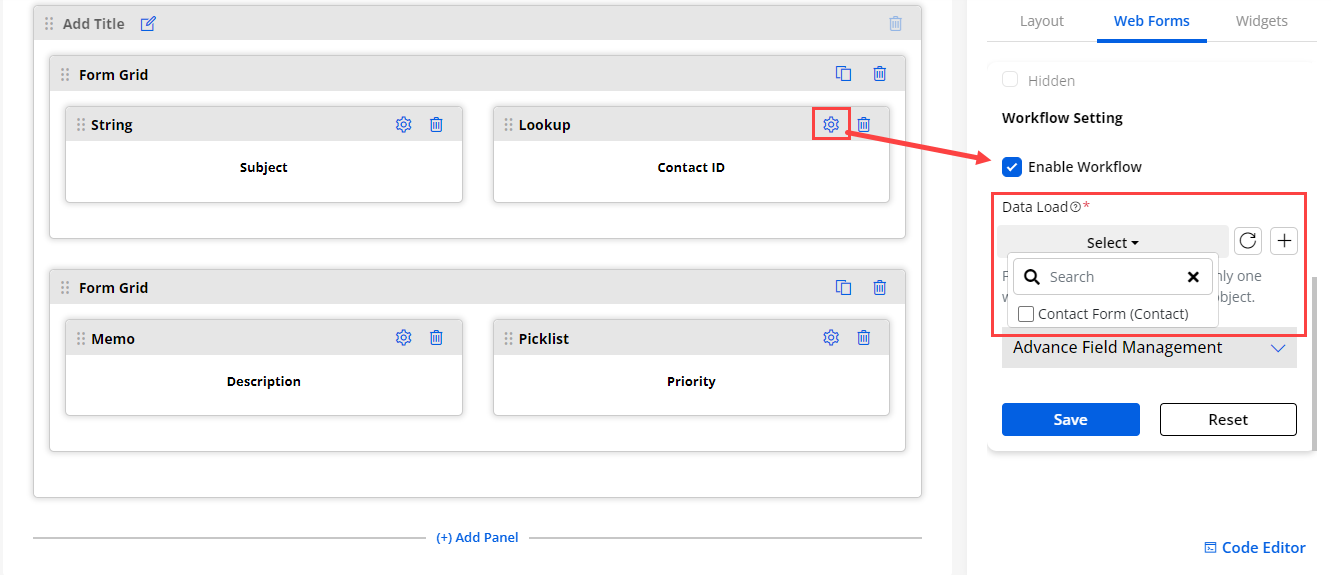
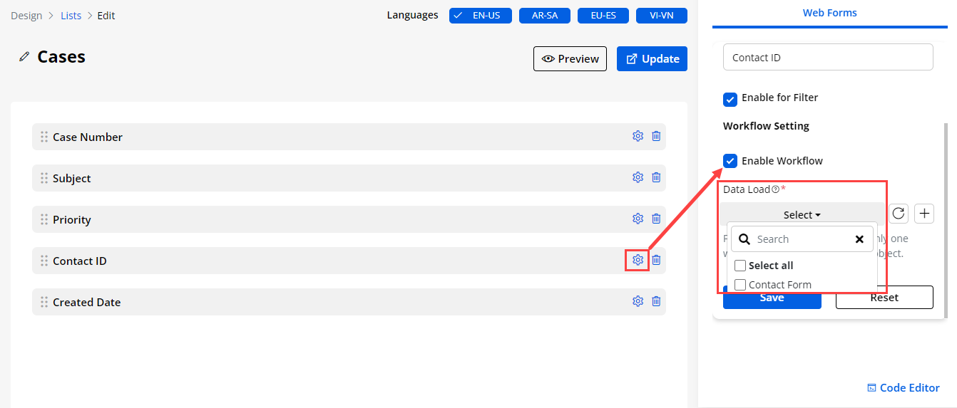
Also we can assign workflow in Form and List Builder at the field level for only lookup type of fields.
-
But make sure the lookup field related to the object must have the workflow.
-
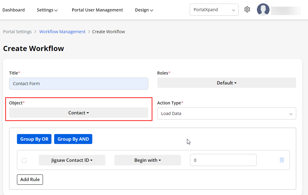
Here we have created a workflow for Contact object. Contact ID is related to the Contact object hence we can enable the workflow for it.
For Forms
-
Navigate to the Design > Form you will get the list of the forms. Now open the form in the Edit mode. Open the settings panel of the Lookup field.
-
Here Enable and select the workflow you have created from the Workflow management for the object.
For List Builder
-
You can also assign the Load Data Workflow to the lookup field of the list.
-
Some widget will have the Load Data Workflow and some widget will have the both workflows. Here is the classification of them.
Load Data: Chart Widget, Counter Widget, Knowledge Base Widget, Case Deflection Widget
Both Workflows: List Widget, Data Card Widget, Recent Activity, Form Widget
Payment Integration
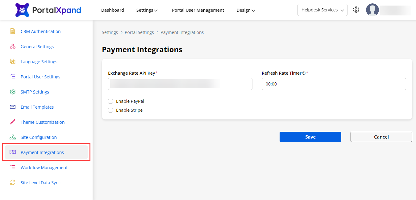
- You can configure the “Payment Integration Support” for the portal users in the customer portal.
– Exchange Rate API Key: Insert the API Key which will help you in currency conversions which is subscription based. You can generate the API key by following these instructions.
– Refresh Rate Time: Set the timer to refresh the exchange rate at a regular time interval as per requirement. Maximum time can be 23:59 and minimum time can be 00:00.
Note: If the Refresh Rate Time is 00:00, you will get the live exchange rate.
-
There are two payment methods provided to enable the Payment Gateway for the customer portal: PayPal and Stripe. These will be third-party integrations to enable the Payment methods in the customer portal.
-
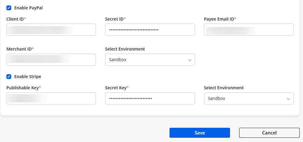
First, you need to enable the Payment methods (PayPal and/or Stripe) and then integrate them as per your requirement to provide the Payment Gateway to the portal users.
– PayPal configuration: Enable the PayPal payment method.
– Client Id: Insert the Client ID of your PayPal account.
– Secret Id: Insert the Secret ID of your PayPal account.
– Payee Email Id: Insert the Payee Email ID that is registered with the PayPal account.
– Merchant Id: Insert the Merchant ID of your PayPal account.
– Select Environment: You will get the drop-down selection to select the specific environment. Select either the Live or Sandbox option from the drop-down selection.
– Stripe configurations: Enable the Stripe payment method.
– Secret Key: Insert the Secret API Key of your Stripe account (that will be stored on your own servers).
– Publishable Key: Insert the Publishable Key of your Stripe account (to identify your account with Stripe).
– Select Environment: You will get the drop-down selection to select the specific environment. Select either the Live or Sandbox option from the drop-down selection.
After configuring the Payment Integrations, click on the Save button.
Site Filter and Global Filter
-
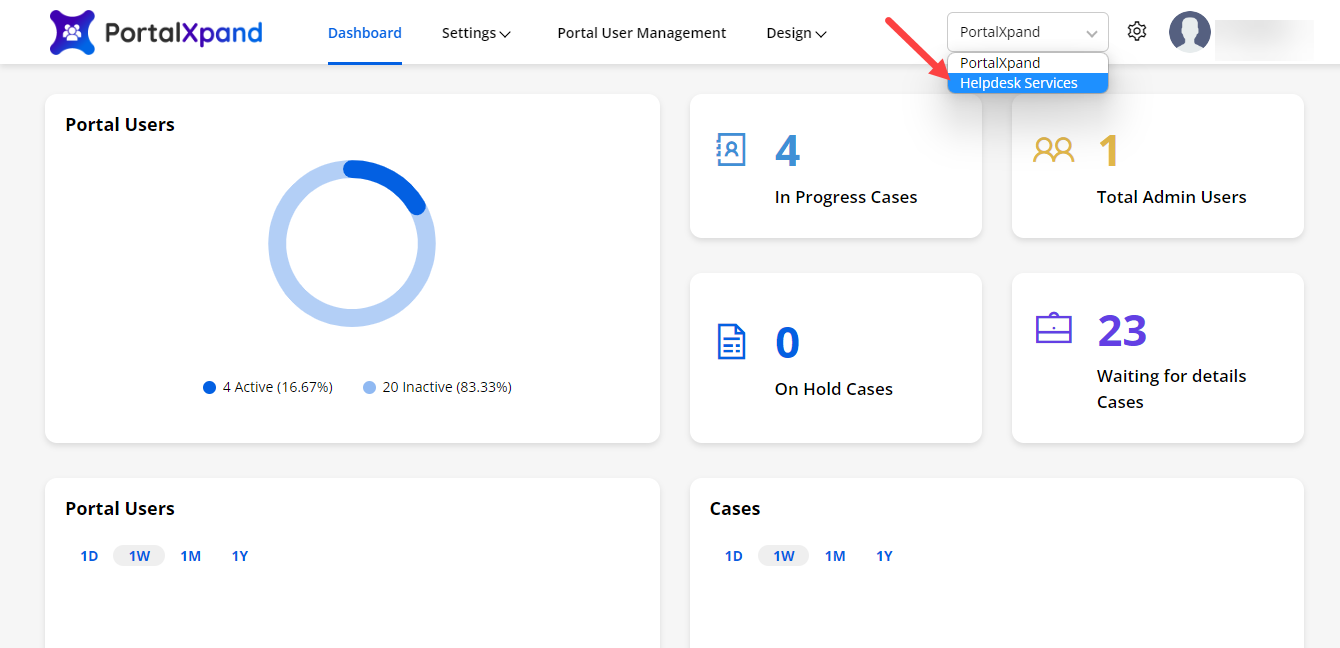
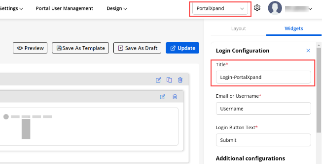
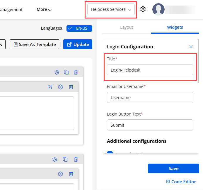
Once you or any Admin users logged in, you will get the published site. To change the portal site, the Global Filter selection option is provided to manage all the builders’ data and templates. The different sites can have different pages.
-
So, you can change the portal site from that site drop-down selection and according to that, you can make the changes in the builders.
-
Multiple sites management helps to display the different types of site data (Lists, Forms, Pages, Templates, and Menus) as per the site configuration.
-
As you change the Site, you will get the page builder data as you have configured for that site.
Site Configuration
-
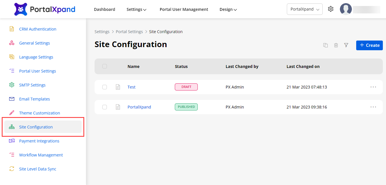
When the Admin users log in to the Portal-Admin and authenticate the CRM, they will get the default published site.
-
You can create and configure multiple sites for the current portal instance, but one site can be published at a time. Being an admin user, you can create a new site for the customer portal and publish it. Later, you can edit the site as well.
-
By navigating to “Site Management”, you will get the list of the sites that are created. You will get the status of which site is currently active (published).
-
You can edit if required to change the settings or by clicking on the + Create button, you can create a new site by configuring the required details. When you create/edit any site you need to configure the site as per the following sections:
– Create/Edit Site: Site details.
– General Settings: Portal (site) Name & its logo/icon.
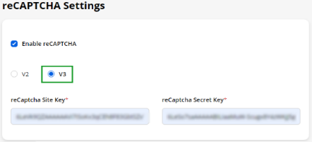
– reCAPTCHA Settings: Enable reCAPTCHA V2 or V3.
– Theme Customization: Fonts and color combinations.
– Customer OnBoarding Settings: Enable portal login with social media.
– Customer OnBoarding Settings User Validation: 2FA, Verify Email & User Approval details.
Create/Edit Site
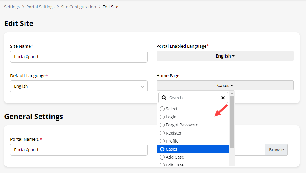
- Insert the details of the site:
– Site Name: Insert the relevant name of the site that will appear in the list of the site.
– Portal Enabled Language: All the languages that are enabled from the Language Settings will be listed here.
– Default Language: Select the Default language for the portal.
- After saving the details and configuration of the site, you will get the HomePage drop-down option.
– Home Page: Select the redirection page when the portal users load the initial page of the customer portal.
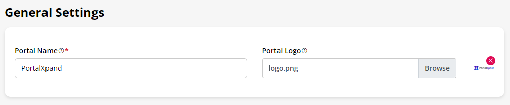
General Settings
– Portal Name: Insert the Portal Name (title) that will be used for the admin interface and will reflect on the top-left corner.
– Portal Logo: Select the image to display as a logo. The selected image logo will appear there.
reCAPTCHA Settings
-
The spam protection feature is provided so you can secure the customer portal pages, forms, and any widgets from the Spam. To protect the customer portal data (pages, forms & widgets), the Google reCAPTCHA feature is provided.
-
You can set your portal details under General Settings. You can set the general details as follow:
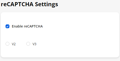
– Enable reCAPTCHA: Check the checkbox of the “Enable reCAPTCHA ”. You will find the two versions of the Google reCAPTCHA: V2 & V3. You can enable the required captcha version for your customer portal.
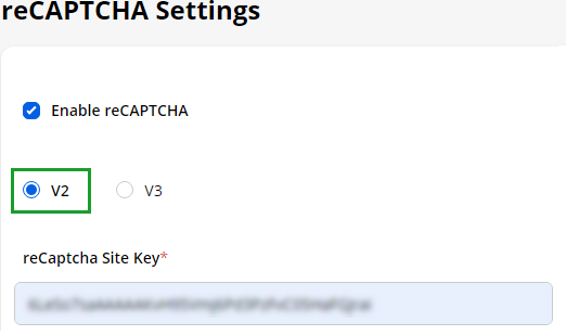
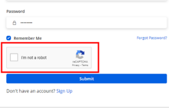
– V2: You will be needing the reCAPTCHA Site Key. The “Site Key” is used to render the reCAPTCHA within a page. V2 validates the requests with the “I’m not a robot” checkbox.
-
When portal users access the customer portal, the captcha will be visible at the end of any Form with the “I am not a robot” checkbox as google provides. Portal users must be checked for the Form submission.
-
After inserting & configuring all the details, click on the Save button to save the changes.
-
The V2 captcha can be applied to the following “Widgets”:
– Form widget – Login widget – Registration widget -Forgot Password widget
– In Subgrid Forms in the form builder
- When portal users access the customer portal, the captcha (V2) will be visible at the end.
– V3: You will be needing the reCAPTCHA Site Key & Secret Key. The Site Key is used to render the reCAPTCHA within a page and the Secret Key is used for performing server-side validation. V3 Verify the user’s response with a score.
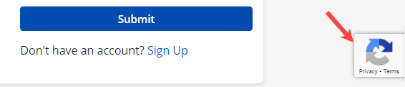
- When portal users access the customer portal, the captcha (V3) will be visible at the right corner of the screen that will send the token automatically based on the user actions.
The V3 captcha can be applied to the following “Widgets” and the “Page”:
– Page – Form widget -Login widget – Registration widget
– Forgot Password widget – List widget – Recent Activity widget
– Case Deflection widget – Chart widget – Counter widget
– Knowledge Base widget – Search widget – In Subgrid forms in the Form builder
Theme Customization
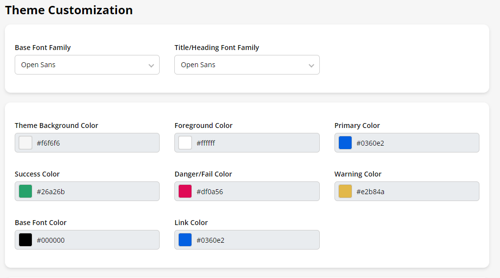
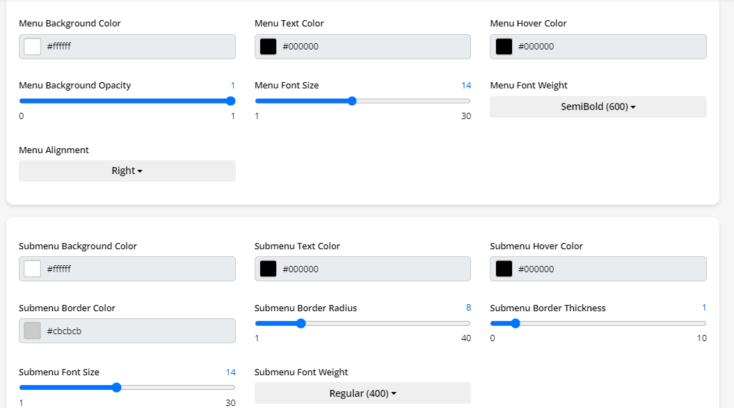
- You can customize Theme Colors, Font style & Font colors for the Customer Portal as well for the site. You can also customize the theme as per the Site and configure the below elements:
– Base Font Family: Choose a font to use for the main body text and for the menus.
– Title/Heading Font Family: Choose a font to use for all the headings and titles of the Portal.
– Theme Background Color: Choose a color to display as a background color to the body part.
– Foreground Color: Choose a color to display content background color.
– Primary Color: Choose a primary color to be displayed most frequently across all the modules. This color will appear for text/iconography.
– Success Color: Choose a color to display when the action performs and gets success. (Toast Notification)
– Danger/Fail Color: Choose a color to display when the action performs, fails, or anyerror. (Toast Notification)
– Warning Color: Choose a color to display warning. (Toast Notification)
– Base Font Color: Choose a color for body text and description of Portal main content.
– Link Color: Choose a color for all text to which links have been added
– Menu Background Color: Choose a color to display as a menu background
– Menu Text Color: Choose a color to display as a menu text
– Menu Hover Color: Choose a color to display as a menu hover
– Menu Background Opacity: Choose opacity of menu background
– Menu Font Size: Choose font size of the menu
– Menu Font Weight: Choose font weight of the menu
– Menu Alignment: Choose alignment of the menu
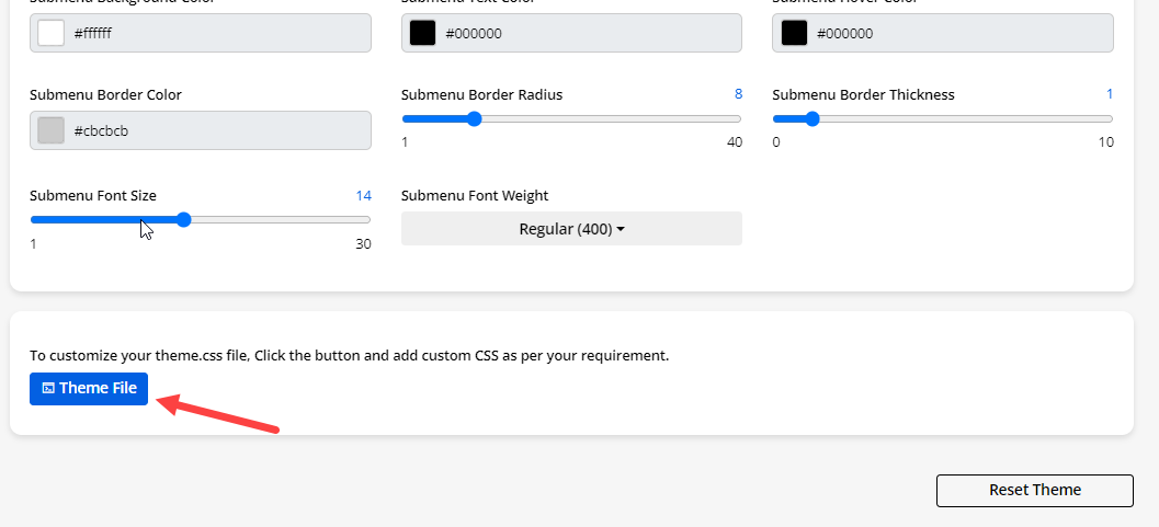
– Submenu Background Color: Choose a color to display as a submenu background
– Submenu Text Color: Choose a color to display as a submenu text
– Submenu Hover Color: Choose a color to display as a submenu hover
– Submenu Border Color: Choose a color to display as a submenu border
– Submenu Border Radius: Choose radius of submenu border
– Submenu Border Thickness: Choose thickness of submenu border
– Submenu Font Size: Choose font size of the submenu
– Submenu Font Weight: Choose font weight of the submenu
– Theme File: You can customize your Portal’s UI & appearance by updating the Theme CSS file
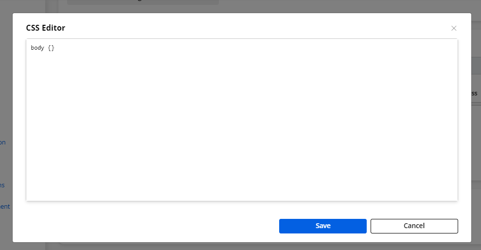
-
By clicking on the ThemeFile button, you will get the ‘CSS Editor’ popup where you can insert the CSS and save the changes.
-
Reset: You can set back to the default theme and fonts by clicking on the Reset button.
-
By clicking on the Save button, the theme & fonts of the Customer Portal will be updated. If you have added the custom theme, you will get the Portals UI & appearance as per the CSS that is inserted in the CSS Editor
Customer Onboarding Settings
-
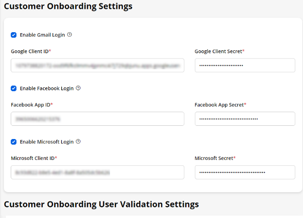
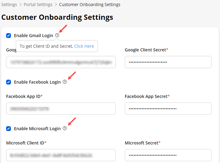
You can provide the customer portal login using the different credentials of the social media to the portal users.
-
You can allow the portal users or new portal users to be login or register through social media credentials: >Google ID (Gmail)>Facebook> Microsoft
-
You need to set up the social login credentials to allow the portal users to access the customer portal through any social media credential. You need to enable the checkbox for the respective platforms (social media) that you want to enable to the customer portal.
-
You will get a helpful tip to get the Client/App ID & Secret the link is provided by. By clicking on the help tip (Click Here) that will redirect you (or your other admin users) to the page that provides the instructions on how to get the ID & Secret key credentials.
Note: The portal users should have enabled the allowcookies from the browser settings for the portal site to avoid any type of contractions in the third party.
-
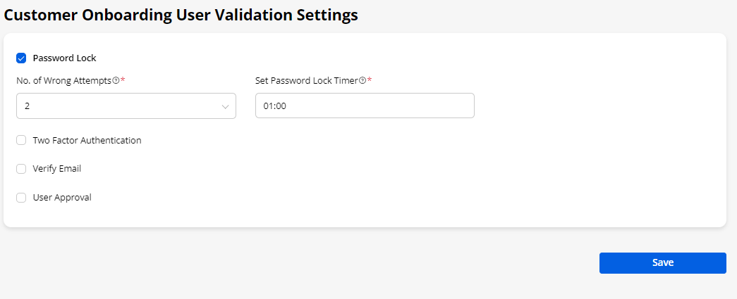
Additionally, you will get the Customer User Validation Settings for login validation
-
You can enable the following settings:
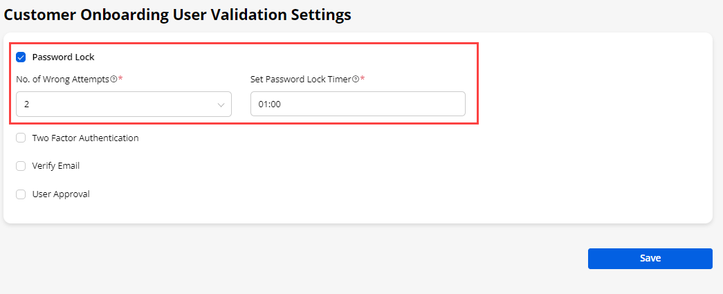
– Password Lock: If you have enabled the ‘password lock’ , portal users will be locked to access the portal after wrong attempts (defined in ‘No. of Wrong Attempts’ ) and till the time defined as ‘Set Password Lock Timer’.
- You can configure the Password Lock by following :
– No. of Wrong attempts: Select the number to provide the portal users’ number of attempts for entering the wrong Password.
– Set Password Locker Timer: Set timer that will lock portal users from using login functionality after wrong password attempts.
– Two Factor Authentication (2FA): Enable this option if you want the two-side authentication when the portal users log in to the portal. If it is enabled from here, once the portal users log in with their credentials, they will get the OTP in their registered email that needs to be verified here for successful login.
- You can configure the OTPactive duration under Two Factor Authentication.
– Set OTP Timer: Set the timer that will display in the registered Email of the portal users with the -OTP. It will show the reverse countdown in minutes that is inserted in the Set OTP Timer.
– No. of Wrong attempts: Select the number to provide the portal users’ number of attempts for entering the wrong OTP.
– Disable Resend OTP: Set the periods to remain to disable the Resend OTP option for some time to the portal users.
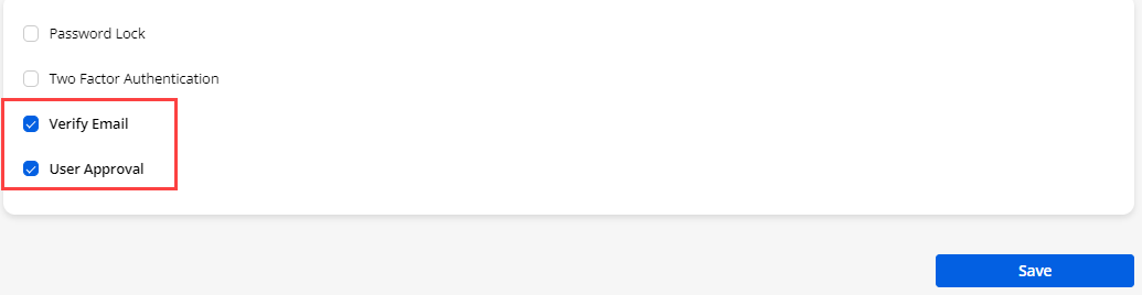
– Verify Email: If you have enabled the ‘verify Email’, the new users who registered from the Customer Portal, will get an Email verification link to their registered Email id to verify their portal account.
If the new user login with any social media platform(Google, Facebook, or Microsoft), they will be verified through Email after successfully authenticating any social media. They will get the Email verification link to their registered Email id to verify their portal account.
– User Approval: If you have enabled ‘User Approval’, the admin must approve for the login to the portal users created from the portal. The users who have logged in with any social media platform must approve for the login once they successfully authenticate with any social media login.
Site Publish
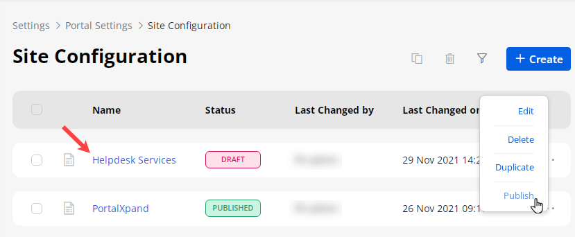
- The new site will be listed under the “Site Configuration”. By clicking on the ellipsis icon (details), you can Publish the newly configured site.
Note: At a time, you can publish one site only so by publishing another site, the status of the current published site will change to Draft. You cannot delete the Published site. Once you publish the site all the changes will be reflected on the front side (Customer portal).

Theme Customization
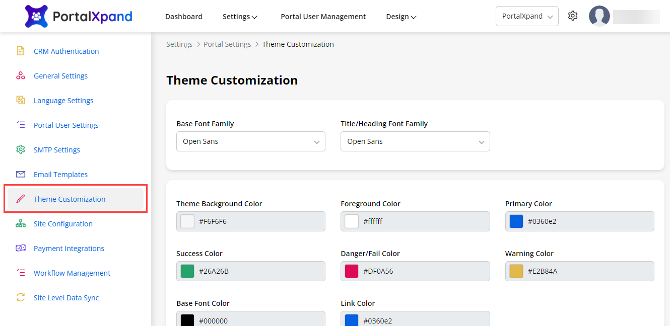
- You can customize Theme Colors, Font style & Font colors for the Admin Portal. You can also customize the below elements:
– Base Font Family: Choose a font to use for the main body text and for the menus.
– Title/Heading Font Family: Choose a font to use for all the headings and titles of the Portal.
– Theme Background Color: Choose a color to display as a background color to the body part.
– Foreground Color: Choose a color to display content background color.
– Primary Color: Choose a primary color to be displayed most frequently across all the modules. This color will appear for text/iconography.
– Success Color: Choose a color to display when the action performs and gets success. (Toast Notification)
– Danger/Fail Color: Choose a color to display when the action performs, fails, or anyerror. (Toast Notification)
– Warning Color: Choose a color to display warning. (Toast Notification)
– Base Font Color: Choose a color for body text and description of Portal main content.
– Link Color: Choose a color for all text to which links have been added.
-
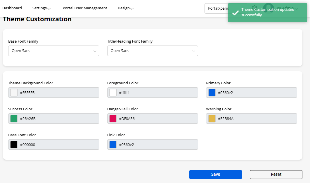
- By clicking on the Save button, the theme & fonts of the Admin Portal will be updated.
-
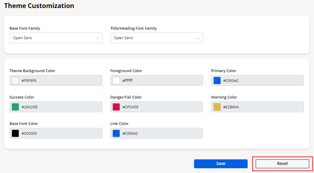
By clicking on the Reset button you can also reset the theme to default.
Email Templates
-
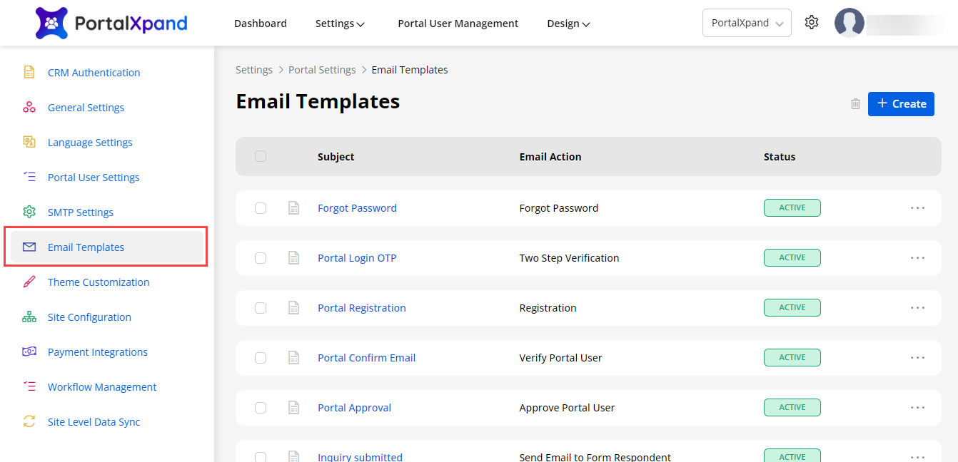
You can set different email templates as per requirements for different email actions (Ex. Registration, Forgot Password, Verify Email, etc.). You can edit the existing email templates from the list.
-
You can add a new ‘Email template’ by clicking on the + Create button.
-
You can add a new ‘Email template’ by clicking on the Create Email Template button.
-
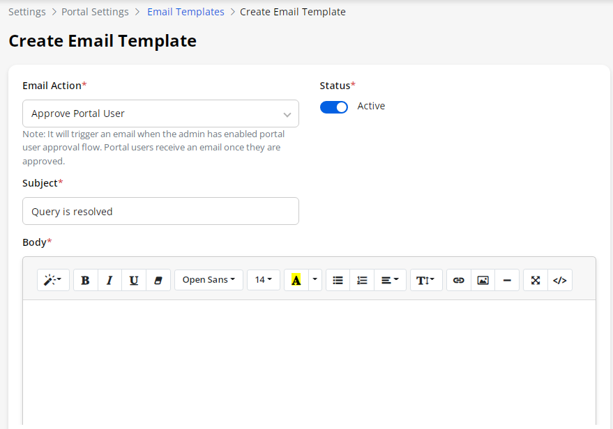
By clicking on Create Email Template, you will navigate to the Email template creation page. You need to configure and insert the following details:
– Email Action: Select the events/actions for what you want to trigger an Email. i.e. For Portal Registration, Forgot Password, etc. You will get the drop-down of the list of the different actions.
– Status: Select the current status- ‘Active’ or ‘Deactive’.
– Subject: Insert the relevant subject to identify the Email purpose.
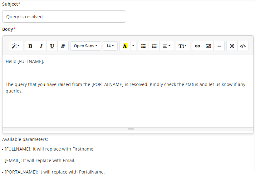
– Body: Insert the Email description in the Body part. You can use the editing option to make email descriptions in proper format if required.
-
During inserting the Email description, you can use the parameters as per your Email action.
-
When you select ‘Send Email to Form Respondent’ from Email Action , you need to configure Object. You can configure this email action multiple times.
-
You will have the following Parameters for the Form data (Based on Email Action selection , Available parameters will be updated) :
– [FULLNAME]: It will get the FULLNAME of the portal users.
– [EMAIL]: It will get the EMAIL of the portal users.
– [PORTALNAME]: It will get the PORTALNAME of the portal users.
Note: You can add more than one template for a single Object. If there are multiple templates for a single Object. Admin users will get in the list of the Email Templates selection from the Form widget configuration in the Page layout.
-
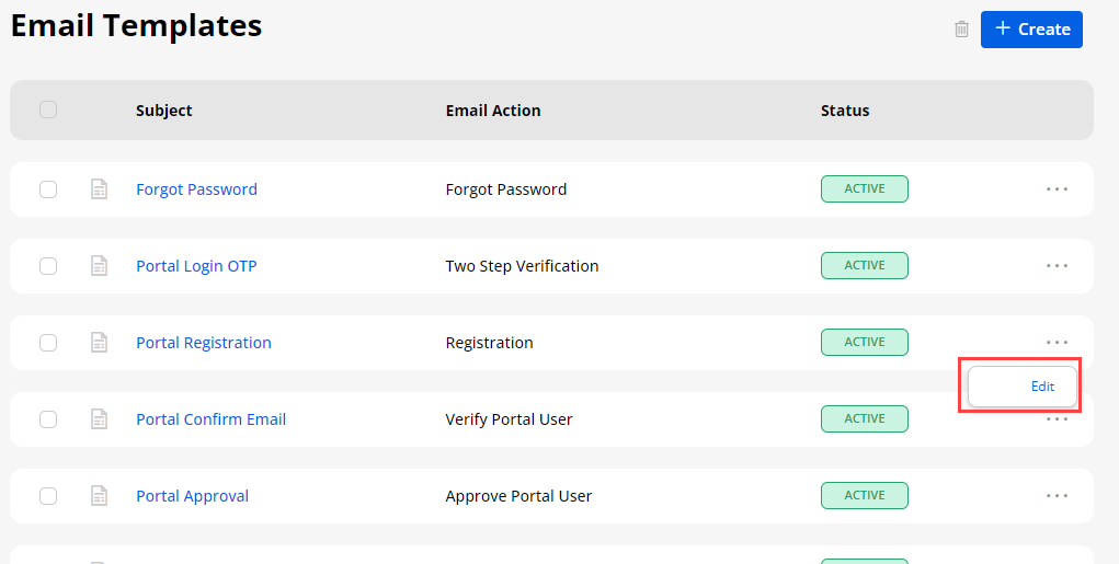
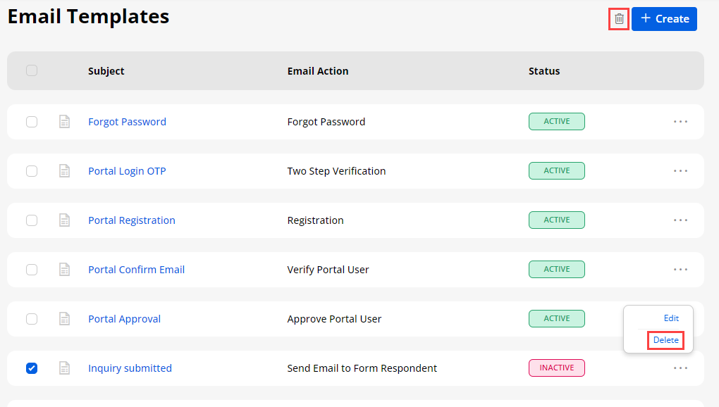
Once the “Email Template” is configured, click on the Save button to create an email template. A new Email Template will be listed. You can edit any template by clicking on the ‘Edit’ option.
-
You can also delete any template by selecting it and clicking on the ‘Delete’ button.
Note: Email template should be Inactive in order to delete it.
SMTP Settings
-
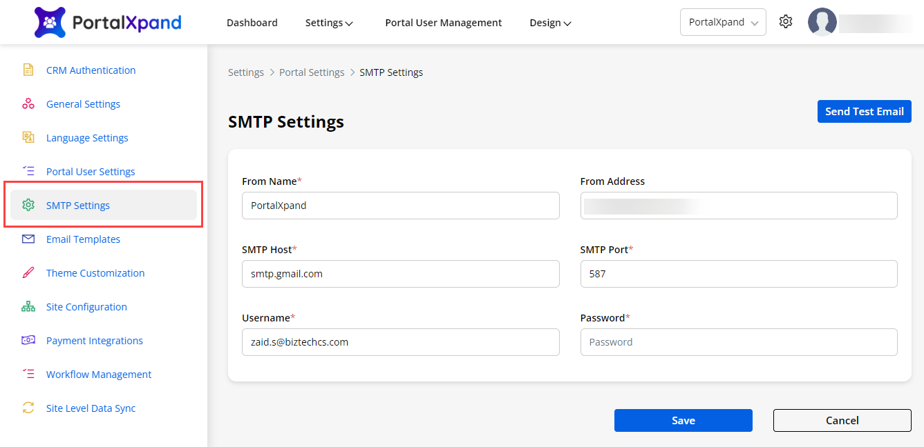
You must configure the “SMTP settings” to start the email service for the portal users.
-
You need to configure the following SMTP Settings:
– From Name: Insert the name you want to display in the email to the receiver.
– From Address: Insert the e-mail address you want to display in the email to the receiver. It will only work with the servers that support this functionality.
– SMTP Host: Insert the host address of your email SMTP.
– SMTP Port: Insert the port number that is used by outgoing mail servers.
– Username: Insert your username.
– Password: Insert the password.
- After inserting the details click on the Save button to complete the SMTP settings.
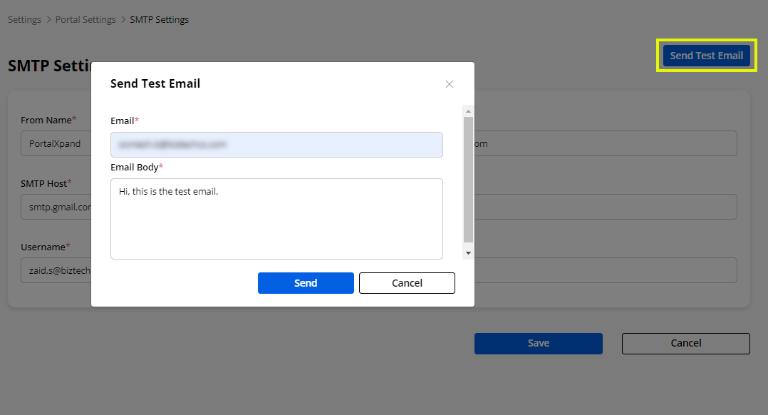
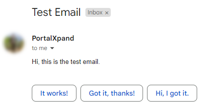
– Send Test Email: You can send the test mail to verify if all the details are correct or not.
Here is the test mail:
Note:
- Each smtp server has different authentication method so user have to follow the mail server specific rules.
You can check the following sites for the same:
– Microsoft Exchange: smtp-mail.outlook.com/587
– Yahoo: smtp.mail.yahoo.com/587
– Gmail: smtp.gmail.com/587
– Hotmail: smtp.live.com/587
– AOL: smtp.aol.com/587
Portal User Settings
-
Super admin/admin users if they have rights, can define the layout for the “Contacts” page records that are used to display in the admin backend only.
-
You can design the layout of the “Contacts” for the Add/Edit page & List page.
-
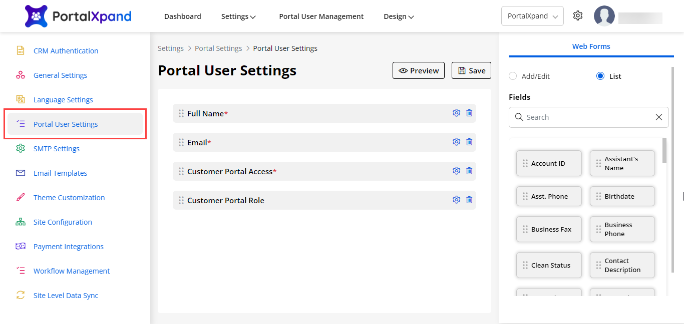
For the List page, you need to drag and drop the required fields under “Fields”.
-
By clicking on the Add/Edit page, you will navigate to the Layout page of the Add/Edit.
-
After designing the layout for both, click on the Save button to save the layout settings.
-
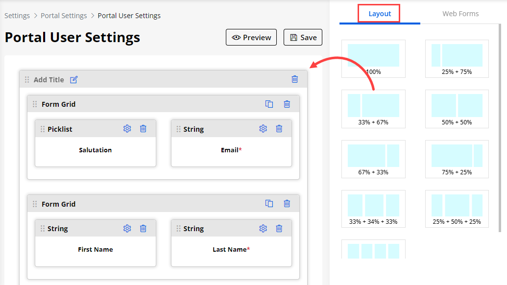
You can drag and drop any layout under the “Layout” tab and set the layout for the contact as you want it to be displayed.
-
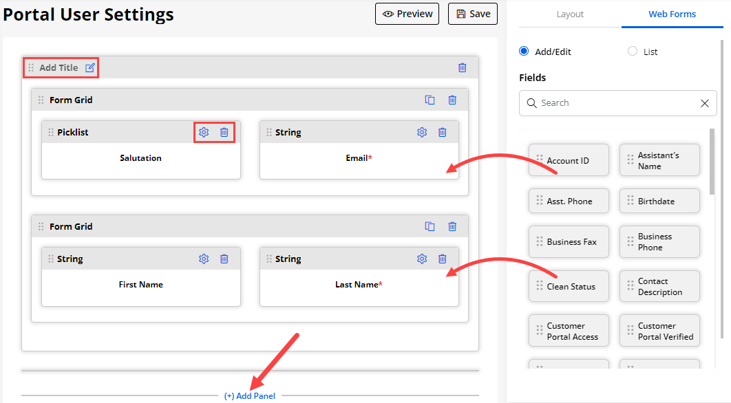
After setting the layout, you can drag and drop the required fields from the “Fields” under the “Web Forms” tab. You can also drag the inserted Fields position.
-
The Fields that are added here will be displayed at the time of editing the Portal Users details from the Portal User Management -> Contacts.
-
You can edit the ‘Field label’ or ‘delete’ the fields as per your requirement.
-
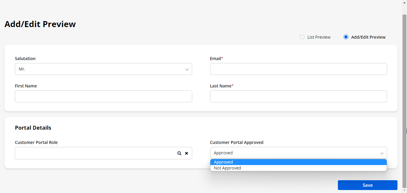
You can also see the preview of the contact’s layout by clicking on the Preview button.
-
By clicking on the ‘List Preview’, you will get a preview of the listing layout.

Language Settings
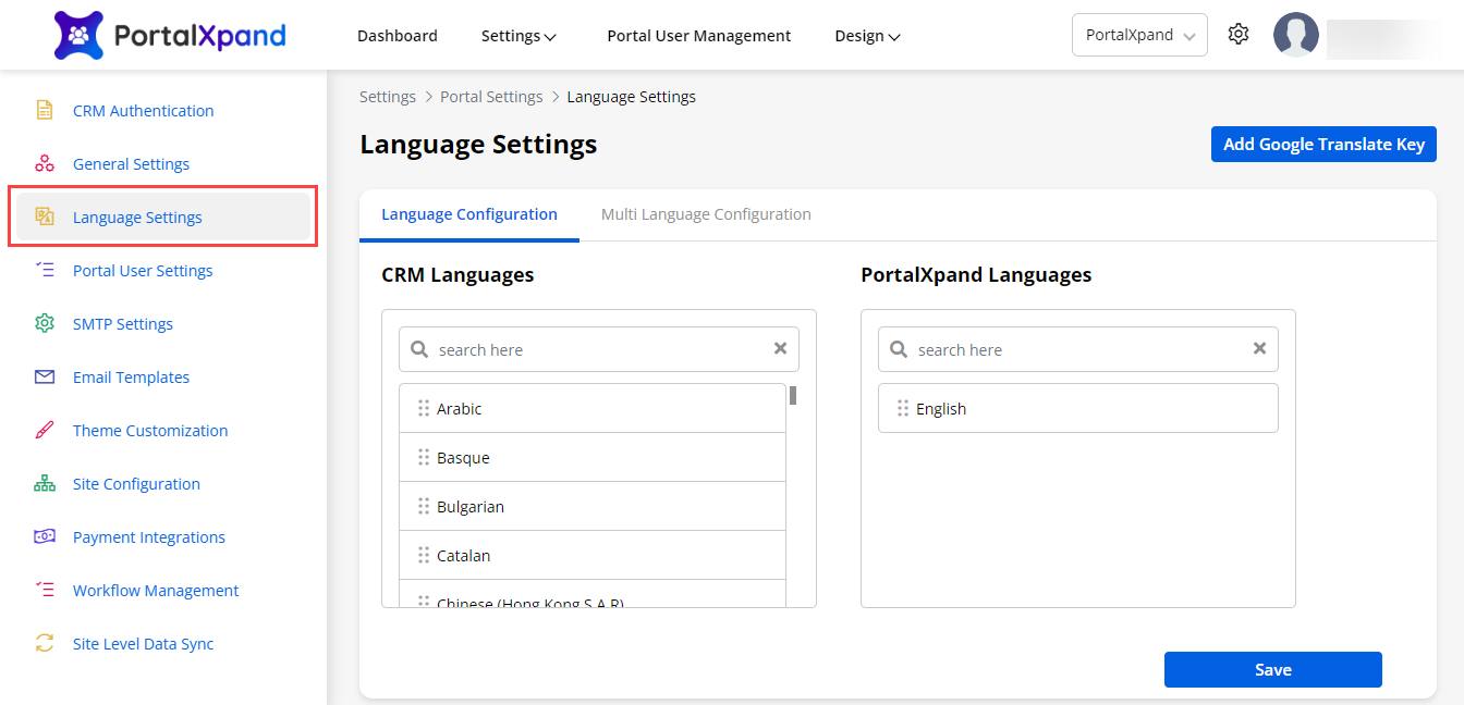
You can configure the Language for the Customer Portal. From Settings > Portal Settings > Language Settings you can enable the multilanguage for the portal.
There are 41 languages available as following
– English
– Arabic
– Basque
– Bulgarian
– Catalan
– Chinese (Hong Kong S.A.R)
– Croatian
– Czech
– Danish
– Dutch – Netherlands
– Estonian
– Finnish
– French – France
– Galician
– German
– Greek
– Hebrew
– Hindi
– Hungarian
– Indonesian
– Italian – Italy
– Japanese
– Kazakh
– Korean
– Latvian
– Lithuanian
– Malay – Malaysia
– Norwegian (Bokmål)
– Polish
– Portuguese – Brazil
– Romanian
– Russian
– Serbian (Cyrillic)
– Slovak
– Slovenian
– Spanish – Spain (Modern Sort)
– Swedish
– Thai
– Turkish
– Ukrainian
– Vietnamese
-
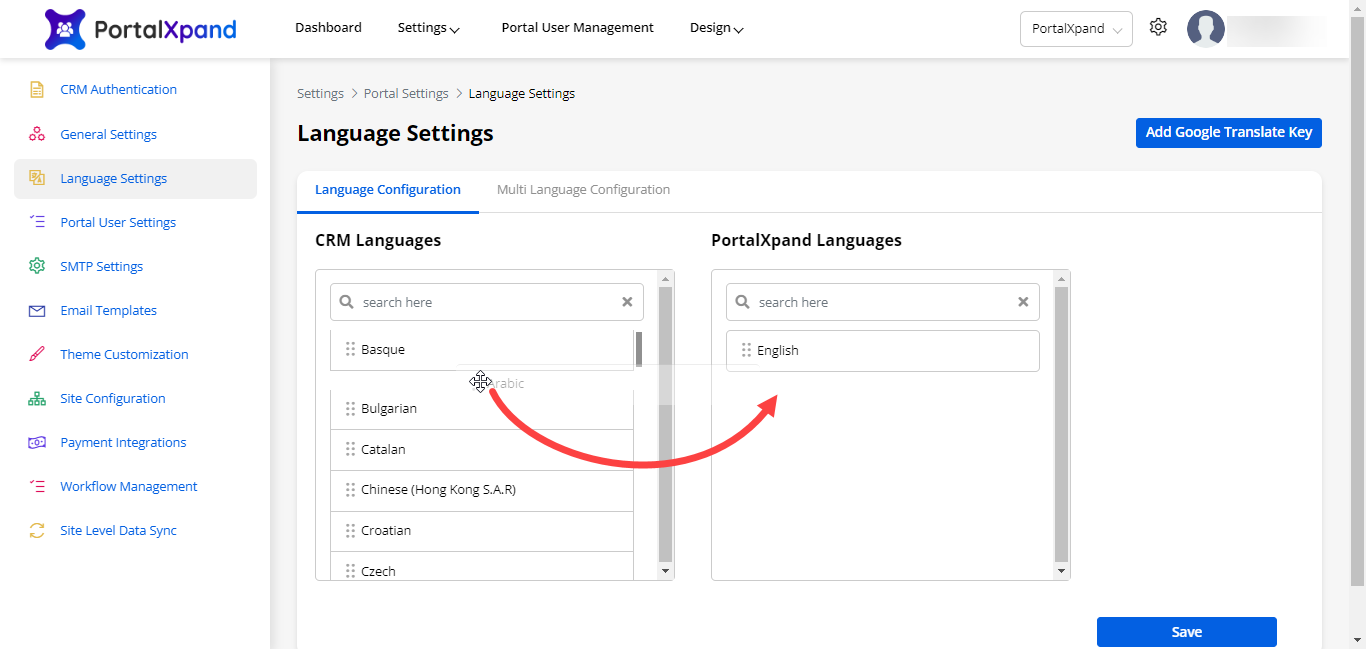
You can enable any language in the portal by dragging and dropping the language from the CRM Languages to the CRMJetty Portal Languages.
-
Now Save the configurations.
Note: English is default language. You can’t disable it.
Multi Language Configuration
-
You can configure the labels for multiple languages from here.
-
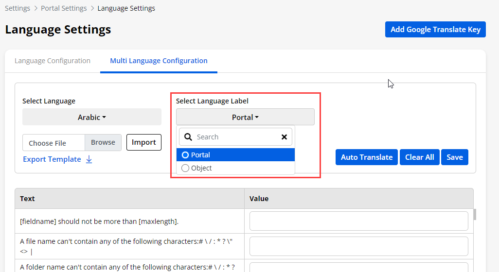
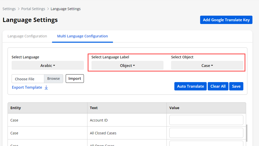
Firstly you have to Select the Language for which you want to set the labels.
-
Secondly you have to Select the Language Label from the Portal or Object.
– Portal: If you select this option then you can change the label for all the success and failure messages in the portal.
-
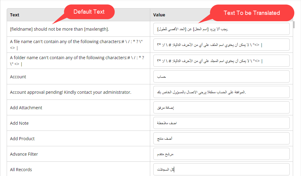
Once you select this option then you will get the list of the default text of the message which are currently displaying in the portal.
-
On the right side you will get the value tab. You can insert the translated value of the default text on the left side.
– Object: If you select this option then you can change the language for all the text labels present in that object.
-
For example we have selected Case object.
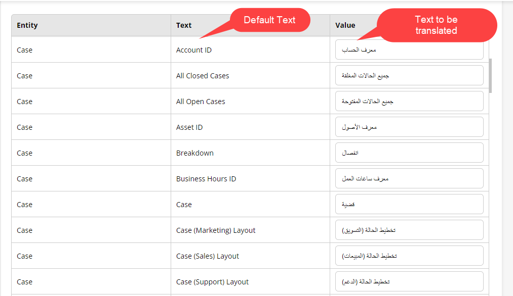
-
Now all the default text in the case object will be loaded below.
-
You can insert the translated value for the default text on the left side.
-
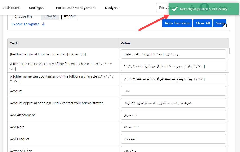
After configuring the language, click on the Save button. Now the multiple languages is enable in your portal.
– Import Text labels:
-
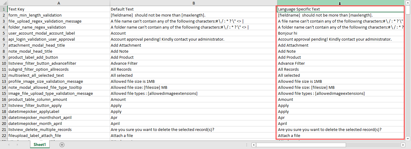
You can also add the translated text by importing the file. First you need to click on the Export Template button. The template file will be downloaded into your system.
-
The template file will have the information like Text Key, Default Text, and Language Specific Text. You have to add the translated text in the Language Specific Text column.
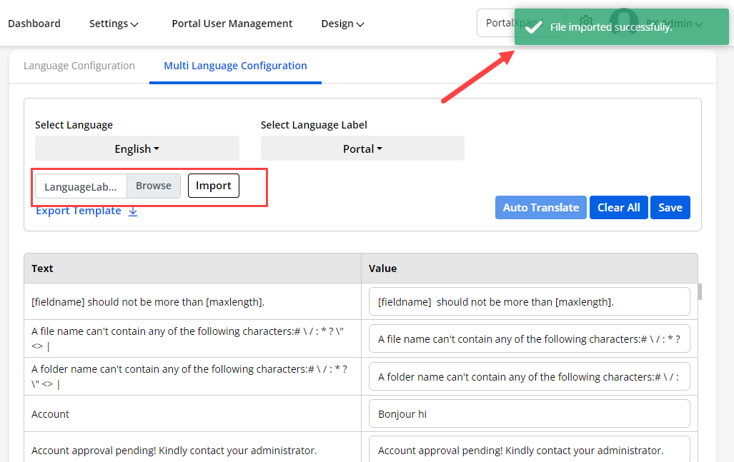
-
After adding the details in the sample file, Import the file. The value will be populated with translated labels. Now, You have to Save the settings to make it work properly.
– Auto Translate:
-
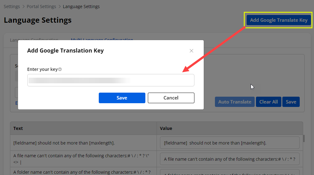
You can also auto translate the labels rather than translating each label manually. There is one button on the top right corner of language setting named Add Google Translate key.
-
After clicking the button insert the Google Translation key.
-
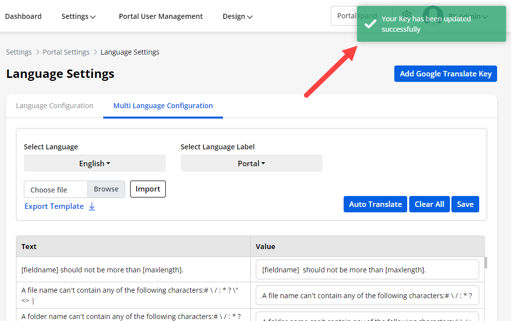
Click on the Save button and your Key will be saved successfully.
Note: You must enable the “Translate API” from Google developer console for the website domain (portal domain).
-
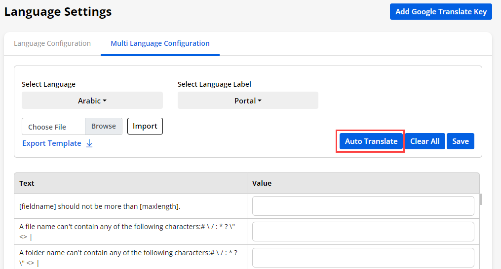
Once you have inserted the Translate API key, you are able to Auto Translate the Portal labels by selecting the language(s).
-
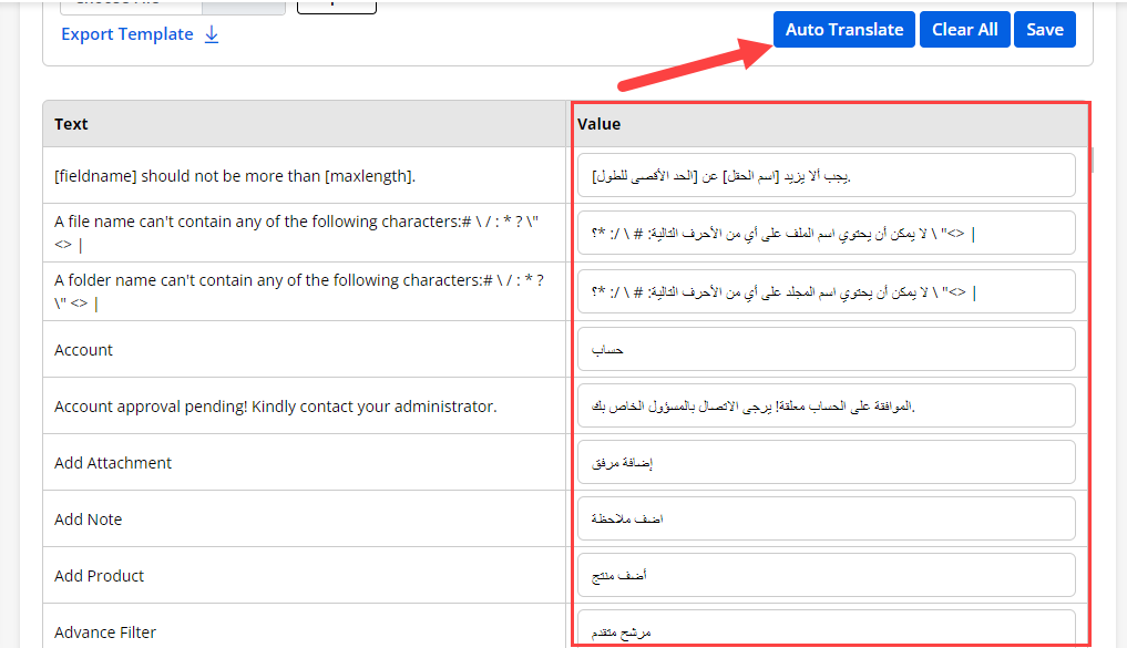
Now, click on the ‘Auto Translate’ button, to translate all the labels at once based on the language selection.
-
Now, Save the labels to make it working on the portal.
-
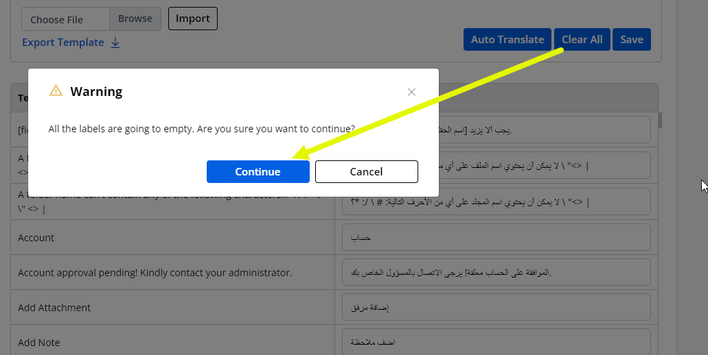
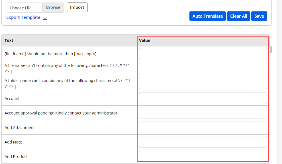
you can also remove all the labels all at once by clicking on the Clear All button.
-
You can see all the fields are again empty.
Portal General Settings
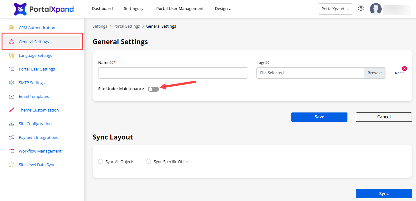
- Navigate to the Settings → Portal Settings to set up your portal details. Also, from the ‘gear’ icon, you can navigate to the General Settings. You will have two different settings here: General Settings and Sync Layout settings.
General Settings
- You can set your portal details under General Settings. You can set the general details as follow:
– Portal Name: Describe your Portal Name (Title).
– Portal Logo: Select the image to display as a logo. The selected image logo will appear there.
- Admins also have an option to display the site under maintenance page if your site is under maintenance. Enable the Site Under Maintenance switch and select the page you want to display when your site is not working so that your users are not able to access the portal.
Sync Layout
-
You can configure the Sync Layouts to make the process faster for getting data from the CRM. It will sync the CRM object layouts (metadata) like objects fields, views, forms, relationships, etc.
-
If the admin users made any changes to the CRM Object, they must Sync the data with the portal in the CRMJetty Portal admin.
-
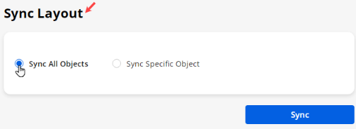
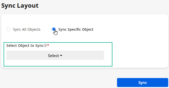
You will see the two options to sync the Object’s data: Sync All Objects or Sync Specific Object.
– Sync All Objects: If you want to sync all enabled object data from the CRM, you need to select this option.
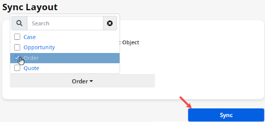
– Sync Specific Object: If you want to sync the data of the specific Object, you need to select this option. When you select this option, you will get the Object drop-down selection of the enabled Objects.
– Select Object to Sync: Select the Object from dropdown selection to sync the CRM data.
Once you select the Object, click on the Sync button.
CRM Authentication
-
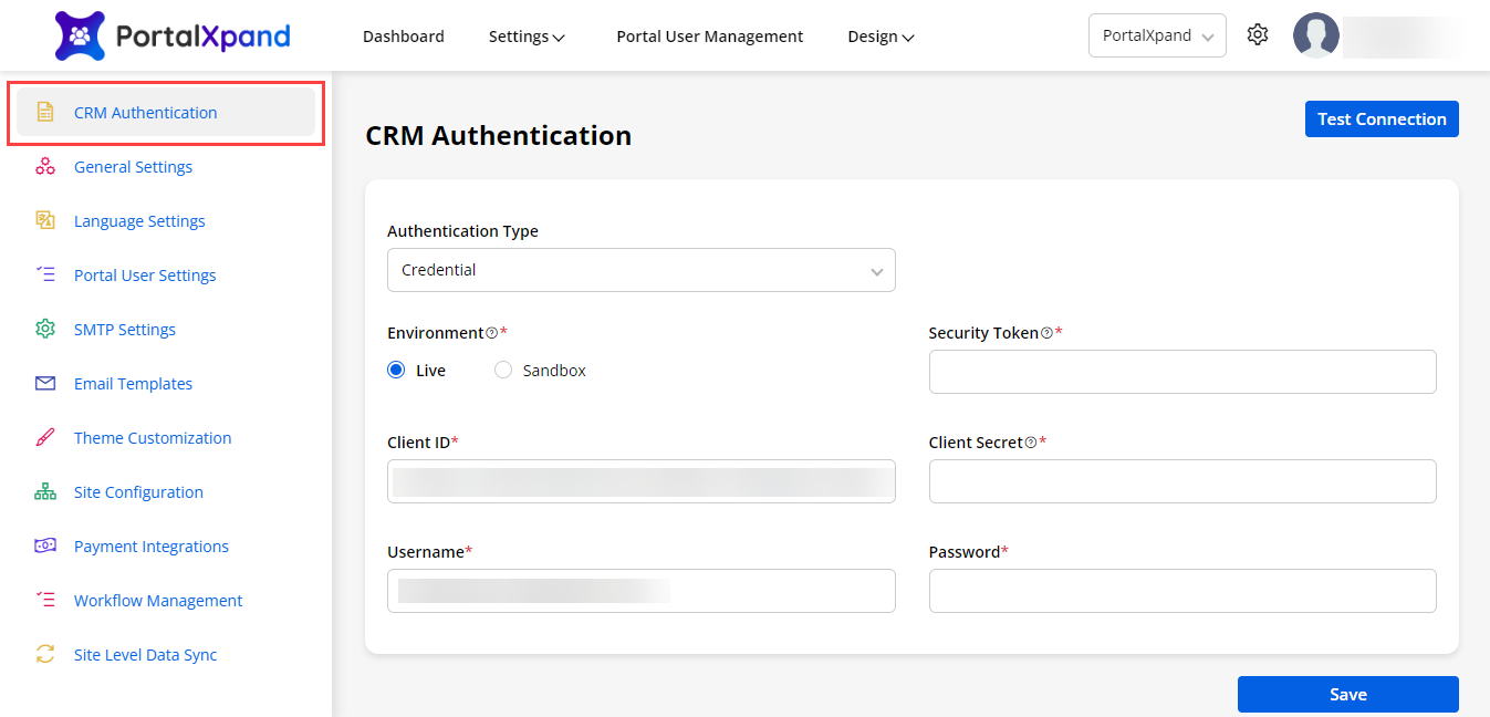
Being a super admin, you must configure the CRM Authentication, once you log into the Portal after verifying the email.
-
You need to authenticate the following configurations:
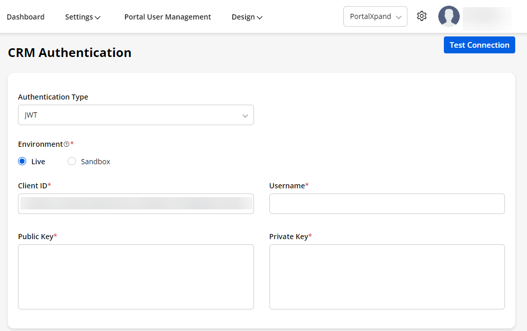
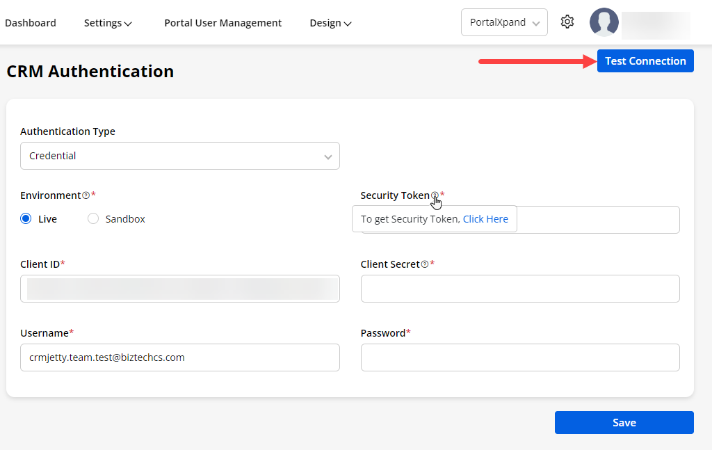
– Authentication Type: You can select authentication type for Salesforce from Credentials or JWT.
– Environment: You can connect with Live or Sandbox CRM instances to connect the CRMJetty Portal.
- For Credential
– Client ID: Insert the Client ID for your selected Environment.
– Username & Password: Insert the credentials of the portal.
– Security Token: Insert the token that you have got from the relevant environment Live or Sandbox. Click here to generate Security Token
– Client Secret: Insert the client secret key. Click here to generate Client Secret.
- For JWT :
– Client ID : Insert the client id generated by JWT
– Username : Insert the credentials of the portal.
– Public Key : Insert the Public Key generated by JWT
– Private Key : Insert the Private Key generated by JWT
– Test Connection: You will find the Test Connection button on the CRM Authentication page. It will verify whether the entered credentials are correct or not .
-
By clicking on the help tip , you will see the link on how to get the Security Token.
-
Once you have configured the CRM Authentication details, Save the changes.
Preserve & Reset Data
-
You can change the whole CRM structure if required. You can change the portal completely by removing the internal data as per your requirement.
-
You will find the Test Connection button on the CRM Authentication page. It will verify the credentials that are entered whether it is correct or not.
-
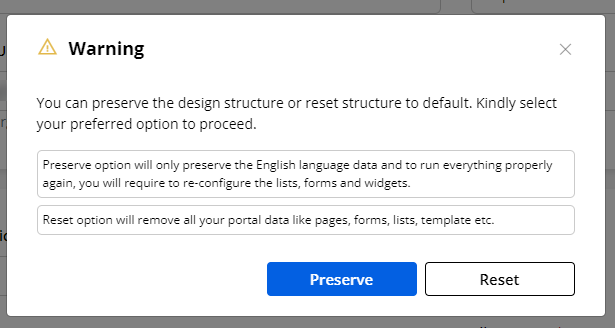
In the case you have inserted a different CRM instance, the warning popup will appear to structure the data as per your requirement.
-
- You will have two options: Preserve Data or Reset Data.
– Preserve Data: If you want to preserve the design structure and you want to remove CRM data for your new portal, you need to click on the Preserve button. All the pages, forms, lists, menus, sites will be preserved for the new portal. You need to reconfigure the list, form, widgets that contain CRM settings like Recent Activities, Counters, Data Card, etc.
-
-
- All the roles which were in the previous CRM will be added to the new CRM as it is. But, the Access rights for the roles will be removed and you need to reassign the access rights for the latest CRM entities.
-
-
-
- For the “Forms” and “List” builders, all the configured structures will be preserved but the added fields will be removed.
-
– Reset Data: If you want to reset the portal from the scratch level, you need to click on the Reset button. You will get the data that was set for the first time. It will remove all the portal data like page, form list, templates, etc.
- So, as per your requirement, you can preserve or reset the CRM data from CRMJetty Portal.
– Cases to consider:
For Fresh Instance (No CRM Authenticated):
-
If the admin user is going to authenticate their CRM details and there is no any previous CRM Authenticated and after the successful authentication, it will create the default role with contact relation and allow the case object to be accessed
-
Also the default Pages/Lists/Forms are created which contains necessary pages like : Registration, Login, Forgot Password, CRUD pages etc.
For New Instance (CRM Authenticated):
-
If the admin user is going to authenticate their CRM details and there is already a CRM Authenticated after checking all the credentials for authentication and if the details are correct then you will get one warning popup that indicates you that you have change the CRM
-
- It will show 2 option on for preserve and reset data
-
and after the successful authentication, it will flush all the data from the Role Object and also remove the portal access from the existing contact (If any)
For Change in Current Instance
- Until the service URI and the Organization ID is not changed the CRM data will not be flushed once the portal detects that either of the details is changed it will show you a warning message and according to the selection your portal data will be removed
Portal User Management
Object Configuration
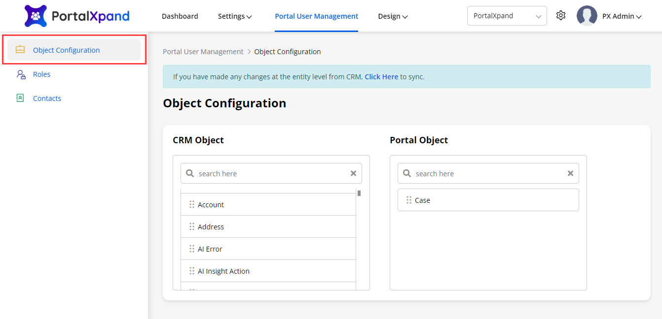
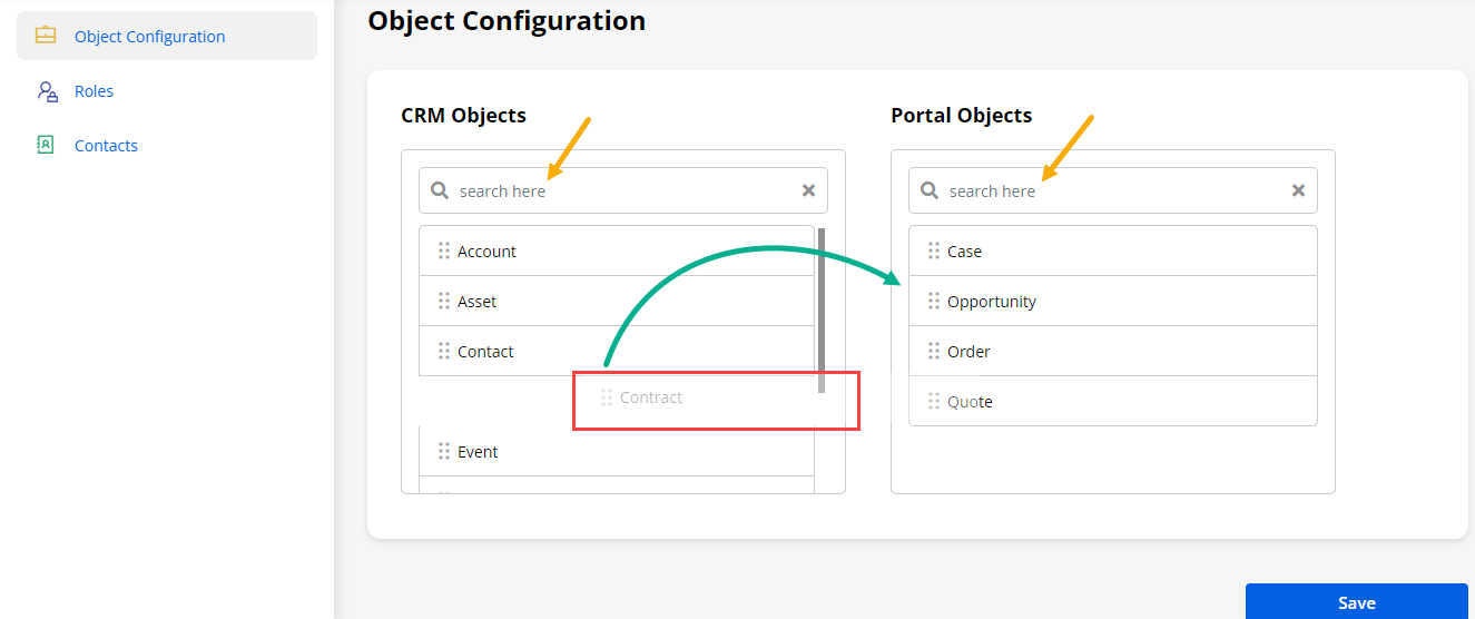
- Once you successfully authenticate the CRM, you can enable the CRM Objects from the Object Configuration. You will get the list of the CRM Objects that you can add to the Portal Objects.
Sync Object
- If you have updated/modified the objects from the Salesforce CRM (Object Layout Management), you must sync the object configuration by clicking on the ClickHere text caption.
CRM-Portal Objects
-
You can search the objects that you want to sync/unsync with the portal. You can simply drag and drop from the CRM Objects column to Portal Objects to enable the Object for the Portal. Similarly, if you want to disable any Object, you need to drag and drop from Portal Objects to CRM Objects.
-
At the bottom, you will find the Save button. After selecting the required ‘Objects’, click on the Save button to enable the Objects for the Portal.
Note: You can Sync any customizable objects in the portal along with the record type of any object will sync from here.
Contacts
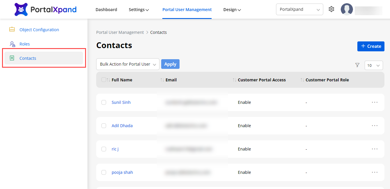
- To check the portal users, navigate to the Portal User Management → Contacts. Here you will get the list of the Salesforce contacts that you can add/manage from here and sync with Salesforce CRM.
Note: Here you will get the list layout only if you have created the user forms in the Portal User Settings.
- Once the contacts are added, you can generate the portal credentials and approve the users for the CRM contacts in bulk. Convert these contacts to portal users just with a single click.
Filter Contact Records
-
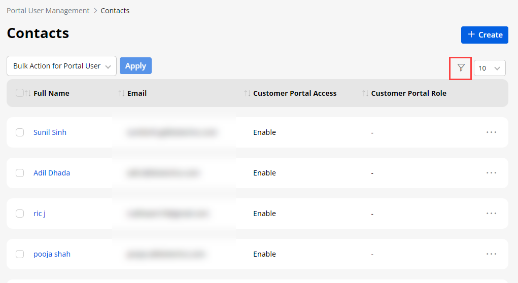
You can filter the specific records by clicking on the ‘Filter’ icon from the right side.
-
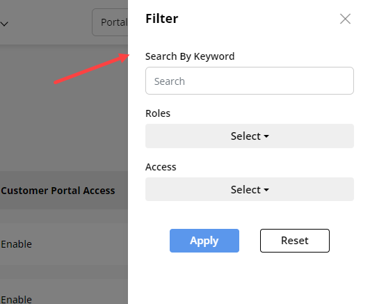
By clicking on the ‘Filter’ icon, the sidebar will open from the right. You can filter the specific Contact records based on the following criteria:
– Search By Keyword: Search the contact records by inserting the Keyword.
– Roles: Search the Role wise contact records. You need to select the Roles from the dropdown list.
– Access: Select the record’s customer portal accessibility: “Enabled” or “Disabled” records.
- After selecting the filter options, click on the Apply button to get the Contact records.
Create Contact
-
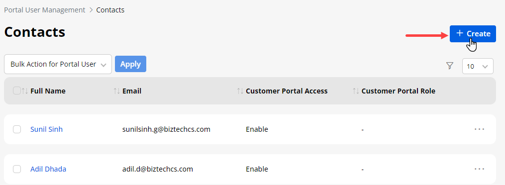
You can create a new contact by clicking on the Create button. Inserting the contact details and saving them will create a new contact here as well as in CRM.
-
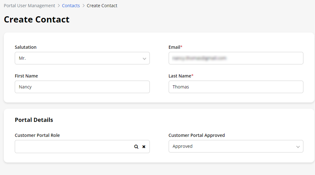
By clicking on the “Create” button, you will be redirected to the Create Contact page where you need to insert the contact details and portal details.
-
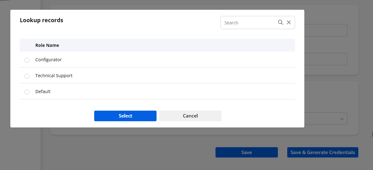
You can select the “Customer Portal Role” for the new contact by clicking on the ‘search’ icon (magnifying glass icon). You will get the list of the existing roles.
-
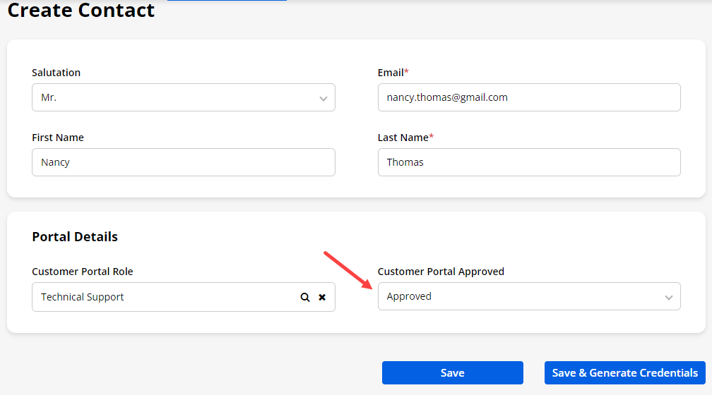
After selecting the Role, you need to select the “Customer Portal Approval” to approve the new contact for the customer portal. Here, you will have two different scenarios as follow:
– Case-1: By selecting the “Approved” option and clicking on the Save button, the new contact will be approved for the customer portal. But, credential generation will be still pending.
– Case-2: When you select the “Approved” option and click on the Save & Generate Credentials button, the credentials for the customer portal will be generated and the portal users will get the email with the customer portal access link.
- Once the contact details are inserted and you have saved them by selecting the Not Approved for the customer portal, you can approve for the customer portal and can generate the credentials from the contact’s listing page as well.
Note: Only those admin users can add the Contacts who have access to add Contacts.
Approve
-
If any new customers register from the Portal and the ‘User approval’ flow is enabled from the “Customer Onboarding Validation Setting”, the admin will approve the portal user. After that, the registered customer can access the Portal.
-
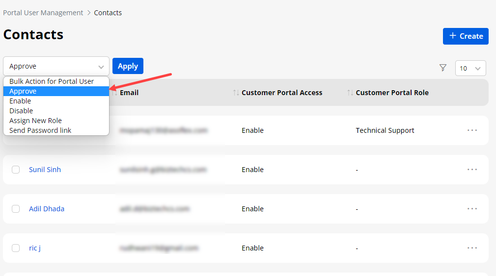
You can approve the portal users (Contact) who is already portal user, but the Approval Status is “Pending”.By selecting the contact(s) from the list, you need to click on the Approve from the ‘Bulk Action’ drop-down options.
-
After selecting the “Approve” from the Bulk Action drop-down options, you need to click on Apply button.
Note: Only those admin users can approve the users that they have the access to do so.
Enable
-
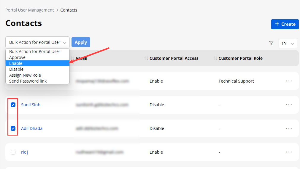
To generate the portal user credentials for a newly added contact, select the Enable from the “Bulk Action” drop-down.
-
You can also enable the contacts that are approved and generated but disabled for some reason. For that, you need to click on the Enable Portal User from the “Bulk Action” drop-down options.
-
You can select single contact or multiple contacts from the list to generate the credentials and/or to enable the disabled portal users. After selecting the contact record(s) and selecting the “Enable Portal User” from the drop-down options, you need to click on the Apply button.
-
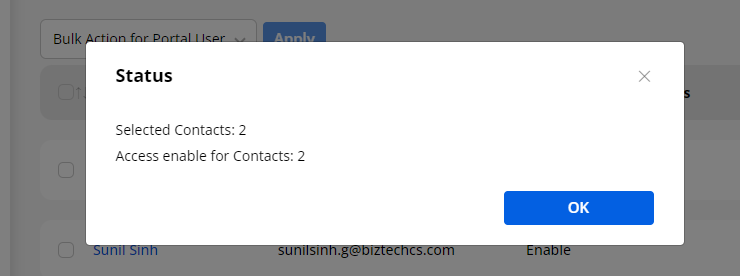
Once you click on the Apply button, you will get the status report in the popup for the converted portal users. It will also enable portal access for disabled portal users.
-
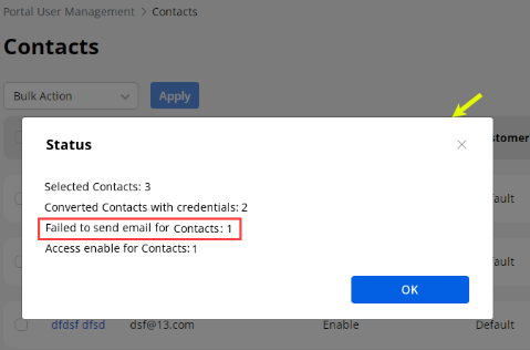
If any failure occurs, you will also get the failure details in the popup.
Note: Only those admin users can and generate the credentials that have the access.
Assign new role to Contacts
-
From the Contacts, you can assign a new role to the portal users (Contacts). If you need to change the role for mass records, you just need to select those contacts for which you want to change the role.
-
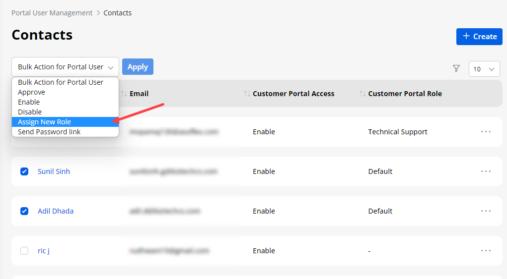
Check the checkboxes of the contacts and select the Assign New Role option from the “Bulk Actions” drop-down option. After selecting the “Assign New Role”, you need to click on the Apply button.
-
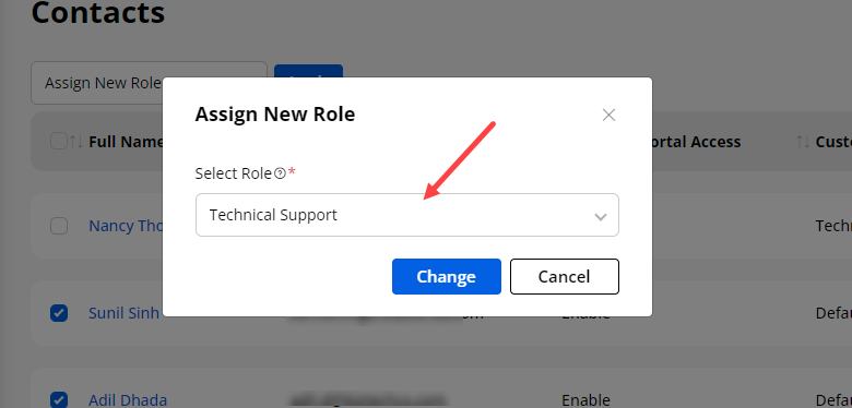
By clicking on the “Apply” button, you will get the Assign New Role pop-up, from there you can select a new ‘Role’ from the drop-down list.
-
After selecting the New Role, you need to click on the Change button and the new role will be assigned to the selected contacts.
-
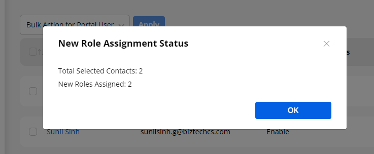
After assigning roles to the single contact or bulk Contacts, the “Status” will be generated in the popup.
Note: Here only the portal user’s role will change once the new roles are assigned to the contacts (Portal users).
Disable Portal Users
-
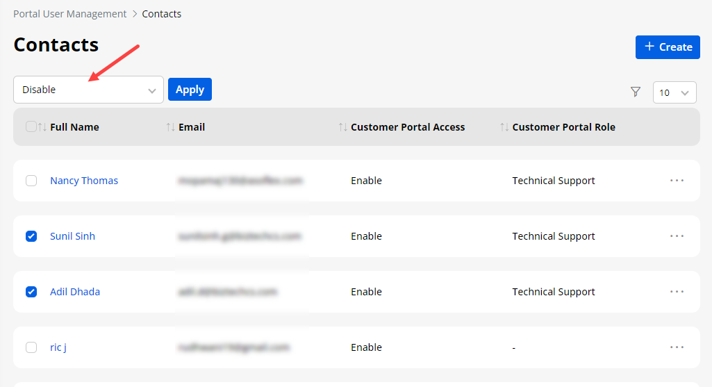
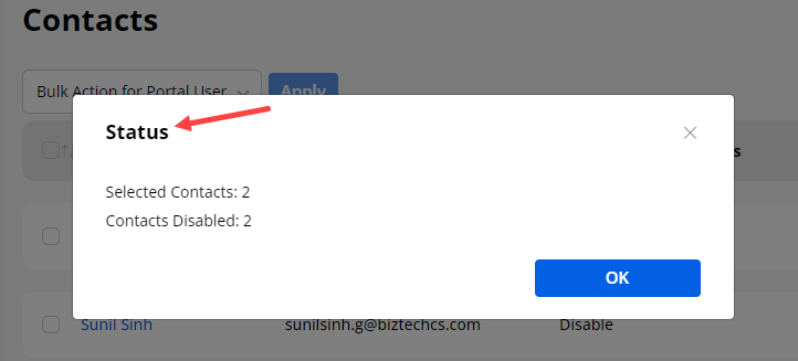
Similarly, you can disable the portal users as per need. For that, you need to select the single/multiple portal users (contacts) that you want to disable for a while and select the Disable from the Bulk Action drop-down options.
-
You will get the summary of the disabled portal users in the popup.
Send Password Link
-
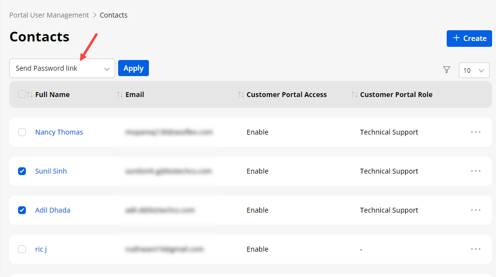
You can send a link to the portal users in the email to set a new password. From the ”Bulk Actions” drop-down, you will see Send Password Link option. Select the “Send Password Link” and then click on the Apply button.
-
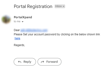
By clicking on the “Apply” button, you will get the Status of the sent password link. The password link will be sent to the selected contacts (portal users) and they can check in their email ID that is registered with the customer portal.
Note: You can send a password link to create a new password only for those Contacts (portal users) having user names and whose portal access is enabled.
Edit/Delete Contacts
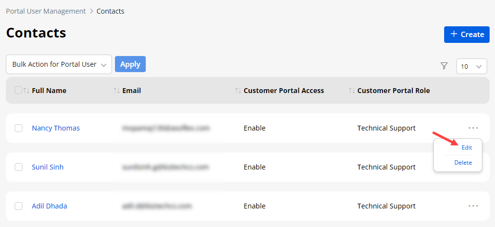
- You can edit any contact if any update in it and delete it if it is not required. This will be synced from the CRM side as well.
Roles (for Portal Users)
-
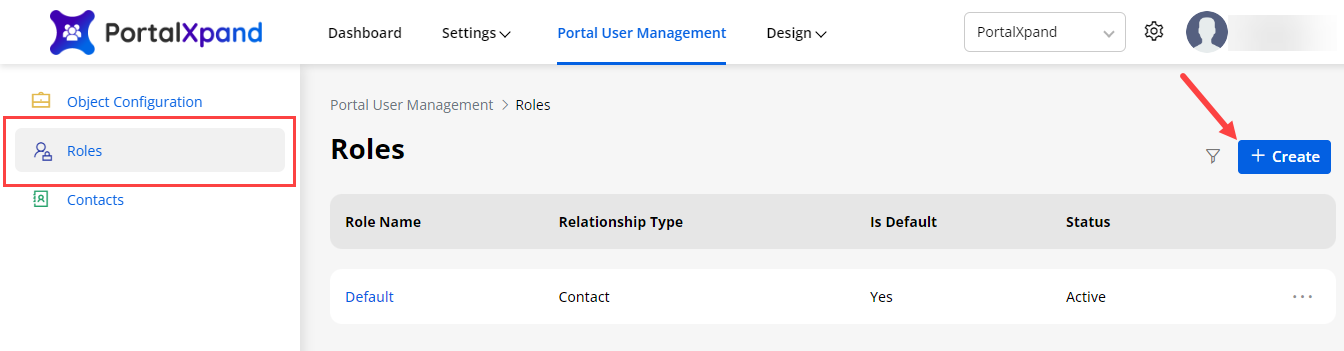
You can add and manage the Roles for the Portal Users from the Portal User Management → Roles.
-
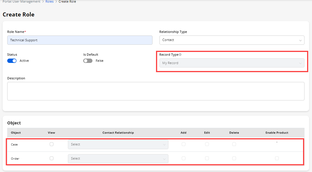
By clicking on Create, you can add a role for the portal users. Insert the Role details, select the Relationship Type, and Record type to select the relationship associated with the Role.
-
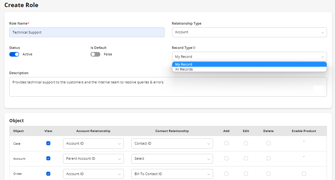
Based on Relationship Type, Record Type is managed and based on record type , records will be accessible to the user.
-
- If Relationship Type is Contact then Record Type will be set as My Record(read only). In this case you have to select only Contact Relationship in the Object section. Portal Users can see records related to the contact only.
-
If Relationship Type is Account then Record Type will can be My Record Or All records
– My Record: In this case you have to select Account Relationship and Contact Relationship both.This will list records of all data related to either logged-in contact and account.
– My Record: In this case you have to select Account Relationship compulsory.And Contact Relationship is optional. This will list records of all data of the account and all contacts related to this account.
Note: If you have selected Contact Relationship Type then you can only select My Records in Record Type. This means the person associated with this role can only see their records.
Enable Objects
-
If you have selected objects for the portal objects from the “Object Configuration”, you will see in the role matrix to give the access rights for the portal role.
-
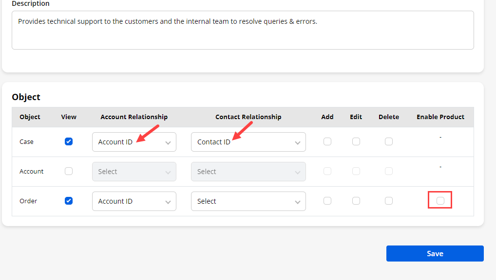
Enable the ‘objects’ that you want to enable for the portal users. By ticking the ‘View’ checkbox, you can enable the object. You can provide access to Add/Edit/Delete as per your need.
-
The Relationship selection is provided to select the relationship that is created in CRM between the contact/account and the Object.
Enable Product
-
If you have selected objects for the portal objects from the “Object Configuration”, you will see those objects in the role matrix to give access to the portal role.
-
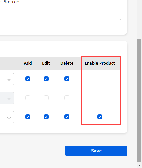
You can enable the product for ‘Order’, ‘Opportunity’, and ‘Quote’ objects.
-
You need to just tick the check box to enable the product selection from the customer portal side.
-
After configuring the “Role” details, save the details by clicking on the Save button and the newly added portal user role will be listed under the Roles.
Filter Roles
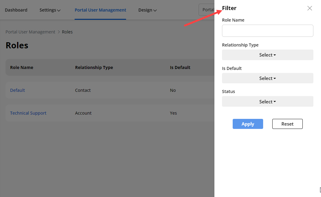
- The newly created role will be listed. If there are multiple records of the roles, you can easily search the specific records by filtering the options. By clicking on the ‘filter’ icon, you will see the popup on the right side where you can filter the roles as per the Relationship Type, Is Default, and Status.
– Relationship Type: You can filter the listing of the Roles by selecting the Relationship Type either “Contact” or “Account”.
– Is Default: You can filter the listing of the Roles by selecting the Default selected Roles (Yes) or Non selected roles (No).
– Status: You can filter the Roles by selecting the Status of the Role either “Active” or “Inactive”.
- After selecting the Filter options, you need to click on the Apply button to filter the Roles records. Here the listing of the Roles is filtered as per the Relationship Type ‘Account’.
Edit & Delete Role
-
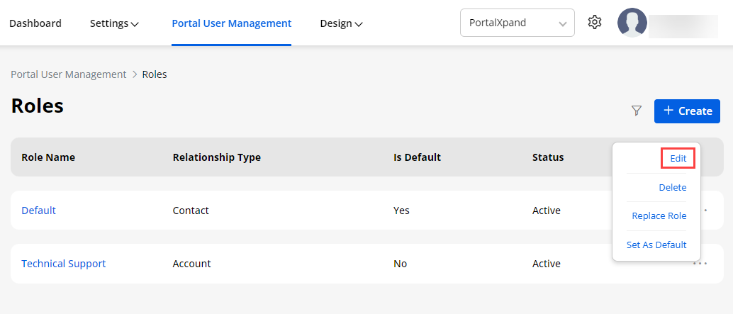
You can edit the existing role if you want to update/change any details or role matrix. By clicking on the ellipsis icon, you will find the ‘Edit’ option. By clicking on the “Edit” option, you will be redirected to the Edit Role page and update as per your requirement.
-
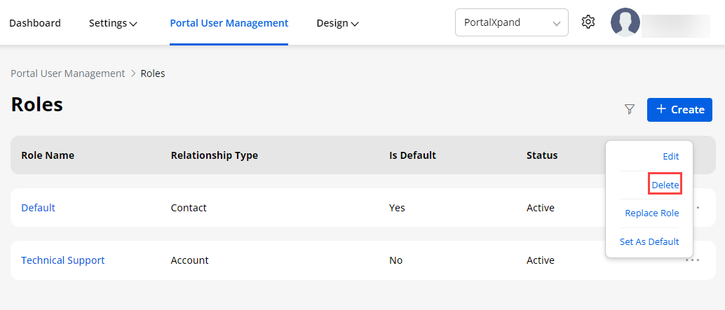
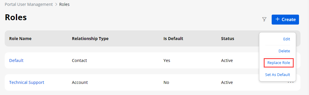
You can also delete the role if the role is not required anymore. You will find the delete option by clicking on the ellipsis icon of the role and by clicking on the “delete” option, the role will be deleted.
Note: You can’t delete the role which is set as default.
Replace Role
-
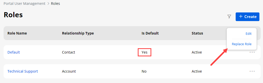
From the list of the portal user roles, you can change a role to the users (contacts) that were already assigned and can replace it with another role you want to assign.
-
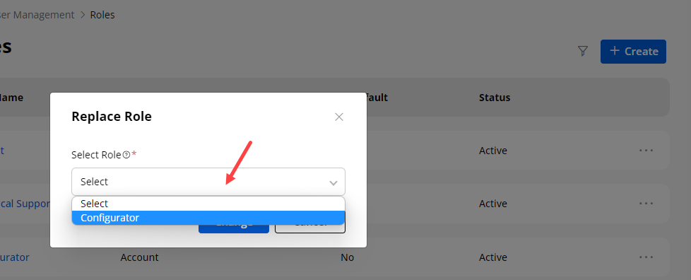
By clicking on the Replace Role option of the specific role that is not assigned as the default role, a pop-up will appear to select another role from the drop-down list.
-
Once you select another role, it will replace the current one and assign the new role to all the contacts (portal users).
Note: Here in the drop-down list, only those Roles will appear whose Relation Type is common.
Design
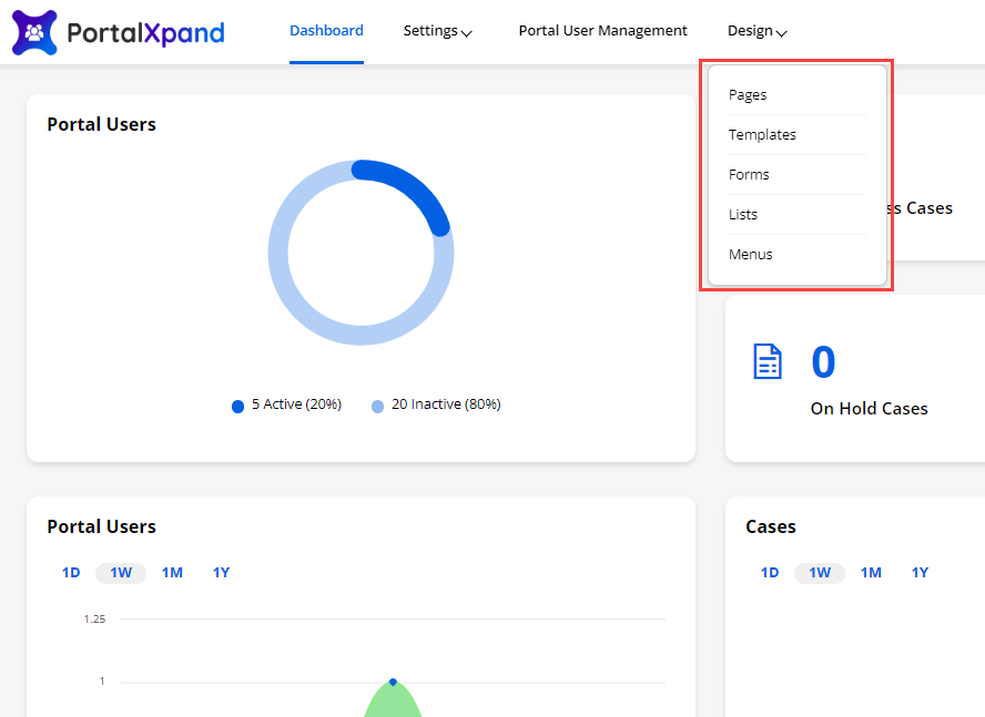
- You can design the portal layouts for the different Objects to display in the customer portal. You can design & configure the following layouts:
– Pages
– Templates
– Forms
– Lists
– Menus
The JS Code Editor is provided in the Page, Form, and List builders. You will get the Code Editor option on all the builder pages. i.e., Add, Edit, Delete, Profile, Registration.
Page Builder
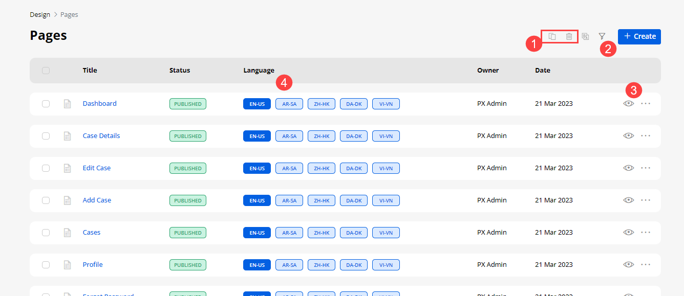
- Navigate to the Design → Page Builder to design & configure the Form layout for the add/edit and the detail page of different Objects. You can design the dynamic layout of the pages for the ‘list view’ and ‘form view’ of the different Objects. By clicking on the “Page Builder”, you will navigate to the list of the Page Builder page.
-
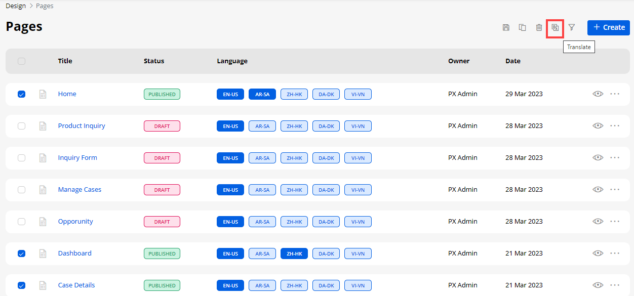
By selecting the listing record(s), you can duplicate or delete or Translate the record(s).
-
You can filter and search the specific page records by clicking on the ‘Filter’ icon.
-
You can ‘preview’ the page view design by clicking on the ‘eye’ (preview) icon.
-
If you have enabled the multiple languages then you will have the ‘Translate’ icon. By clicking on the icon you will be able to translate the forms in portal.
-
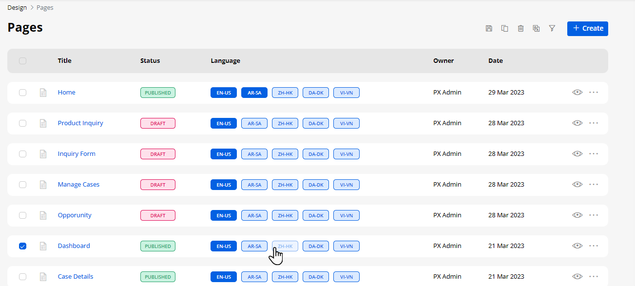
In the languages column you can see the enabled languages in the portal.
-
Here the translated languages will be shown in the dark-colored button and the languages that are not translated yet will be shown in the light-colored button.
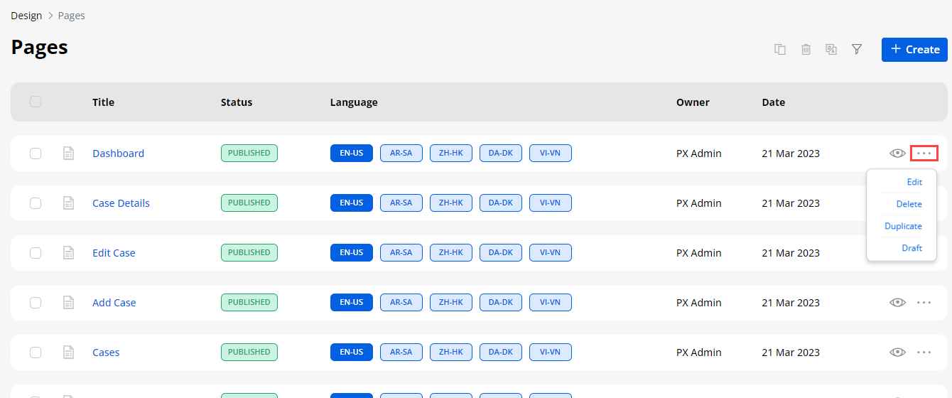
-
By clicking on the ‘ellipsis’ icon, you will get some actions to Edit the Form record, Delete, Duplicate, and move to Draft/Publish.
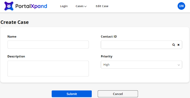
-
You can ‘preview’ the Page layout by clicking on the ‘eye’ (preview) icon.
Translate Page records (multi-language)
-
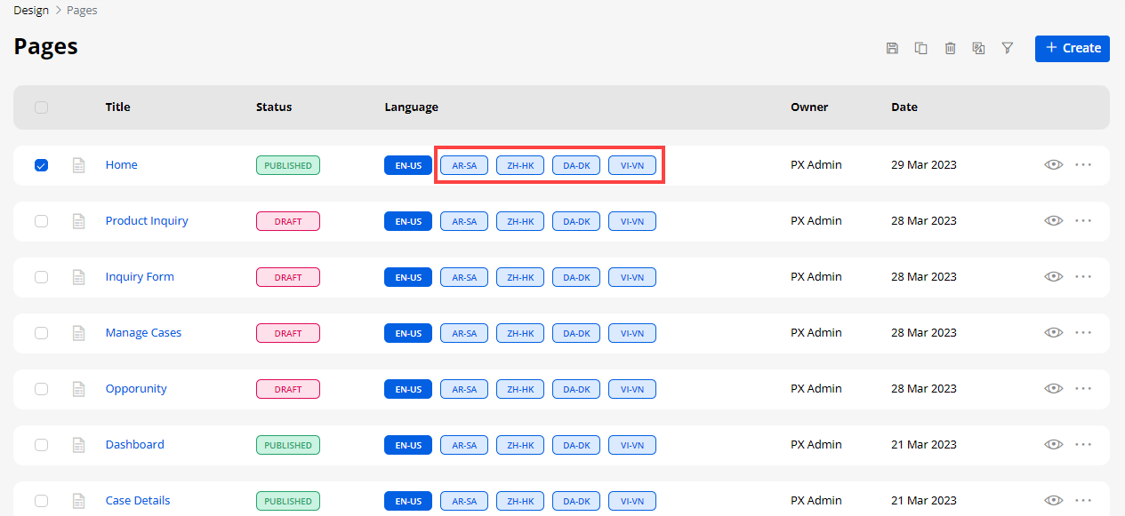
From the listing page of the ‘Page’ builder, all the available languages will appear in the ‘Language’ column. Here the translated languages will be shown in the dark-colored button and the languages that are not translated yet will be shown in the light-colored button.
-
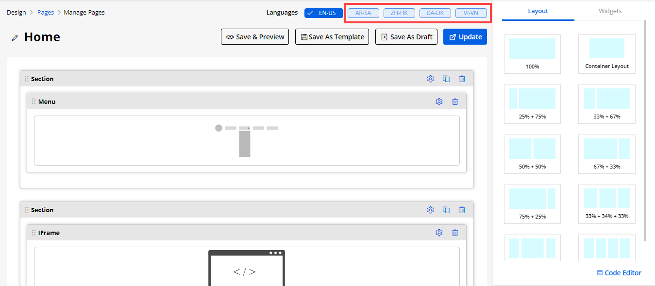
You can also translate the Page layout records from its edit page. From the top, you will find the “Languages” option and the enabled languages.
-
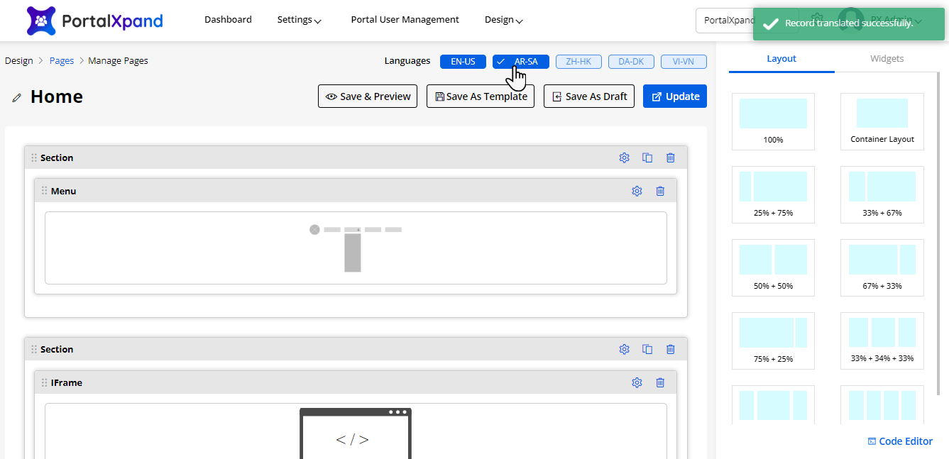
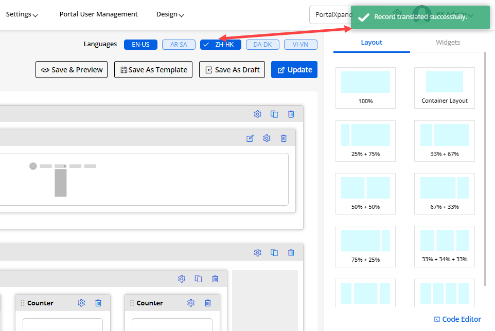
Here, the untranslated language can be seen in the light-colored. By clicking on it the CRM content of the Form layout like text labels & messages will translate into the selected language.
-
You can translate the ‘Form’ layout record by selecting the specific record and click on the ‘Translate’ icon from the record options from the list page or by clicking on the light-colored button from the edit page.
-
Once you click on any of those options, the Page builder record will automatically translate it to the selected language. You can check the translated content from the edit page and if the Page layout record is already translated, it will navigate you to the translated edit page from the list page.
Multiple Records Translation
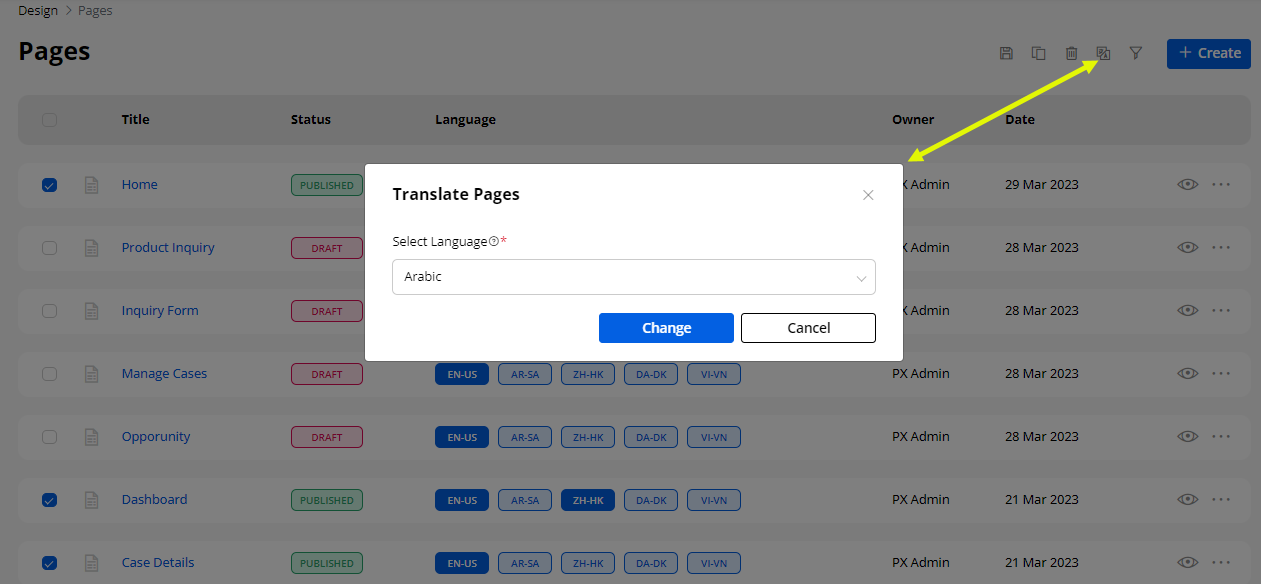
- You can also translate the list layout records in bulk by multiple selections.
Note: If only two languages are enabled, the records will be translated to other languages automatically. But, if the enabled languages are more than two, you will get a dropdown selection to select any one language to translate the selected records.
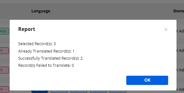
- After translating multiple records, a Report will pop up on the screen. This pop-up will display the translated status of the records
Note: Make sure you have translated all the fields in the Settings > Portal Settings > Language Settings for the language to properly translate the fields.
Widgets
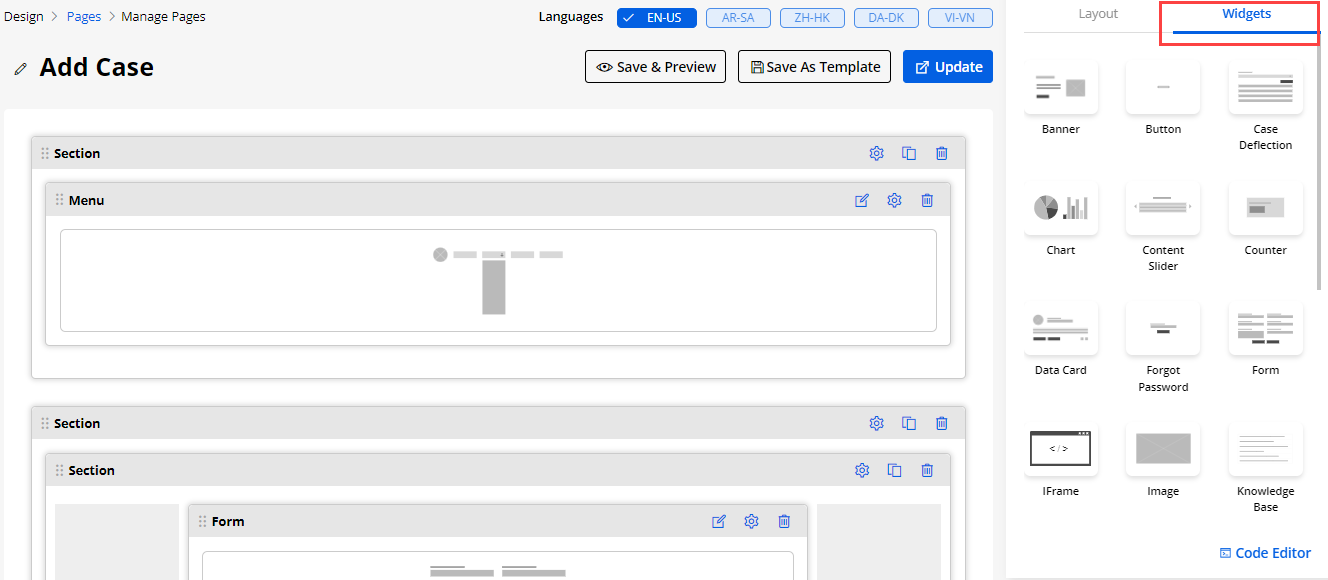
Now, click on Widgets to add the page layout content for a specific page to the page layout grids.
- Predefined widgets provided to set the page layout content:
1. Banner
2. Button
3. Case Deflection
4. Chart
5. Content Slider
6. Counter
7. Data Card
8. Forgot Password
9. Form
10. IFrame
11. Image
12. Knowledge Base
13. List
14. Login
15. Menu
16. Payment
17. Profile
18. Recent Activity
19. Registration
20. Slider
21. Testimonial Slider
22. Video
23. Text
You need to drag and drop any widgets to the page layout grids. You can customize the widgets by adding a custom HTML ID and Class
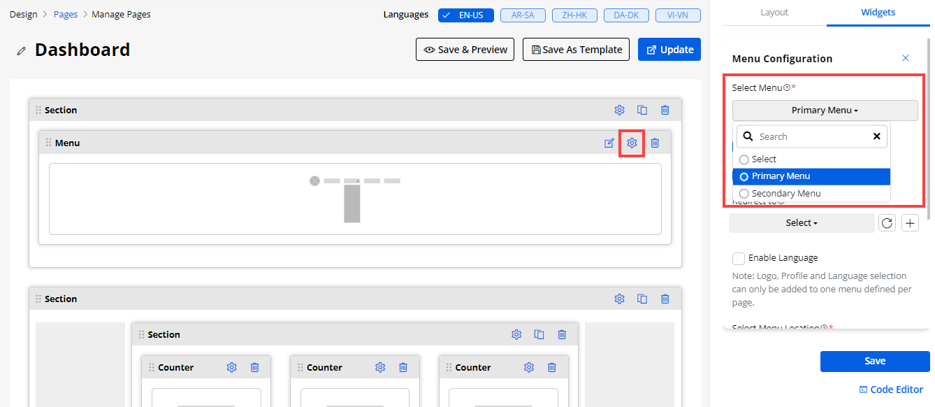
15. Menu Configuration
- You can configure the Menu widget to provide navigation to the customers to another page (menu):
– Select Menu: Select the ‘Menu’ that are added in the “Designer -> Menu Builder” option. Here you will get the searchable drop-down option to search & select the Menu.
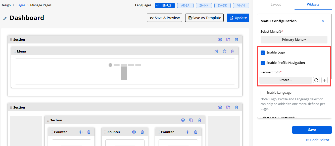
– Enable Logo: Enable logo to display the portal logo in the menu of the customer portal.
– Enable Profile Navigation: Enable the profile navigation to display the profile navigation in the menu.
-
After checking this check box there is one dropdown appeared to select which page you eant to redirect
-
Redirect to : Select the page -where to redirect on click of profile menu
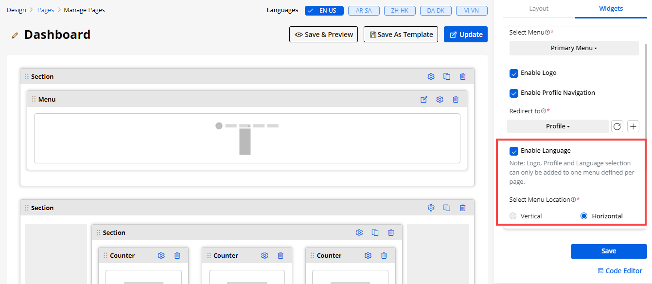
– Enable Language: If you have enabled the Language option, only then the portal users will get the Language change (switcher) option in that Menu. So, if you don’t want to allow the portal users to change the language for the specific menu, disable this option.
– Select Menu Location: You can set the Menu Location (Menu view) either Vertical or Horizontal.
Note: You will get the vertical option enabled only when the page layout ration is less than 50%. (i.e., 25% + 75%)
16. Payment
-
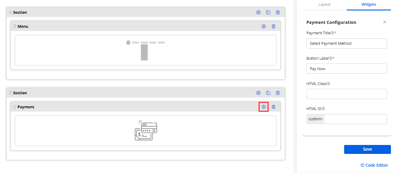
You can create a page for the payment by adding a Payment widget in the Page Builder. You need to add the Payment widget to provide the Payment option to the portal users in the customer portal.
-
The portal users will get the “Payment” options (PayPal and/or Stripe) as you have configured in the Payment Integrations settings.
-
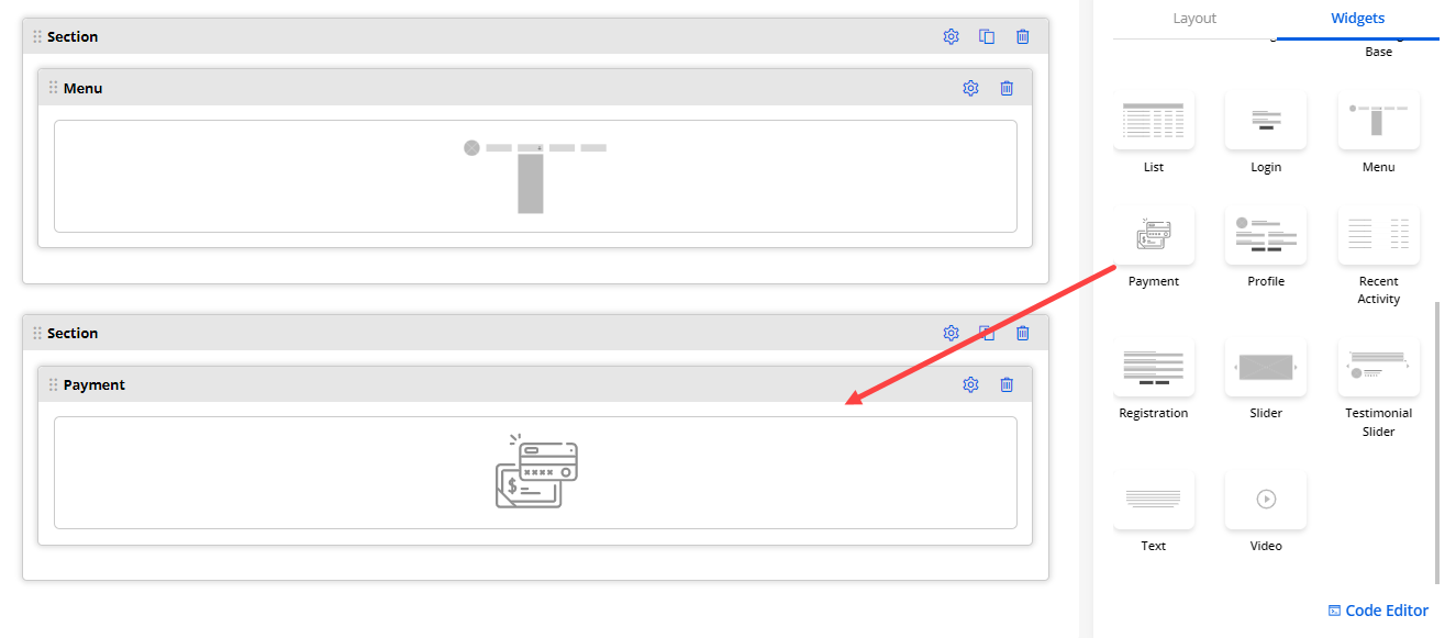
Now, Drag and drop the Payment widget to the page layout section.
-
You can configure the Payment widget by clicking on the setting icon.
– Payment Title: Insert the text caption to be displayed as the title on the Payment page.
– Button Label: Insert the text to be displayed as the Payment Button.
- After configuring the payment widget, click on the Save button and Publish the page.
17. Profile
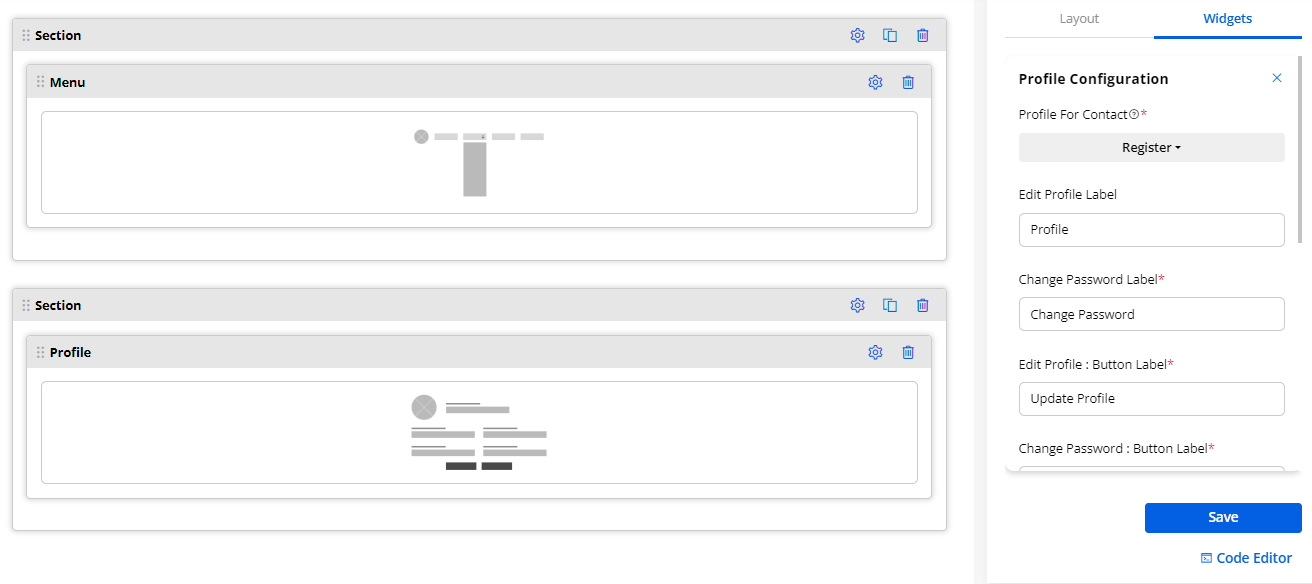
This widget is used to see the user profile details from the user portal. Insert the label names of the profile:
– Profile For Contact: Select the Form page for the Profile.
– Edit Profile Label: Insert the label for the edit profile
– Change Password Label: Insert the text label for the change password
– Edit Profile: Button Label: Insert the button label for updating the profile
– Change Password: Button Label: Insert the button label for Change Password
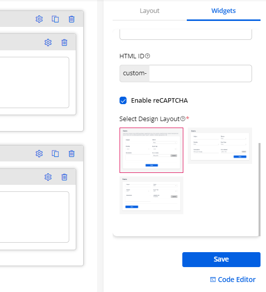
– Enable reCAPTCHA: Enable the reCAPTCHA option to the profile page to protect from spam. The portal users will get the reCAPTCHA V2 or V3 as you have configured in the “Portal General Settings” from the Settings → PortalSettings.
– Design Layout: You will get the 3-predefined Design Layout (Style) for the Profile page. Select any design layout to display in the customer portal.
18. Recent Activity
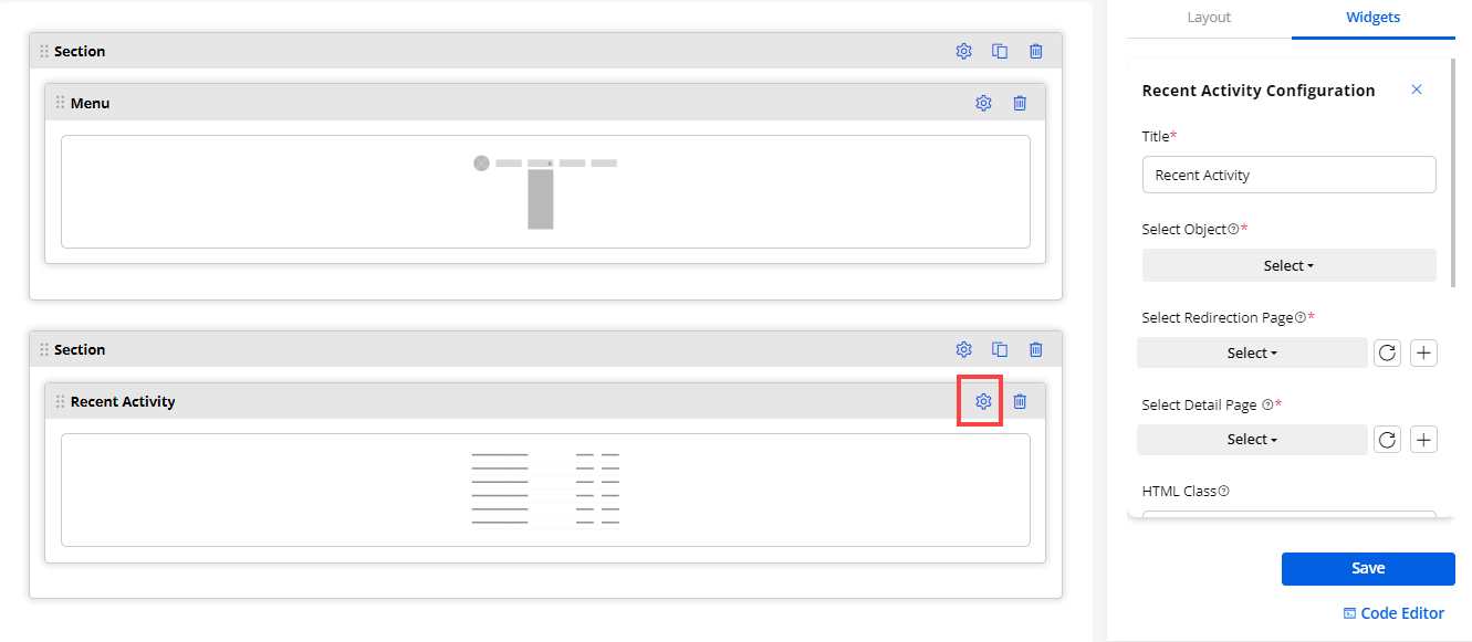
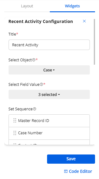
- By configuring the ‘Recent Activity’ widget, you will find the following options:
– Title: Insert the relevant Title. i.e., Recent Cases, Recent Orders.
– Select Object: Select the object from the list. i.e., Account, Case, Attachment, Order, etc.
– Select Field Value: Select the field value you want to display in the Recent Activity widget.
-
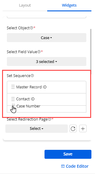
- You can also arrange the sequence for the field value to be displayed on the recent activity page.
Note: You can select only upto 3 fields.
– Select Redirection URL: Select the page to navigate to the specific page when the portal users click on the Redirection URL or View more.
– Select Detail Page: Select the page where you want to navigate to the specific page when the portal users click on the specific record.
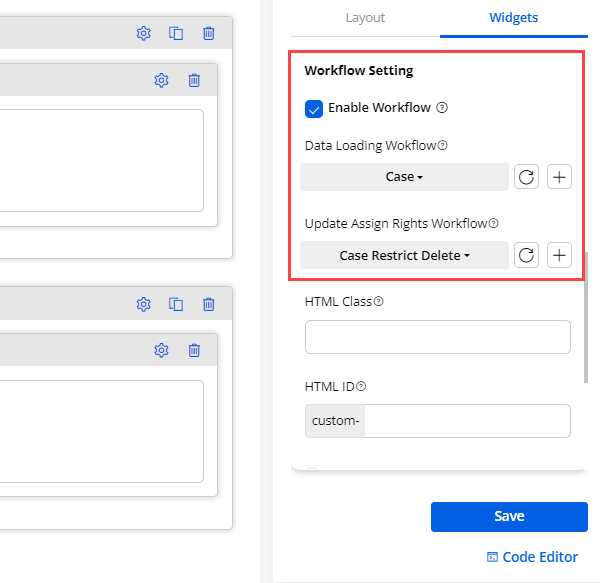
– Workflow Settings: Tickmark this option to assign the workflow and derive the results based on the assigned conditions.
– Data Loading Workflow: Assign the created workflow to the widget that you want to enable for the data loading.
– Update Assign Rights Workflow: Select the Update Assigned Rights workflow you want to apply to this Form Widget
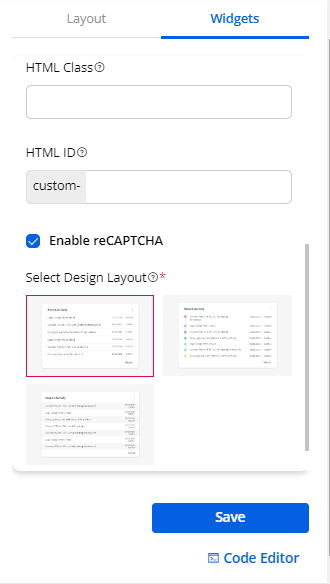
– HTML Class & HTML ID: You can customize the page sections and widgets by adding a custom HTML ID and Class.
– Design Layout: You will get the 3- predefined Design Layout (Style). Select any design layout to display in the customer portal.
- By clicking on the design, you will get a preview of it.
19. Registration Widget
Create a ‘Registration Form’ for the new customers. You need to configure the following details:
– Registration Form: Select the ‘form’ for the registration from the list of forms.
– Title: Insert the label to display the title of the Registration form.
– Register Button Text: Insert the button label for submission of the registration form.
– Redirect To: Select the page where you want to redirect whenever they click on the Register button.
– Enable reCAPTCHA: Enable the reCAPTCHA option to the customer portal Registration page to protect from spam. The portal users will get the reCAPTCHA V2 or V3 as you have configured in the “Portal General Settings” from the Settings → Portal Settings.
–Design Layout: You will get the 3- predefined Design Layout (Style) for the Registration page. By clicking on any design, you can preview the layout. Select any design layout to display in the customer portal.
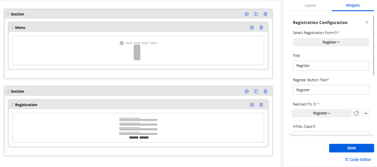
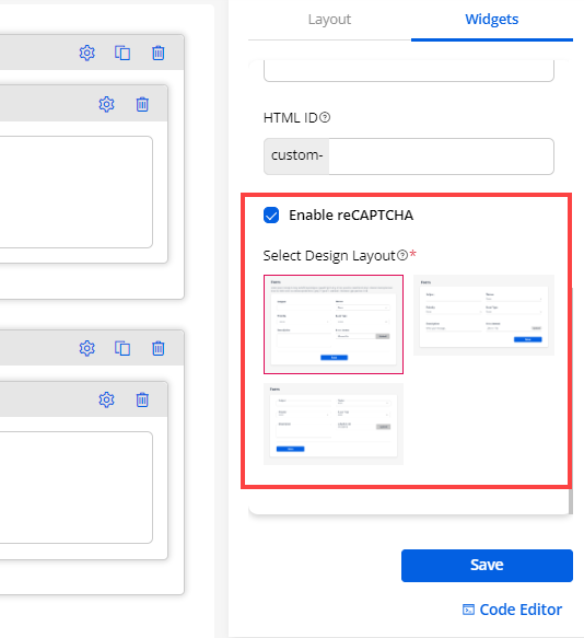
20. Slider Widget
- You can add the Slider widget to display the details in the slides to the customers in the customer portal. Drag and drop the Slider widget and click on the ‘Settings’ icon to configure the settings.
(+) Add Slide
-
First, you need to add the slides by clicking on the (+) Add Slide. You need to configure the following options for the slider.
-
You need to configure the following settings as per the selection of “Template”:
– Select Template: There are three different templates provided:
- Only Content 2. Content (left) & Image (right) 3. Image (left) & Content (right). You can choose the template to display on the customer portal. It will be displayed on the page when the portal users access the customer portal.
- By clicking on any template, the template is selected, and you will get the preview.
1. Only Content
2. Content (left) & Image (right)
3. Image (left) & Content (right)
Slider’s Header:
– Text: Insert the text label to be displayed as the header of the slider.
– Color: Choose the color for the header text. A custom color picker is given to choose the color.
Slider’s Sub header:
– Upload Image: You will get this option if you have chosen the template that contains the “Image” (Template-2 & 3). Choose the image file to be displayed on the slider that will display on the customer portal. The image size should not be more than 1MB and allowed file types are JPG, JPEG, GIF, BMP, PNG, SVG.
-
- Alt-Text: You can insert the “alternative text” for an image.
Note:
-
You will get the “Upload Image” option if you have chosen a slider with an image.
-
If you have uploaded the image and inserted the details for the “Alt Text” attribute, it will be placed as the Alt and Title attribute. But, if you have not uploaded the image, then the file name will be added to only the Alt attribute. This is only for the images inside the slider.
– Redirect to: You need to set the redirection on the button’s click event. There are two options provided: Select Page or URL.
– Select Page: You can select the specific portal page to redirect the portal users when they click on the button.
– URL: You can insert the URL to navigate the portal users to that URL when they click on the button.
– Background of slider: You can set the background of the slider that will be displayed on the customer portal. There are three options given: Color, Image, or Video.
– Color for Background: If you select the “Color” to set as a background, you will get two more options to set the background color of the slider. You can either select Solid or Gradient for the slider background.
– Solid: You need to choose the “Color” to display in the background of the slider. A custom color picker is provided to choose the color. (left image)
– Gradient: You need to choose “Primary Color” and “Secondary Color” to display in the background of the slider. A custom color picker is provided to choose the color for both. (right image)
– Degree: You can set the degree (0 to 360) of the gradient color for the slider’s background.
– Image for Background: If you select the “Image” to set as a background, you need to upload the image.
– Video for Background: If you select the “Video” to set as a background, you will get two more options to set the background of the slider. You can either Upload a File or insert an External Link.
– Upload (local video): You can select and upload the local video file from your system to set the slider’s background.
- Note: You can upload the local video maximum of 2MB size. The video’s size must not be more than 2 MB. The supported video files are MP4, M4V, MPG, WMV, MOV.
– External Link: You need to insert the video’s URL in the “Video URL” box to set the slider’s background.
-
Now, by clicking on the Save button, the slide will be added. Similarly, you can add more slides that you want to display in the customer portal.
-
You can see the newly added slides under the Slides section. You will see three options for the added slider: Settings, Clone, and Delete.
– Settings: You can edit the slide to update/change any configuration and the details.
– Clone: You can duplicate the slide with the same configuration and details.
– Delete: You can delete the unwanted slide from the slider. By clicking on it, you will get the warning message and after confirming the message, the slide will be deleted.
Slider Settings
- You need to configure the common settings for the sliders (slider content) to display in the customer portal.
– Enable Auto Slide: This option will help to play the added slides automatically as per the timer. By ticking the checkbox, you need to set the timer to play the slides.
– Transition: Apply the slider effects. You will have two effects: Slide or Fade.
Navigation
- You can display the navigation settings of the slider.
– Enable Arrow: Check the box if you want to display the arrow on the slide.
– Enable Pagination: Check the box to enable the pagination in the slides. You will have three designs (pagination type) to display the pagination below the slider.
– Slider Height (px): Insert the height of the slider that will be displayed on the customer portal.
Note: If you have not set any height or set it to 0, the slider height will be set to auto.
- By scrolling down, you will find the Save button to save the slider settings and publish the page to apply the changes.
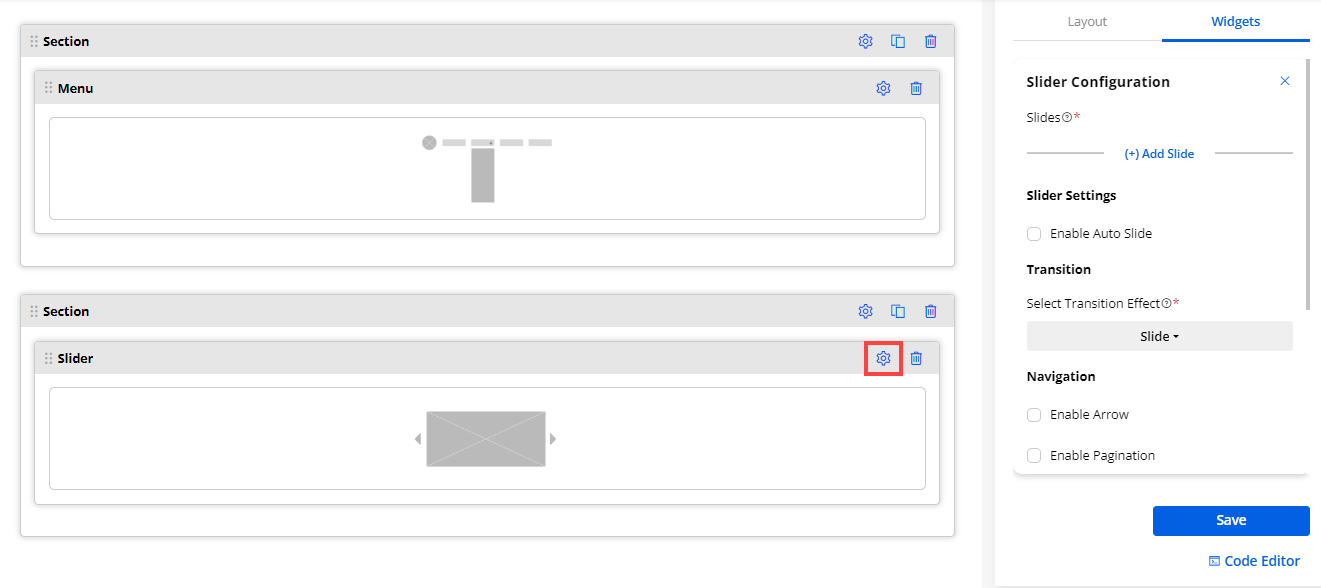
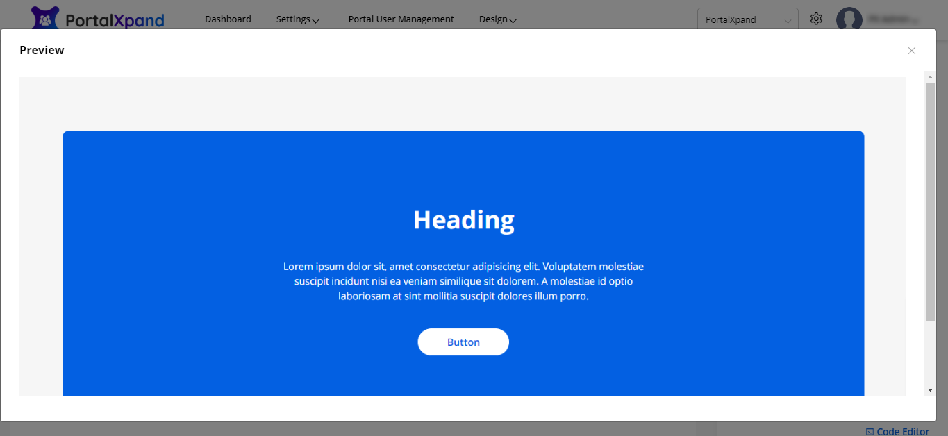
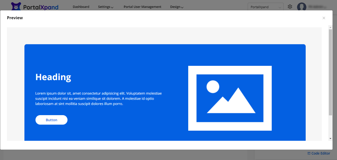
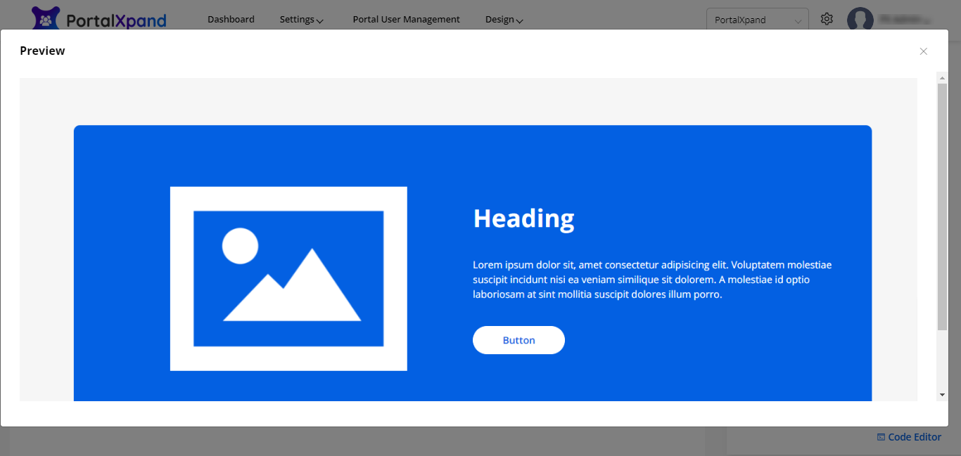
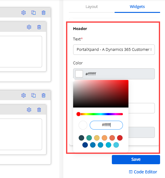
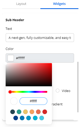
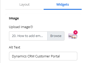
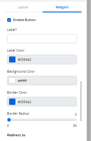
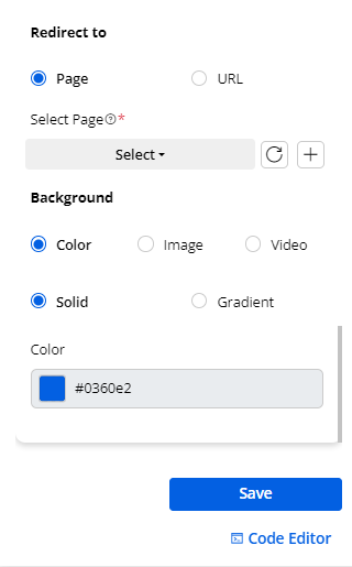
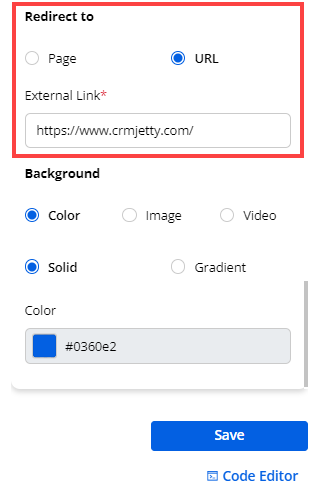
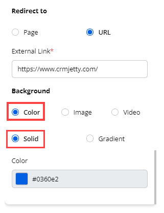
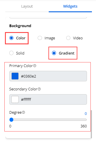
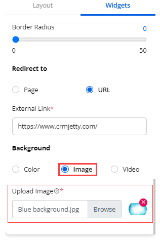
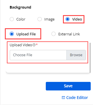
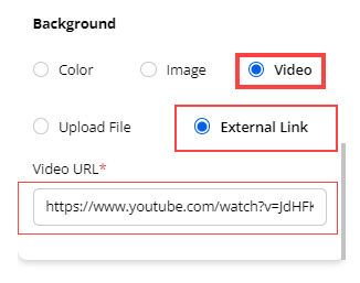
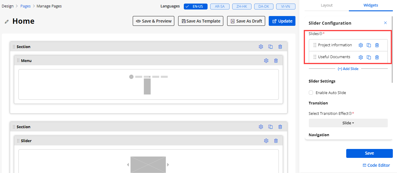
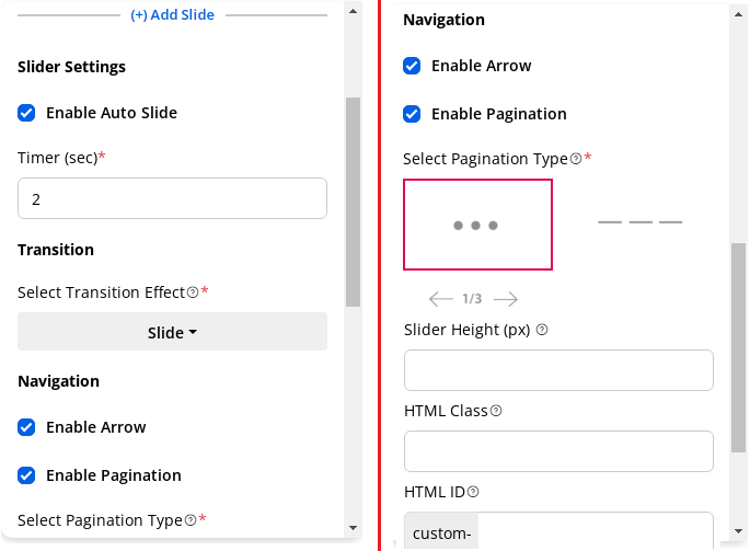
21. Testimonials Slider Widget
- You can add the Testimonial Slider widget to display the customers’ testimonials by customizing the content. Drag & drop the widget and click on the ‘Settings’ icon to configure the testimonials slider.
(+) Add Testimonial
First, you need to add the testimonial slides by clicking on the (+) Add Testimonial. You need to configure the following options for the testimonial slider:
– Author Name:
– Text: Insert the Author’s name.
– Color: Choose the text color for the author’s name.
– Author’s Designation:
– Text: Insert the Author’s designation/position.
– Color: Choose the text color for the author’s designation.
– Description:
– Text: Insert the message.
– Color: Choose the text color for the description.
– Profile Picture: Upload an image that indicates the author’s profile picture.
– Alt-Text: You can insert the “alternative text” for an image.
Note:
-
If you have uploaded the image and inserted the details for the “Alt Text” attribute, it will be placed as the Alt and Title attribute. But, if you have not uploaded the image, then the file name will be added to only the Alt attribute.
-
The maximum image size must be 1 MB. Allowed file types are JPG, JPEG, GIF, BMP, PNG, or SVG.
– Rating: You can select the ratings with 5-stars. You need to click on the star(s) to apply the default rating. You are allowed to select a half-star rating as well. To clear the rating, you will find the ‘clear’ icon beside the stars.
-
After configuring the “Testimonial Slider Configuration”, click on the Save button to save the configuration. Publish the page to apply the changes.
-
Now, by clicking on the Save button, the testimonial slider will be added. Similarly, you can add more testimonial slides that you want to display in the customer portal.
-
You can see the newly added testimonial slides under the Testimonials section. You will see three options for the added testimonial slides: Settings, Clone, and Delete.
– Settings: You can edit the slide to update/change any configuration and the details.
– Clone: You can duplicate the slide with the same configuration and details.
– Delete: You can delete the unwanted slide from the slider. By clicking on it, you will get the warning message and after confirming the message, the slide will be deleted.
Testimonial Slider Settings
- You need to configure the common settings for the testimonial slider to display in the customer portal.
– Slider Title: Insert the title of the testimonial slider to be displayed on the frontend.
– Enable Auto Slide: This option will help to play the added slides automatically as per the timer. By ticking the checkbox, you need to set the timer to play the slides.
Navigation
- you need to display the navigation settings of the slider.
– Enable Arrow: Check the box if you want to display the arrow on the slide.
– Enable Pagination: Check the box to enable the pagination in the slides. You will have three designs (pagination type) to display the pagination below the slider.
– Rating Color: Select the color of rating to be displayed on the portal.
– Slider Height (PX): Insert the height of the slider that will be displayed on the customer portal.
Note: If you have not set any height or set it to 0, the slider height will be set to auto.
- By scrolling down, you will find the Save button to save the slider settings and publish the page to apply the changes.
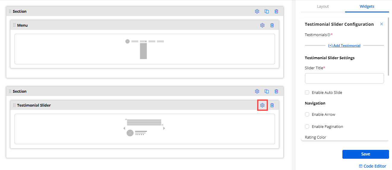
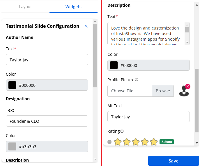
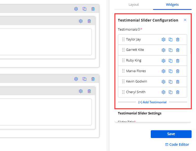
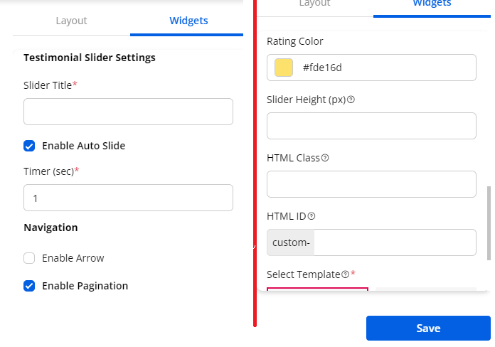
22. Text
- Add the Text widget for any page layout content. Design the text with different settings.
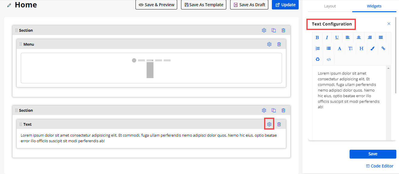
23. Video
-
Video widget is used to display the upcoming product launch, any offers, or any tutorials on any page in the customer portal.
-
Drag & drop the ‘Video’ widget to the page layout and configure the following details:
– Title: Insert the relevant video title name.
– Select Video Types:
– YouTube URL: Paste/insert the ‘URL’ of the YouTube video. If you have selected the YouTube URL, you will get the “Auto-play” video option.
– Auto-play: Enable the Autoplay option for auto-playing the video when portal users navigate there.
– Embedded Code: You can insert your embedded code that should contain an iframe. You can add the 3rd party embedded code for the video that must be in proper format.
- After configuring the video widget Save and Publish to display the video on the portal.
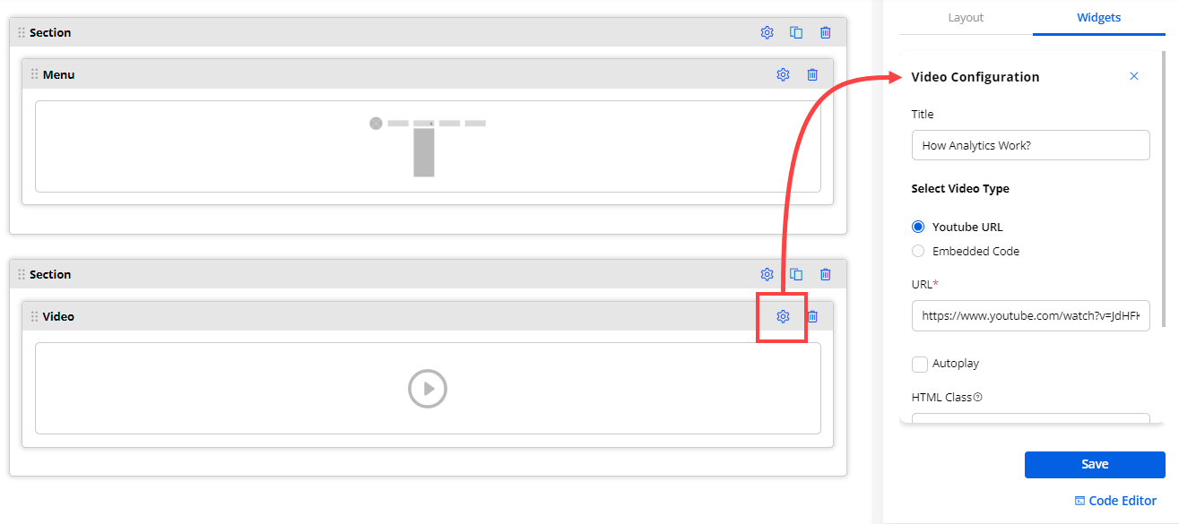
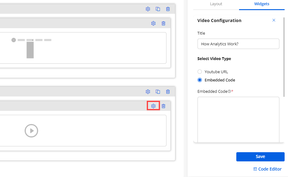
1. Banner Widget
-
A good customer portal banner should represent the business or organization accurately. Admin users can create the page banner as per their organization’s theme to display on the customer portal using the Banner widget.
-
Now, drag and drop the ‘Banner’ widget to the page layout section and configure the details of the banner widget.
-
Now, by clicking on the ‘Settings’ icon, you can configure the details of the banner widget.
-
You need to configure the following settings as per the selection of “Template”:
– Select Template: There are three different templates provided:
1. Only Content 2. Content (left) & Image (right) 3. Image (left) & Content (right). You can choose the template to display on the customer portal. It will be displayed as the home page when the portal users access the customer portal.
- By clicking on any template, the template is selected, and you will get the preview.
1. Only Content
2. Content (left) & Image (right)
3. Image (left) & Content (right)
Banner’s Header:
– Text: Insert the text label to be displayed as header.
– Color: Choose the color for the header text. A custom color picker is given to choose the color.
Banner’s Subheader:
– Text: Insert the text label to be displayed as a subheader.
– Color: Choose the color for the subheader text. A custom color picker is given to choose the color.
– Redirect to: You need to set the redirection on the button’s click event. There are two options provided: Select Page or URL.
– Select Page: You can select the specific portal page to redirect the portal users when they click on the button.
– URL: You can insert the URL to navigate the portal users to that URL when they click on the button.
– Background of Banner: You can set the background of the banner that will be displayed on the customer portal. There are three options given: Color, Image, or Video.
– Color for Background: If you select the “Color” to set as a background, you will get two more options to set the background color of the banner. You can either select Solid or Gradient for the banner background.
– Solid: You need to choose the “Color” to display in the background of the banner. A custom color picker is provided to choose the color. (left image)
– Gradient: You need to choose “Primary Color” and “Secondary Color” to display in the background of the banner. A custom color picker is provided to choose the color for both. (right image)
–Degree: You can set the degree (0 to 360) of the gradient color for the banner’s background.
- Image for Background: If you select the “Image” to set as a background, you need to upload the image.
- Video for Background: If you select the “Video” to set as a background, you will get two more options to set the background of the banner. You can either Upload a File or insert an External Link.
– Upload (local video): You can select and upload the local video file from your system to set the banner’s background. (left image)
Note: You can upload the local video maximum of 2MB size. The video’s size must not be more than 2 MB. The supported video files are MP4, M4V, MPG, WMV, MOV.
– External Link: You need to insert the video’s URL in the “Video URL” box to set the banner’s background. (right image)
– Banner Height (px): Insert the height of the banner that will be displayed on the customer portal.
- After configuring the “Banner” widget, click on the Save button to save the configuration and publish the page to apply the changes.
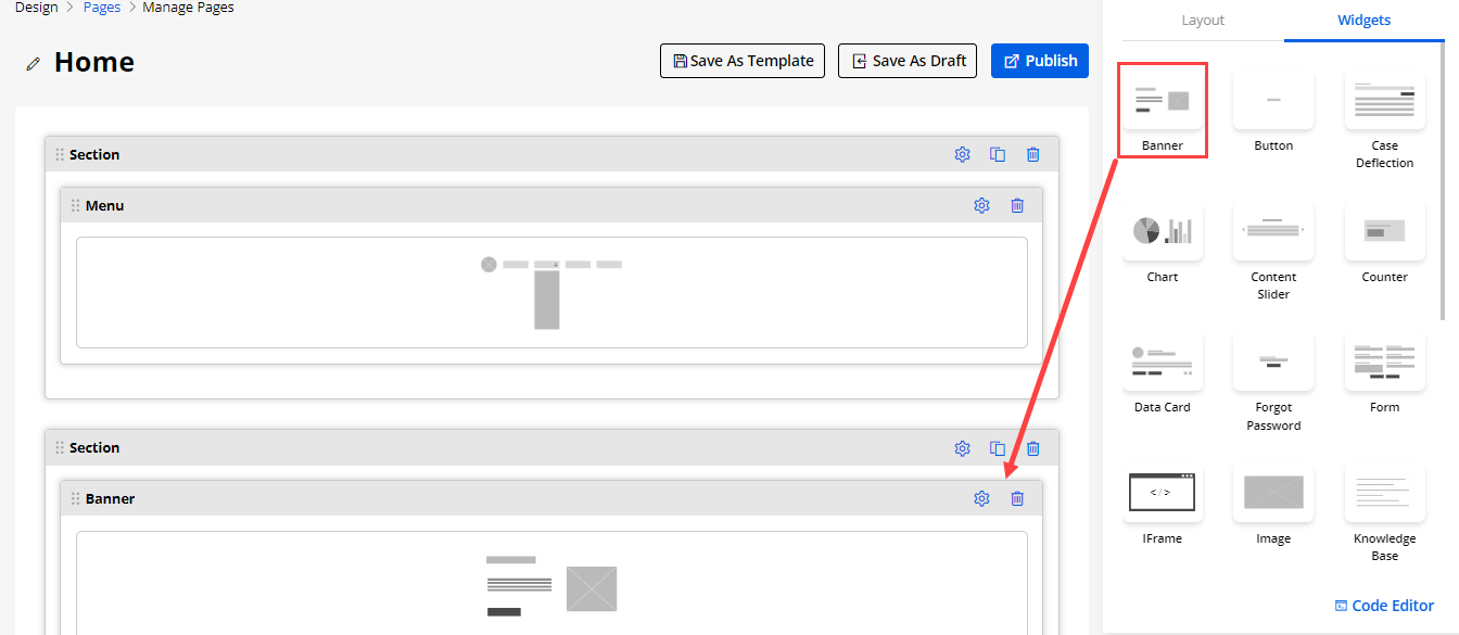
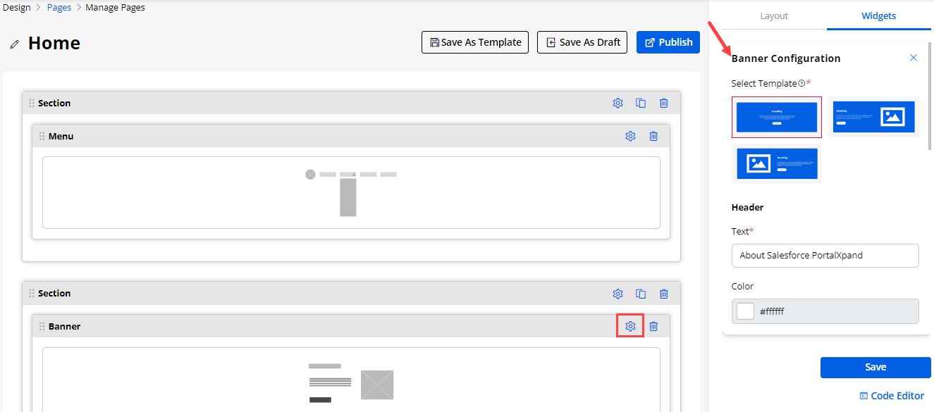
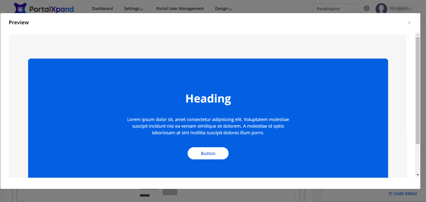
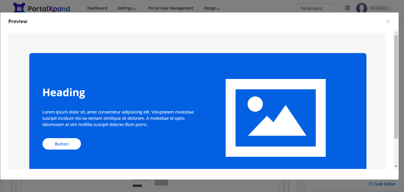
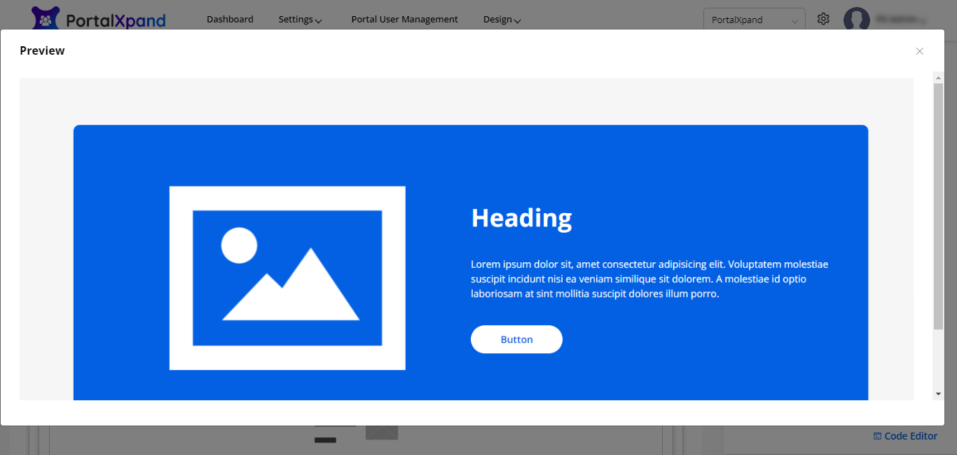
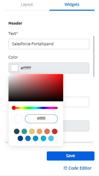
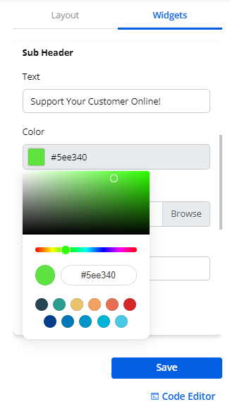
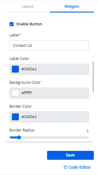
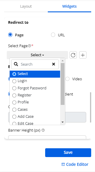
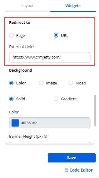
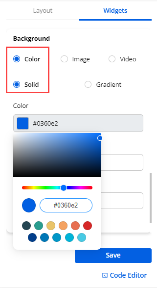
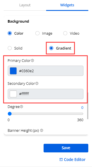
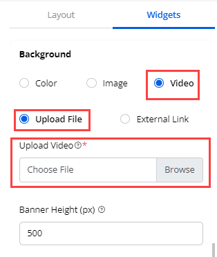
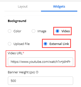
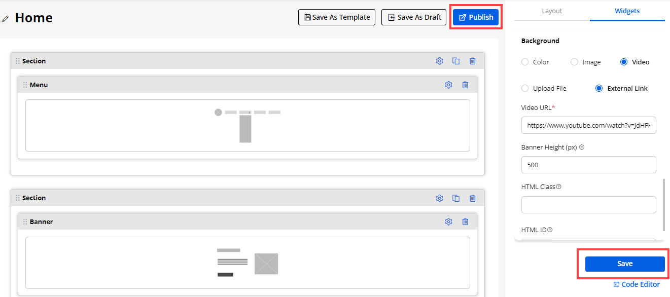
2. Button
- You can configure the Button widget to perform such actions:
– Label: Insert the text label for the button.
– Help tip: Insert the text label that helps portal users to understand the button action.
– URL Type: Select the URL for the button actions. There are 2 types of URLs given: Internal & External.
– Internal Type: You can select the page that is created in the Page builder of the portal.
– External Type: You need to insert any specific URL manually to navigate the portal users to any external URL.
– Open in a new tab: Check the checkbox to open the redirection page in the new tab. If this option is unchecked, it will open on the same page.
– Preview: You can preview the configured button widget on the page.
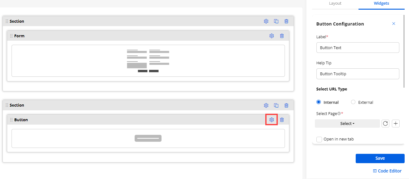
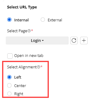
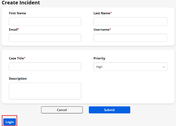
3. Case Deflection
- You can configure the Case Deflection widget to allow the customers to search the solution. You need to configure the following details:
– Redirect Page: Select the specific redirection page. i.e., Create Case page
– Records Per Page: Set the no. of records to be displayed on the page.
Select object : In CRMJetty Portal we can show the case deflection records on bases of two different object
-
Solution
-
Article (Knowledge Article)
Based on the Object selection the records are display.
– Enable Workflow: Tickmark this option to assign the workflow and derive the results based on the assigned conditions.
– Data Loading Workflow: Assign the created workflow to the widget that you want to enable for the data loading.
– Design Layout: By scrolling down, you will get the 2-predefined Design Layouts to select the appearance of the case deflection in the customer portal.
Notes:
If case deflection widget dragged previously with another CRM, now it is disabled(Front) :
- If case deflection is done for KB entity, it will not be displayed in front
If case deflection widget dragged previously with another CRM, now it is disabled (Admin):
- Case deflection with KB entity : It will show entity required validation. So user will reset the entity.
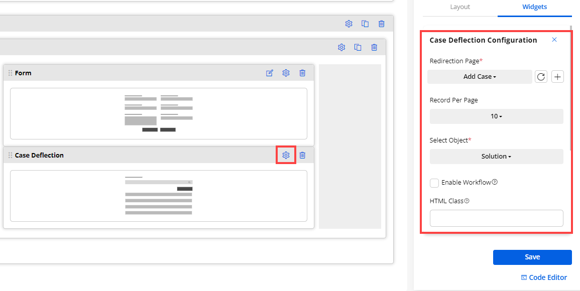
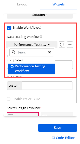
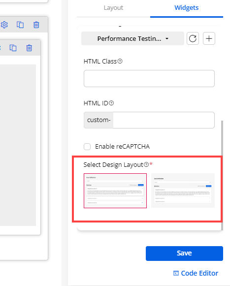
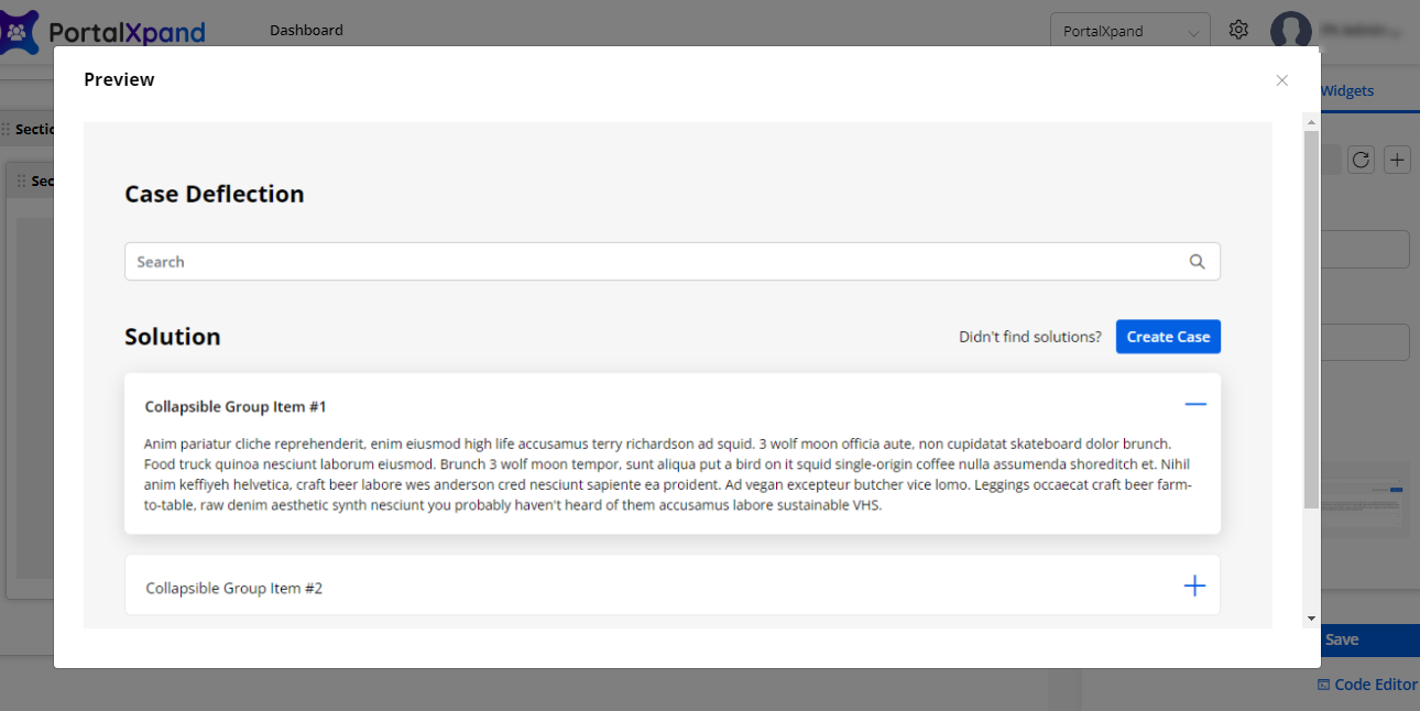
14. Login
- ‘Login widget’ is used to access the portal. Insert and select the following details:
– Title: Insert the title label for the Login
– Email or Username: Insert the label by inserting what credential the user can log in with.
– Login button text: Insert the button label for login.
- You can enable and configure the “Additional Configurations” for the Login:
– Remember Me: It will be visible on the Login page. The portal users can enable to save their credentials.
Note: Latest credentials are saved if remember me field is enable.
– Forgot Password: If you have selected to display on the login page, you need to select the Forgot Password “Redirection URL”.
– Select Forgot Password Redirection Page: Select the URL from the searchable drop-down to navigate the portal users to the Forgot password page. Here you will get the searchable drop-down list. You can search & select the relevant page.
– Allow Registration: If you have selected this option to display on the login page, you need to select the “Redirection URL” for the Registration. Select the registration page in the URL.
– Select Registration Redirection Page: Select the URL from the searchable drop-down to navigate the portal users to the Registration page.
– Login Redirection Page: Select the URL from the searchable drop-down to navigate the portal users to the next page once their login credentials are corrected.
– Enable reCAPTCHA: Enable the reCAPTCHA option to the login page to protect from spam. The portal users will get the reCAPTCHA V2 or V3 as you have configured in the “Portal General Settings” from the Settings → PortalSettings.
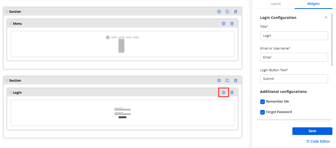
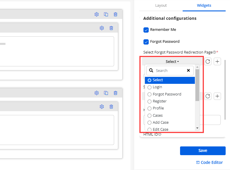
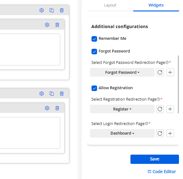
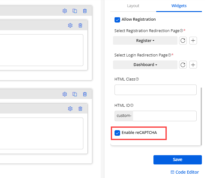
4. Charts
If you want to display the analytics in Charts by selecting the Object & its specific field, you need to configure the following details:
– Title: Insert the relevant Chart Title. i.e., Total Cases, In Progress Cases.
– Select Object: Select the Object from the list. i.e., Account, Case, Attachment, Contract, Call, Order.
– Select Field: As per the Object selection, the Fields will be fetched.
– Select Field Value: As per the ‘Field’ selection, the Field values will be fetched, and select that field value for which you want to display the count. i.e., In Progress, Cancelled.
– Enable Workflow: Checkmark this field, to enable the workflow created from the Portal Settings ➤ Workflow Management.
– Data Loading Workflow: Select the Data Loading workflow you want to apply to this chart widget.
– Enable reCAPTCHA: If you have enabled the reCAPTCHA, you will get the “Enable reCAPTCHA” option in the widget. By enabling the reCAPTCHA, the page will be protected from spam when the portal users navigate to the page.
Note: If the V3 reCAPTCHA is configured, only then you will get the Enable reCAPTCHA option in the Chart widget configuration. If you have enabled it, the V3 reCAPTCHA will appear in the customer portal.
– Design Layouts: By scrolling down, you will get the 4-predefined Design Layouts to select the appearance of the chart in the customer portal.
- By clicking on the design, you will get a preview of the design.
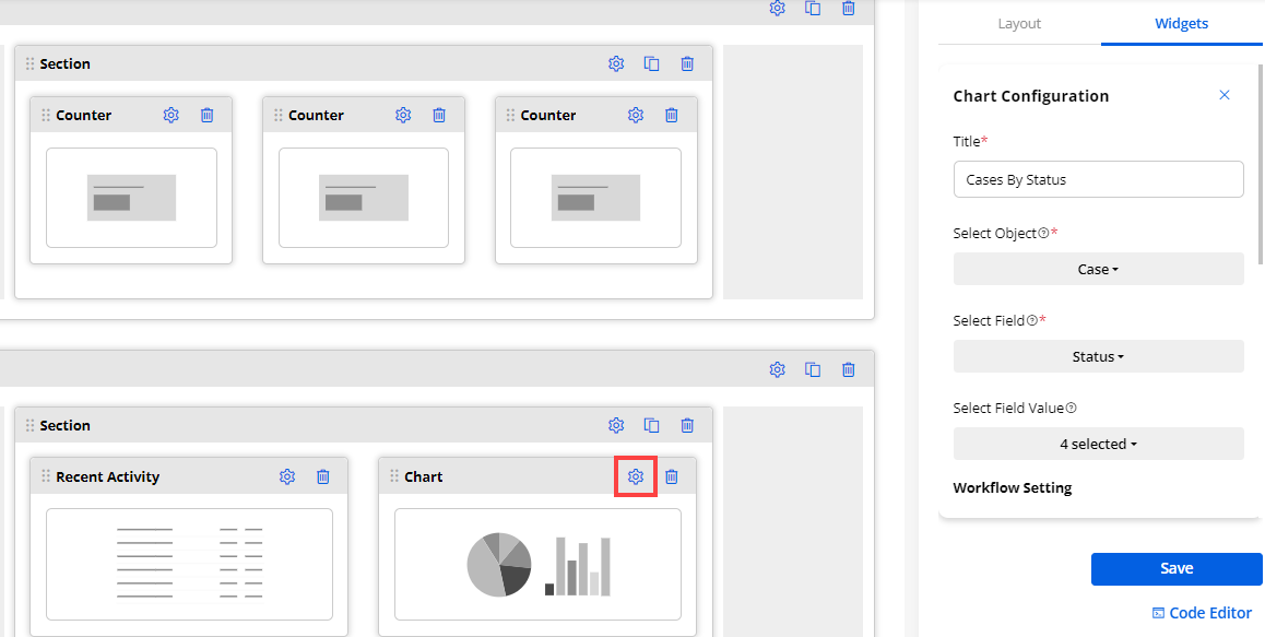
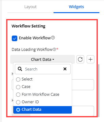
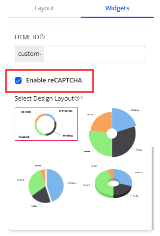
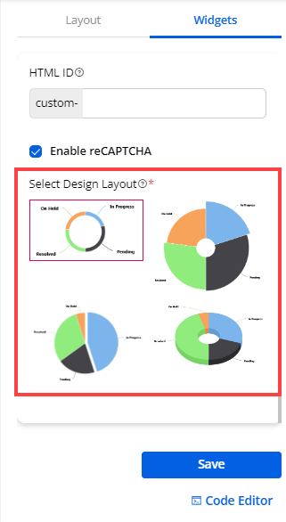
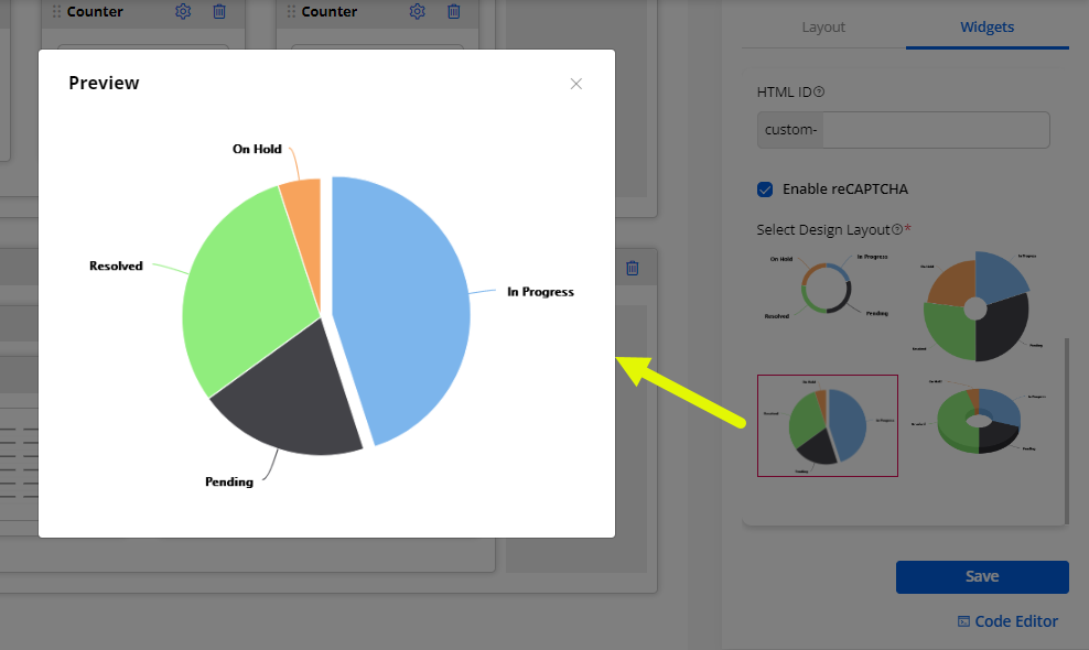
5. Content Slider
- You can add the Content Slider widget to display the information by customizing the content. Drag & drop the widget and click on the ‘Setting’ icon to configure the content slider.
(+) Add Content Slide
- First, you need to add the content slides by clicking on the (+) Add Slide. You need to configure the following options for the content slide:
Header
– Text: Insert the details that will display as the content slider’s header.
– Color: Choose the color for the header’s text.
Description
– Text: Insert the description.
– Color: Choose the text color for the description.
– Background of Content Slider: You can set the background of the slider that will be displayed on the customer portal. You can set the Solid (single) or Gradient (dual) background color for the content slider.
– Solid: You need to choose the “Color” to display in the background of the slider. A custom color picker is provided to choose the color. (left image)
– Gradient: You need to choose “Primary Color” and “Secondary Color” to display in the background of the slider. A custom color picker is provided to choose the color for both. (right image)
– Degree: You can set the degree (0 to 360) of the gradient color for the slider’s background.
After configuring the “Content Slider Configuration”, click on the Save button to save the configuration. Publish the page to apply the changes.
-
Now, by clicking on the Save button, the content slides will be added. Similarly, you can add more content slides that you want to display in the customer portal.
-
You can see the newly added slides under the Content section. You will see three options for the added content sliders: Settings, Clone, and Delete.
– Settings: You can edit the slide to update/change any configuration and the details.
– Clone: You can duplicate the slide with the same configuration and details.
– Delete: You can delete the unwanted slide from the content slides section. By clicking on it, you will get the warning message and after confirming the slide will be deleted.
Content Slider Settings
You need to configure the common settings for the content slider to display in the customer portal.
Slider Title
– Text: Insert the title that will display as Content Slider’s title.
– Enable Auto Slide: This option will help to play the added slides automatically as per the timer. By ticking the checkbox, you need to set the timer to play the slides.
Navigation
- You can display the navigations to the content slider.
– Enable Arrow: Check the box if you want to display the arrow on the slide.
– Enable Pagination: Check the box to enable the pagination in the slides. You will have three designs (pagination type) to display the pagination below the slider.
– Slider Height (px): Insert the height of the content slider that will be displayed on the customer portal.
Note: If you have not set any height or set it to 0, the slider height will be set to auto.
– Select Template: You can select the template for the content sliders. The three different templates are provided as per the 1, 2, and 3 column structures.
Note: The column structure could be changed according to the width of the section in which the slider is configured.
By scrolling down, you will find the Save button to save the slider settings and Publish the page to apply the changes.
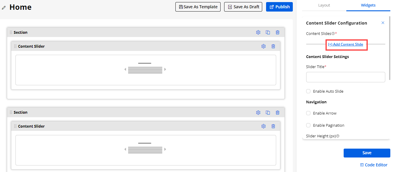
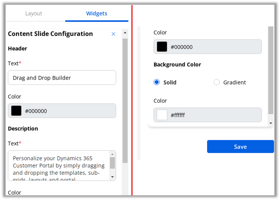
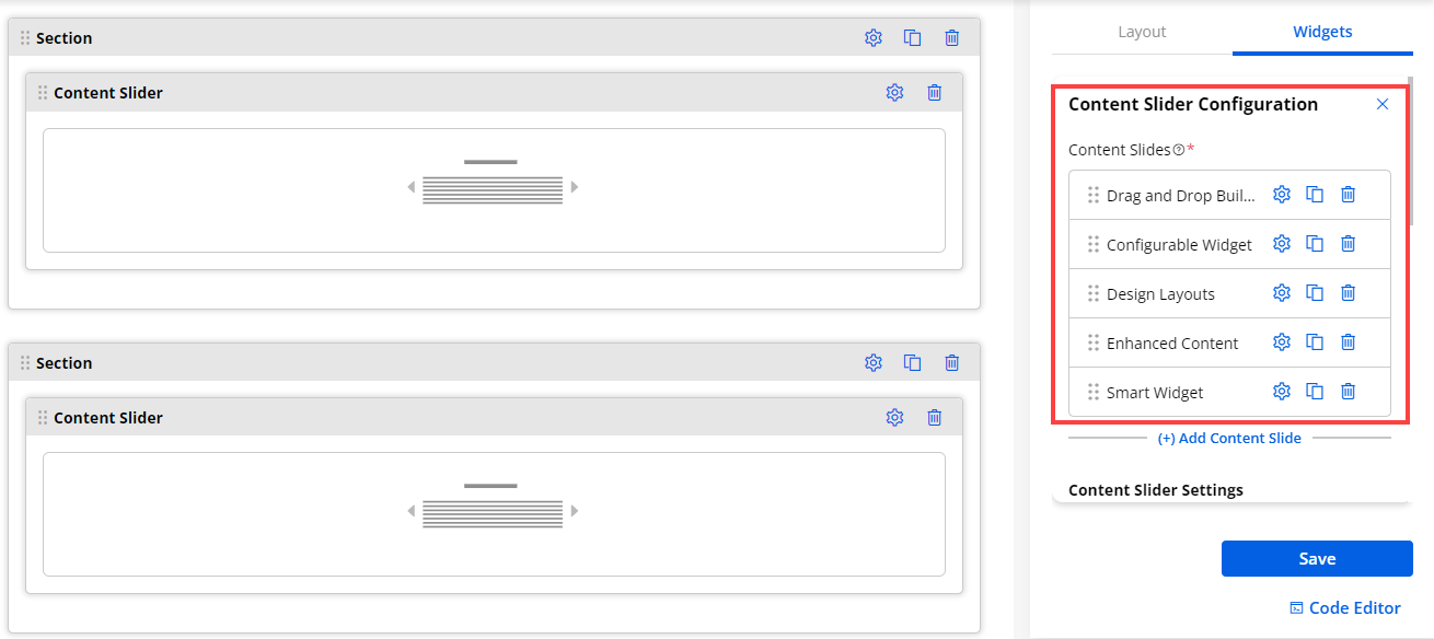
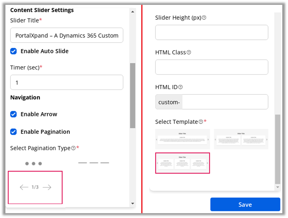
6. Counter
- To display the record counter of a specific Object, you need to insert the following details:
– Title: Insert the relevant Counter Title. i.e., Total Cases, In Progress Cases.
– Select Object: Select the module from the list. i.e., Account, Case, Attachment, Contract, Call, Order.
– Select Field: As per the Object selection, the Fields will be fetched.
– Select Field Value: As per the ‘Field’ selection, the Field values will be fetched, and select that field value for which you want to display the count. i.e., In Progress, Cancelled.
– Icon Class: By clicking on the Pick an Icon button, you will get the icon picker list. Pick a relevant icon.
– Enable Workflow: Checkmark this field, to enable the workflow created from the Portal Settings ➤ Workflow Management.
– Data Loading Workflow: Select the Data Loading workflow you want to apply to this chart widget.
– Enable reCAPTCHA: If you have enabled the reCAPTCHA, you will get the “Enable reCAPTCHA” option in the widget. By enabling the reCAPTCHA, the page will be protected from spam when the portal users navigate to the page.
Note: If the V3 reCAPTCHA is configured, only then you will get the Enable reCAPTCHA option in the Counter widget configuration. If you have enabled it, the V3 reCAPTCHA will appear in the customer portal.
– Design Layout: You will get the 5- predefined Design Layouts (Style). Select any design layout to display in the customer portal.
- By clicking on the design, you will get a preview of it.
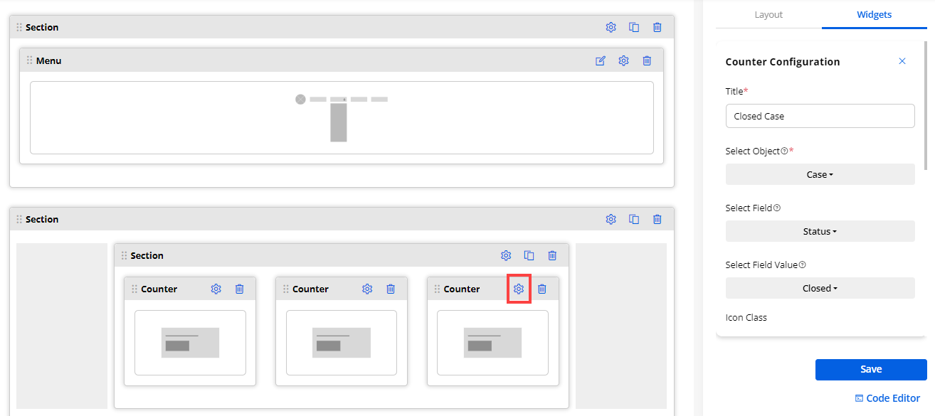
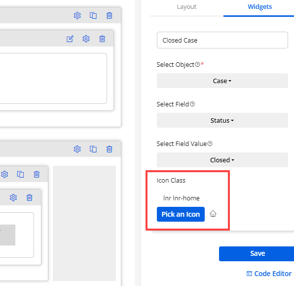
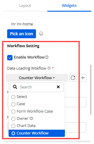
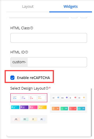
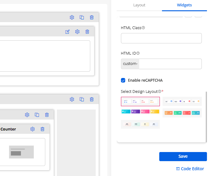
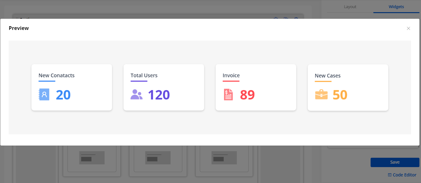
7. Data Card
-
Display any object records in grid view in the Data Card. It will display the object records details in the Data Card instead of the list view to the portal users in the customer portal.
-
Drag and drop the ‘Data Card’ widget to the page builder section and configure the following details:
Widget Settings
– Data Card Title: Insert a relevant title to display in the customer portal.
– Select Card View: Select the object from the dropdown list to display in the customer portal.
– Select Data Card Styling: Select the Design Layout for the data card.
Image Configurations
- Select the Object field that you want to display for an image. Here only those fields will be available which you have enabled as “Show as Image” in the list.
Header Configuration
Enable the checkbox to display the header field label in the data card.
– Text: Select the field of object which you want to display on the header text.
Sub Header Configurations
Enable the checkbox to display the sub-header field label in the data card
– Text: Select the field of object which you want to display on the sub-header text.
Supporting Configurations
Enable this checkbox to display the supporting field label in the data card.
– Text: Select the field of object which you want to display as the supporting text.
Tags configuration
– Tags: Select the object’s CRM Field from the dropdown list to display as Tag of the record’s card in the customer portal. i.e., Tags could be Priority, Status, Reason fields of the object.
Tabs Configuration
- If you have selected a second design in the “Data Card Styling” then you will get the Tabs configuration.
– Enable Field Label: Checkmark this option to display the text label for tabs in the data card.
– Select Tab Fields: Select the fields you want to display in tab. You can only select 3 tab fields.
Create Action Settings
– Create Button Text: Insert a text to display for the button label for the create page.
– Redirect To: Select the page to navigate to create a new object record.
Edit Action Settings
– Redirect To: Select the page to navigate to edit an existing data card record.
Detail Action Settings
– Redirect To: Select the page to navigate to the details of the selected data card record.
Workflow Setting
– Enable Workflow: Checkmark this field, to enable the workflow created from the Portal Settings ➤ Workflow Management.
– Data Loading Workflow: Select the Data Loading workflow you want to apply to this data card widget.
– Update Assign Rights Workflow:
– Records per page: Insert the number of object records (data cards) you want to display per page. You can decide how many data cards to be displayed at a time.
Enable CSV Support
-
Enable this feature if you want to offer the CSV Support for the data card widget. This means the users can export the information of data card in CSV format.
-
After configuring the Data Card widget, you need to Publish the page to apply the changes to the selected page. As you have configured the Widget Settings, the portal users will get the object records as Data Cards in grid view from the customer portal.
Static Widgets in Card Design
-
You can also display the widgets – Image, Text, and Video as Data Card design in the customer portal.
-
Once you drag and drop to the page layout while creating a specific page, it will automatically set as card style.
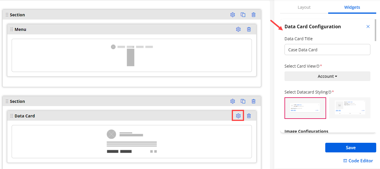
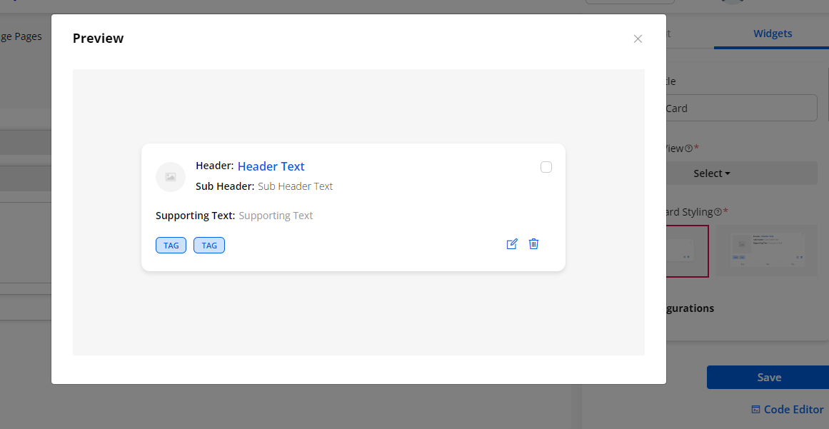
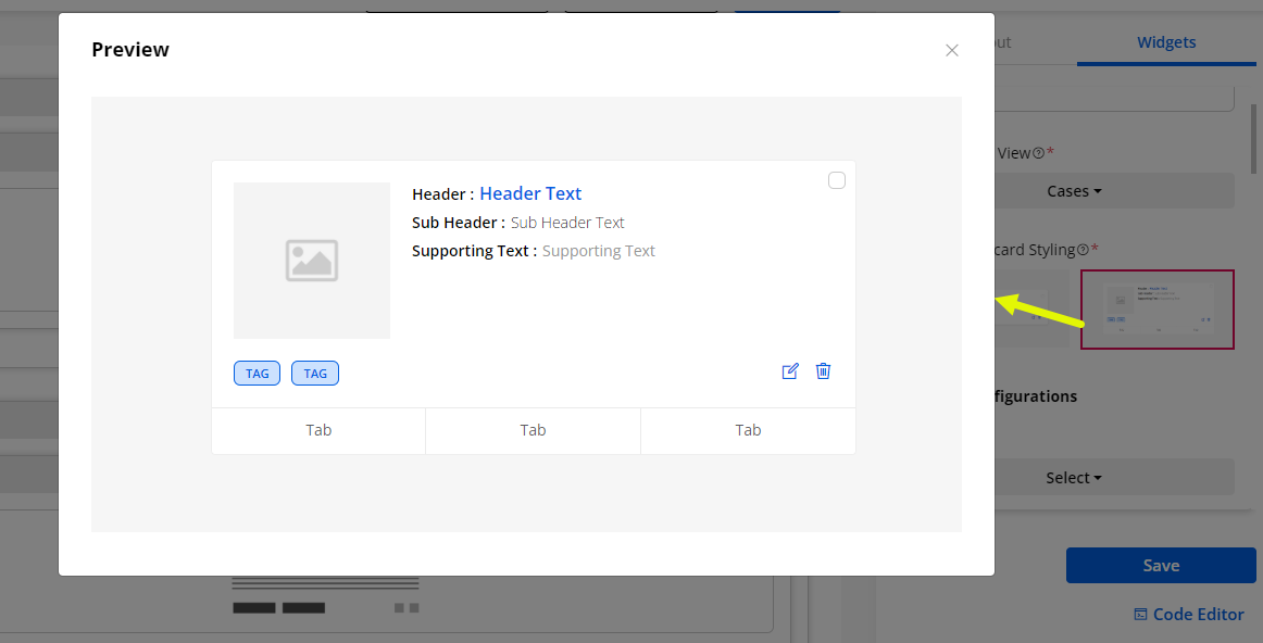
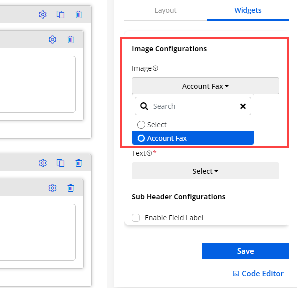
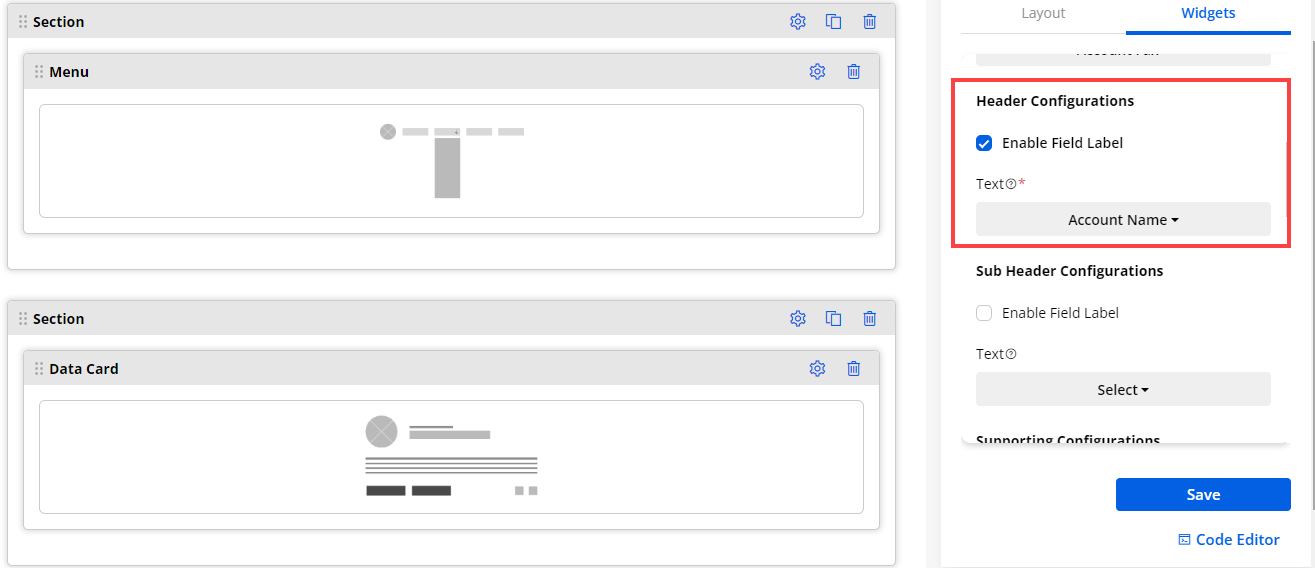
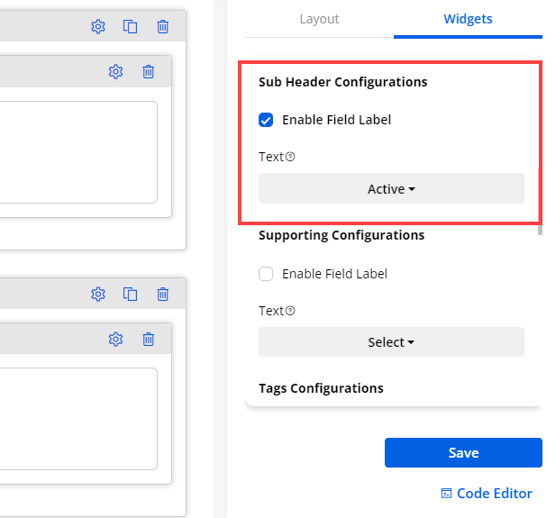
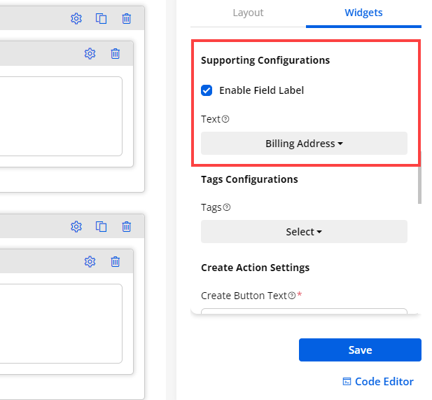
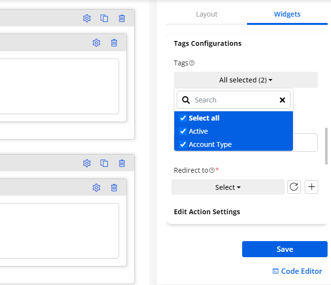
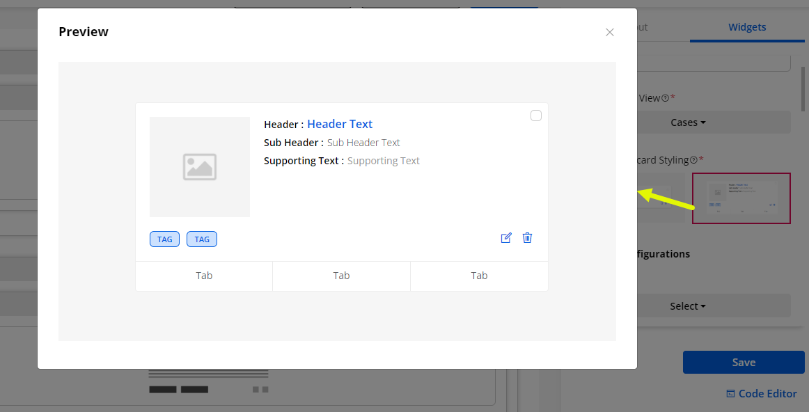
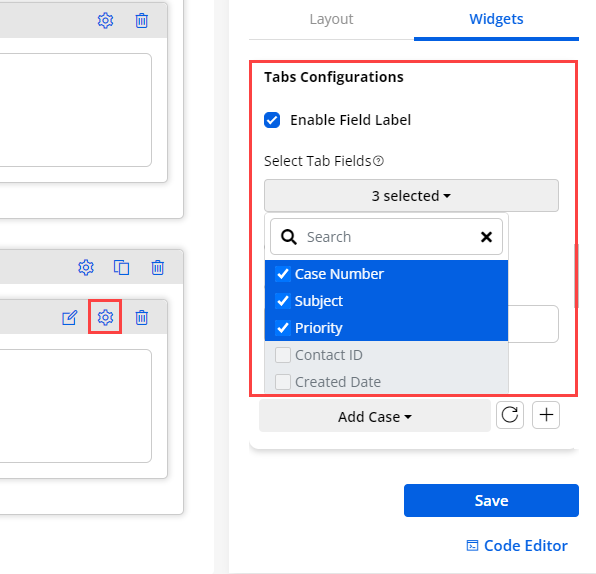
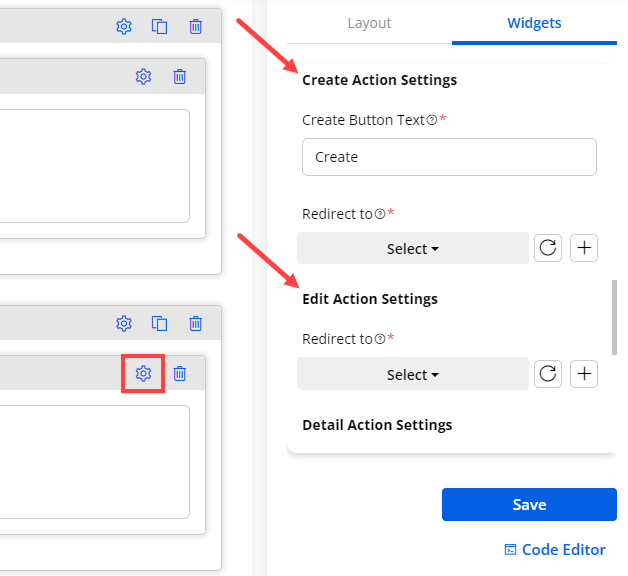
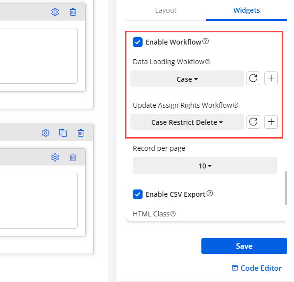
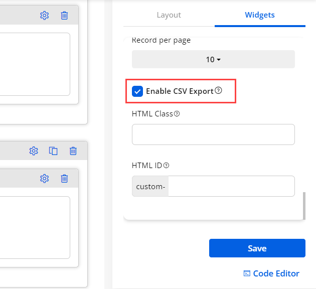
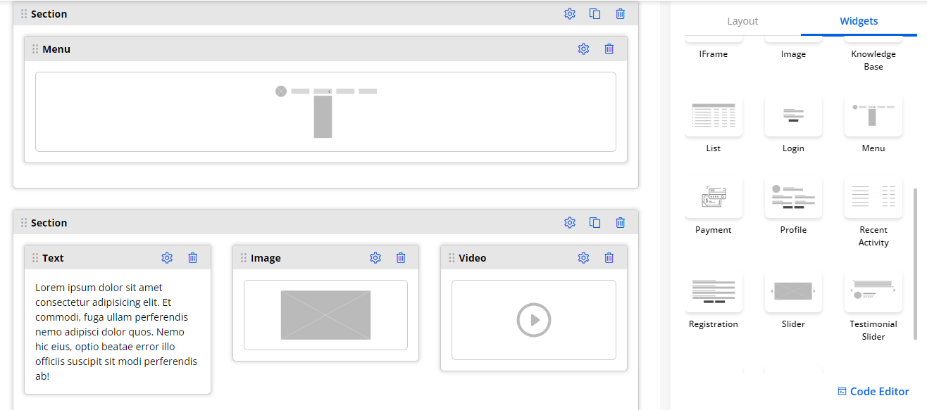
8. Forgot Password
It provides the functionality to reset passwords for registered users. You will find the following options for Forgot Password widget:
– Title: Insert the label of the forgotten password title
– Forgot Password Button text: Insert the label of the button.
– Enable reCAPTCHA: Enable the reCAPTCHA option to protect from spam. The portal users will get the reCAPTCHA V2 or V3 as you have configured in the “Portal General Settings” from the Settings → Portal Settings.
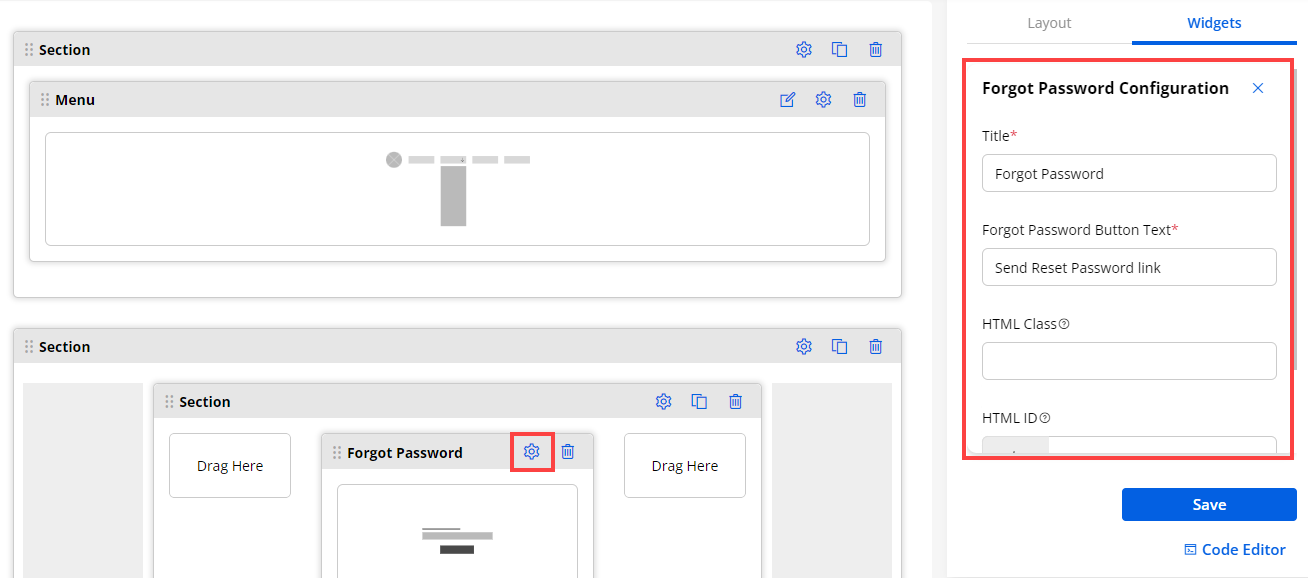
9. Form
- Using the ‘From’ widget, you can select the created Forms under the Form builder to display the add/edit or detail page for a specific Object.
Form Configuration:
– Form Title: From the drop-down select the Form that you need to display.
– Select Form View: Select the ‘Form’ from the searchable drop-down list to navigate the portal users to that page.
– Edit Button Text: Insert text caption for the Edit button. i.e., Update Record, Edit Details.
– Redirect to: Select the page where you want to redirect the portal user whenever they want to edit the form.
– Delete Button Text: Insert text caption for the Delete button. i.e., Remove Record
– Redirect to: Select the page where you want to redirect the portal user whenever they perform the delete action.
‘Add ’ Form type
– Record Type: If there are any record type in the selected object then for Add type form there is one additional setting to create the record with the selected record type.
Note: This setting will appear if there are any record type available for the object.
– On Success: Select the URL for redirecting to the page after successful form submission.
– Submit Button Text: Insert the ‘Text captions’ for the Submit button (after inserting the details to be clicked).
Exit Settings
– Cancel Button Text: Insert the ‘Text captions’ for the Cancel button.
– Redirect To: Select the page where you want to redirect your portal users wherever they click on the Cancel button.
– Design Layout: You will get the 3- predefined Design Layouts (Style) for the ‘From’. Select any design layout to display in the customer portal. You can preview the layout by clicking on it.
– Enable reCAPTCHA: If you have enabled the reCAPTCHA, you will get the “Enable reCAPTCHA” option in the Form widget.
-
By enabling the reCAPTCHA, the Form page will be protected from spam when submitted by the portal users. The portal users will get the reCAPTCHA V2 or V3 as you have configured in the “Portal General Settings” from the Settings → PortalSettings.
-
You can enable the reCAPTCHA for any other forms that will be accessible to the customer portal.
-
- You can manage the Edit/Detail page by configuring the Redirection and Text Label settings. Navigate to the Edit/Detail page and edit the form.
‘Edit ’ Form type
Edit Form Configuration
– Form Title: Insert the text label for the title of the form.
– Select Form View: Select the Page URL from the searchable drop-down to redirect the portal users to the editing page.
Success Settings
– On Success: Select the Page URL from the searchable drop-down to redirect the portal users once the form is edited successfully.
– Delete Button Text: Insert the text label for the Delete button.
– Redirect To: Select the Page URL from the searchable drop-down to redirect the portal users after deleting the record from the edit page.
Exit Settings
– Cancel: Insert the text label for the Cancel button.
Workflow Settings
– Enable Workflow: Checkmark this field, to enable the workflow created from the Portal Settings ➤ Workflow Management.
– Data Loading Workflow: Select the Data Loading workflow you want to apply to this Form widget.
– Update Assigned Rights Workflow: Select the Update Assigned Rights workflow you want to apply to this Form Widget
– Design Layout: You will get the 3- predefined Design Layouts (Style) for the ‘From’. Select any design layout to display in the customer portal. You can preview the layout by clicking on it.
- After configuring the Edit page details, click on the Save button and publish the page to apply the changes to the customer portal.
‘Detail ’ Form type
Edit Detail Form Configuration
– Form Title: Insert the text label for the title of the form.
– Select Form View: Select the Page URL from the searchable drop-down to redirect the portal users to the detail page.
– Edit Button Text: Insert the text label for the edit action from the detail page.
– Redirect to: Select the Page URL from the searchable drop-down to redirect the portal users to the form editing page.
– Delete Button Text: Insert the text label for the Delete button.
– Redirect To: Select the Page URL from the searchable drop-down to redirect the portal users after deleting the form from the edit page.
Workflow Settings
– Enable Workflow: Checkmark this field, to enable the workflow created from the Portal Settings ➤ Workflow Management.
– Data Loading Workflow: Select the Data Loading workflow you want to apply to this Form widget.
– Update Assigned Rights Workflow: Select the Update Assigned Rights workflow you want to apply to this Form Widget
– Design Layout: You will get the 3- predefined Design Layouts (Style) for the ‘From’. Select any design layout to display in the customer portal. You can preview the layout by clicking on it.
- After configuring the Edit page details, click on the Save button and publish the page to apply the changes to the customer portal.
Send Email to Form Respondent for Form Widget
- Admin users will get the Email Respondent option from the Form widget Configuration. There will be an option as “Send Email to Form Respondent”, by enabling this option you will get the following option to select:
– Select Page: Select a page from the drop-down list to redirect to that page. You need to select record links from the “Select Page“ that will convert into the page link which is sent in an email, and it will redirect the form submitter to the selected page.
– Select Email Template: Select an Email Template from the drop-down to send an Email with that template details. The Email template is according to the selected form’s Object, in the case of the parent-child relationship form the templates will be according to both the Objects.
Note: If the page is “Add” type (to create a new record), only then an “Email respondent setting” will be shown in the From widget configuration.
- If the page is also selected for the Before Login, the Email field must be in the form details that will be used to send the Email.
For the After login, the portal users will get the Form respondent mail with the form details in the Email that is used for the logged in.

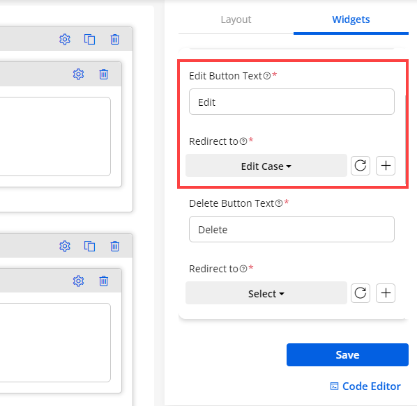
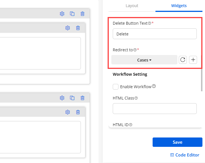
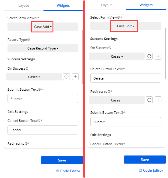
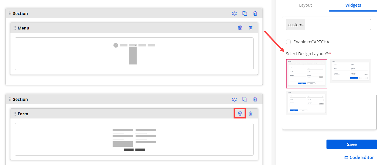
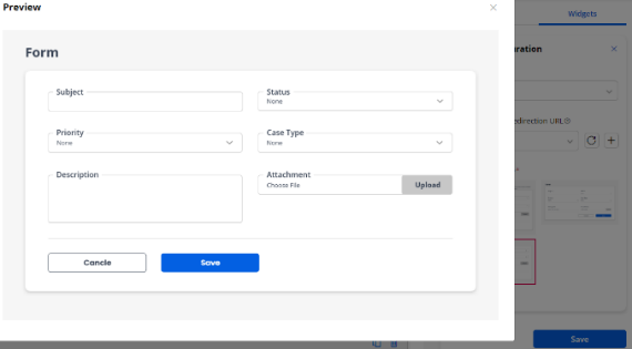
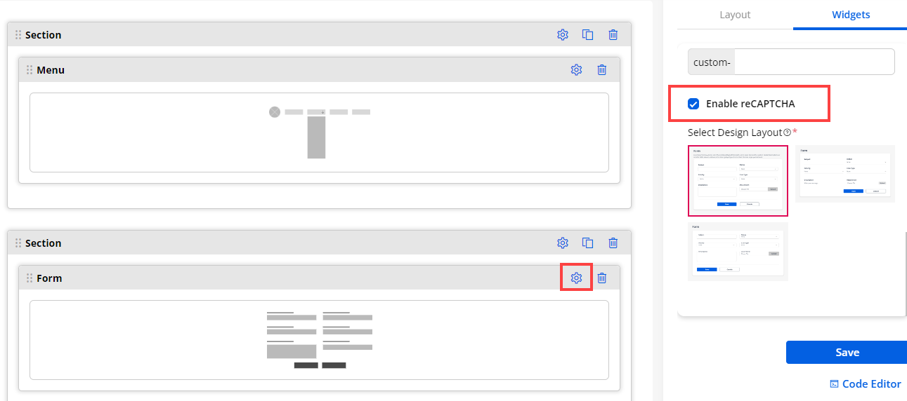
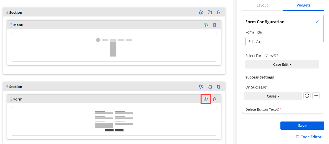
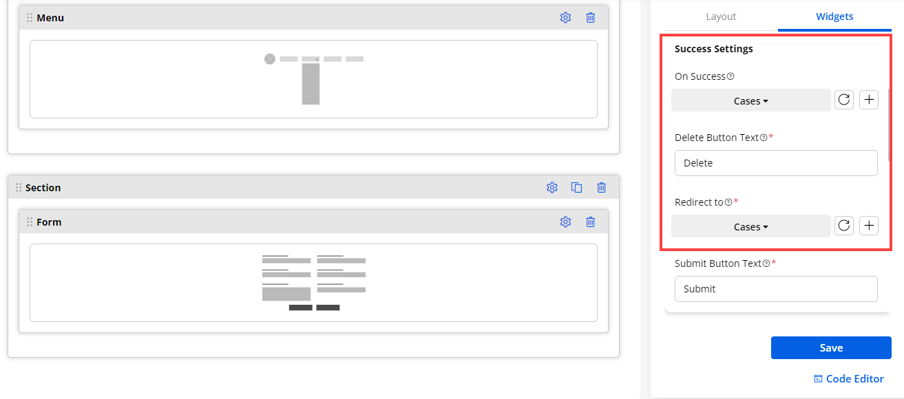
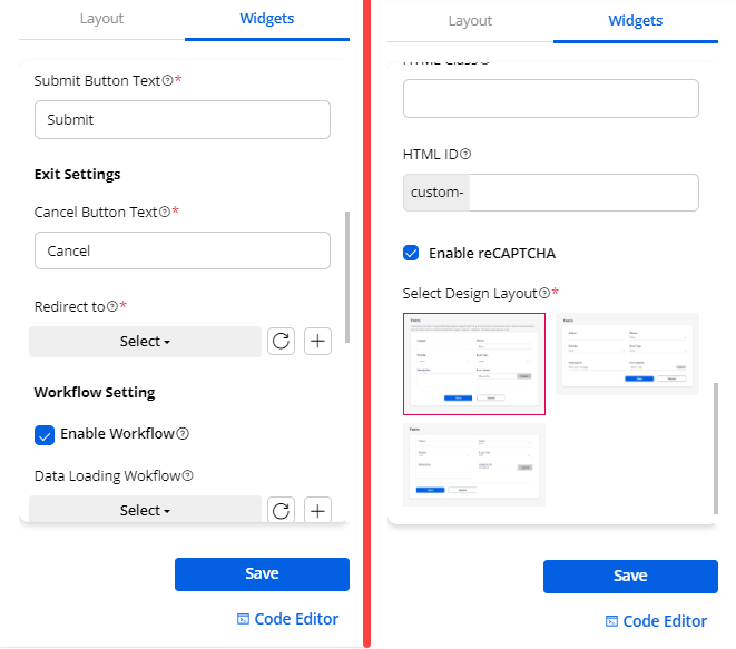
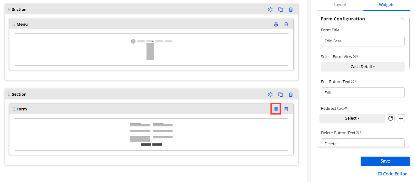
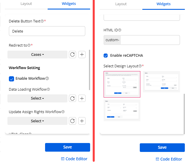
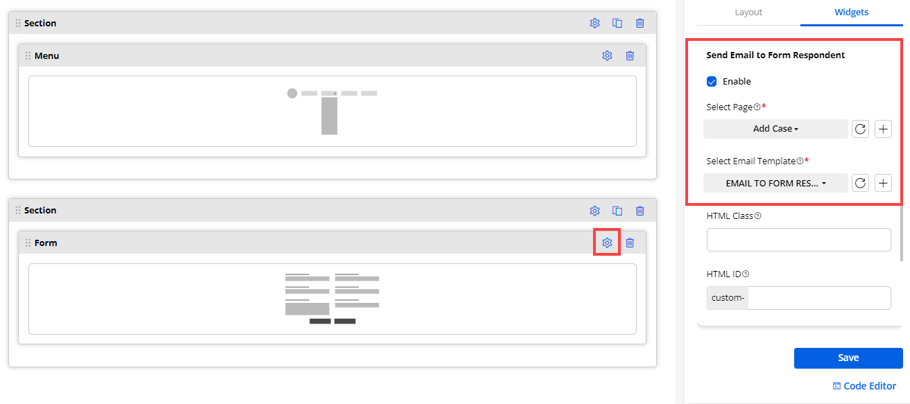
10. IFrame
- Drag-drop any iframe to display on the customer portal from the Iframe Configuration. Under Iframe Configuration:
– Embedded Code: Enter the IFrame embedded code.
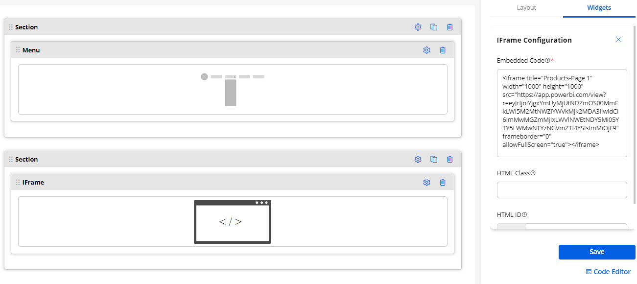
11. Image Widget
- Drag-drop any image to display on the customer portal or you can browse the image from the Image Configuration. Under Image Configuration:
– Height: Insert the height as per your requirement
– Width: Insert the width as per your requirement.
– Choose File: Select an image from the local drive.
– Alt-Text: Insert the ‘Alt text’ that will appear in place of an image on a webpage if the image fails to load on a user’s screen.
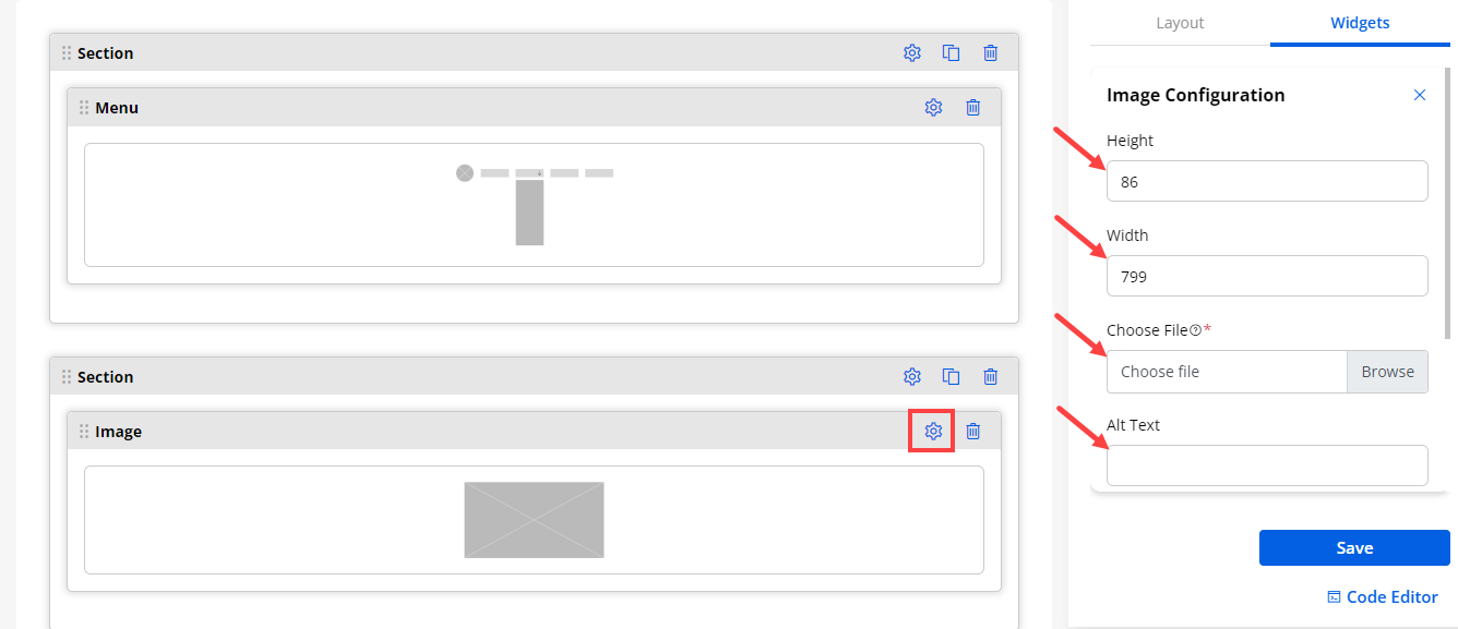
12. Knowledge Base
Salesforce Knowledge
– Enable Knowledge for User: Before you can set up all the great features of Salesforce Knowledge, make sure that you’re a Salesforce Knowledge user.
1. At the top of any Salesforce page, click on your profile photo and then click Settings.
2. Under My Personal Information, select Advanced User Details and click Edit.
3. Select Knowledge User.
- Save your changes.
– Enable Salesforce Knowledge:
-
From Setup, in the Quick Find box, enter Knowledge, and then select Knowledge Settings.
-
Confirm that you understand the impact of enabling Salesforce Knowledge and click Enable Salesforce Knowledge and click OK in the dialog box.
-
If you want to display the Knowledge base articles/blogs to the portal users, select this widget. You need to configure the following details:
– Knowledge Base Title: Set the title for the knowledge base widget.
– Records per Page: Set the no. of the records per to be displayed on the page.
– Select Role Types: Select the Portal users Roles that are created under the Portal User Management -> Roles.
– Enable Workflow: Tickmark this option to assign the workflow and derive the results based on the assigned conditions.
– Data Loading Workflow: Assign the created workflow to the widget that you want to enable for the data loading.
– Enable reCAPTCHA: If you have enabled the reCAPTCHA, you will get the “Enable reCAPTCHA” option in the Knowledge Base widget. By enabling the reCAPTCHA, the page will be protected from spam when the portal users navigate to the page.
Note: If the V3 reCAPTCHA is configured, only then you will get the Enable reCAPTCHA option in the Knowledge Base widget configuration. If you have enabled it, the V3 reCAPTCHA will appear in the customer portal.
– Design Layout: You will get the 2- predefined Design Layouts (Style). Select any design layout to display in the customer portal.
- By clicking on the design, you will get the preview of the design.
Notes:
-
Possible cases for disabled Knowledge Base Widget
-
Knowledge Base not enabled from the SF
If Knowledge Base widget dragged previously with another CRM, now it is disabled(Front) :
- It will not be displayed in front.
If Knowledge Base widget dragged previously with another CRM, now it is disabled (Admin):
– Knowledge Base : When user saves setting it will not allow to save
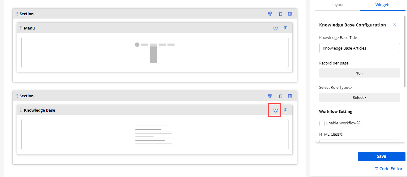
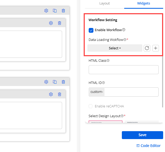
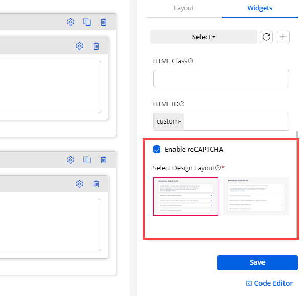
13. List widget
- You can configure a list widget to display the object data in the list:
– List Title: Insert the relevant ‘Title’ caption for the selected Object list.
– Select List View: Select the Object for the List view from the searchable drop-down list. If there are many list records, you can easily search the record and select it.
-
By clicking on the + add icon beside the Page URL (Create, Edit & Detail), you will navigate to the Page Builder to create a new page. You can directly add a new page by hereby clicking on the Refresh icon, it will refresh the list of the pages and get the latest pages.
-
Here, you will get the three different sections: “Create Action Settings”, “Edit Action Settings” & “Detail Action Settings.”
Create Action Settings
– Create Button Text: Insert the text caption for the create button.
– Redirect To: Select the Page URL from the searchable drop-down to redirect to the Create Page.
Edit Action Settings
– Redirect To: Select the Page URL from the searchable drop-down to redirect to the Edit Page.
Detail Action Settings
– Redirect To: Select the Page URL from the searchable drop-down to redirect to the Detail page.
- Enable Workflow: Checkmark this field, to enable the workflow created from the Portal Settings ➤ Workflow Management.
– Data Loading Workflow: Select the Data Loading workflow you want to apply to this list widget.
– Update Assign Rights Workflow: Select the Update Assign Rights workflow you want to apply to this list widget
– Records per page: Set the no. of the records to be displayed on the page.
– Enable CSV Export: Enable this option to enable the CSV Export option.
– Enable reCAPTCHA: If you have enabled the reCAPTCHA, you will get the “Enable reCAPTCHA” option in the List widget.
-
By enabling the reCAPTCHA, the List page will be protected from spam when the portal users navigate to the list page. If you have enabled & configured reCAPTCHA V3 in the “Portal General Settings” from the Settings → Portal Settings, the list view will be protected with the reCAPTCHA V3.
-
You can enable the reCAPTCHA for any other Lists that will be accessible to the customer portal.
– Design Layout: By scrolling down, you will get the 3- predefined Design Layout (Style) for the List view. By clicking on any design, you will get a preview of it. Select any design layout to display in the customer portal.
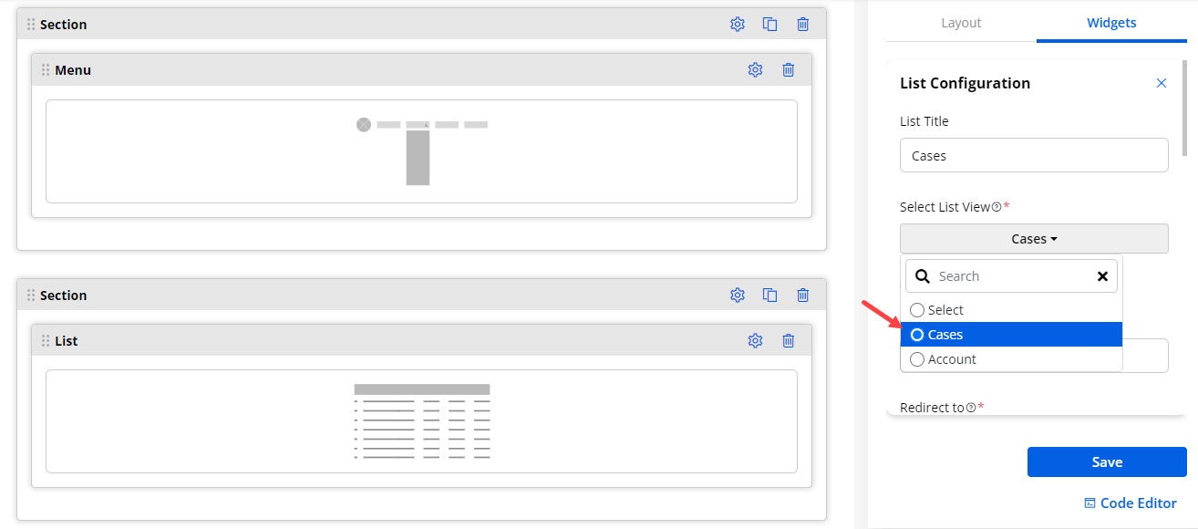
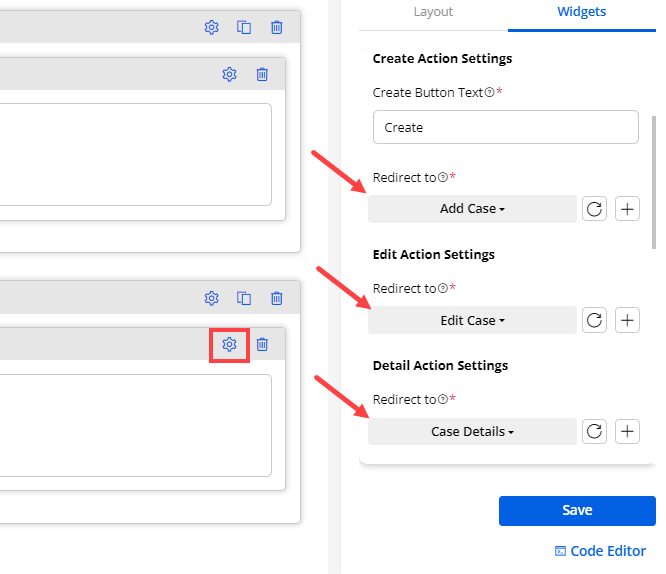
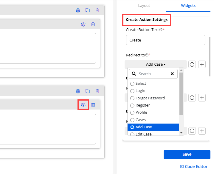
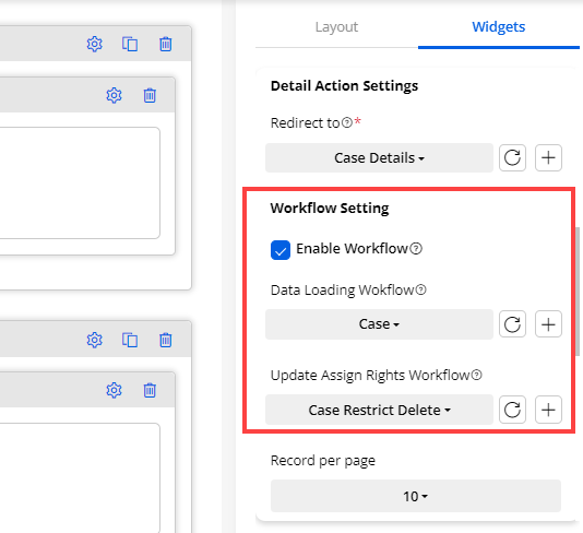
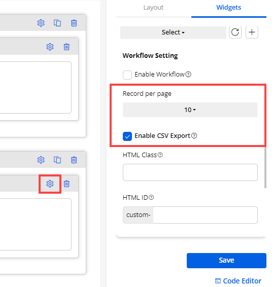
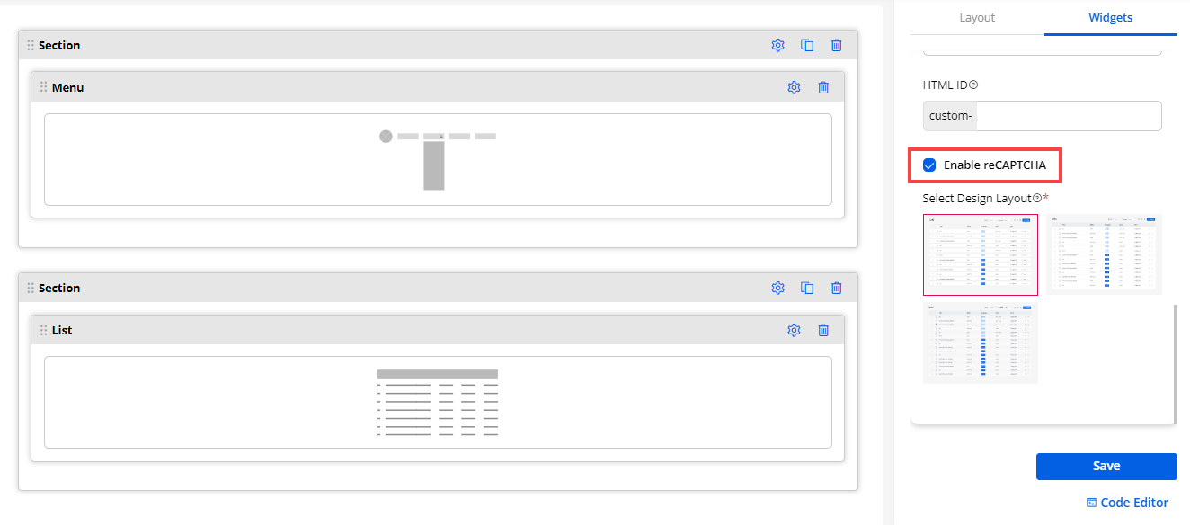
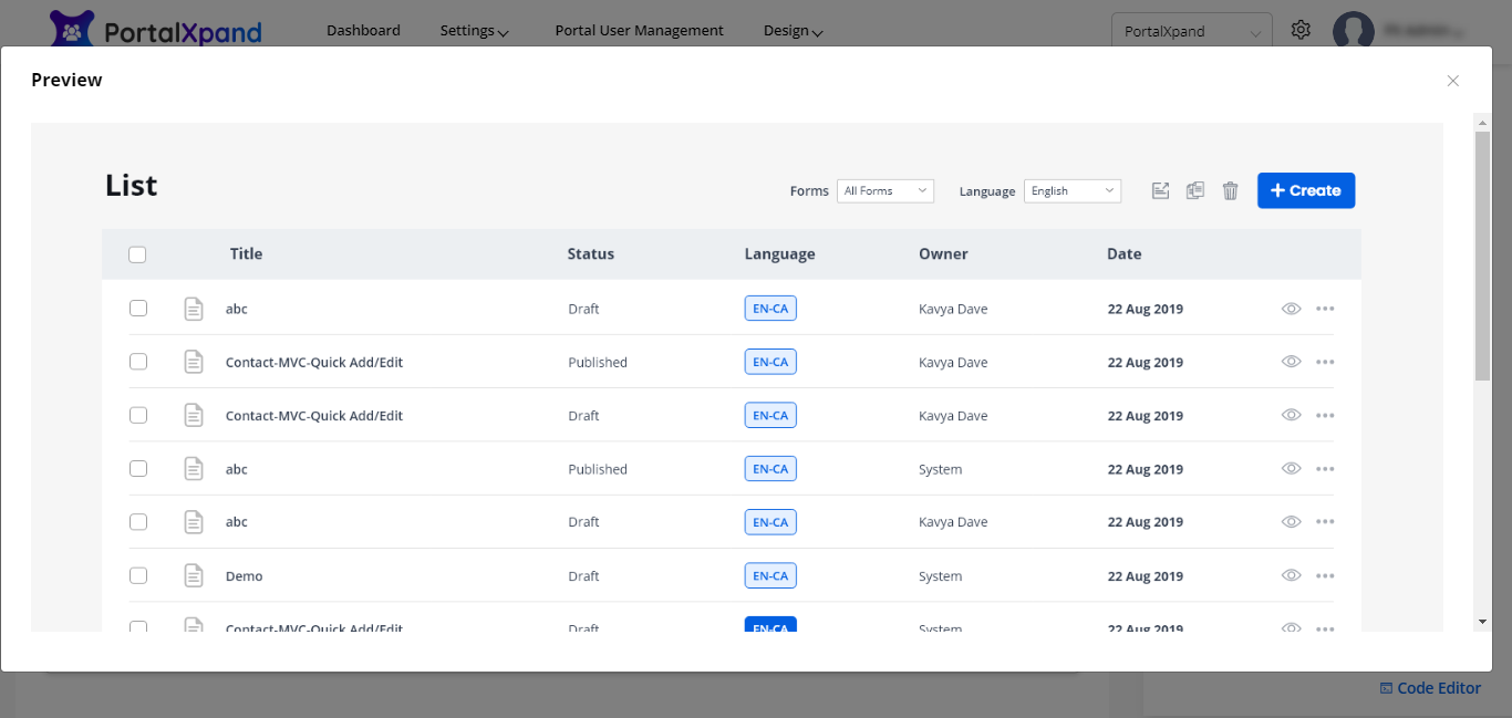
HTML Class & ID for widgets
- Customize the widgets by adding a custom HTML ID and Class.
– HTML Class: Add the multiple classes with a comma (,) separated values. The class can be applied to multiple elements so it could be multiple times on a single page.
– HTML ID: Add the ID for the section. The id will be prefixed with “custom-” text. ID is unique on a page and can only apply to at most one element.
Note:
-
For the widget, the classes and id are not directly applied to the widget. It will apply to the div.
-
Add classes and id without space and if required add valid special characters i.e. [ -, _ ].
-
Admin users can apply the custom class & ID in the JavaScript code to customize the widgets.
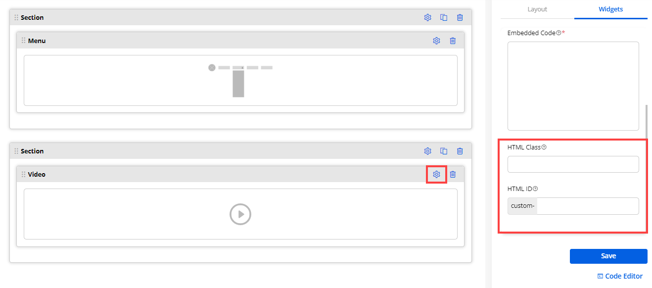
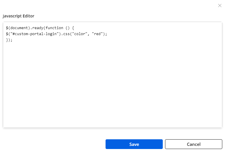
Using Template
-
Once the template is selected, click on the Next button and you will navigate to the pre-designed page layout.
-
You can also edit the page layout if you want to make any changes and configure the sections, widgets, and other details as per requirements.
-
If you are creating a new page using the Page Layout option, after designing and configuring the details, you can also save it as a new template by clicking on the Save As Template button.
-
You will get a message that the template is created. If you navigate to the ‘Templates’, a new template record will be created.
-
You will also get a column where you can see the pages (page builder) for which the template has been selected.
-
You can see the pages (page builders) for that template is used.
Note: If you save the designed page as a template that is already in the Template, it will be saved as the same name having the ‘copy’ suffix.
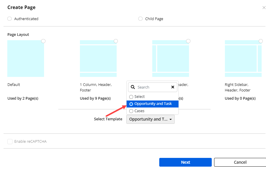
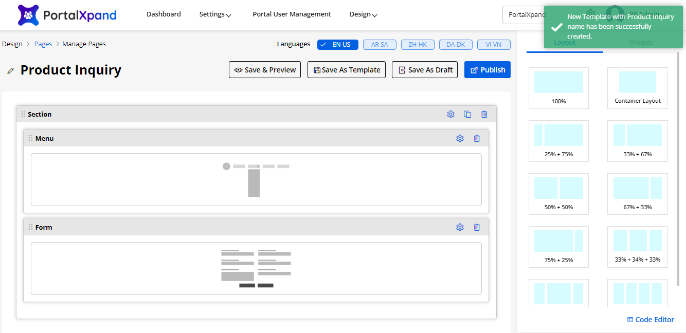
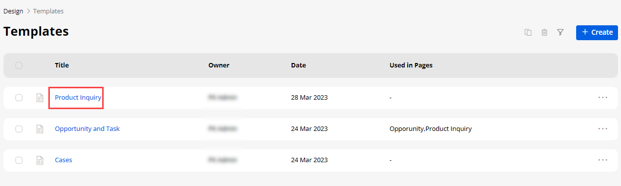
Using JS Code Editor
-
You can create or update the layout of the Pageview using JavaScript Code Editor if you have any custom JS code.
-
By clicking on the Code Editor, an editor will popup where you can edit/paste your JS code. Once you edit/paste the JS code, click on the Save button and Publish the Page builder record.
-
You can ‘Preview’ the Page builder to check how it looks.
-
Similarly, you can also edit/paste the JavaScript code to update the UI & appearance as per your desire or as per your Portal’s theme.
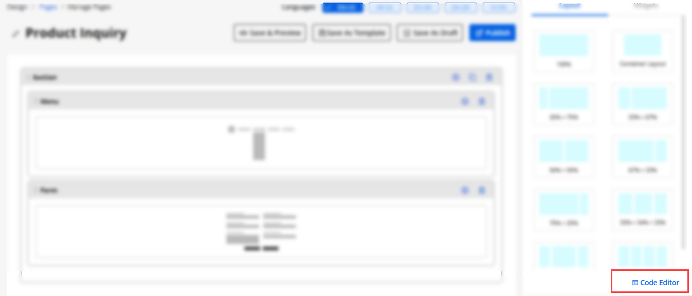
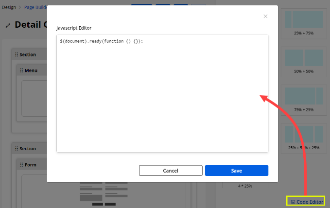
HTML Class & ID
-
You can customize the page sections and widgets by adding a custom HTML ID and Class.
-
You will get the ‘Setting’ icon on the top right corner of the Section besides the delete icon. By clicking on that edit icon, the “Section Configuration” will be opened on the right-side panel.
-
You will get two controls there:
– HTML Class: Add the multiple classes with a comma (,) separated values. The class can be applied to multiple elements so it could be multiple times on a single page.
– HTML ID: Add the ID for the section. The id will be prefixed with “custom-” text. ID is unique on a page and can only apply to at most one element.
Note: Please add classes and ID without space and if required add valid special characters i.e. [ -, _ ].
-
By clicking on the Save button, the HTML Class & ID will be saved.
-
Admin users can apply the custom class & ID in the JavaScript code to customize the page sections.
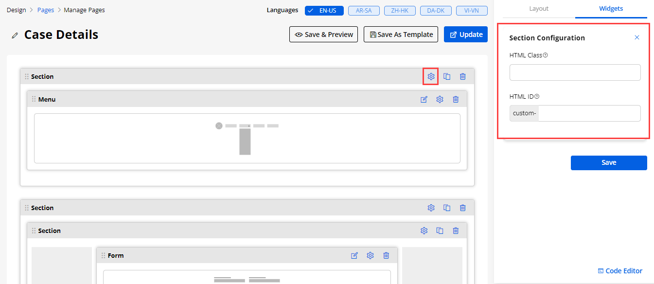
Publish/Draft List Records
-
If any Page is already published, you will get the “Draft” option here. But if the list Form is in the ‘Draft mode’, you will get the Publish option.
-
If you select multiple page records containing draft and published status, then all those forms will be converted to published status.
-
If you select all the published page records, it will convert to the draft mode.
Note: You can move into the ‘Draft’ mode only if the page is not published yet.
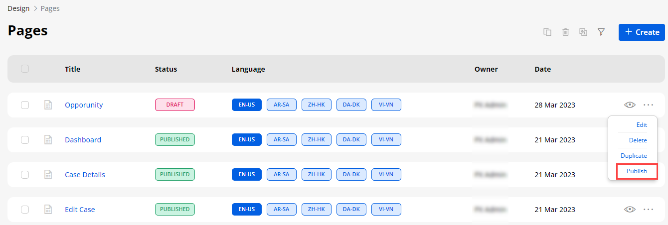
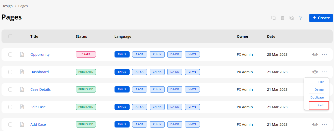
Create & Edit Page
Edit Page
-
After clicking on any page, you can edit the design of the page layout. You will see the default widgets to set the content on the page layout.
-
By clicking on the Preview button, you will get an idea of how the page will look.
-
You can also edit the added widgets, add new widgets, and remove if not required.
-
Menu and Form widgets are added for the ‘Edit Case’ page. “Menu” widget is for navigation that will display the list of the menu to navigate to other pages.
Create Page
-
By clicking on the + Create button, you can create a new page. Here you will have two options: create a page using the Page Layout or create a page using the pre-designed Template.
-
If you have selected ‘Page Layout’, select any page format, and click on the Next button. But if you want to select any pre-designed template, you will have the “Select Template” drop-down option to select the relevant template from the list.
-
To create a page, you need to provide certain mandatory details:
– Title: Insert the title of the page.
– Page URL Slug: Once you insert the title, the slug will be suggested. You can edit the URL slug.
– Page Access: Select the option for the page that would be shown before login and/or after login. You will have two options here to show the page to the portal users: Public or Authenticated.
If you want to show the page before login and after login on both sides, you need to select the Public checkbox. But, if you want to show the page after the portal users log in, you need to select Authenticated option.
– Page Nesting: Select whether it is the parent page or the object’s child page (Under Parent Page).
Select the page as ‘parent’ or the created pages will be listed under any parent page if you have selected the ‘Under Parent Page’.
– Page Layout: You will get the ready-made page builders to design the page layout as per requirement else you can select the Default Page Layout.
- When creating a new page layout, you will get the reCAPTCHA option at the end if you have enabled & configured the reCAPTCHA.
Note: If the V3 reCAPTCHA is configured, only then you will get the Enable reCAPTCHA option at the time of the Page Layout creation. If you have enabled it, the V3 reCAPTCHA will appear in the customer portal for that page.
-
Now, click on the Next button to design the page layout and you will navigate to the page layout settings.
-
Under the “Layout” tab, the different layouts (body) are provided to manage the page layout and display the portal content as you want it to be displayed.
-
Drag and drop any layout from right to left Body part.
Container Layout :
-
If you want to center align the content in the page then, you can use the Container Layout.
-
You can also select the “Custom Page Layout” as per your requirement.
-
If you have selected the Custom Page Layout, the custom layouts will be added under the Page layout design.
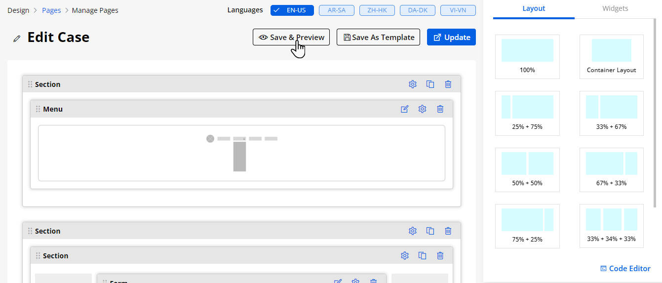
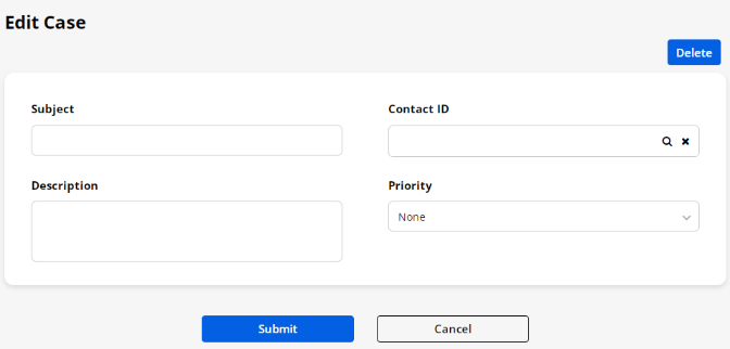
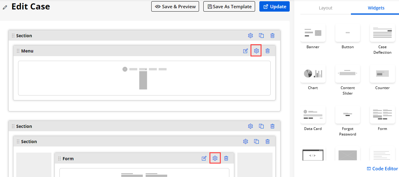
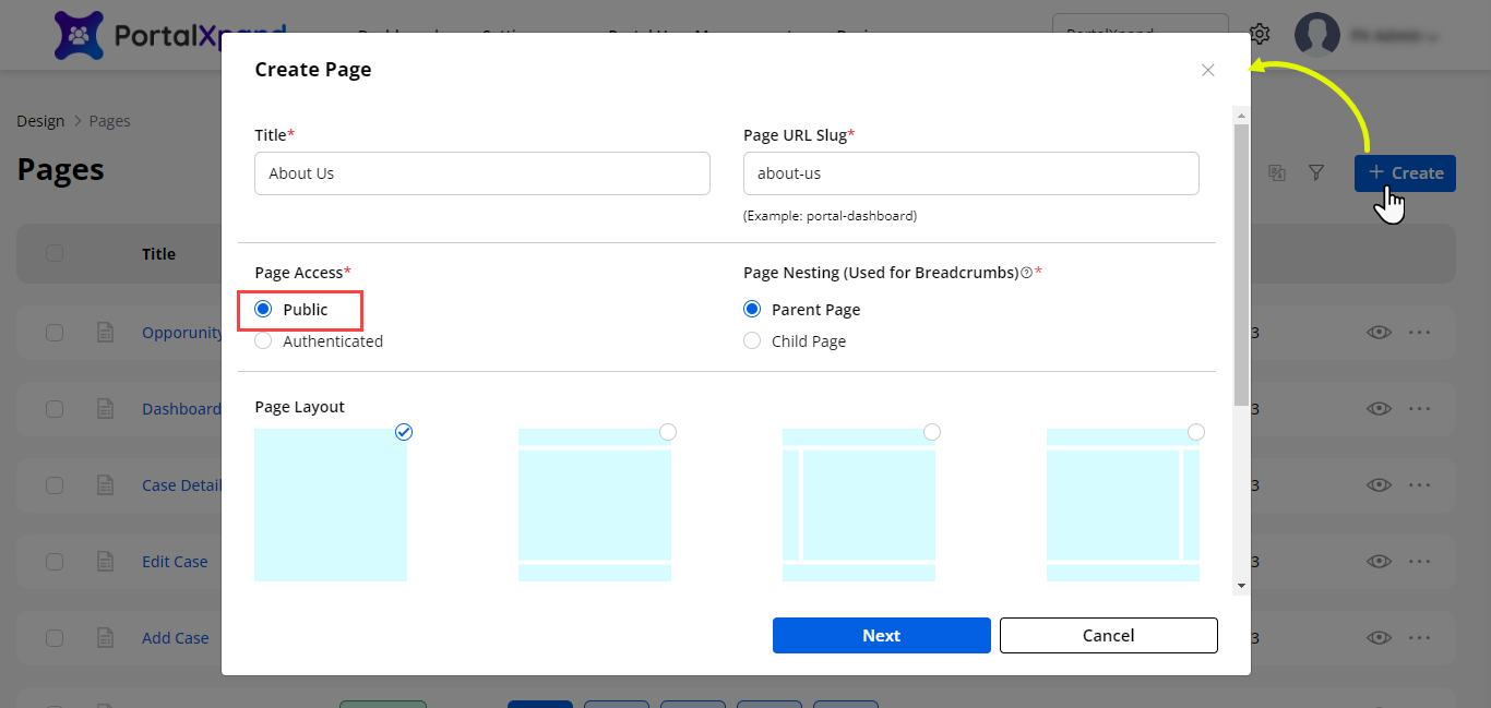
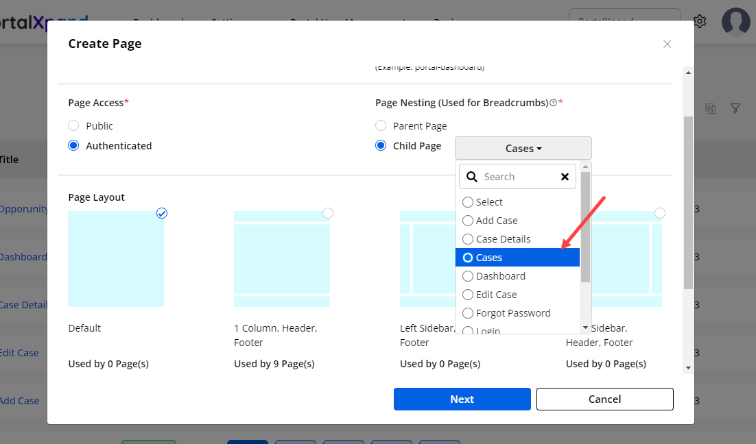
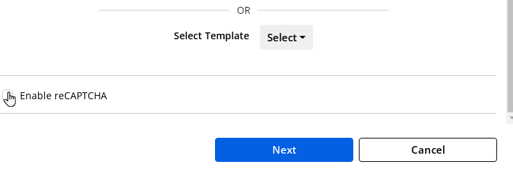
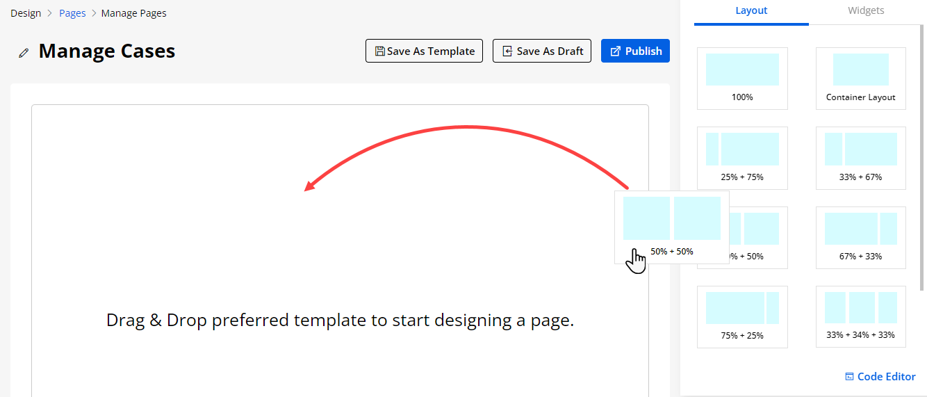
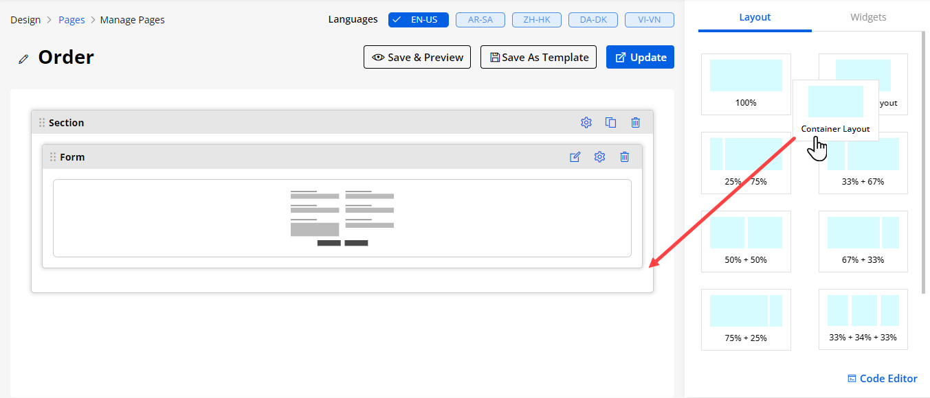
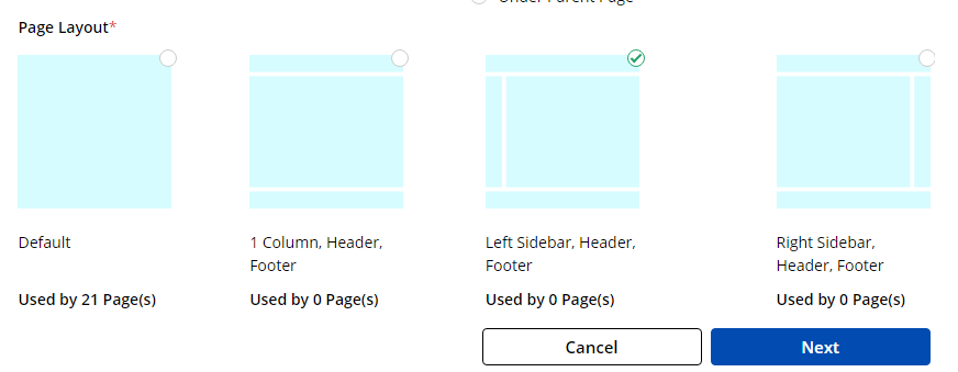
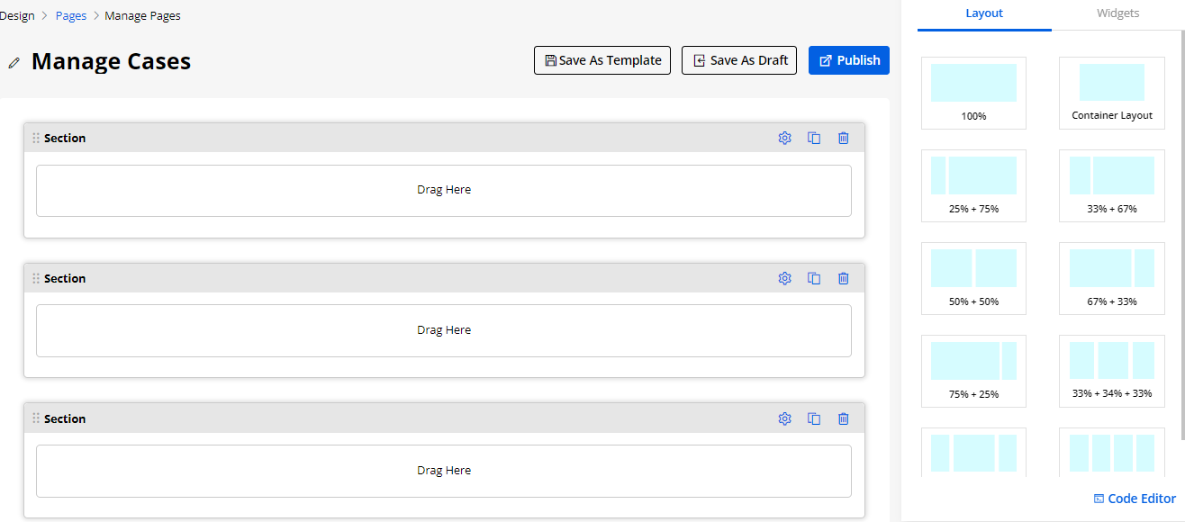
Add Form Access to Public
-
You can set up the inquiry form, case registration form, etc. that will be displayed on the login page (public). For that, you need to select “Page Access” as Public while creating or editing the specific page.
-
Once you have created the page and added the layouts, you need to add the Form widget to the page layout and configure the Form details.
-
Once the ‘Form’ widget is configured to display it public (without login), the portal users can access that form before logging in in from the customer portal.
-
You can preview the form view that is configured in the page as public page access.
Note: Once you add a new page, you also need to select that page in the Menu (Design → Menu). Only then it will be accessible to the portal users on the customer portal side.
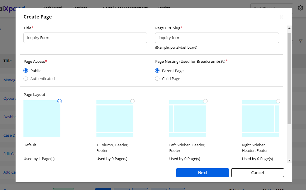
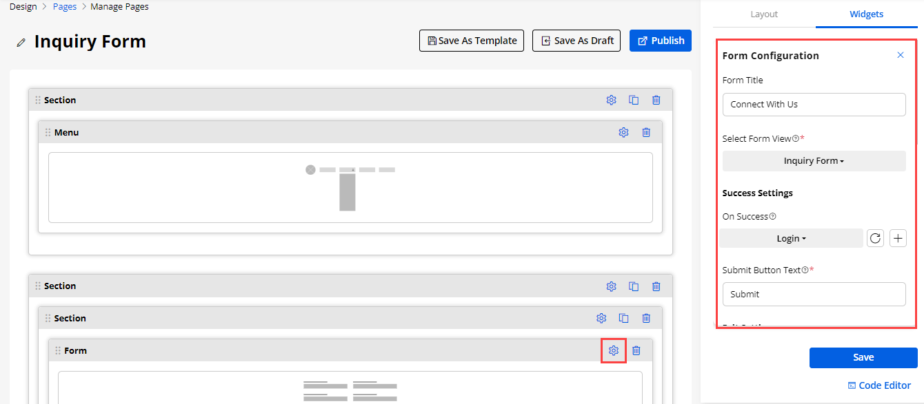
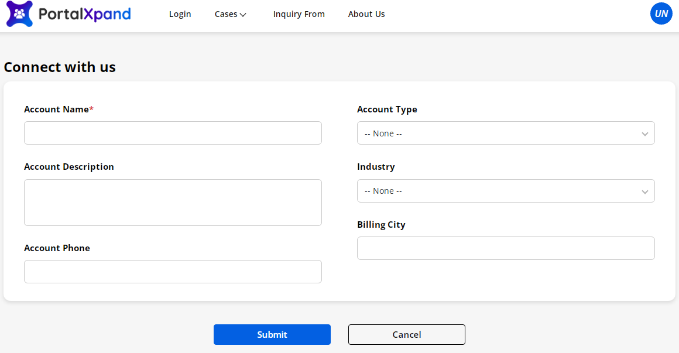
Templates (Template Builder)
-
Navigate to the Templates (Design → Templates) to design and create a generic template for the different pages.
-
If the design and layout of the different Object pages are the same, you can create a template for the reusability of your layout design and widget.
-
You can design the layout and add the required widget that will be common for the pages. So, you will not require to design the same page layout for the different Objects. The created templates can be used at the time of the creation of the pages.
-
By clicking on the ‘Templates’, you will get the list of the templates to create, edit and detail pages. You can see for which page the template is used at the time of creating a Page (Page builder).
-
Duplicate and delete the templates by multiple selecting the template records.
-
You can filter the template records.
-
By clicking on the ‘ellipsis’ icon of the specific template, you can Edit, Delete, and Duplicate the template.
Create Template
-
By clicking on the + Create button, you can create a new template by designing a layout and adding a widget.
-
Insert a relevant Title to identify the template during page creation and by clicking on the Next button, you will navigate to the page layout to design the template.
-
Here you can drag and drop the design layout under the ‘Layout’ tab and insert the required widgets from the ‘Widgets’ tab.
-
After designing the template, click on the Save button to create and save the template. Admin users can also edit the existing template as per requirement or design change.
-
When Admin users create the Page, on the “Create Page” popup, they can create a new page either by selecting the Page Layout or selecting the relevant Template from the drop-down list. They will get the Select Template dropdown of the created template.
-
By selecting the required template, you will navigate to the page layout with the designed layout.
After designing the layout, you can save it as a template by clicking on the Save As Template button.
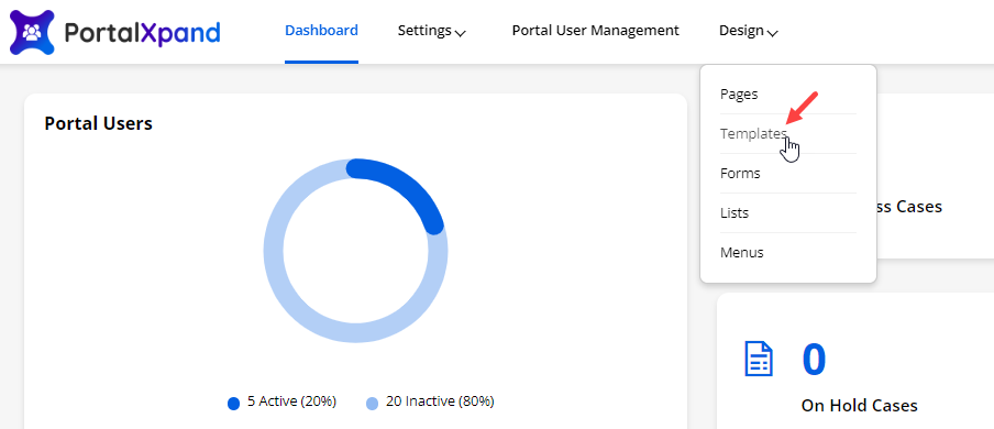
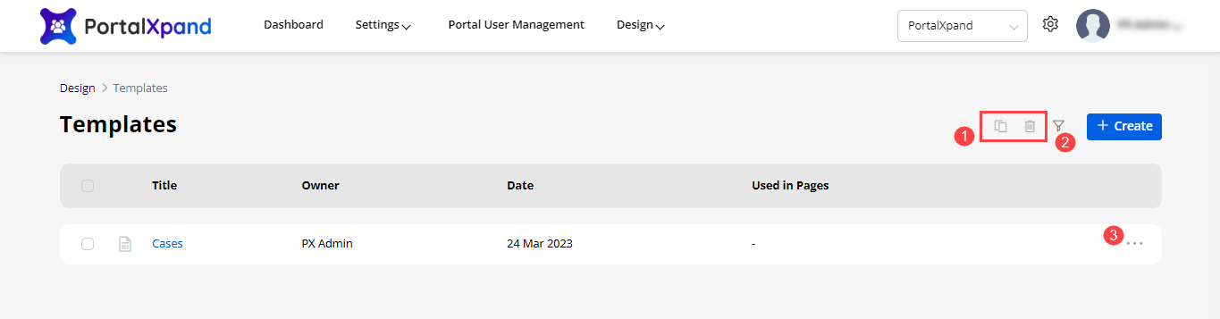
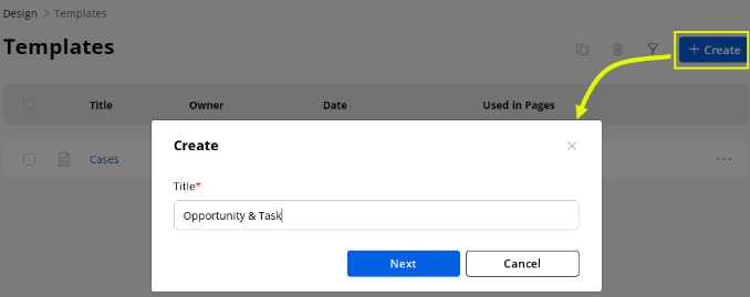
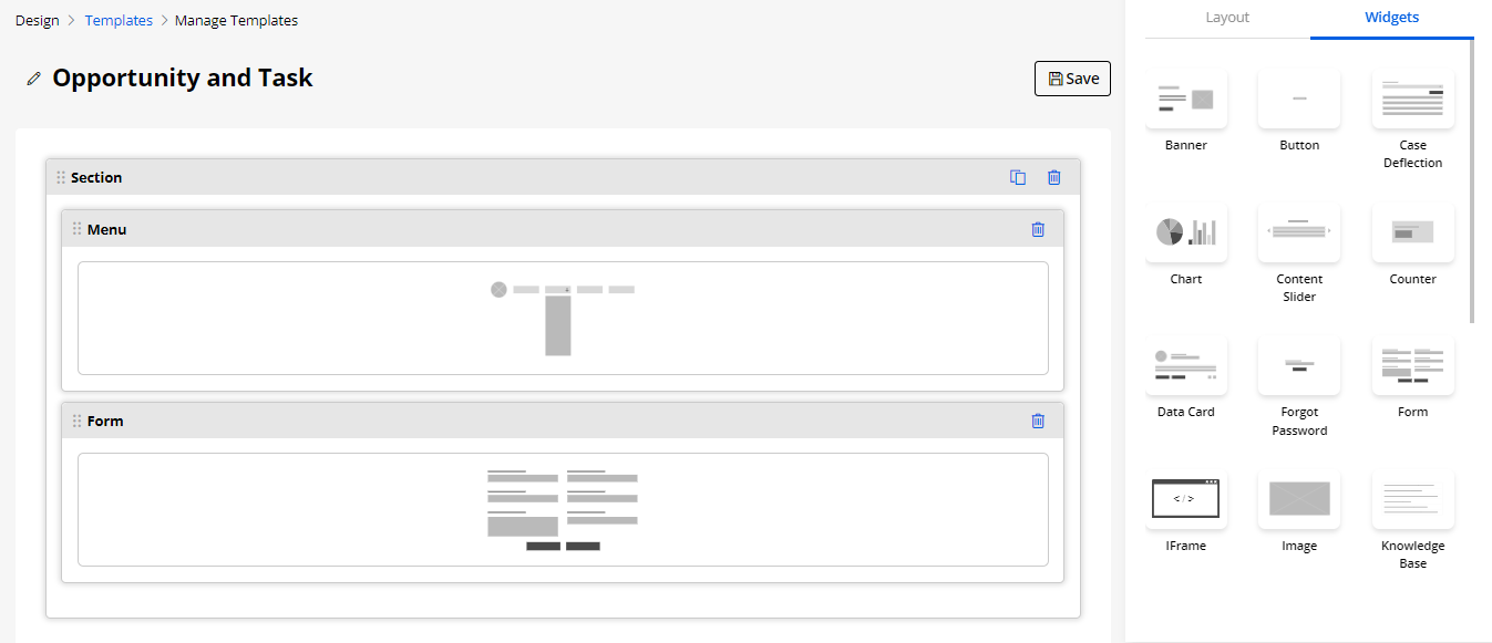
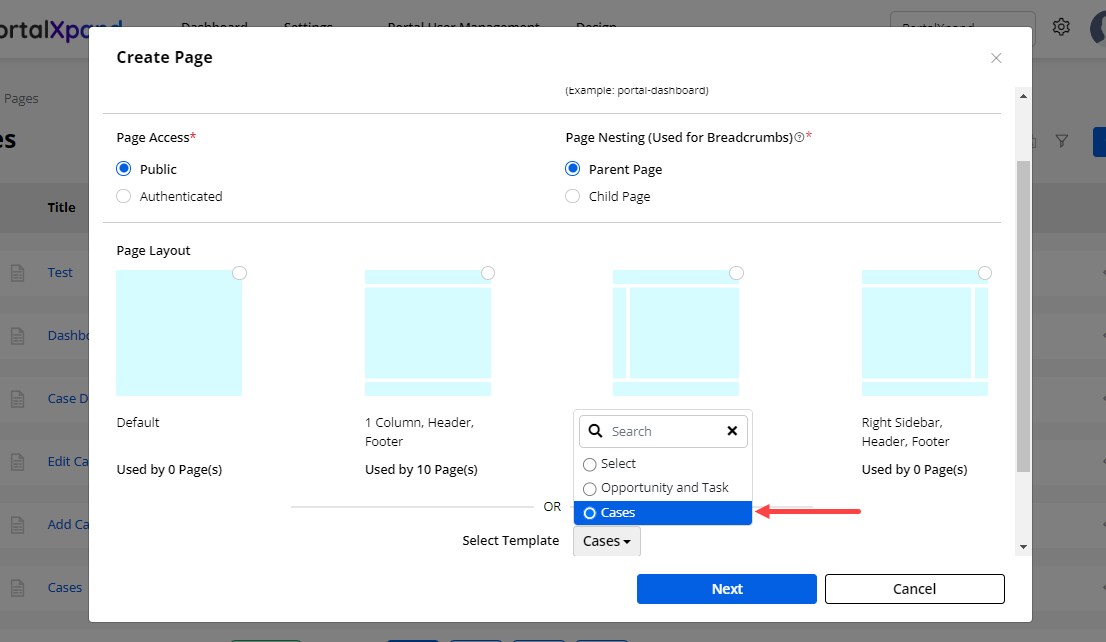
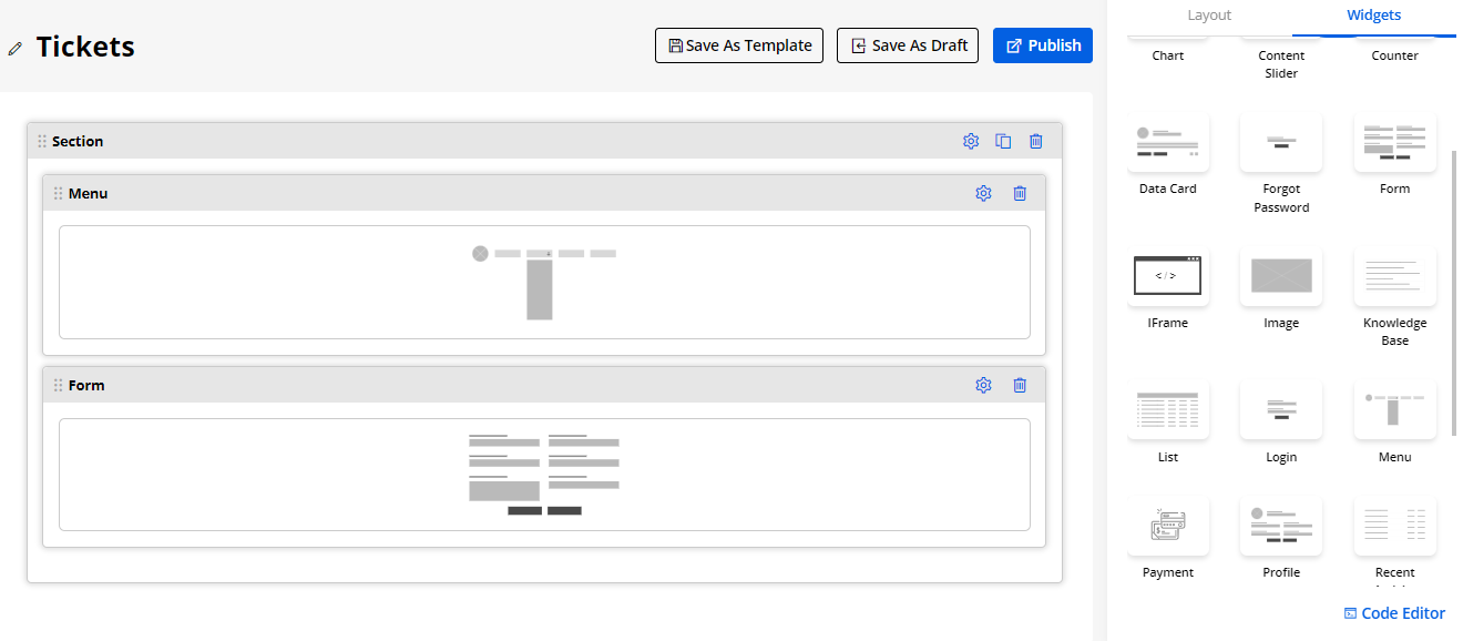
Menu Builder
-
You can create and customize the Customer Portal Menu to display when the user’s login into the customer portal. You can change the following settings for the Menu.
-
To create a menu, navigate to the Design->Menus.
-
By clicking on the Menu Builder, you will navigate to the Menus page where you can see the existing created menus list.
-
From the list of the ‘Menu Builder’, you can perform actions like Filter the specific Page, duplicate, or delete, preview, and edit the Menu. You can also Replace the Menu by selecting the specific pages from the list of all the pages.
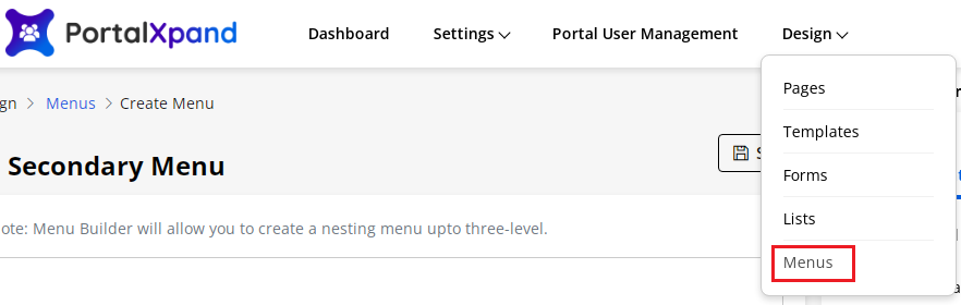
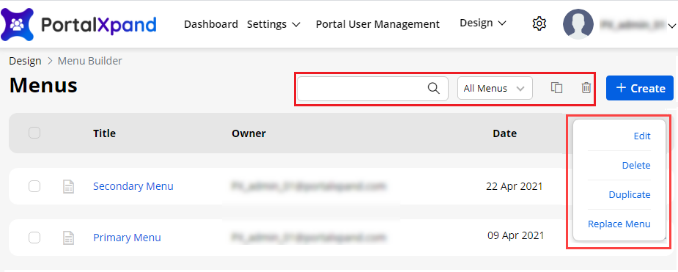
Create Menu
-
Now, by clicking on the + Create button, you can create a Menu.
-
By clicking on the Next button, you will navigate to the “Create Menu” page. You need to select the pages for menu items.
-
Here you will get 3-tabs under the Pages where you can find the Pages:
– Most Recent: You will get the most recently created pages list.
– View All: You will get all the pages list.
– Search: You can search the specific page by inserting the page name.
- You can also add the Custom Link as a Menu Item.
– Menu Title: Insert the Menu Text caption that you want to display.
– URL: Insert the ‘URL’ where you want to navigate the users.
-
By clicking on the “Add to Menu” button, the custom link menu item will be added on the left side.
-
You can simply drag & drop the Menu Items and set them as a sub-menu item under any main menu item. You will have 3 level menu navigation.
-
You can also edit the Menu Items by clicking on the down arrow.
– Menu Item Label: Insert the Menu label caption.
– URL: You will get the URL of the menu item. If you have added the custom link, a custom URL will be shown.
– Is Active: Enable/Disable the Menu item for the customer portal.
– Select Role: You can enable the Menus for the Roles. Not all users can be accessible for all the menus. Check the checkbox of the role to enable the menu. Here, the searchable drop-down is given to search for a specific role.
– Language: The configured language will be visible here. By clicking on any language, you can set the ‘Label’ for the translation to be visible on the portal. Click on Ok to save the changes.
Note: The portal users will get the Menu access as per the role selection here once they log in to the portal (after login). So, the portal users will log in to the portal, they will get their accessible menu as per the role selection under the Menu detail.
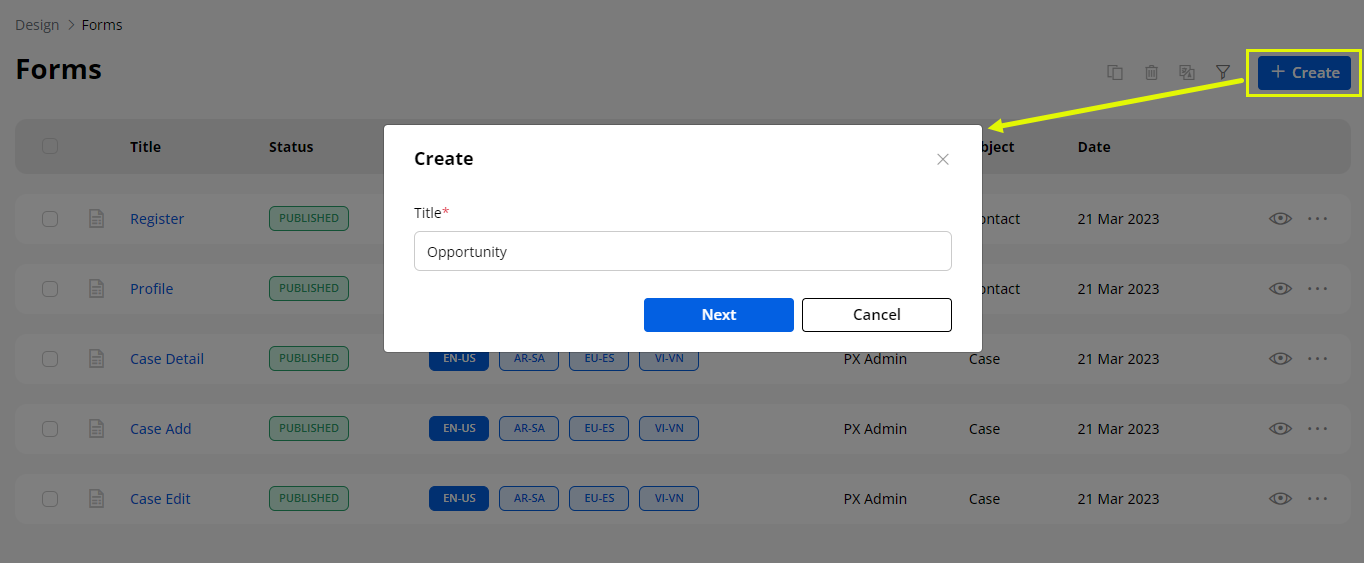
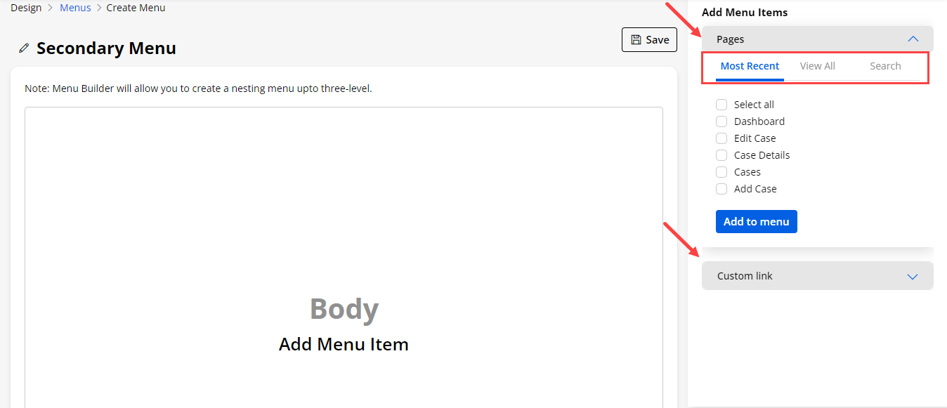
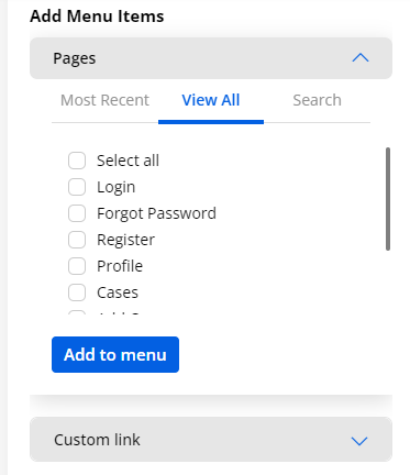
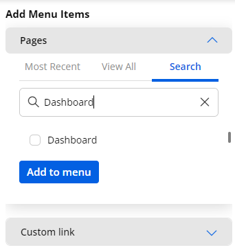
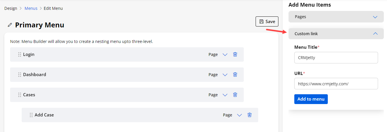
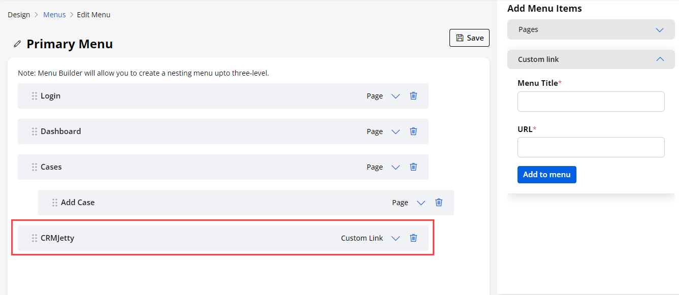
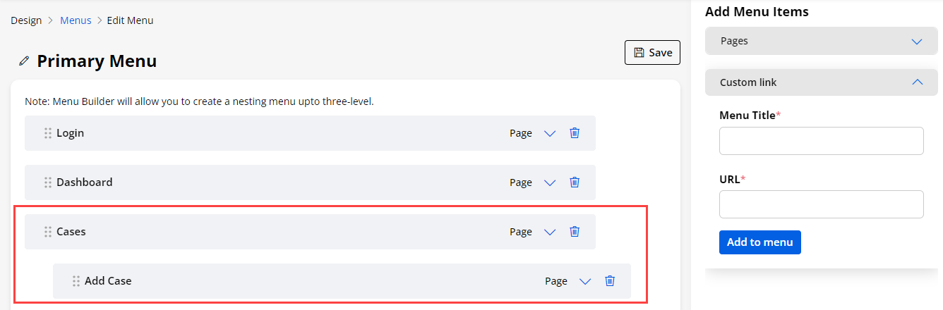
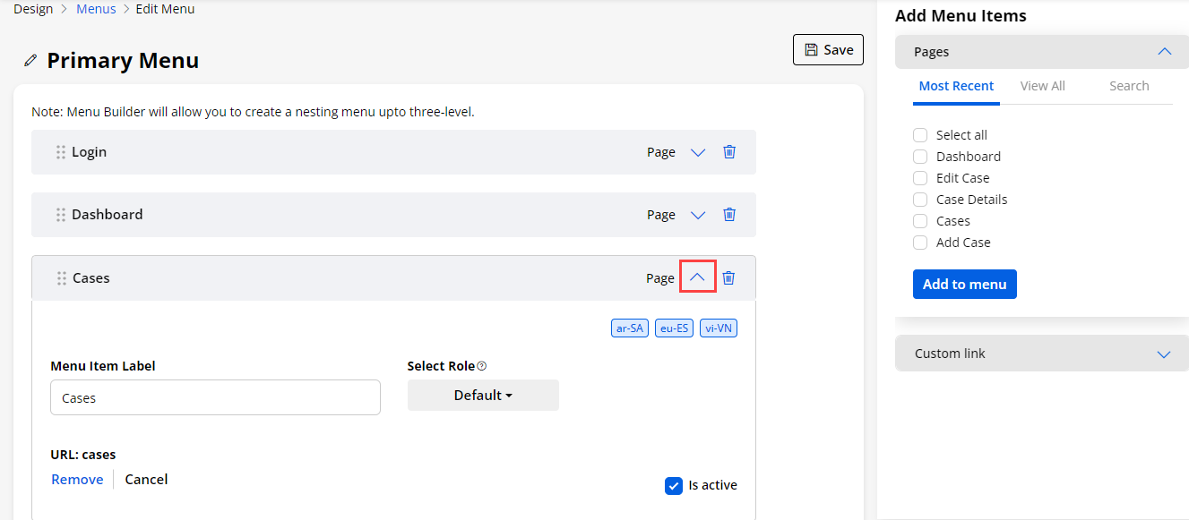
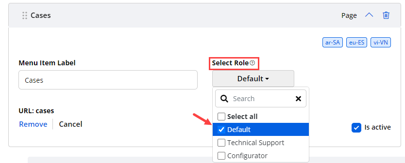
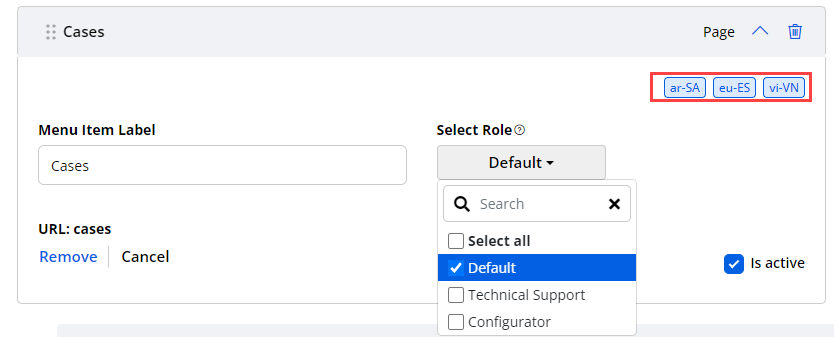
Replace Menu
-
When you have used menus in lots of pages and it is required to change the menu for some pages, the Menu Replacement feature is provided. You can choose the menu that you want to replace.
-
By clicking on the ‘options’ icon of the menu, you will get an option of Replace Menu.
-
By clicking on the ‘Replace Menu’, you will get the Menu Replacement popup from where you can select the menu that you want to Replace with it. So, you will not be required to navigate to the individual pages and update the menu.
-
You will get all the pages in which the selected menu is used. Select the required pages that you want to replace the menu for.
-
By clicking on the “Replace” button, the pages will be replaced by the selected menu.
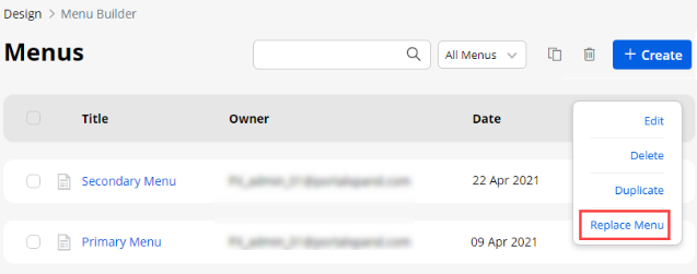
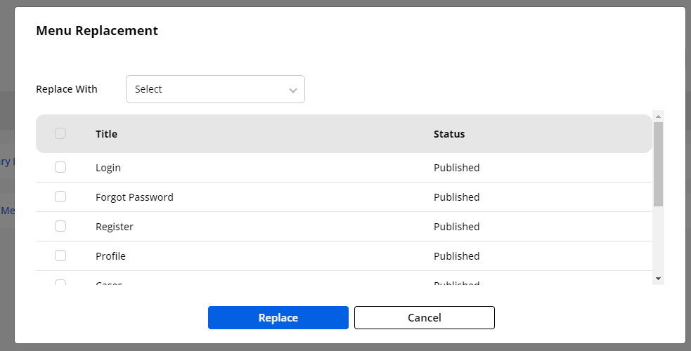
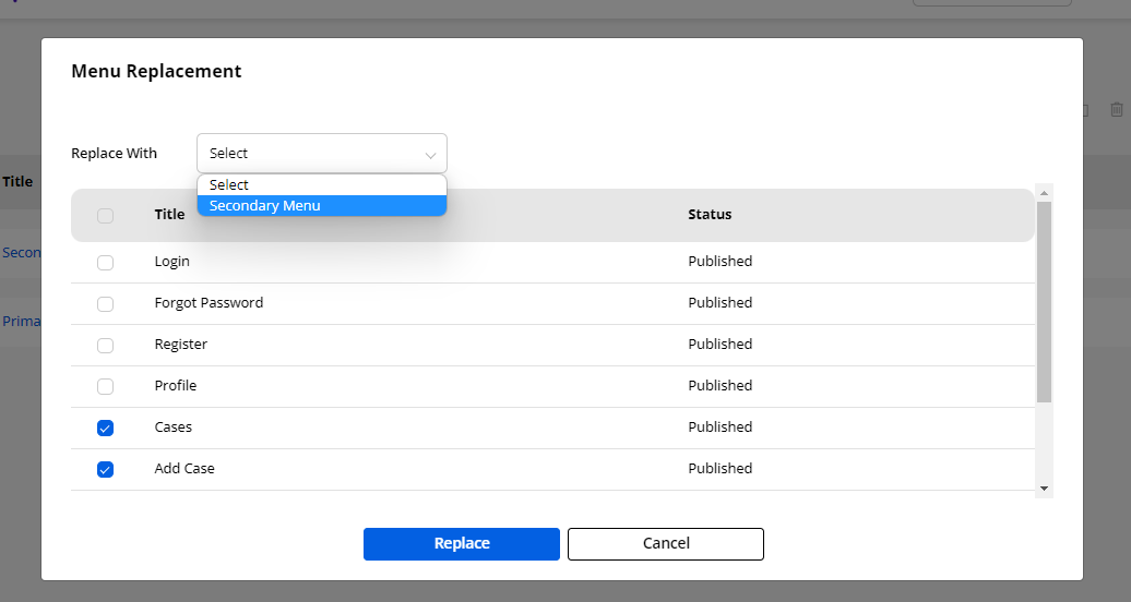
List Builder
-
You can design and configure the listing view for the different Objects. You can create, edit, review, and publish lists that will be used in page builders. You can design the dynamic layout of the list view using the Salesforce CRM fields.
-
By clicking on the “List Builder”, you will navigate to the listing page of the List.
1. By selecting the listing record(s), you can duplicate or delete the record(s).
2. You can filter and search the specific list records by clicking on the ‘Filter’ icon.
3. You can ‘preview’ the List view design by clicking on the ‘eye’ (preview) icon.
4. If you have enabled the multiple languages then you will have the ‘Translate’ icon. By clicking on this icon you will be able to translate the list in portal.
-
In the languages column you can see the enabled languages in the portal.
-
Here the translated languages will be shown in the dark-colored button and the languages that are not translated yet will be shown in the light-colored button.
5. You can also auto translate the list if you have enabled the languages.
-
You can filter the listing records by inserting the “Title”, “Status”, “Owner”, “Object”, and “Date”. After inserting the title and/or selecting details, click on the Apply button to filter the listing.
-
You can auto translate any selected list by clicking on the translate icon beside filter.
-
Now select the language in which you want to translate this list and click on the Change button.
-
By clicking on the ‘preview’ (eye) icon, you can preview the designed list view record.
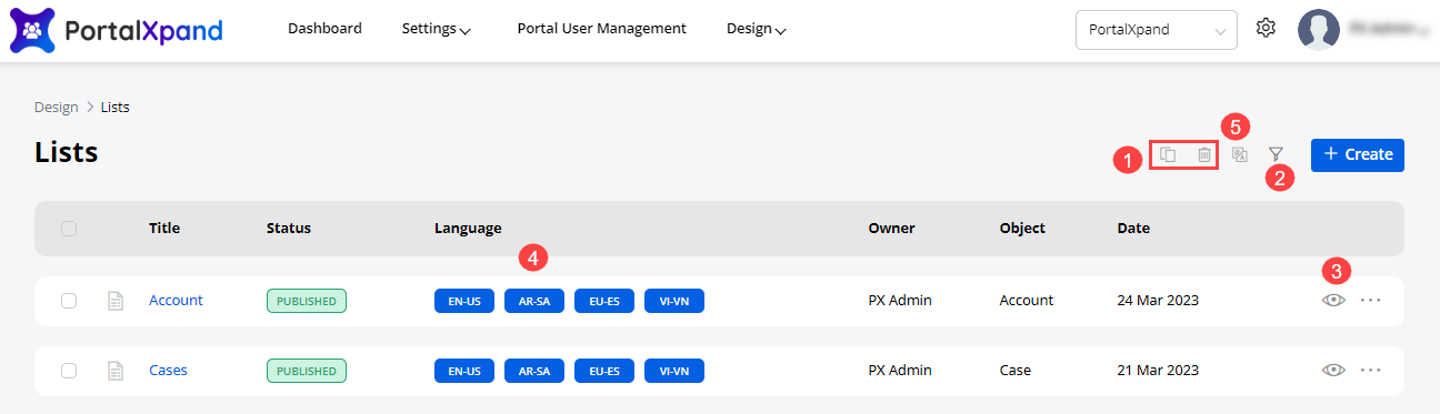
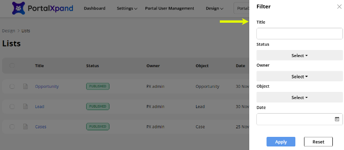
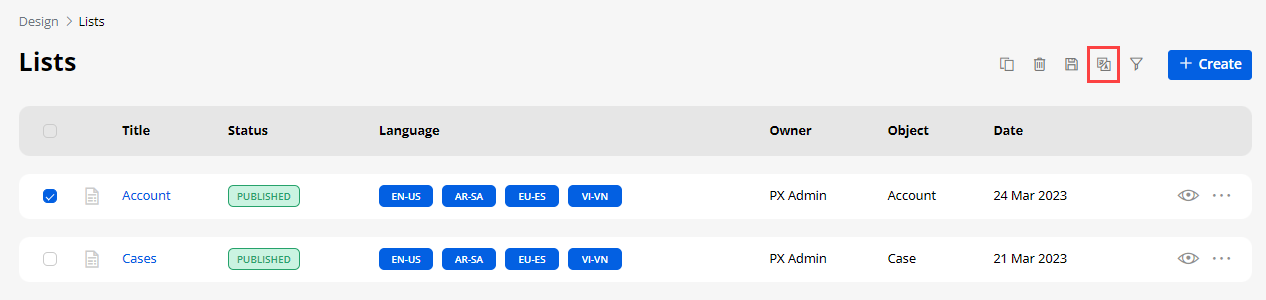
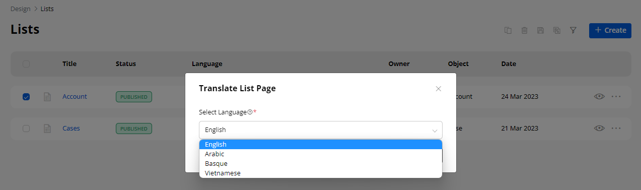
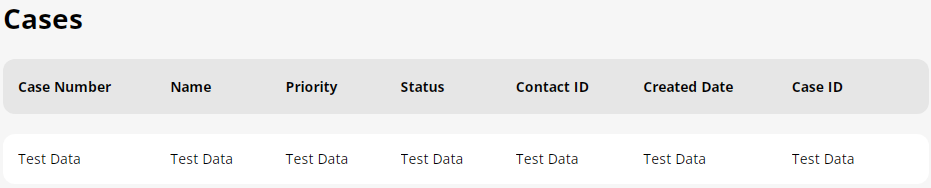
Translate List records (multi-language)
-
From the listing page of the ‘List’ builder records, all the available languages will appear in the Language column. Here the translated languages will be shown in a dark colored button and the languages that are not translated yet will be shown in the light colored button.
-
You can translate the List record by clicking on the light colored button or selecting the specific record and click on the ‘Translate’ icon from the record options. Once you click on any of those options, the List builder record will automatically translate it to the selected language.
-
You can also translate the list layout records from its edit list. From the top you will find the “Languages” option and the enabled languages.
-
Here, the untranslated language can be seen in the light-colored. By clicking on it the content of the list layouts will translate.
-
Once you translate the list layout record from the listing page or the Page layout edit page, it will take a few seconds to translate all the CRM content like text labels & messages and you will get an success message on the screen.
Multiple records Translation
- You can also translate the list layout records in bulk by multiple selections.
Note: If only two languages are enabled, the records will be translated to other languages automatically. But, if the enabled languages are more than two, you will get a dropdown selection to select any one language to translate the selected records.
- After translating multiple records, a Report will pop up on the screen. This pop-up will display the translated status of the records.
Note: Make sure you have translated all the fields in the Settings > Portal Settings > Language Settings for the language to properly translate the fields.
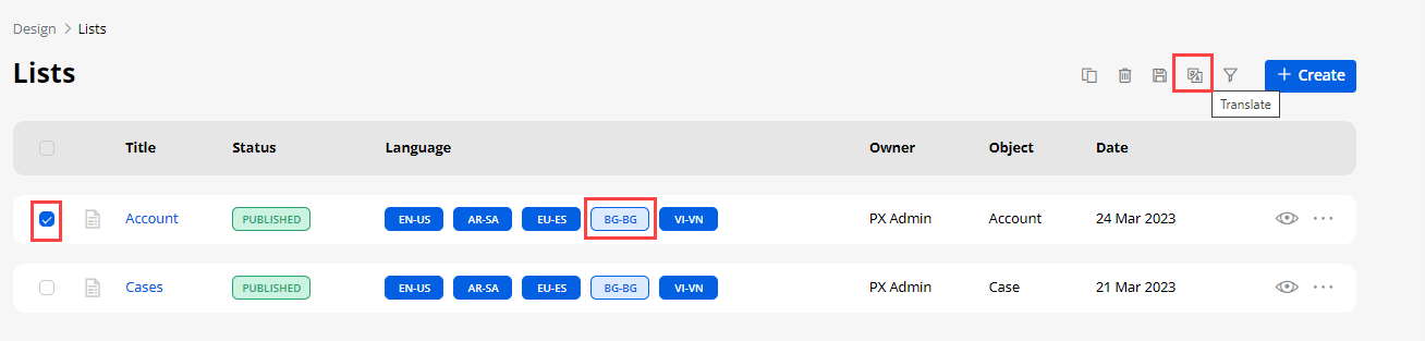
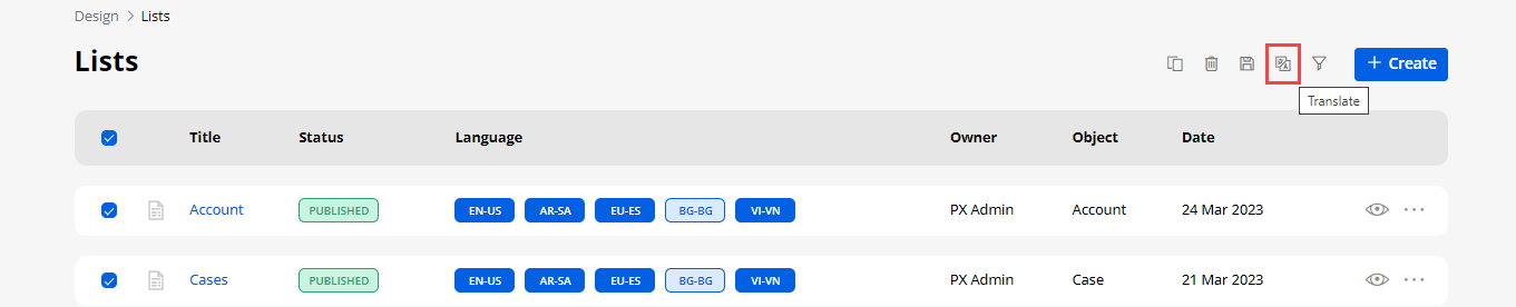
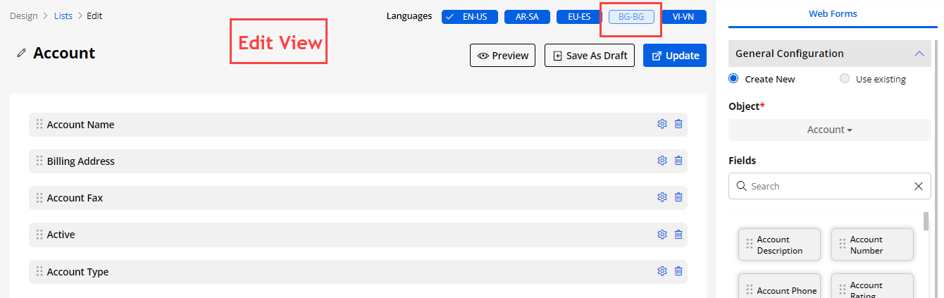
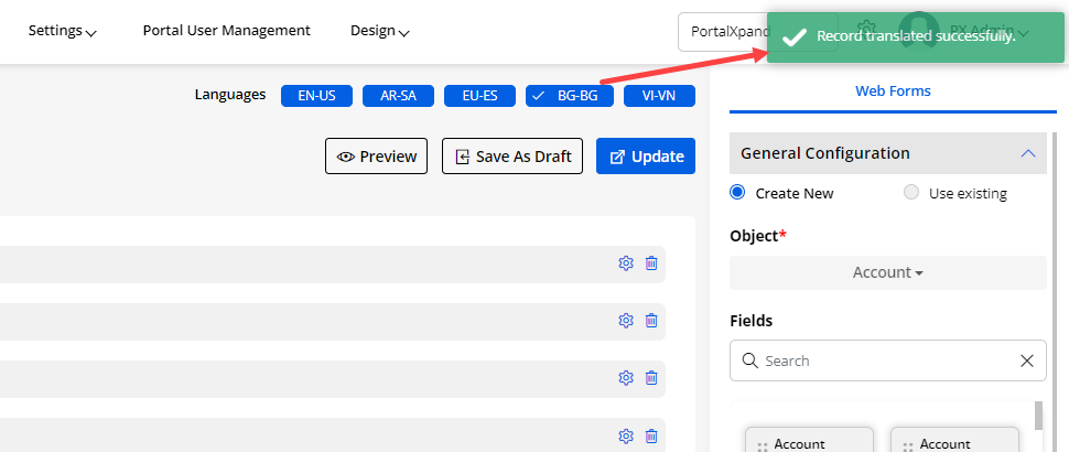
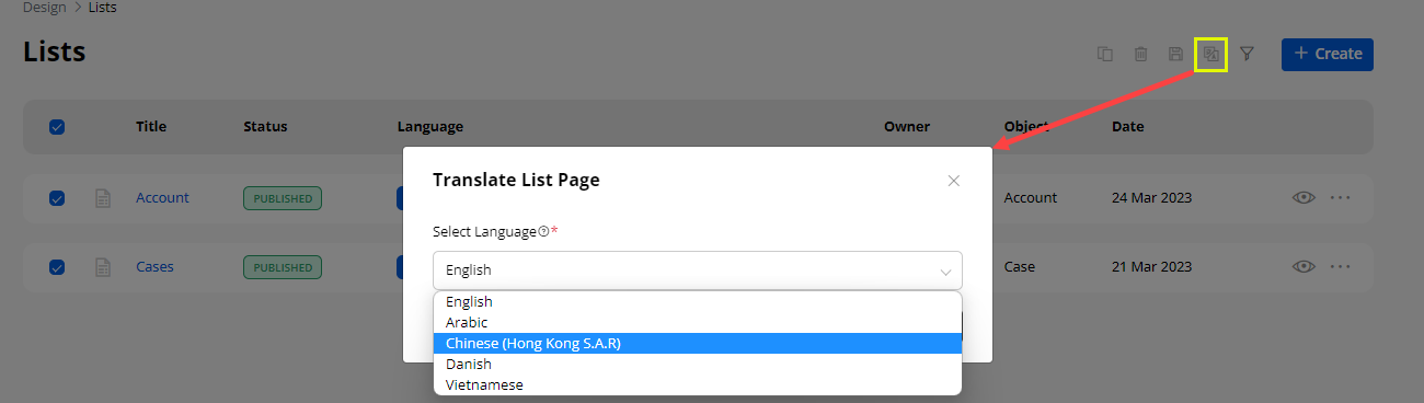
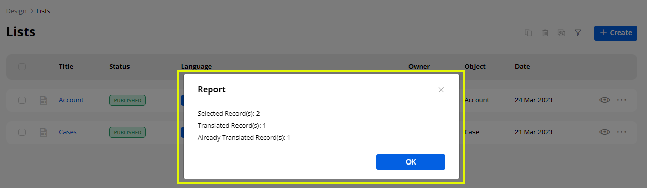
Payment Configuration
-
You can enable the “Payment Configuration” from the right-side panel for the list record of the specific object.
-
By clicking on the “Payment Configuration”, you will get the following options to provide the Payment option to the portal users in the customer portal:
– Enable Payment: You must tick the checkbox of the “Enable Payment”.
Note: You can only enable this feature if the object has the Amount (Currency) type field.
– Button Label: Insert the text label to display as an option in the context menu of the record.
– Enable PageRedirection : Enable this option and Select the page where you would like to redirect the portal users when they click on the payment option.
– Select Amount Field: You need to select the field of the object which you would like to add as an amount field to make payments.
– Set Conditional Field to Enable Pay Button: You need to select the field for the object on which you would like to display the Pay button.
– Set Conditional Field Value to Enable Pay Button: You need to select the conditional value field to enable the “Pay” button. You can select Multiple values as per your requirement.
– Transaction Log Settings: You need to select the Transaction Log Settings to sync the data of the transaction log in CRM.
– Select Transaction Object: You need to select the transaction object to add the transaction details.
– Select Description Field: You need to select the object field you want to add as a short description field.
– Select Payment Object: You need to select the field of the selected transaction object to add as a payment object field.
– Select Payment Record: You need to select the field of the selected transaction object to add as a payment record field.
– Select Payment Method: You need to select the field of the selected transaction object to add it as a payment method field.
– Set Amount Field: You need to select the field of the selected transaction object on which you would like to make payment.
– Select Payment Transaction Log: You need to select the field of the transaction object which you would like to add as Payment Transaction Log field.
– Select Payment Status: You need to select the field of the selected transaction object which you would like to add as Payment Status field.
- After configuring the Payment Method, you need to save the changes and Publish the page to apply the changes in the customer portal.
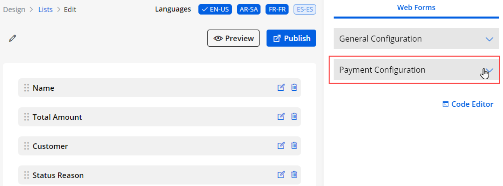
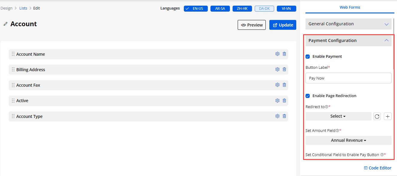
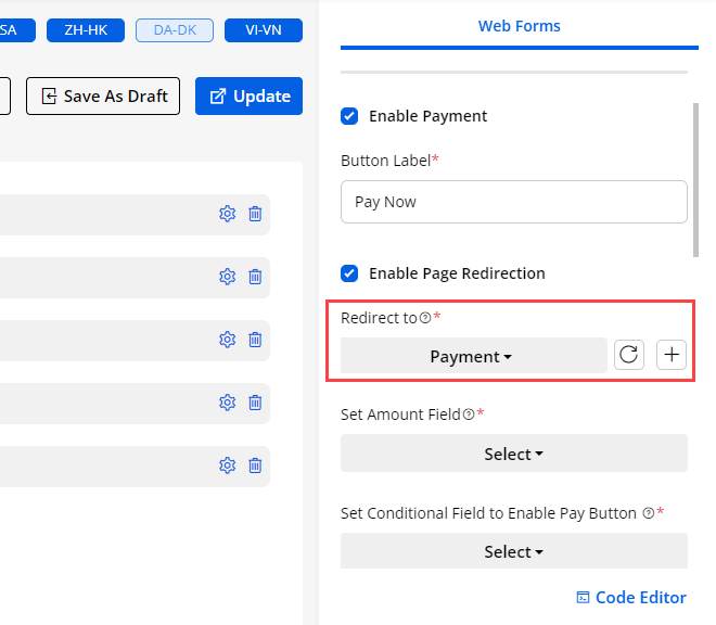
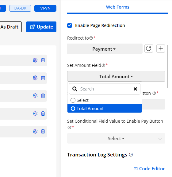
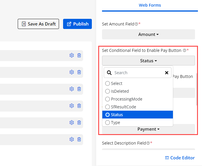
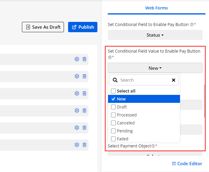
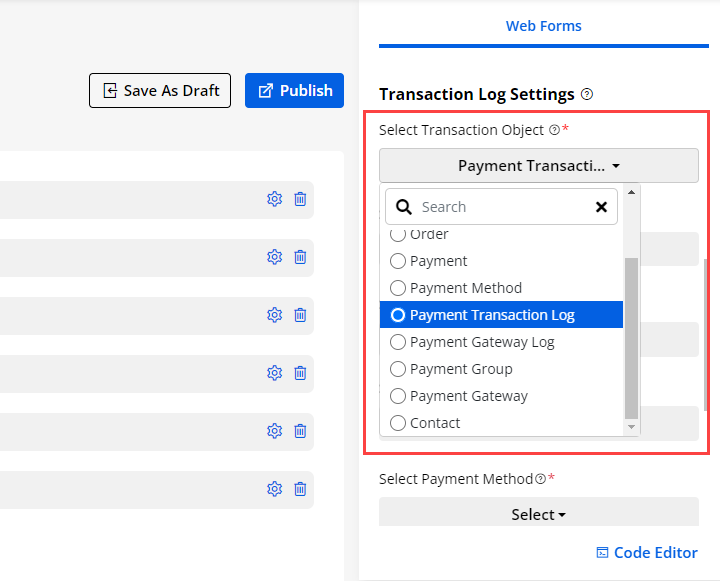
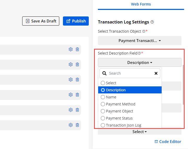
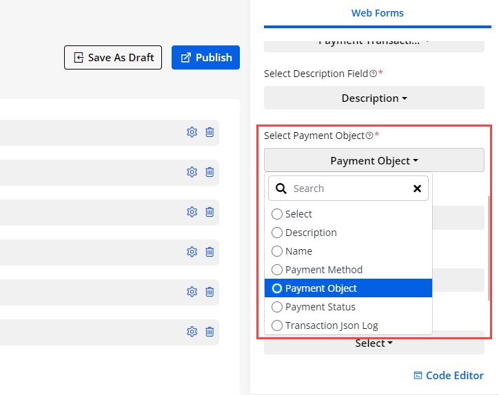
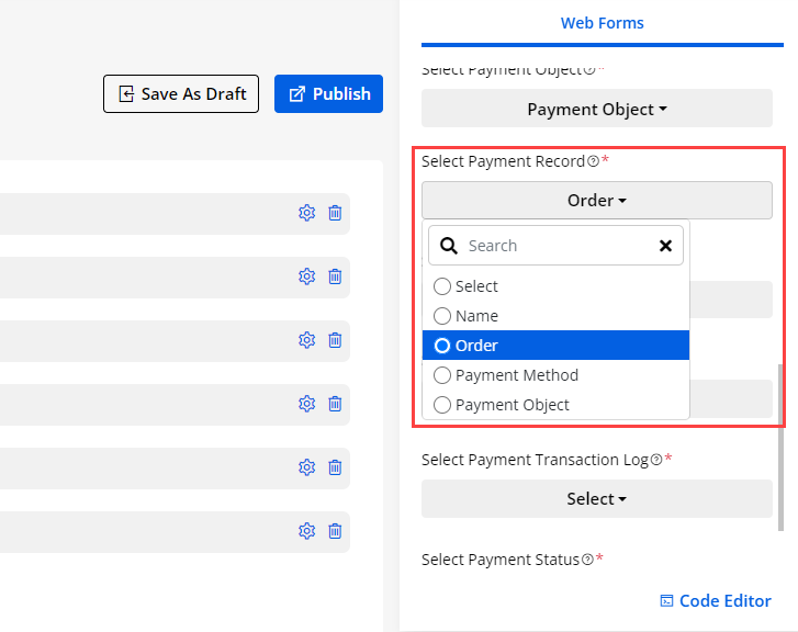
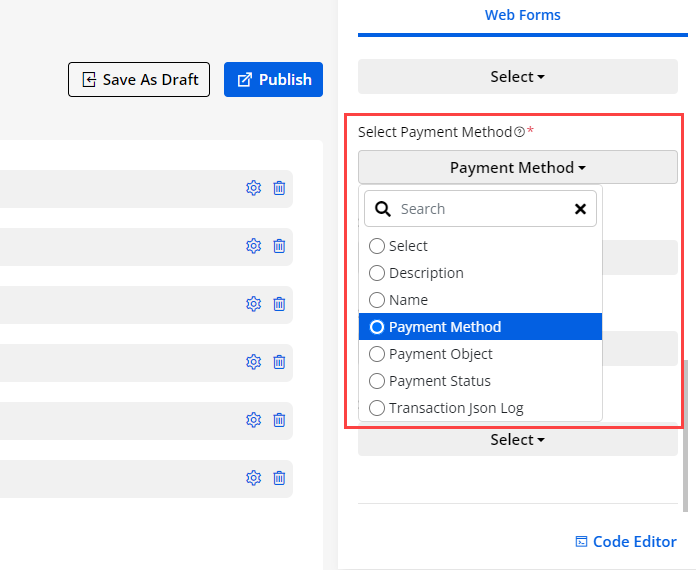
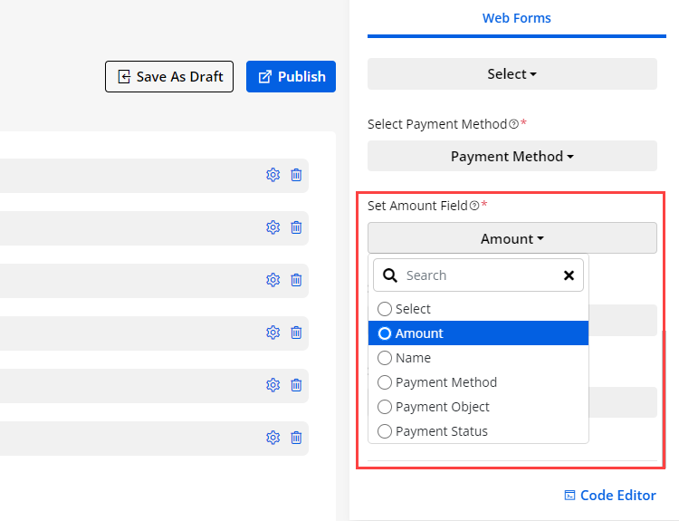
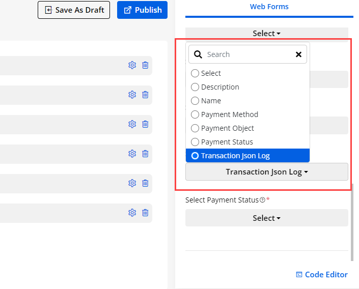
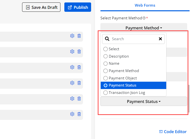
Publish/Draft List Records
-
If any listing page is already published, you will get the “Draft” option here. But if the list page is in the ‘Draft mode’, you will get the Publish option.
-
If you select multiple list records containing draft and published status, then all those lists will be converted to published status. If you have selected all the published list records, they will be converted to draft.
Note:
-
You can move into the ‘Draft’ mode only if the list is not used in the Page Builder for a specific page.
-
By clicking on the ‘Edit’ option, you can edit the list page. You can drag & drop the ‘Fields’ from right to the body of the selected Object.
Note: If you are editing any List page, you cannot edit/change the Object and cannot use the ready list from CRM (Use Existing). You can edit the fields of the Object only.
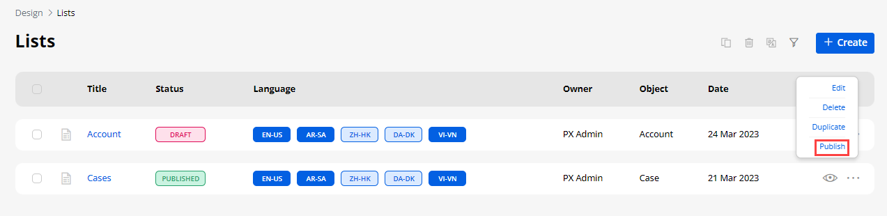
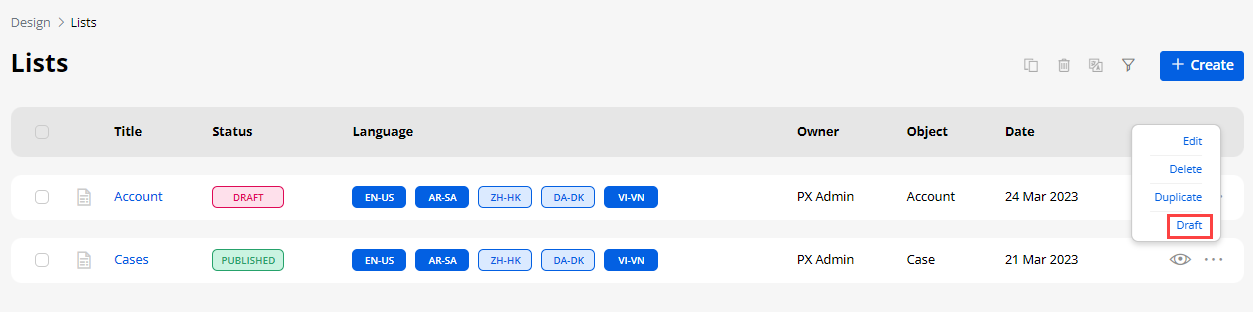
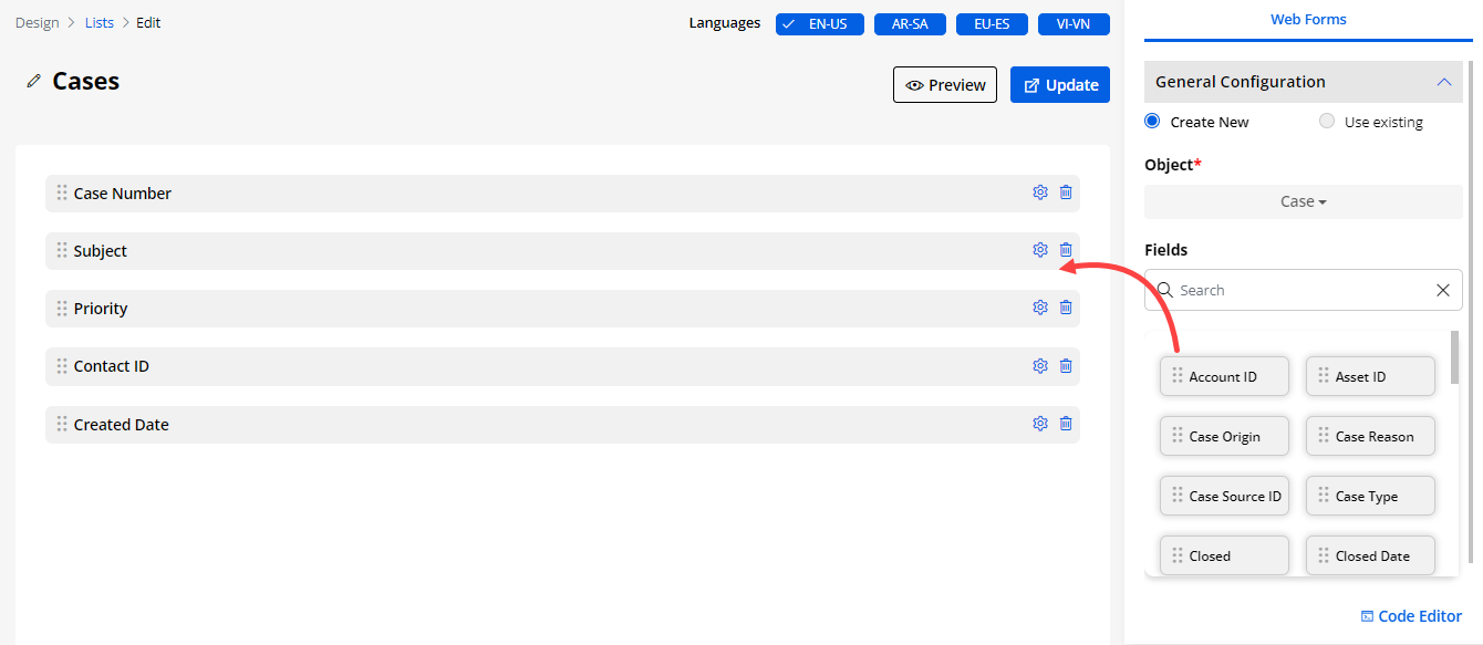
Create a new List layout
-
You can create a listing page for any other object. By clicking on the + Create button, a popup will appear where you need to insert the ‘Title’ of the list page.
-
Click on the Next button to design the listing page layout. You will land on the List layout design page.
From the right side, you can either Create a New List view or Use an existing ready list from CRM and it can be configured in the list builder. Select the Object for which you want to create a layout of the list view.
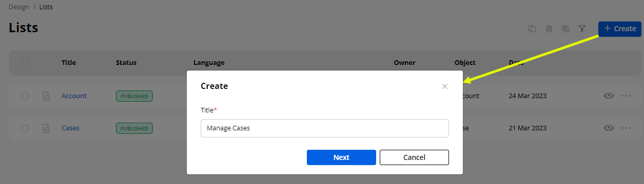
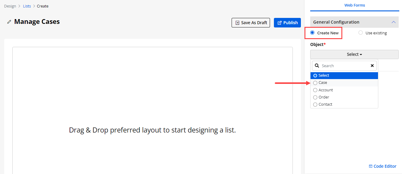
Selecting ‘Create New’ layout
-
After selecting the ‘Object’, you will get the list of the Fields that are enabled from the Salesforce CRM side. You can simply drag & drop the required fields from right to left to add the columns for the list.
-
The search box is also provided if you want to search the field by inserting the text caption.
-
By clicking on the ‘Setting’ icon, you can see the Field Name and Data type of the field. You can also edit the field details. You can enable the filter option to provide the filter listing records on the customer portal side to portal users.
-
By ticking the “Enable for Filter” checkbox, the portal users will get the searchable option for the CRM Fields.
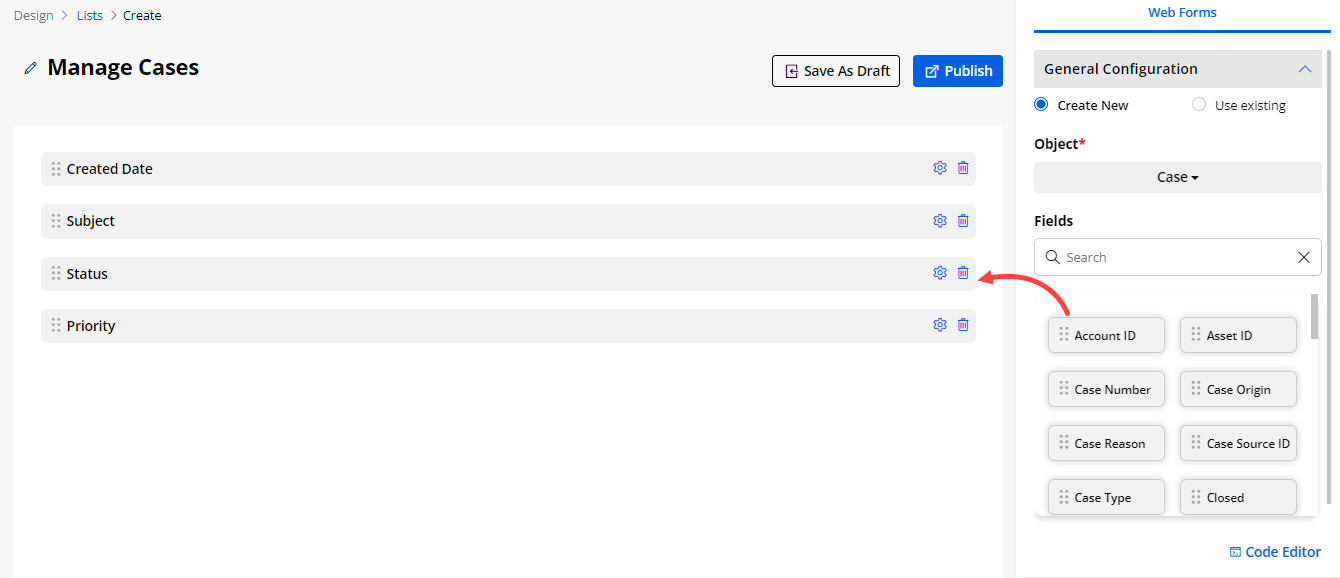
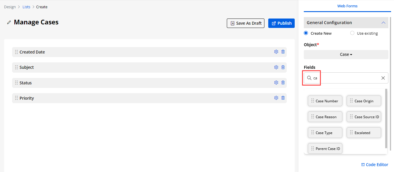
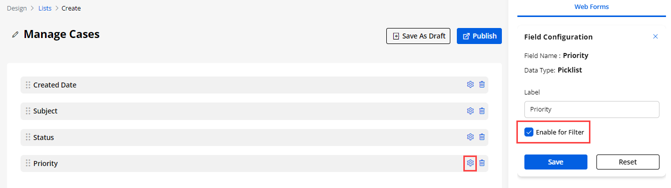
Show as Image
-
If the admin user wants to show in any field then there is “Show as Image” option in the Field Configuration. which can show the string value in the image.
-
For the better image admin needs to add the proper image path for the proper view in the protal. Else it will show the dummy image.
-
Click on the Settings icon and the field configurations will open up. Checkmark the “Show as Image” option.
Note: If you tick the “Show As Image” checkbox , “Enable for Filter” checkbox will be disabled. As filter is not applicable on image type data.
After updating, the Field labels click on the Save button and finalize the list builder by clicking on the Publish button. You can keep it as a draft by clicking on the Save As Draft button.
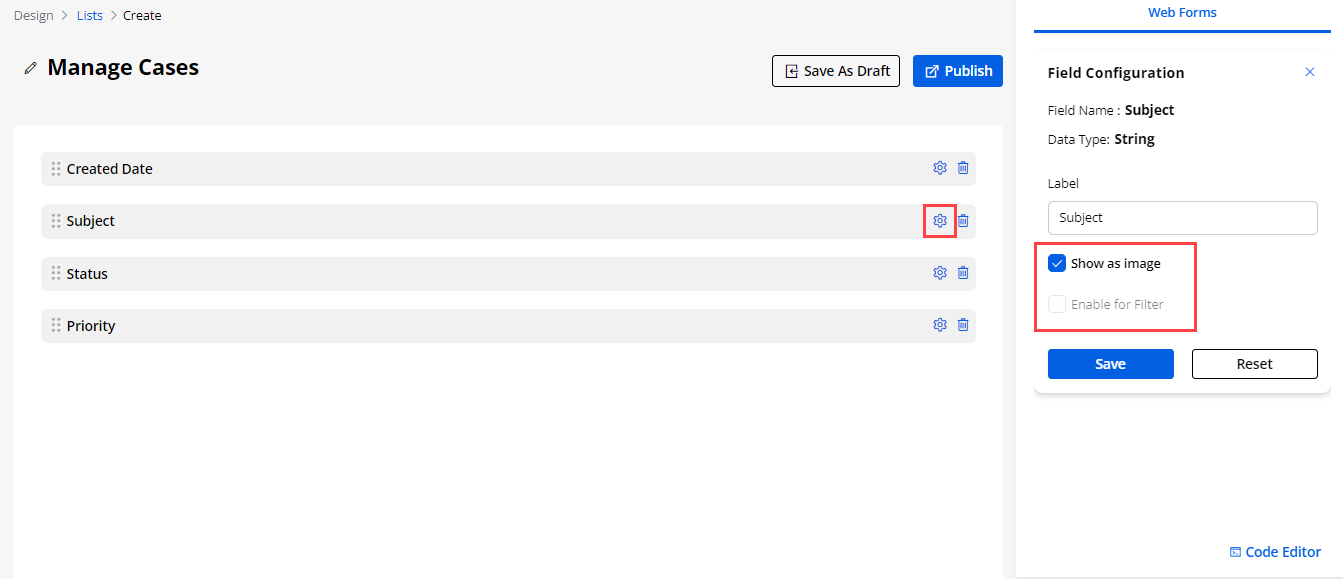
Manage Workflow
- If the field’s data type is lookup and the “Enable for Filter” checkbox is ticked, Workflow Setting will be visible. After ticking ‘Enable Workflow’ , Data Load dropdown will be visible with the workflows (with Data load action type and target object of the field) created in the Workflow Management.
Note: If you tick the “Show As Image” checkbox , “Enable for Filter” checkbox will be disabled. As filter is not applicable on image type data.
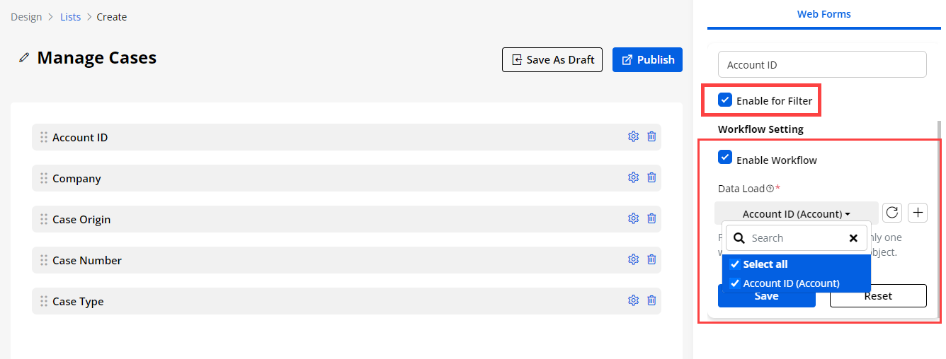
Selecting ‘Use Existing’
-
You can also get the ready-made ‘List view’ layout that is configured from the CRM. By selecting the Use Existing option, you will get all the ready List layouts (CRM Object views).
-
Once you select any ‘List view’ from the View drop-down, you will get the fields of that specific list view that are configured from the Salesforce CRM.
-
You can add/remove the Fields as per your requirement. You can drag & drop the fields from the list on the right side and you can remove any Field by clicking on the ‘delete’ icon.
-
By clicking on the ‘Settings’ icon, you can update and change the labels of any Field.
By editing any Field, you will see the “Data Type” of the fields. You can provide the filter options on the portal side in the list view by ticking the Enable for Filter option.
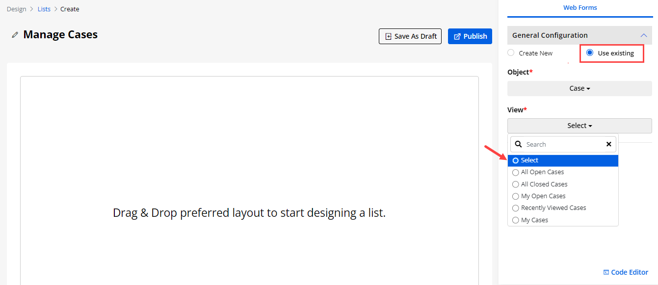
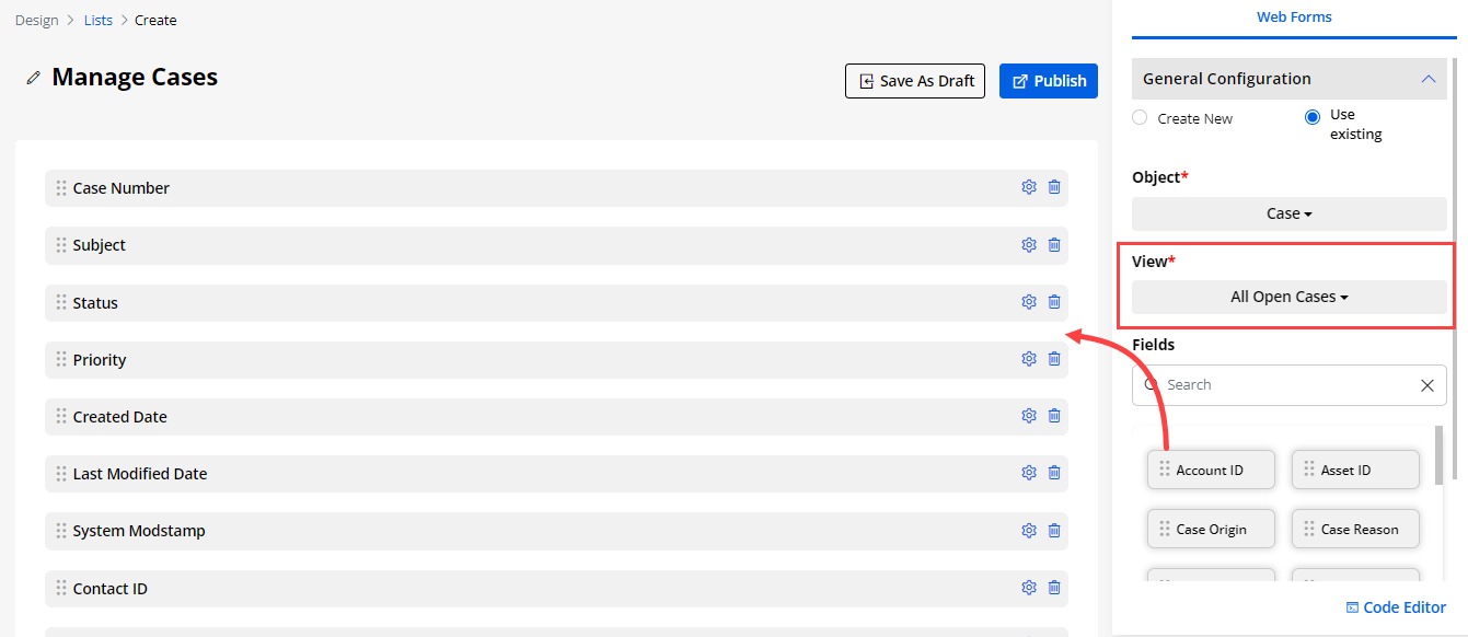
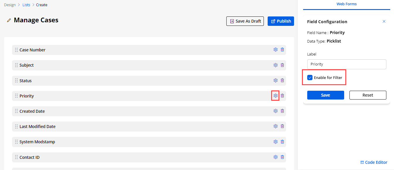
Using JS Code Editor
-
You can create or update the layout of the listview using JavaScript Code Editor if you have any custom JS code.
-
By clicking on the Code Editor, an editor will pop up where you can edit/paste your JS code. Once you edit/paste the JS code, click on the Save button and Publish the List builder record.
You can Preview the List builder to check how it looks.
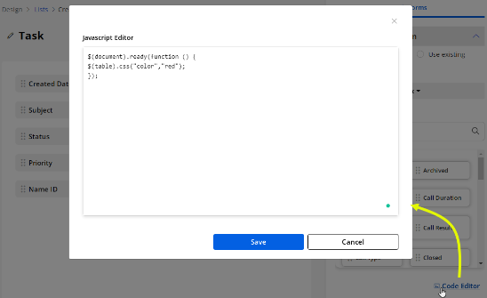

Form Builder
- Navigate to the Design ? Form Builder to design & configure the Form layout for the add/edit and the detail page of different Objects. You can design the dynamic layout of any Object form using the Salesforce CRM fields. You can design the layout of the form page of the portal. By clicking on the “Form Builder”, you will navigate the Form Builder page list.
1. By selecting the listing record(s), you can duplicate or delete the record(s).
2. You can filter and search the specific form records by clicking on the ‘Filter’ icon.
3. You can ‘preview’ the Form view design by clicking on the ‘eye’ (preview) icon.
-
You can filter the form listing records by inserting the “Title”, “Status”, “Owner”, “Object”, and “Date”. After inserting the title and/or selecting details, click on the Apply button to filter the listing.
-
By clicking on the ‘preview’ (eye) icon, you can preview the designed list view record.
4. If you have enabled the multiple languages then you will have the ‘Translate’ icon. By clicking on the icon you will be able to translate the forms in portal.
-
In the languages column you can see the enabled languages in the portal.
-
Here the translated languages will be shown in the dark-colored button and the languages that are not translated yet will be shown in the light-colored button.
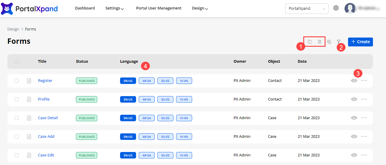
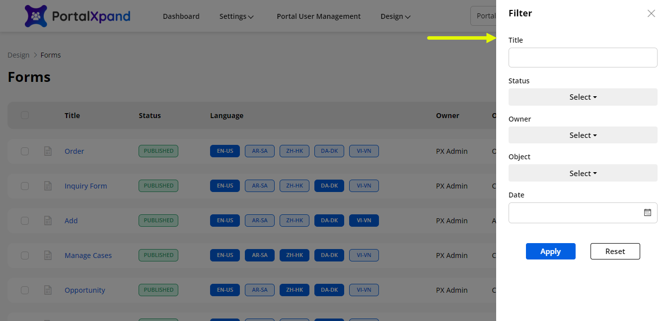
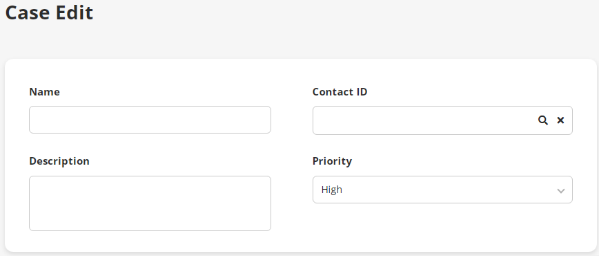
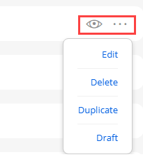
Publish/Draft Form Records
-
If any Form page is already published, you will get the “Draft” option here. But the list Form is in the ‘Draft mode’, you will get the Publish option.
-
If you select multiple form records containing draft and published status, then all those forms will be converted to published status.
-
If you have selected all the published form records, it will convert to the draft mode.
Note: You can move the form into the ‘Draft’ mode only if the list is not used in the Page Builder for a specific page.
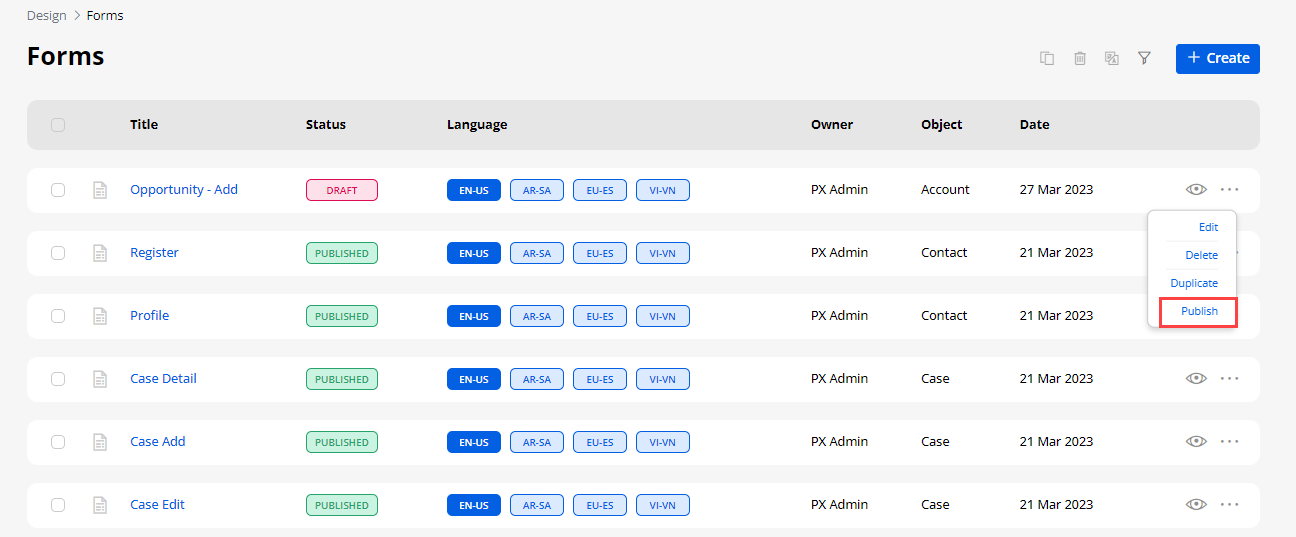
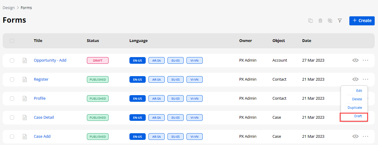
Edit Form
- By clicking on any form, you will navigate to its editing view. Under the “Form Grid”, you can edit the added Field’s label or delete it if not required.
Note: If you are editing the Form page, you cannot change the Object, Form Type, or cannot use the ready form from CRM (Use Existing). You can edit the fields of the Object and its Layout.
-
You can change the position of the inserted Fields under the Form Grid. You can move the fields to change the position in the From Grid and you can also move the inserted fields to another Form Grid.
-
When you move the field to change the position- in between, top, or bottom, the other fields will adjust accordingly.
-
You can preview the ‘Form’ by clicking on the Preview button; you can check the Object layout.
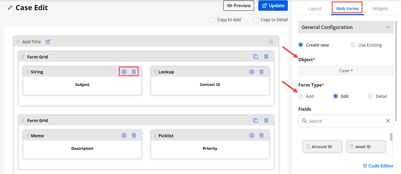
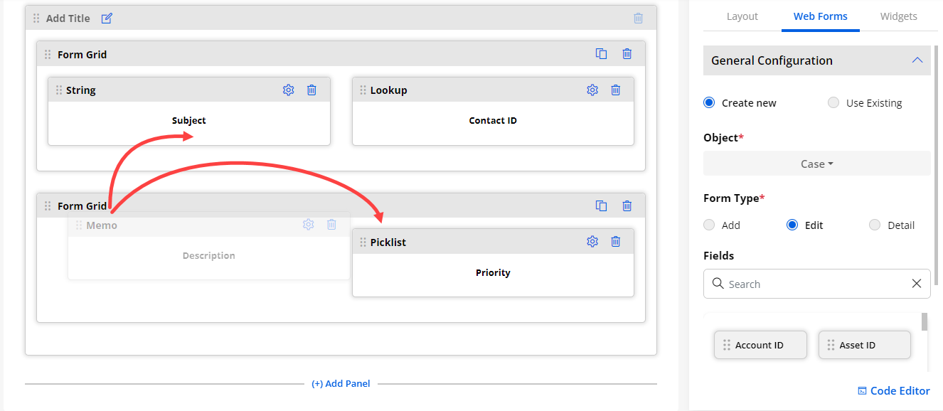
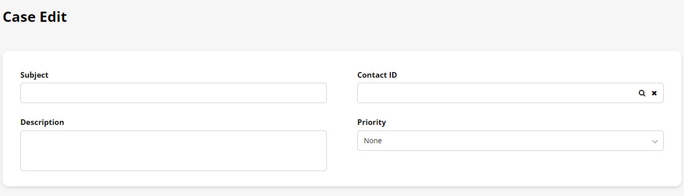
Static Setting for Mandatory field
-
If you are editing a form that has already been assigned to the page and you removed or missed any Fields (i.e. Username, Password) from the Form, you will get the error message that will display the Form is used on another page (i.e. Registration page) and it will require to add the missing fields (i.e., Username, Password)
-
So if the same form needs to be used on different pages but has different Fields, this conflicting message will appear during the editing and designing of the Form.
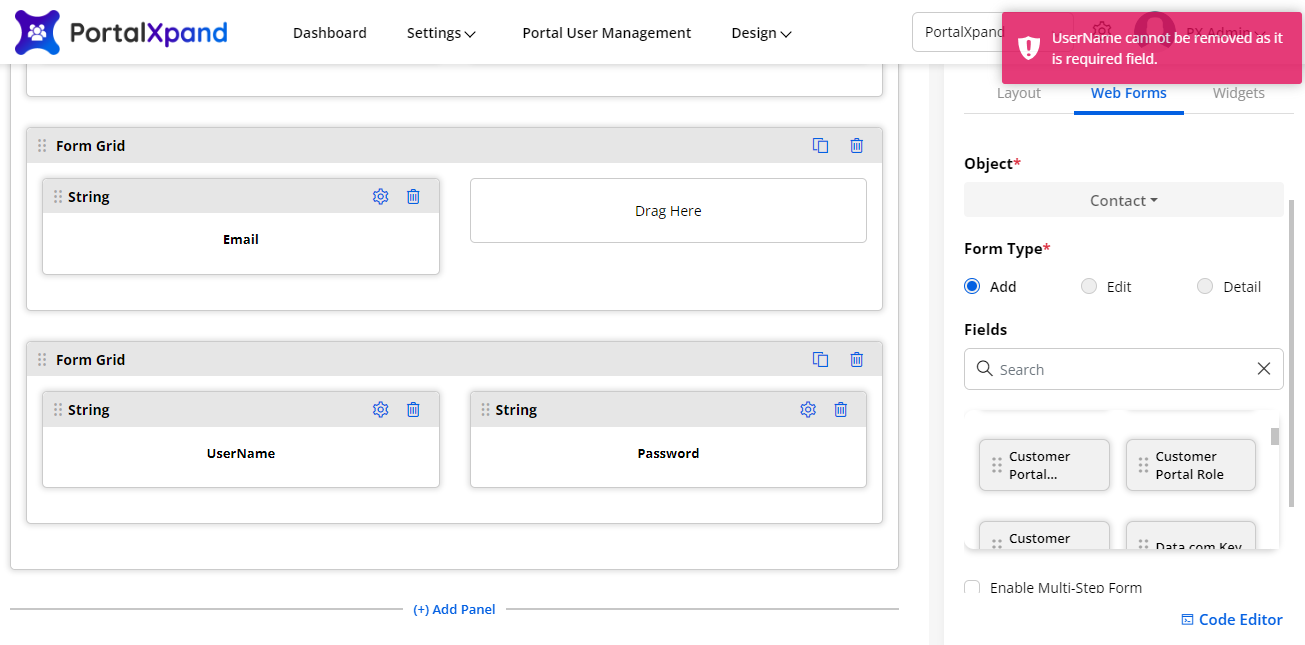
Create a New Form
- You can create a Form for any other Object. By clicking on the + Create button, a popup will appear where you need to insert the ‘Title’ of the Form. Click on the Next button to design the layout.
(+) Add Panel
-
You will get the (+) Add Panel option that can be used to separate the portal content (fields) into multiple sections to be displayed to the portal users in the customer portal.
-
You can insert a relevant title to the panel to identify it. You will get the (+) Add Panel option at the bottom of the drag-drop area (Body).
-
By clicking on the (+) Add Panel a new panel will be added to the drag area (body) of the Form builder. You can edit the panel and update the “Panel Title”. After editing the panel title, click on the Save button.
-
You can drag and drop the layout to the body of the form builder.
-
You can also configure the Panel Title by clicking on the Edit Title button.
-
Under “Web Forms”, by selecting the ‘Object’, you can design the layout for the Add, Edit & Detail pages individually for a new page. You can simply drag & drop the required Fields into the ‘Form’ grid.
-
Here, there are two Copy options provided: Copy to Edit & Copy to Detail. You can copy the ‘Add’ form design for the ‘Edit’ form and ‘Detail’ form as well.
Note: If you are creating the detail type form then you won’t get the “Copy to Add” & “Copy Edit” options.
-
By selecting these options, you can copy the ‘Add’ form for the ‘Edit’ & ‘Details’ forms that will create the same design for the form layout and same Fields. If you are designing the ‘Edit’ form, you will get the ‘Copy to Add’ form.
-
When you are creating a new form and after inserting the Object Fields, you can easily change the position of those Fields just by dragging & dropping under the specific Form Grid.
-
You can also move any Fields to another ‘Form Grid’ easily by dragging & dropping that Field. Other Fields automatically adjust the position.
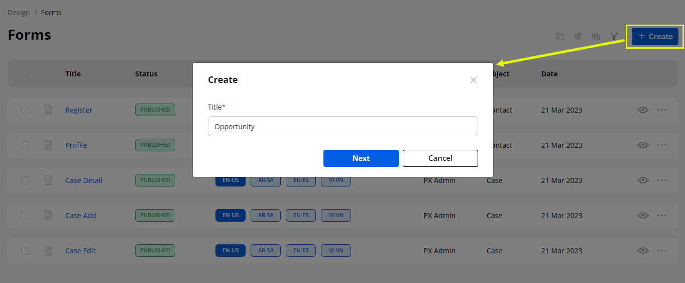
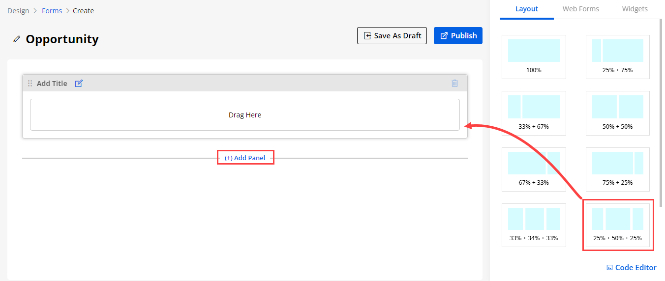
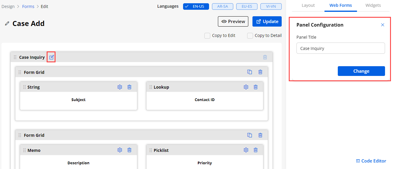
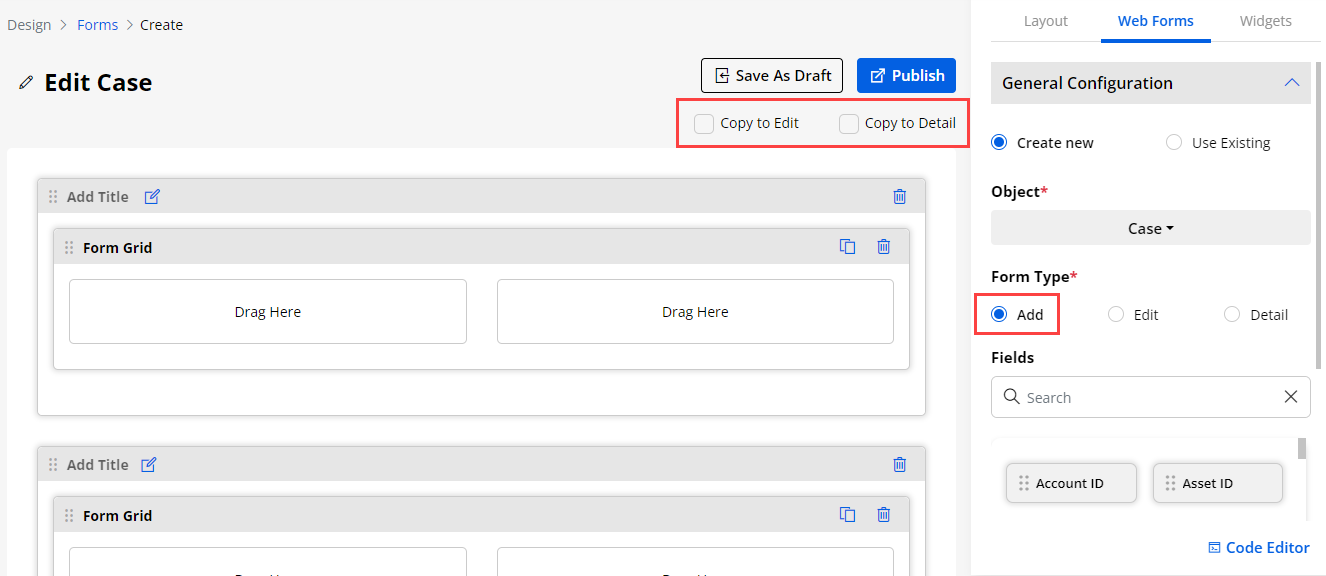
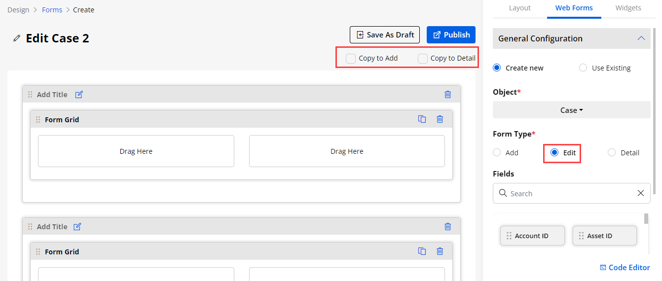
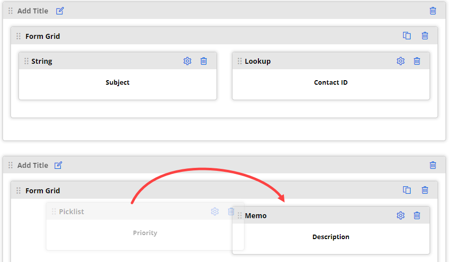
Widgets
Subgrid
-
You can also use the sub-grid layout (from the Widgets tab) to display the form in the sub-grid view in the portal.
-
By clicking on the field Setting icon Sub Grid Configuration panel will open up.
– Label: Insert the label for the sub grid section.
– Select Object: Select the object for which you want to create a sub grid section.
– Select Relationship: Select the relationship (object) which you want to relate the selected object form with.
– Select List View: Select the list you want to display for that selected relationship type sub-grid.
- Admins can also manage sub grid access from the Access Settings, by checking/unchecking Creating, Editing, Deleting Records.
Allow Creating Records:
– Button Label: Insert the label you want to display for creating records on the portal.
– Select Form: Select the form which will be displayed on the portal while creating records.
– Select Record Type : All the active record types related to the ‘Select Object’ will be binded here.
Note: If there are no Record Type in the Salesforce CRM then you won’t get the Select Record Type field in CRMJetty Portal.
Allow Editing Records:
– Button Label: Insert the label you want to display for editing records on the portal.
– Select Form: Select the form which will be displayed on the portal while editing the records.
- Allow Detail Redirection:
– Button Label: Insert the label you want to display for the details of the records on the portal.
– Select Page: Select the page on which you want your users to be redirected when someone clicks on the “Detail” button.
- Allow Deleting Records:
– Button Label: Insert the label you want to display for deleting records on the portal.
– Submit Button Label: Insert the label for the submit button.
– Enable Workflow : This will enable workflows for the subgrid section.
– Data Loading Workflow: This will have all the workflows with data load action type and selected object for the subgrid.
– Update Assign Rights Workflow: This will have all the workflows with Update Assigned Rights action type and selected object for the subgrid.
– Enable Global Access: By enabling this feature you can allow portal users to access the global data, by unchecking it portal users can only access their records in the sub grid.
Note: If global access is enabled then the front side user will get a filter option to show My Records or All Records.
– Enable reCAPTCHA: Enable the reCAPTCHA for the sub-grid in the portal.
Note: Sub grid option only available in edit and detail form type.
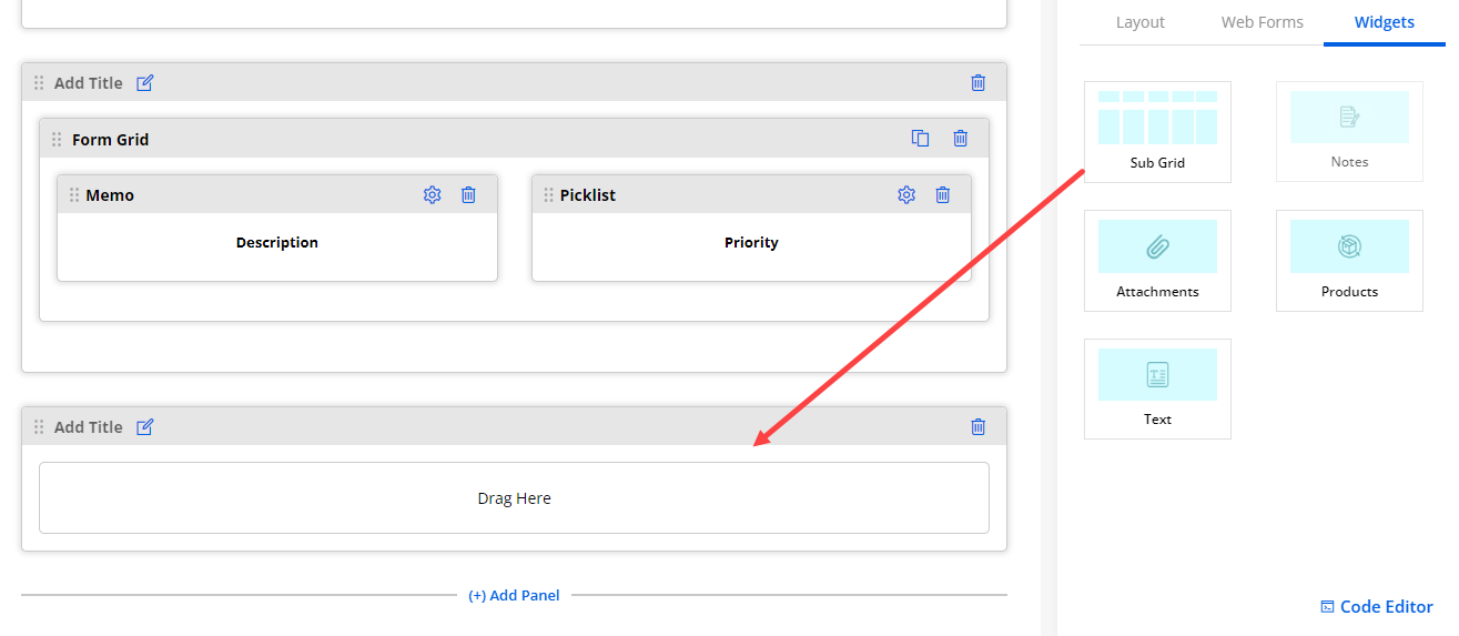
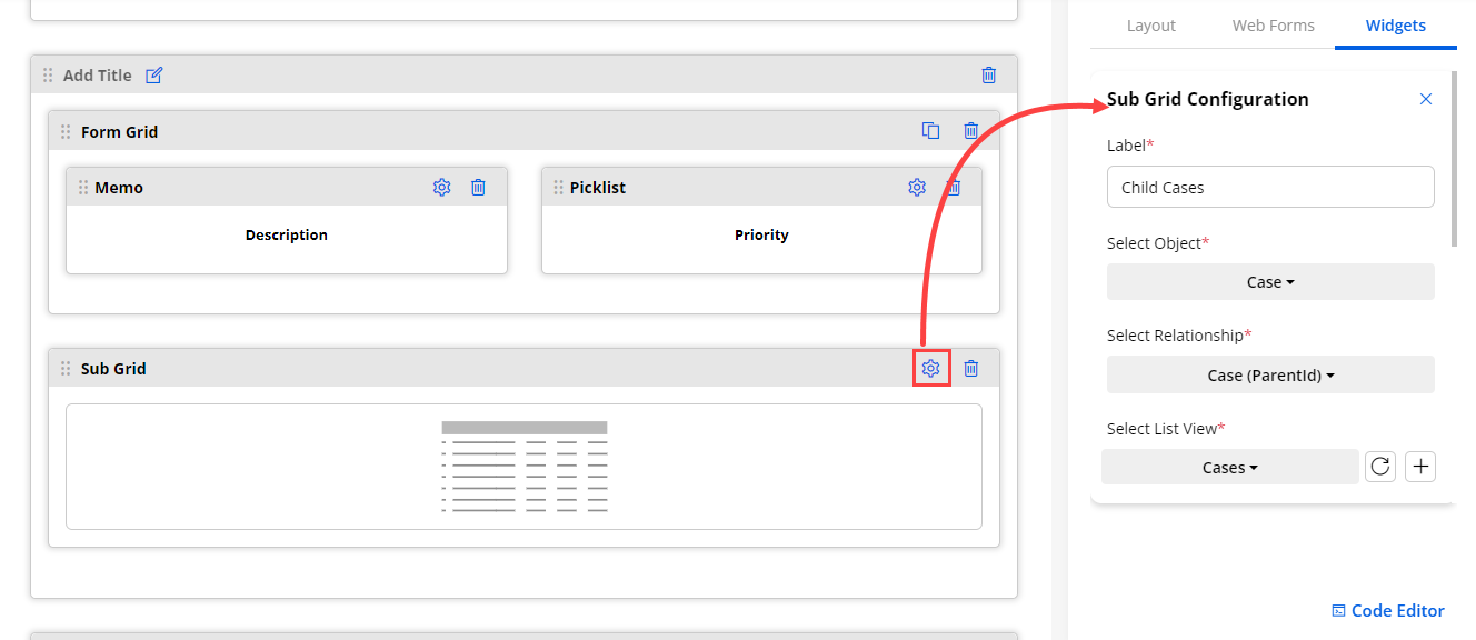
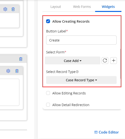
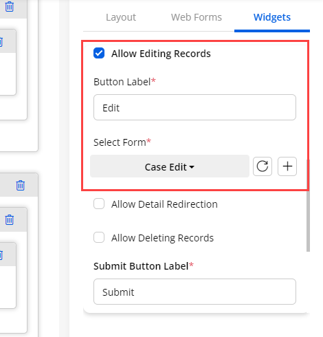
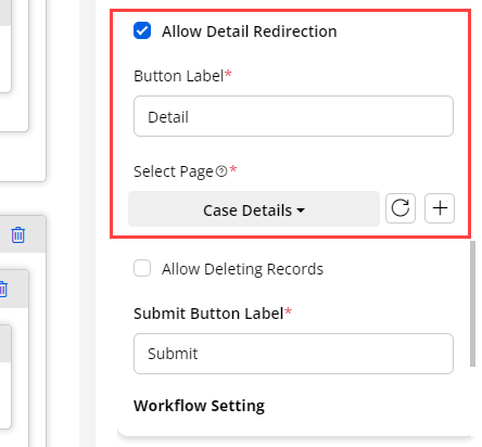
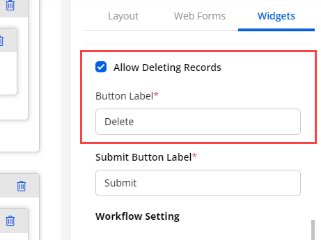
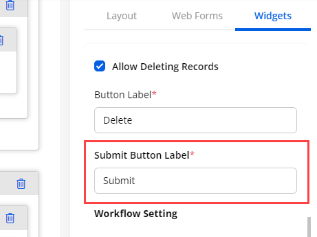
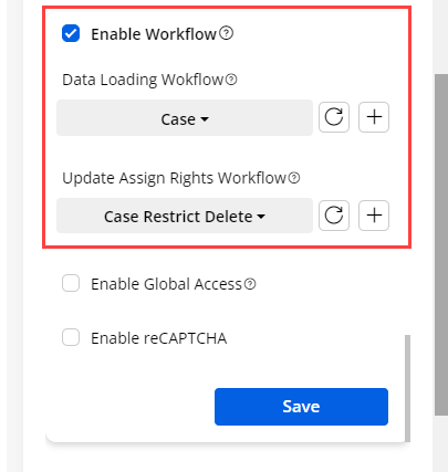
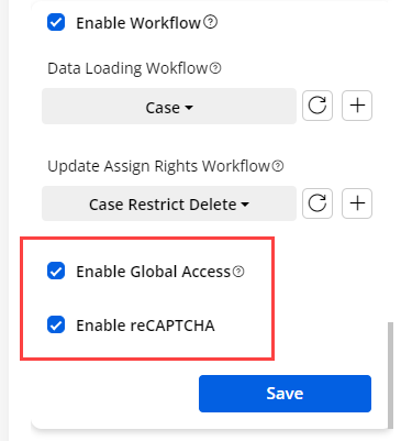
Attachment
-
If you are designing the ‘Edit’/‘Detail’ form of any object, you can enable the attachments for the edit/detail form of any object in the customer portal.
-
This will allow portal users to upload required files.
-
By navigating to the Widgets section you can see the Attachment widget. You can drag and drop it to the form.
-
By clicking on the field Setting icon Attachment Configuration panel will open up.
– Label: Insert the label for the attachment section
– Allow Creating Records: This will allow portal users to create records.
– Button Label: Insert the label you want to display for creating records on the portal.
– Allow Deleting Records: This will allow portal users to delete records.
– Default Accordion Behavior: This will define how list view data will be to portal users in Expanded or Collapsed design format.
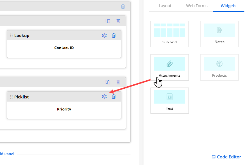
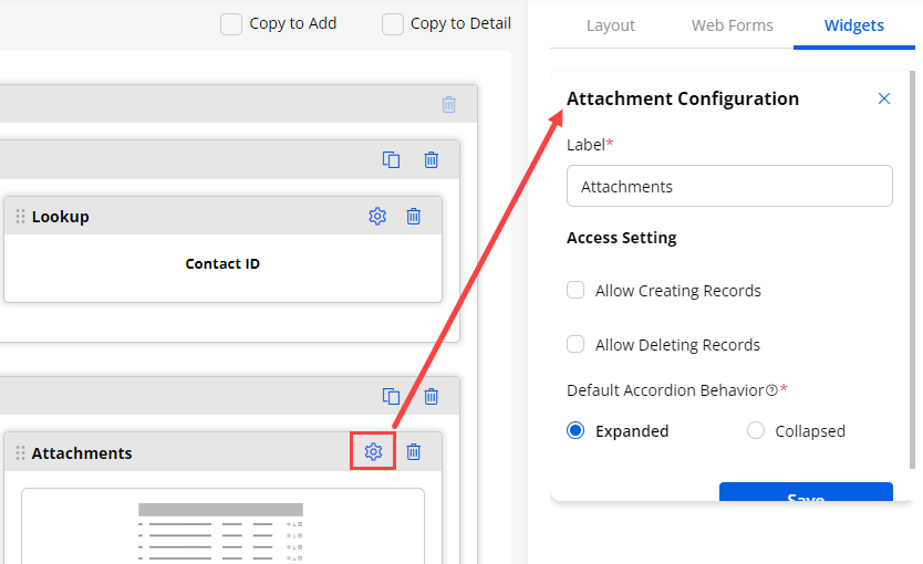
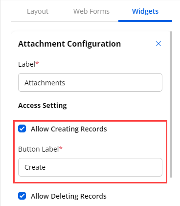
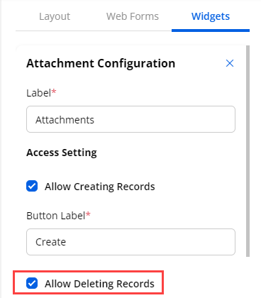
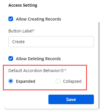
Product
-
If you are designing the form of an object that has products, you can enable the product widget for any type of form in the customer portal.
-
By clicking on any form type with the object that has the product, you will see the Product widget.
-
By clicking on the field Setting icon Product Configuration panel will open up.
– Label: Insert the label for the attachment section
– Default Accordion Behavior: This will define how list view data will be to portal users in Expanded or Collapsed design format
– Allow Creating Records: This will allow portal users to create records.
– Button Label: Insert the label you want to display for creating records on the portal.
– Allow Deleting Records: This will allow portal users to delete records.
– Quantity Update: This will allow users to update the quantity from the portal login.
– Details Type Form: If you are designing the Detail type of form then you will get the below configurations:
– Label: Insert the label you want to make visible on the portal for the product widget.
– Default Accordian Behaviour: Select the Accordian Behaviour from Expanded or Collapsed. In Expanded the accordion will be open by default and in collapsed it will be closed.
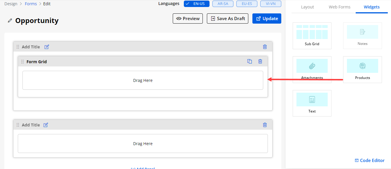
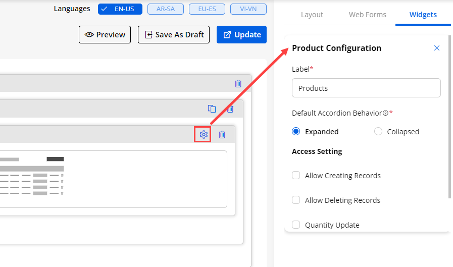
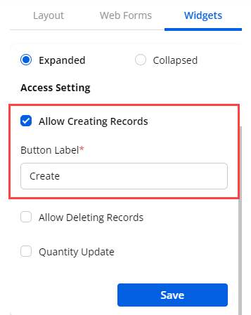
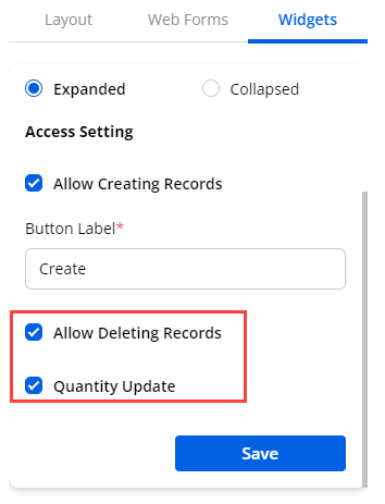
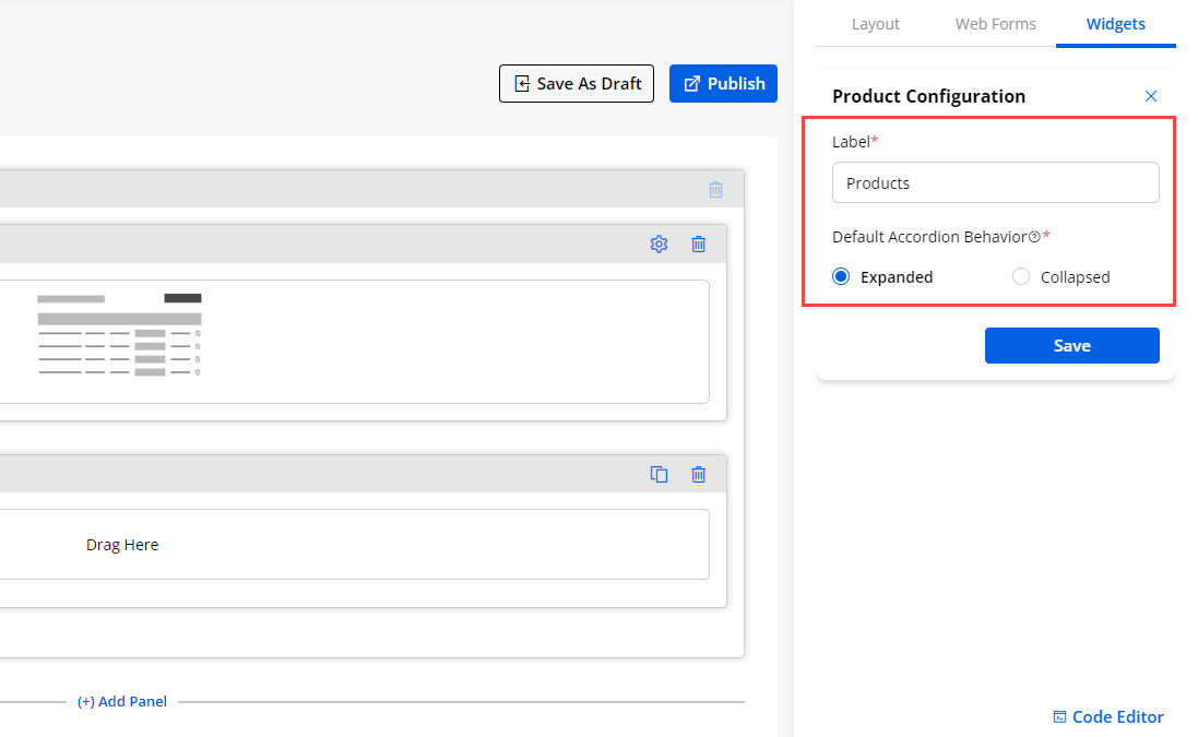
Notes
- Notes feature should be already enabled in Salesforce to display Notes Widget in CRMJetty Portal. To enable Notes in Salesforce, follow these steps.
1. From Setup, enter Notes Settings in the Quick Find box, then select Notes Settings.
2. Make sure Enable Notes is selected.
3. Click Save.
-
Notes widget will let you offer chat view support to your customers. With this, your portal users can initiate a chat with you in case of support. Here is how you can enable chat support in your portal.
-
You need to drag & drop the Notes widget to the design layout area (body) from the Widget section.
-
By clicking on the Settings icon of the Notes widget, you can find the Note Configuration to setup the chat support. You can configure the following settings:
– Label: Insert the text label for the comment section.
Access Settings
– Allow Creating Records: You can enable this option if you want to give the “Create Records” rights to the portal users.
– Button Label: Insert the text label for the create button, the default label will be “Create”.
– Allow Deleting Records: You can enable this option if you allow the customers to “Delete” any record.
– Default Accordion Behaviour: Select the accordion behavior from Expanded or Collapsed.
- Select Design Layout: Select the design layout for the chat support.
Note: “Notes” widget is only supportable for edit/detail type form.
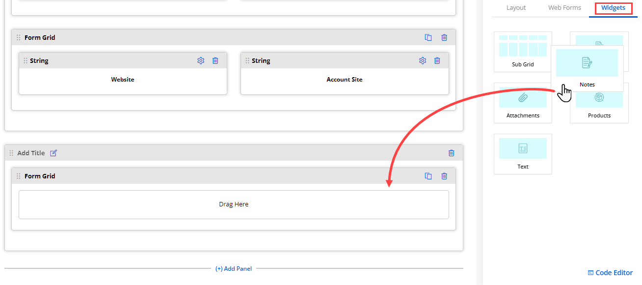
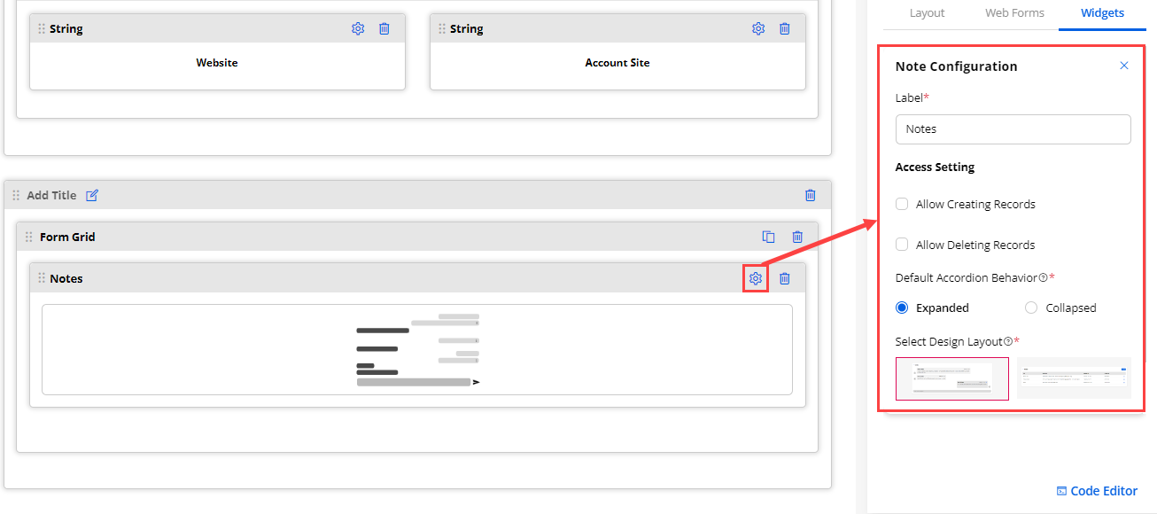
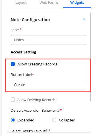
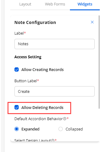
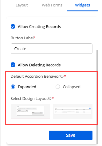
Text
-
Add the Text widget for any page layout content. Design the text with different settings.
-
By clicking on the Settings icon, you can configure the text of the widget. You can also apply the different stylings to the text.
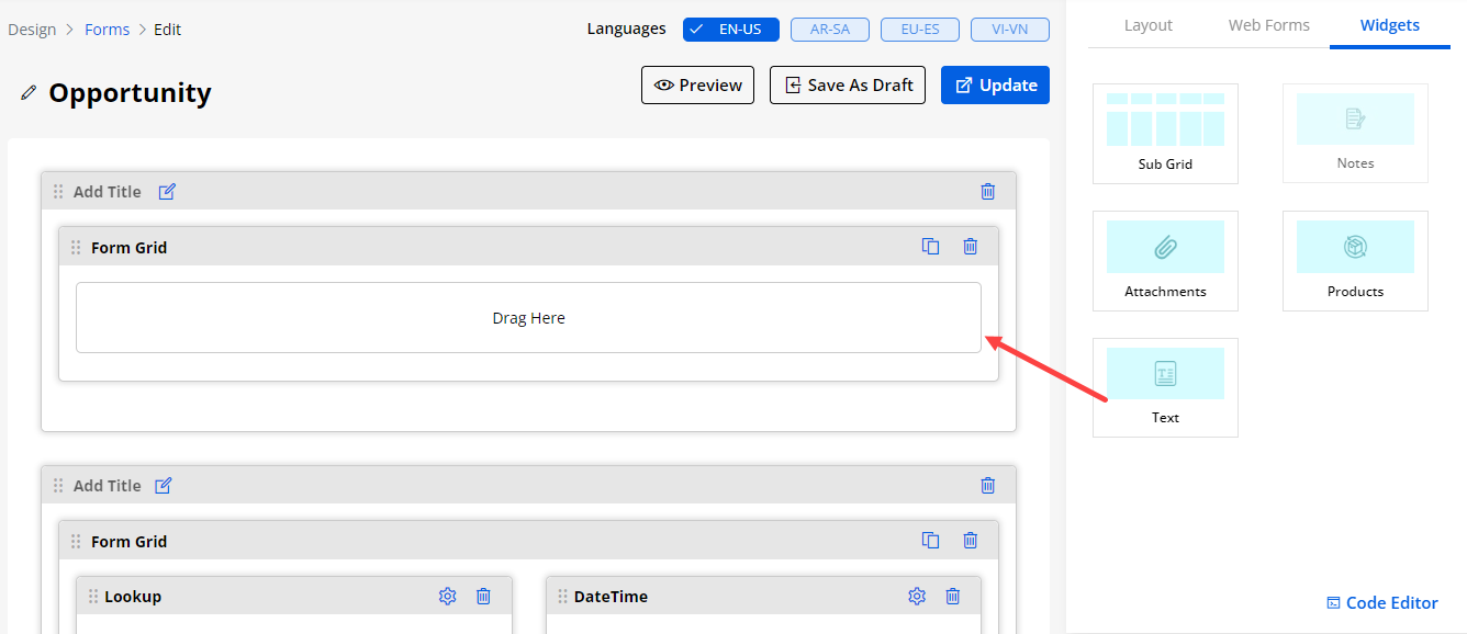
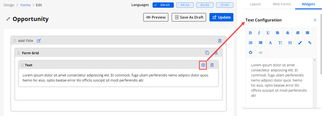
Using Existing Forms
-
You can also get the ready-made ‘Form’ layouts that are configured from the CRM. By selecting the Use Existing option, you will get all the ready Form layouts (CRM Object views) and you can edit the Fields as well.
-
Once you select any ‘Form view’ from the Existing Forms drop-down, you will get the fields of that specific form view that are configured from the Salesforce CRM. You can select Existing CRM Fields for Add, Edit, or Detail page as per the Form type.
-
If your selected object has record types added in CRM, then you will have an ‘Existing Record Types’ option. This will have active record types. You can filter Existing Forms by selecting Existing Record Types. If you do not select any record types, you will have all the forms for the selected object.
-
You can add/remove the Fields as per your requirement. You can drag & drop the fields from the list on the right side and you can remove any Field by clicking on the ‘delete’ icon.
-
By editing any Field, you will get the Field related options to display to the portal users in the customer portal.
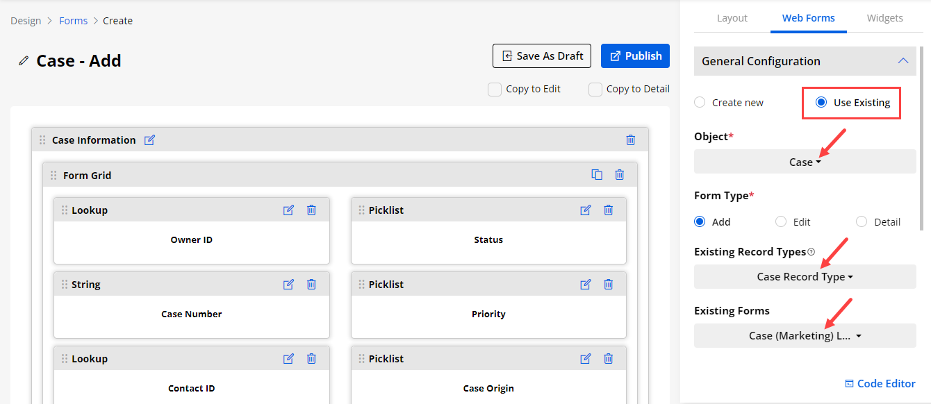
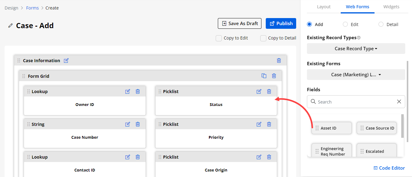
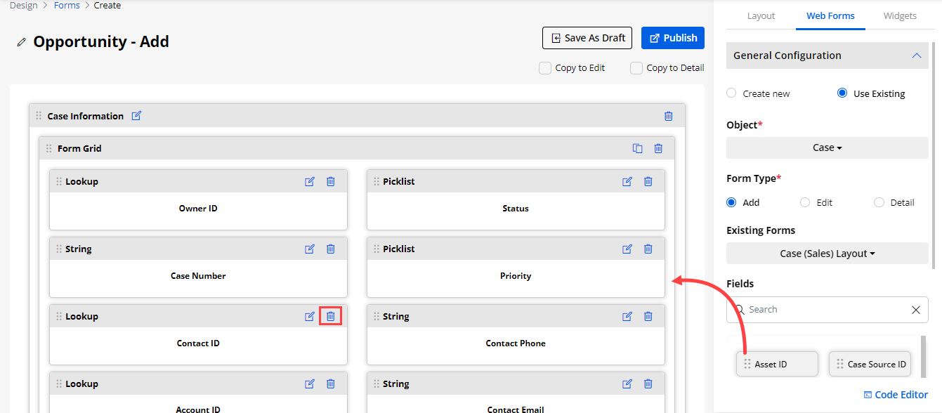
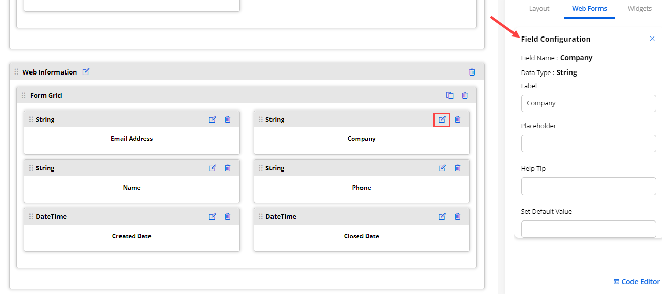
Using JS Code Editor
-
You can create or update the layout of the Formview using JavaScript Code Editor if you have any custom JS Code.
-
By clicking on the Code Editor, an editor will pop up where you can edit/paste your JS code. Once you edit/paste the JS code, click on the Save button and Publish the Form builder record.
-
You can Preview the Form builder to check how it looks.
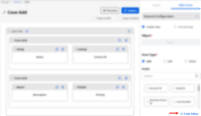
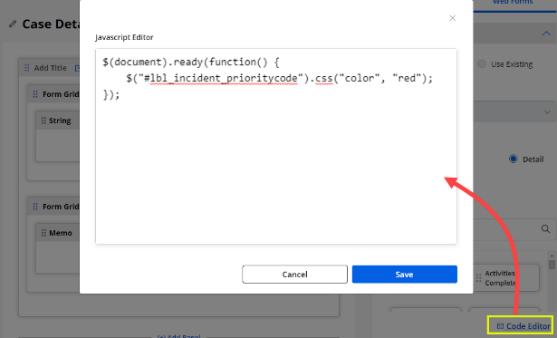
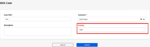
Field Configurations
-
You can also edit and configure any Fields that are added by drag & drop (Create New) or from the existing list of the CRM (Using Existing).
-
You can configure the following details for the Fields:
– Field Name: Here the field name will be displayed that is used in the Salesforce CRM.
– Data Type: Here the data type of the field will be displayed in the Salesforce CRM.
– Label: Insert the relevant text caption.
– Placeholder: Insert the caption into the input text field.
– Help tip: Insert the short details as the mouse hover effect.
Hidden Field
-
If you are designing the Add/Edit form then “Hidden” option under the Attributes section will be visible. If you checkmark the Hidden option then you need to setting the Default Values is compulsory.
-
- Hidden field will not be visible in the form but it will be visible in the CRM.
Workflow Management
-
If the Field’s data type is Lookup, workflow settings will be visible. You can set the workflow for it.
-
Checkmark the Enable Workflow field and apply the Data Load workflow that you have created from the Portal Settings ➤ Workflow Management.
Select Design Layouts
-
If the Field’s data type is Boolean, then you can set the Design Layout. You will get the three pre-defined layouts for the fields. Select any design layout to make it visible on the portal.
-
If the fields data type is multi-select picklist, there will be a “Select Design Layout” option. You will get the three pre-defined Layouts for the field. Select any design layout to make it visible on the portal.
-
By clicking on any layout you can have the preview of it.
Show Video/Image Fields
-
If you are designing the Detail form of any object and the fields data type is string then you will have an option to display that field as video or image.
-
Either you can enable the Show as Video option or Show as Image option.
Set Default Value
-
If you are designing the Add/Edit for of any object and the field’s data type is String, Numeric, Memo, Boolean, Picklist, State, and Status then Set Default Value option will be visible.
-
If the field’s data type is a string/memo then the Set Default Value field data type will also be string and will only take string values.
-
If the field’s data type is numeric then the Set Default Value field data type will also be numeric and will only take numeric values
-
If the field’s data type is picklist/boolean/status/state then the Set Default Value field data type will also be picklist.
Note: In case of picklist , this field called “Set Default Value” is dependent on the field called “Display Values”. It means “Set Default Value” field will only contain only those options which are selected in the Display Values field.
-
Once you have added the fields and designed the layouts, you can Publish the Form or keep it as a Draft.
-
If you have selected the Copy to Edit and Copy to Detail, the pages will automatically be created for the selected copy options.
Note:
-
If you are designing the Detail form then you will get the options for “Copy to Add” and “Copy to Delete”.
-
If any widget is not available in any type of form (Add/Edit/Detail) then the widget will be removed automatically from that form.
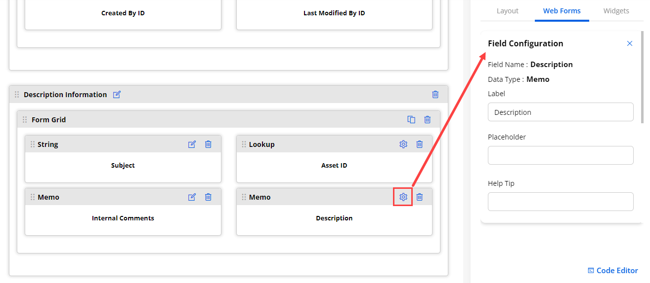
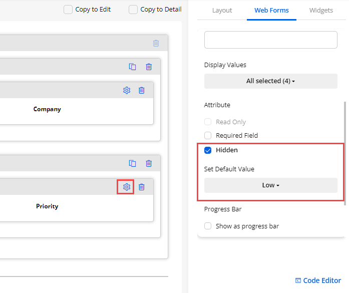
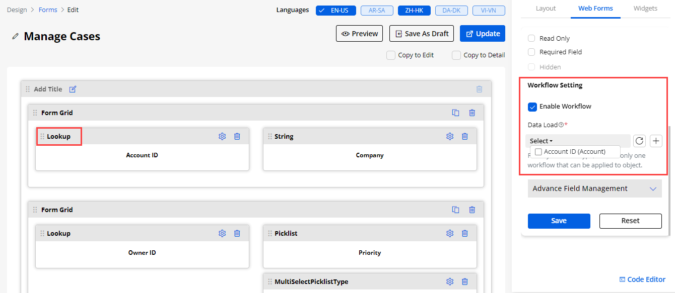
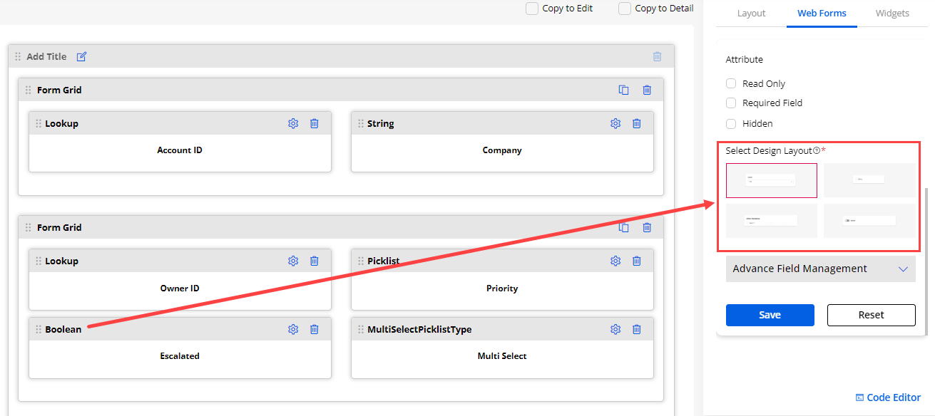
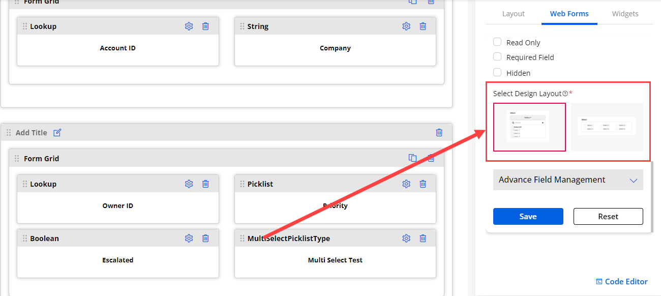
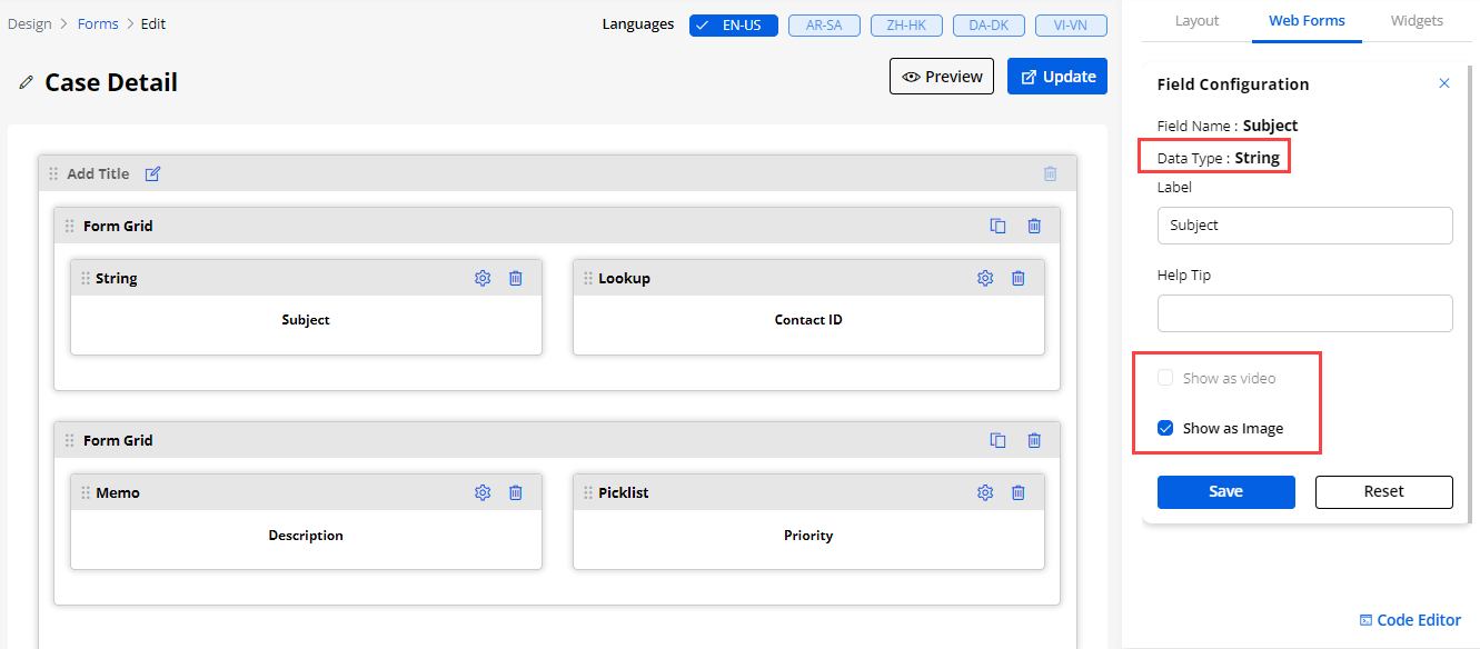
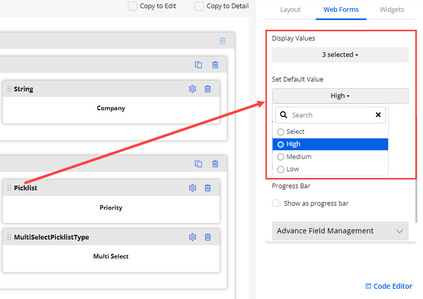
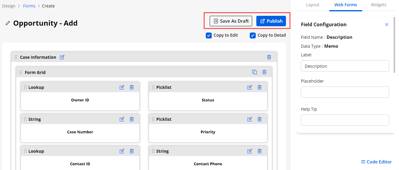
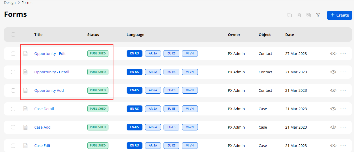
Multi-Step Form builder
-
You can display the Form content of any Object step by step in the customer portal. You will get the “Enable Multi-Step From” option in the Form configuration on the right panel under the “Web Forms”.
-
The portal users will get the Form with Multi-Step as per the sections you have added here. They will get the Form content in section-wise multi-steps while adding & editing the Object form if you have enabled the “Multi-Step Form”.
-
By enabling the Multi-Step Form option, you will configure the following button labels, by default Previous & Next labels will be added respectively:
– Previous Button Label: Insert the ‘previous button label’ for previous form content navigation.
– Next Button Label: Insert the ‘next button label’ for next form content navigation.
-
From the edit form of any Object, you can enable the Multi-step Form as per sections.
-
By enabling the Multi-step Form, you can edit the navigation button labels:
– Previous Button Label: Insert the ‘previous button label’ for previous form content navigation.
– Next Button Label: Insert the ‘next button label’ for next form content navigation.
Note: This option is only available for Add/Edit type Form and it will be enabled for both types of Field selections: “Create New” & “Use Existing” (CRM layouts).
- Once you have created the Form layout, you can set the Form in the Page builder for any portal page, and you can see the preview of the multi-step Form there.
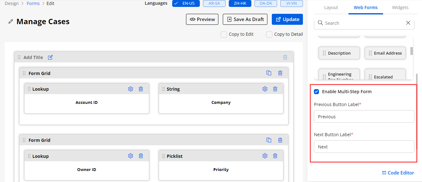
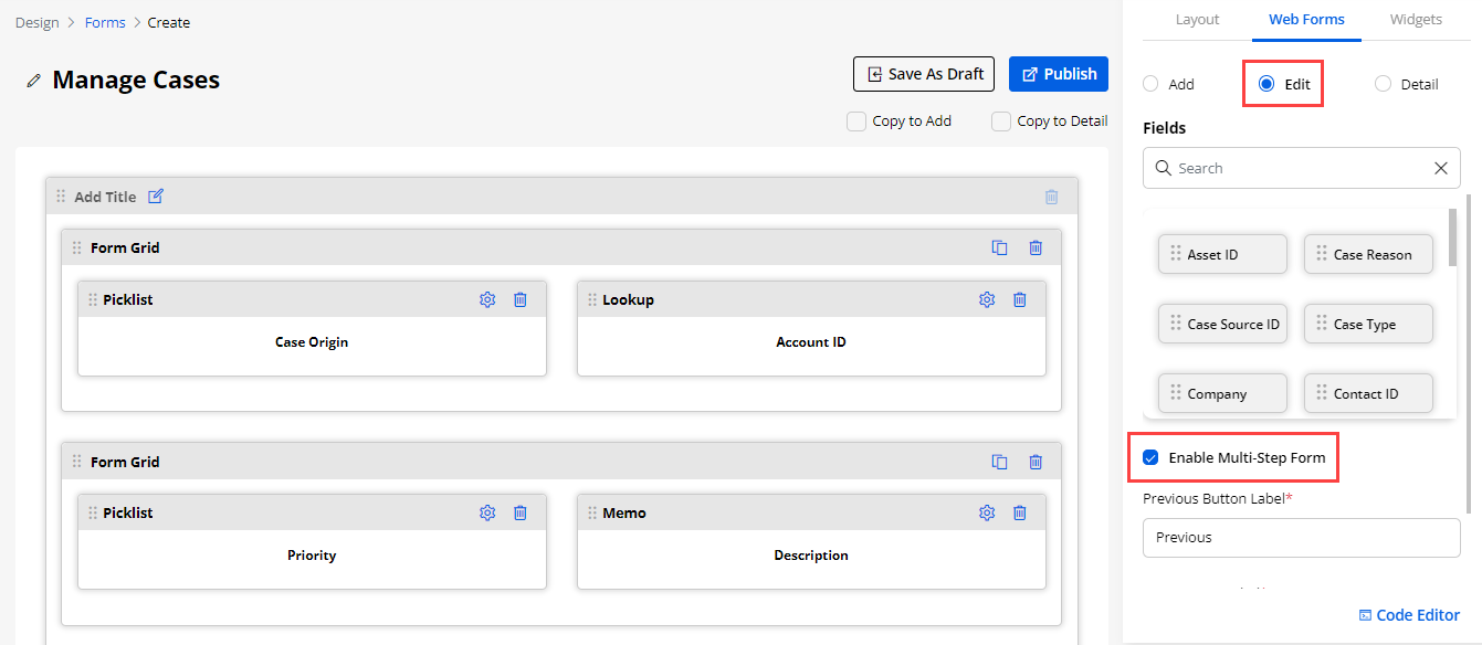
Progress Bar in Field Configuration
-
You can configure the Progressbar in the Form builder for the specific dropdown fields of any Object form. You can enable the progress bar view for the dropdown type fields: Picklist, State, Status.
-
You can enable the Progress bar from the Field Configuration, by scrolling down in the Field configuration, you will find the Show asProgress Bar option. Enable the option to display to the portal users in the customer portal.
-
You can set the sequence of the available options (Field values) for the selected dropdown Field. You can shuffle the options to change the sequence by dragging it up-down.
-
The 2-design layouts are provided. You can select any design layout to display the progress bar in the customer portal.
-
You can also make the progress bar field as Required or Read-Only as per your requirement.
Note: The progress bar status can reflect the “Advance Field Management” settings to display the Field options to allow the portal users to select in the customer portal.
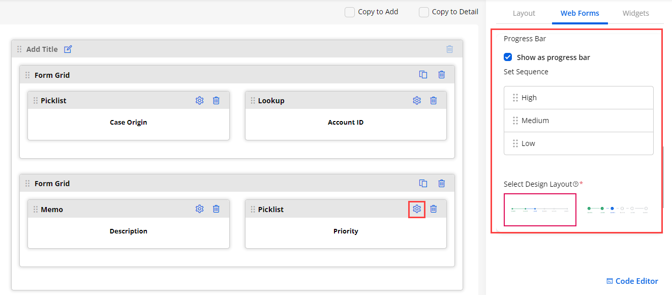
Interlink Support (Parent-Child Form)
-
You can manage and configure the Parent-Child interlink support for the “Add” Form Type. You will get the “Parent-Child Link” option under the AdvancedConfiguration accordion.
-
You need to select the “Add Form Type” and enable the “Parent-Child Link” option. You need to select another Object as “Child Object” which should be related to the parent Object.
-
Once the Parent-Child Link is enabled, you need to select the ‘Object’ and its ‘Relationship type’ from the drop-down option. You will get the Field selection as per the Relationship Type. You can drag & drop required fields to the Form builder.
Parent-Child Interlink Identification
-
You can set the identification field on that any Parent Object record will be identified whether that record is already existing in the CRM or not.
-
You need to select the identification fields that must be String type from the Form grid.
-
You will find the “Create Unique Records On” dropdown list. Select the required field for unique identification and save the configuration. Once the configuration is saved, Publish the form to apply the changes.
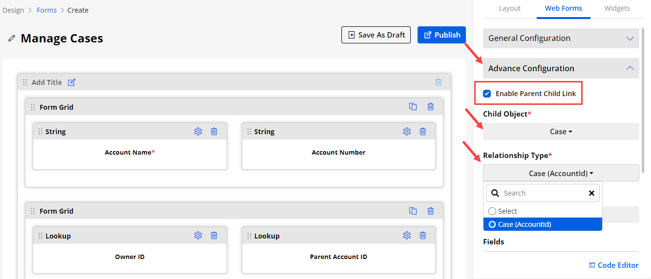
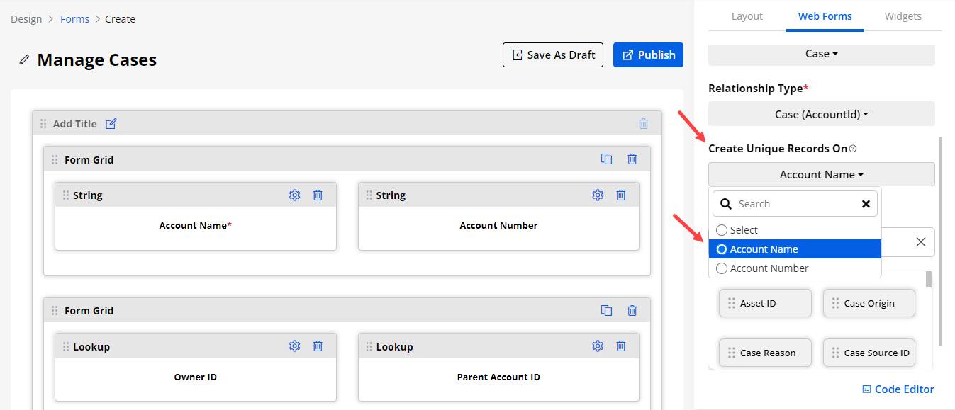
Advance Fields Settings & Management
- You can manage the Field values and allow the portal users to select the required fields only when they are creating/editing any record in the customer portal.
Advance Field Settings to set default values
-
You can configure the Advance Field for the Picklist, Status, State, Boolean, Multi-select picklist, etc..
-
If you have inserted the Picklist field in the Form Builder, you can select the default value to display in the picklist drop-down option from the customer portal.
-
By editing that Field, you will find the Display Values drop-down option under the ‘Field Configuration’.
-
After saving the Field configuration, you can preview the Form to check how portal users will get that option.
Advance Field Settings to set the number of options
-
If you have added the Field with Multi-selection dropdown, you can set the number of options to provide in the customer portal for Multiple selections of the Field values.
-
By clicking on the Settings icon, you can Insert the Label, Placeholder and Help Tip for the multi-select field.
-
Now, you need to select the DisplayValues(These values will be displayed in the multi select field).
-
After selecting the ‘Display Values’, you can set the multi-selection limit from the ‘Selection Limit’ option. Once you select the options (depending on the number of options available) that will display to make multi-selection in the Object form to the portal users.
-
You can also select the default values to be displayed in the multi select field.
-
If you want to make this field as re quired field then you can checkmark the Required Field under the Attribute section. Same way you can also make this field as Read Only or Hidden.
Note: If the number of option selections is less than the total number available, the portal users will not get the ‘All’ option to select all the values.
- After configuring the Field, click on the save button. You can also preview the configured field values by clicking on the ‘Preview’ option.
Advance Field Management
-
You can set the condition to hide/show the fields or multi-selection of the Fields. You can set the conditions for the different values to hide or show the related values.
-
By editing that Field, you will find the Advance Field Management option under the ‘Field Configuration’.
-
You need to configure Field Management as below:
-
Conditional Field Option: You need to select the options to be selected for show/hide the field. Select the values on which the conditions should match.
-
After configuring the Field Management, click on the Save button and publish the form to apply advanced field conditions to the customer portal. You can Preview the Advance Field that is configured.
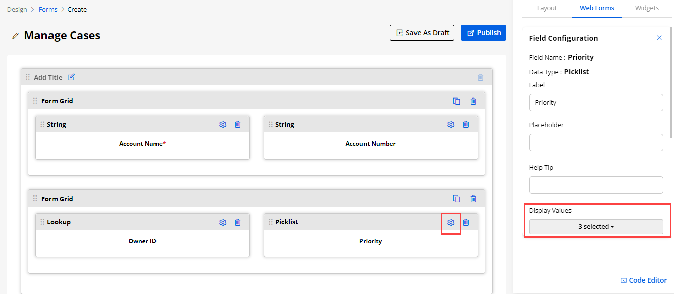
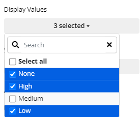
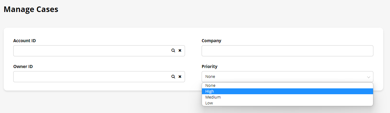
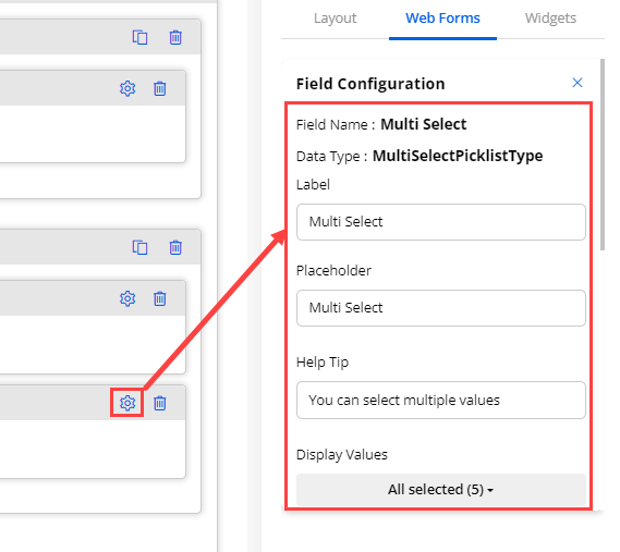
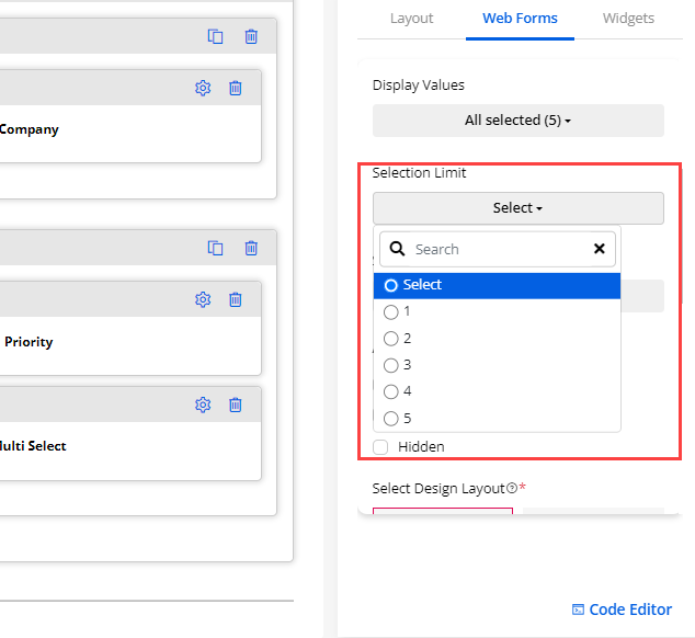
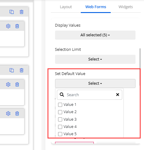
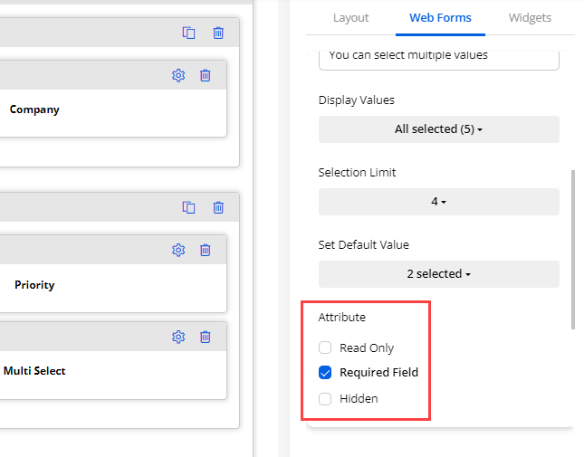
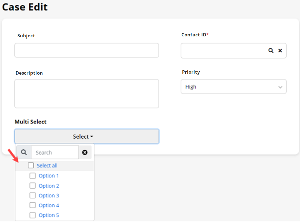
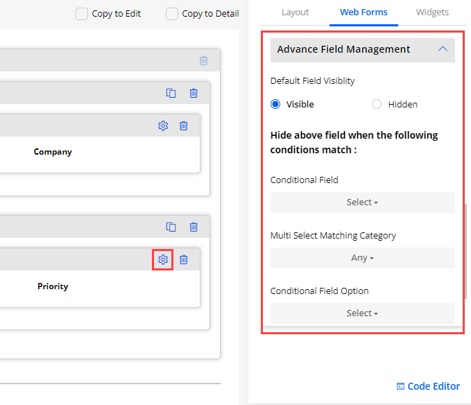
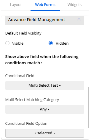
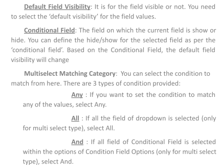
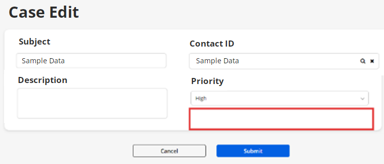
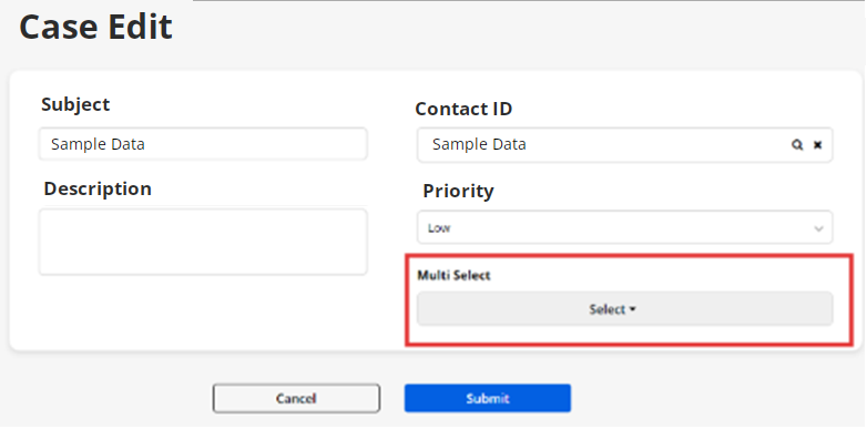
Translate Form records (Multi-Language)
-
From the listing page of the ‘Form’ builder layouts, all the available languages will appear in the ‘Language’ column. Here the translated languages will be shown in the dark-colored button and the languages that are not translated yet will be shown in the light-colored button.
-
You can also translate the form layout records from its edit page. From the top, you will find the “Languages” option and the enabled languages.
-
You can translate the ‘Form’ layout record by selecting the specific record and click on any language under the Language column. Once you click on any of those options, the Form builder record will automatically translate it to the selected language.
-
Once you translate the form layout record from the listing page or the list layout edit page, it will take a few seconds to translate all the CRM content & you will get an Success message on the screen.
-
You can check the translated content from the edit page and if the form layout record is already translated, it will navigate you to the translated edit page.
Multiple records Translation
- You can also translate the list layout records in bulk by multiple selections.
Note: If only two languages are enabled, the records will be translated to other languages automatically. But, if the enabled languages are more than two, you will get a dropdown selection to select any one language to translate the selected records.
- After translating multiple records, a Report will pop up on the screen. This pop-up will display the translated status of the records.
Note: Make sure you have translated all the fields in the Settings > Portal Settings > Language Settings for the language to properly translate the fields..
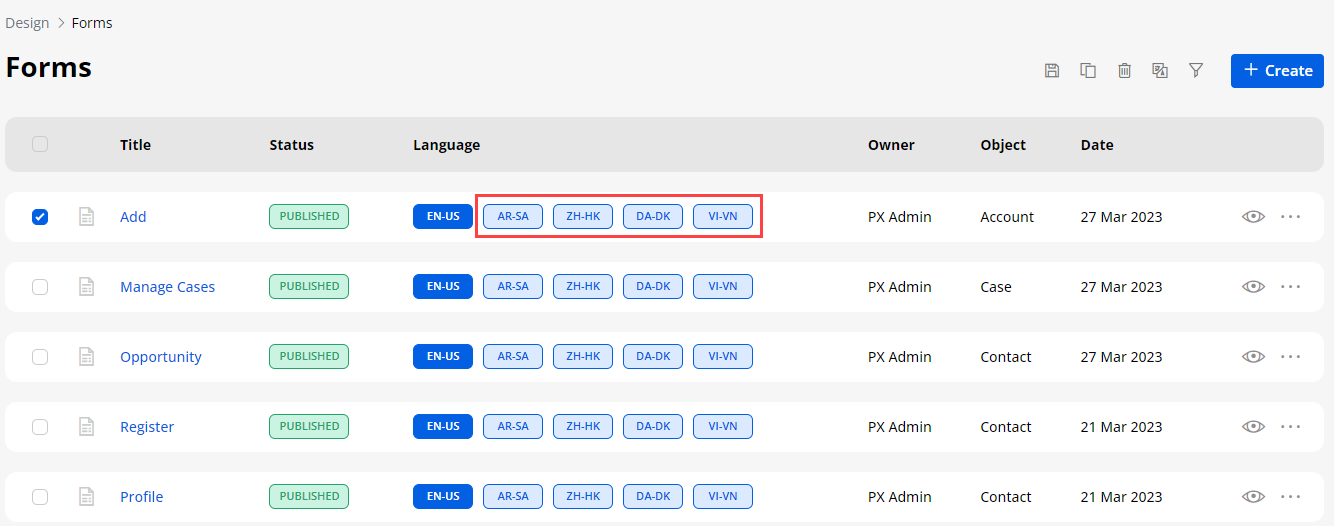
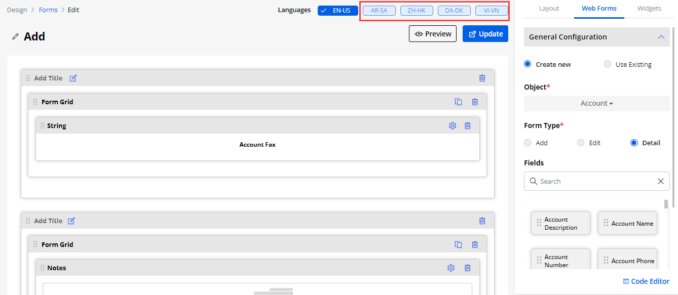
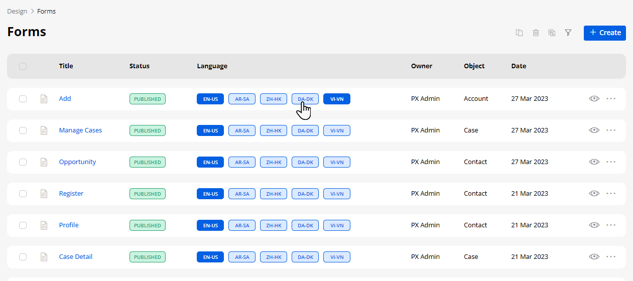
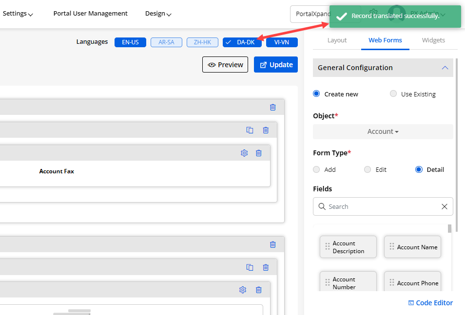
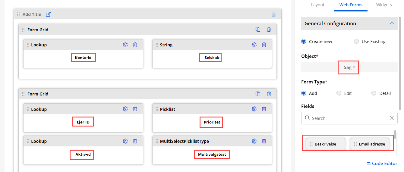
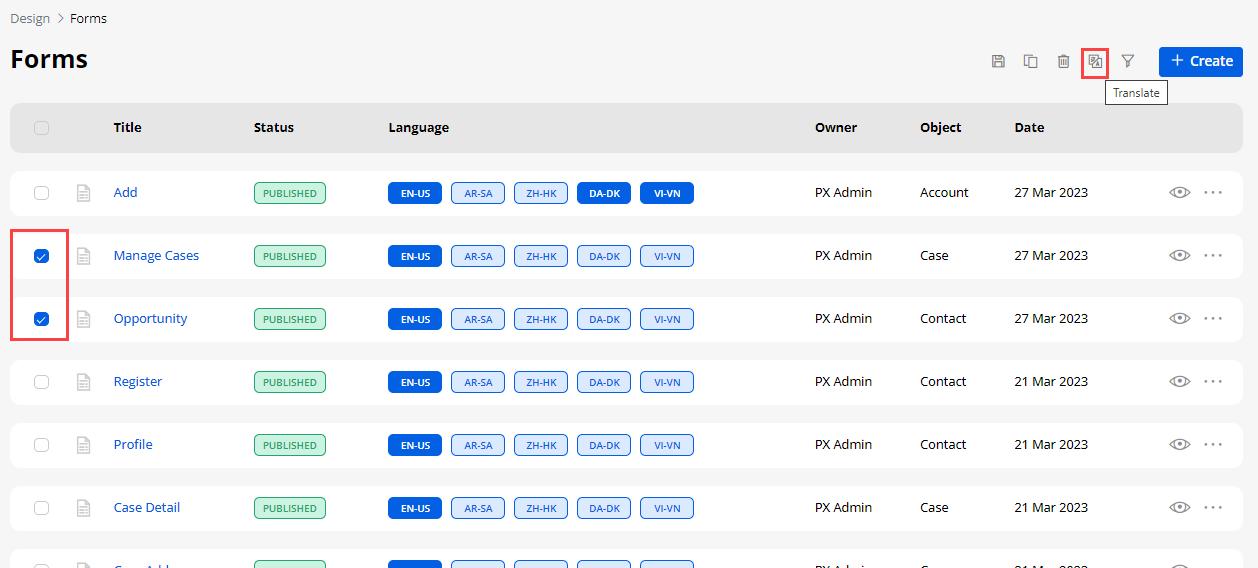
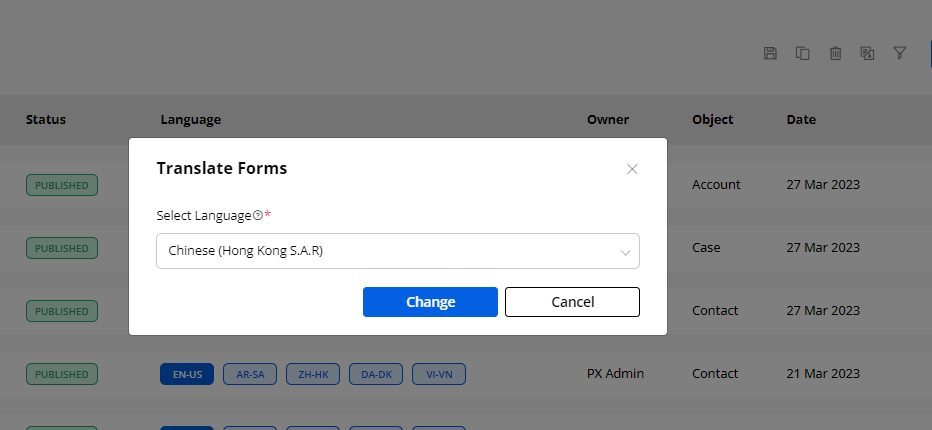
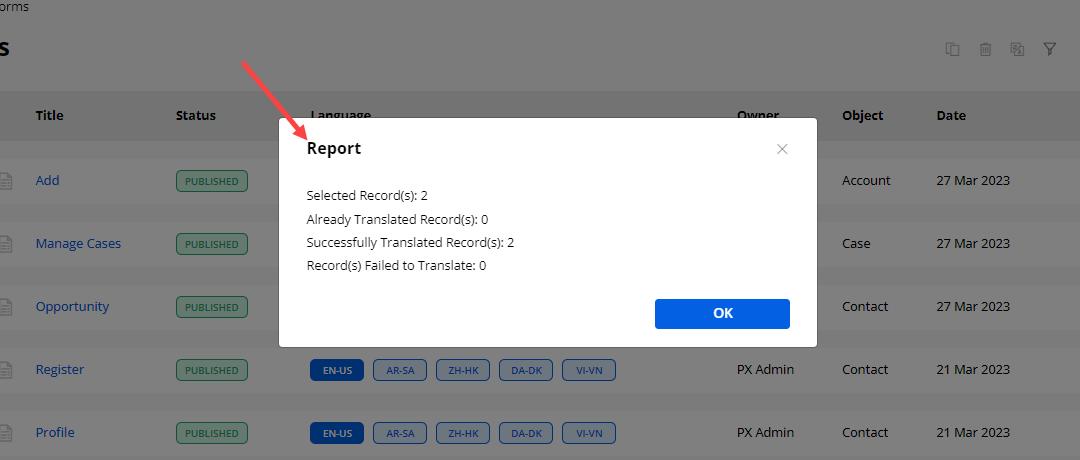
Payment Configuration
-
You can enable the “Payment Configuration” from the right-side panel for the form record of the specific Object.
-
By clicking on the “Payment Configuration”, you will get the following options to provide the Payment option to the portal users in the customer portal:
– Enable Payment: You must tick the checkbox of the “Enable Payment”.
– Button Label: Insert the text label to display as an option in the context menu of the record.
– Enable Page Redirection: If you want to set the page redirection, you can tick this checkbox. When you tick this, “Redirect to” the dropdown will be opened.
– Redirect to: Select the page where you would like to redirect the portal users when they click on the payment option.
– Select Amount Field: You need to select the field of the module which you would like to add as an amount field to make payments.
– Set Conditional Field to Enable Pay Button: You need to select the field for the module on which you would like to display the Pay button.
– Set Conditional Field Value to Enable Pay Button: You need to select the conditional value field to enable the “Pay” button. You can select Multiple values as per your requirement.
– Transaction Log Settings: You need to select the Transaction Log Settings to sync the data of the transaction log in Portal.
– Select Transaction Module: You need to select the transaction module to add the transaction details.
– Select Description Field: You need to select the module field you want to add as a short description field.
– Select Payment Module: You need to select the field of the selected transaction entity to add as a payment entity field.
– Select Payment Record: You need to select the field of the selected transaction module to add as a payment record field.
– Select Payment Method: You need to select the field of the selected transaction module to add it as a payment method field.
– Set Amount Field: You need to select the field of the selected transaction module on which you would like to make payment.
– Select Payment Transaction Log: You need to select the field of the transaction module which you would like to add as Payment Transaction Log field.
– Select Payment Status: You need to select the field of the selected transaction module which you would like to add as Payment Status field.
After configuring the Payment Configuration, you need to save the changes by clicking on the Save button at the end and Publish the page to apply the changes in the customer portal.
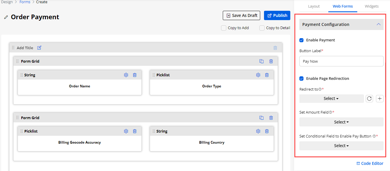
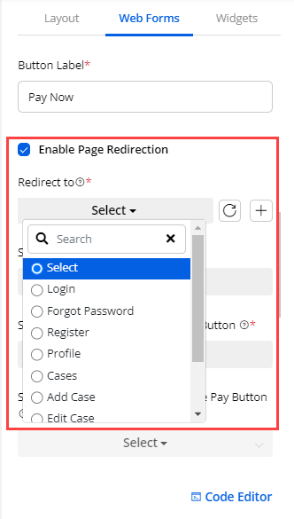
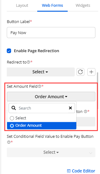
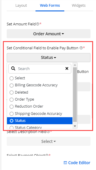
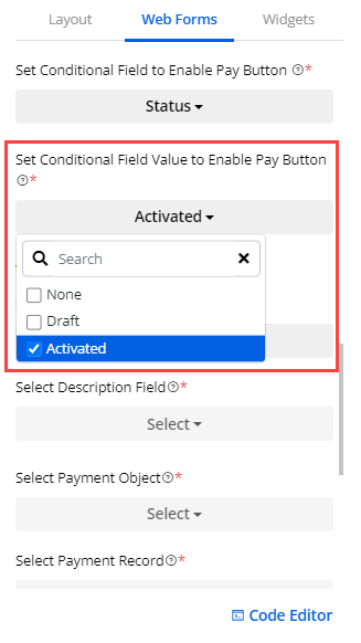
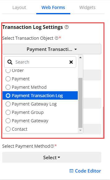
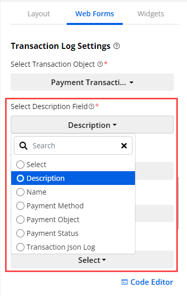
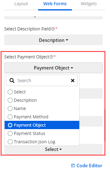
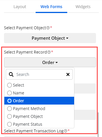
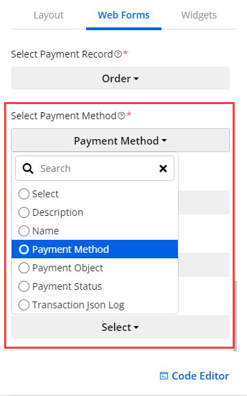
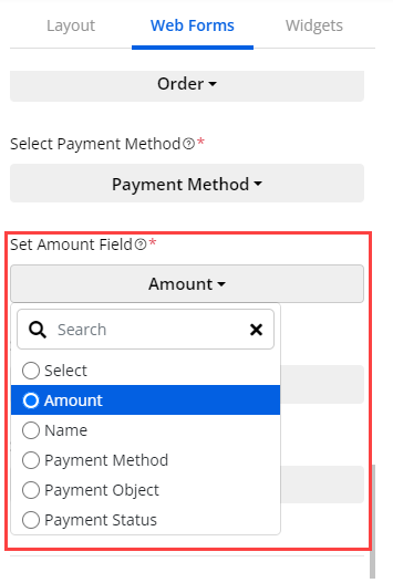
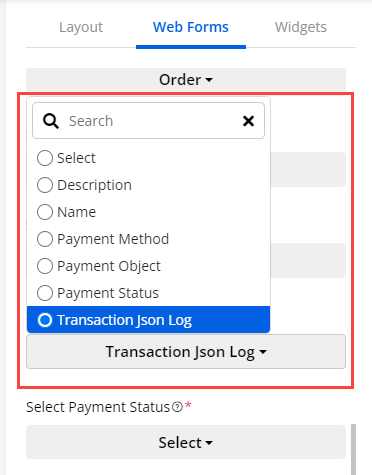
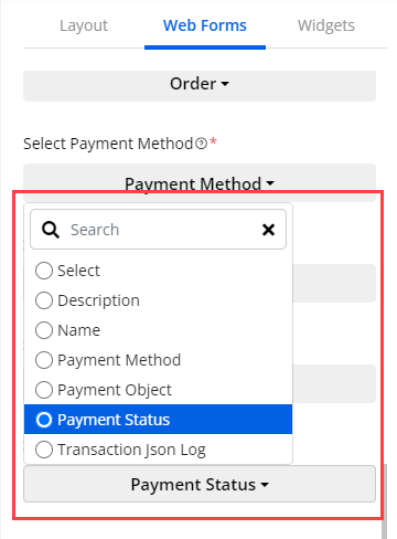
CRMJetty Portal Customer Login
After completing all configurations on the admin side, the portal users can sign-up or log in to Salesforce CRM-CRMJetty Portal Customer Portal and access the pages that are configured by the admin users.
Profile
-
The portal users will get the profile details as per the configuration of the ‘Profile widget’ in the Page Builder of the profile from the admin side. You will get the Profile layout as per the selection of the Design Layout (Style) of the Profile.
-
The portal users can update their data and change password as per their requirement.
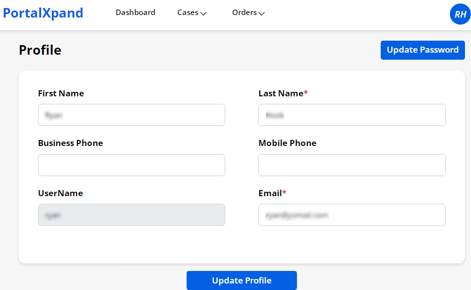
Records View
Record Details
-
By clicking on any records from the list, the portal users can view the record details as per the user rights.
-
The fields will appear as configured from the admin side.
-
The portal users can edit/delete the selected records as per the user rights.
Chat Support
-
Portal users will get the chat functionality by scrolling down in the Case Detail page after enabling the Notes widget from the backend.
-
The portal user can also delete the chats if they are allowed from the backend.
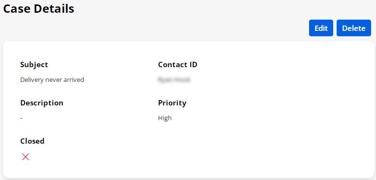
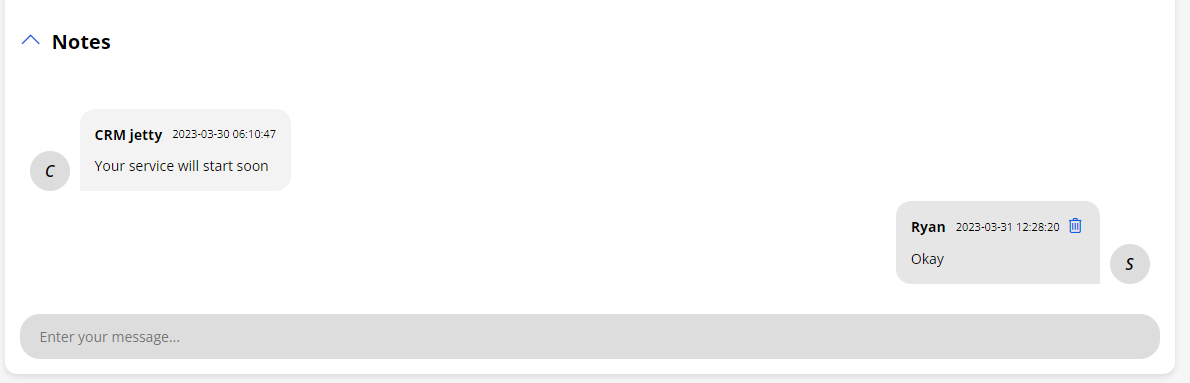
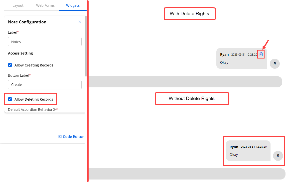
Add/Edit Record
-
The portal users can ‘edit’ any existing records if the editing rights are given.
-
Once the records are edited portal users can submit the record by Clicking on the Submit button .
-
The portal users can add new records if the adding rights are given. As configured from the Page Builder, the fields will appear to insert the details.
-
You can select “Account” or “Contact” as per the Lookup records.
-
You can select the records from the Lookup Records.
Product Grid Support
-
The portal users can add the product if the product selection rights are given for the ‘Order’ object and you have added the product widget in the form.
-
The admin can make the grid collaps or expanded based on the settings
-
User can manage the rights of the grid by check/uncheck the setting for Create, Update Quantity and delete button.
-
By clicking on the Add Product button, the product list popup will appear.
-
The portal users can check the selected products from the detail view page.
-
Similarly, you can give the product selection rights for the “Opportunity” and “Quote” objects as well.
-
Note : There are two Salesforce flows the user has to consider
-
- If there is only one currency enable from salesforce then user need to select only pricebook field to select the products
-
- If there are multiple currencies are enable from salesforce then user need to select the currency first after that user has to select the pricebook and on the combination of these two field product will appear
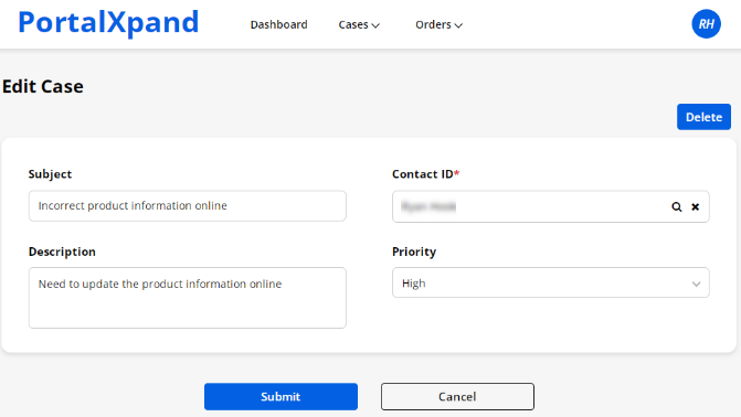
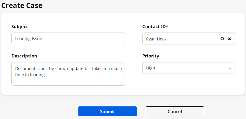
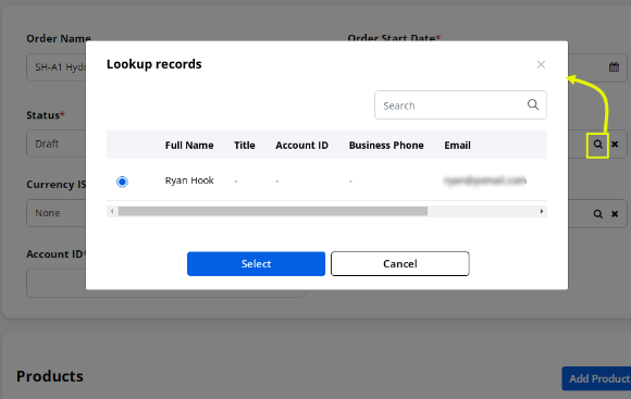
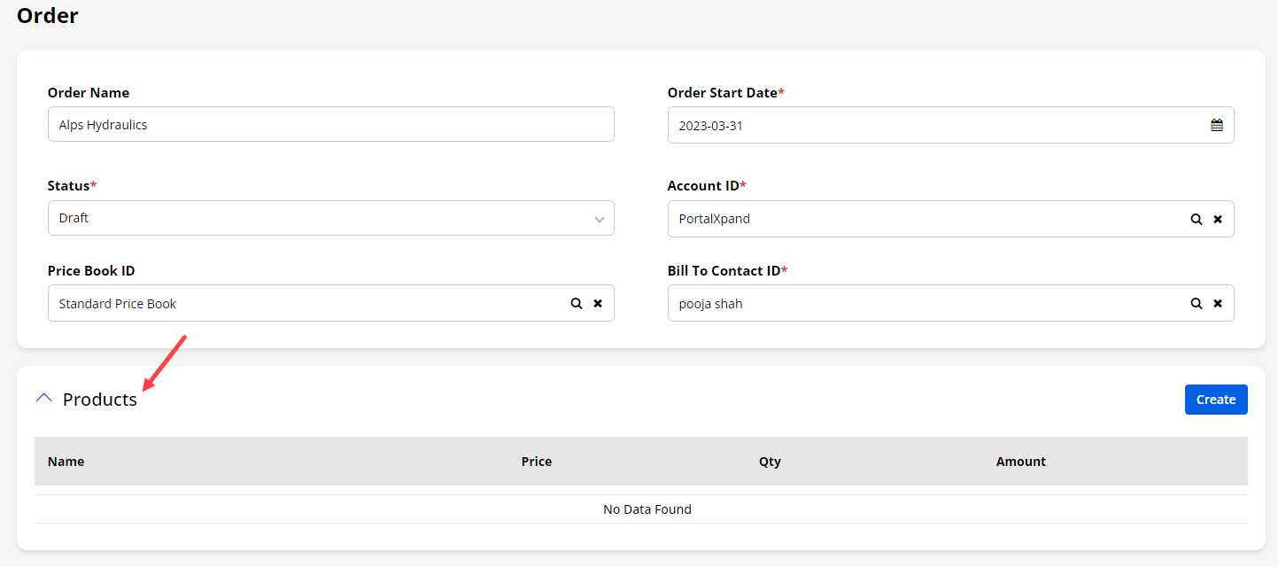
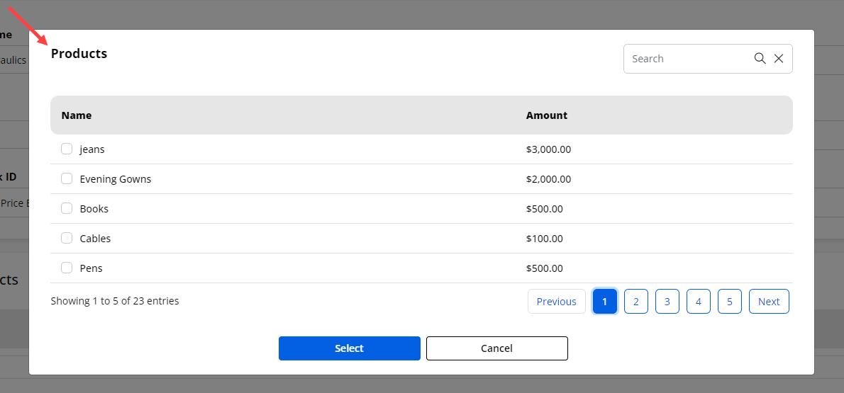
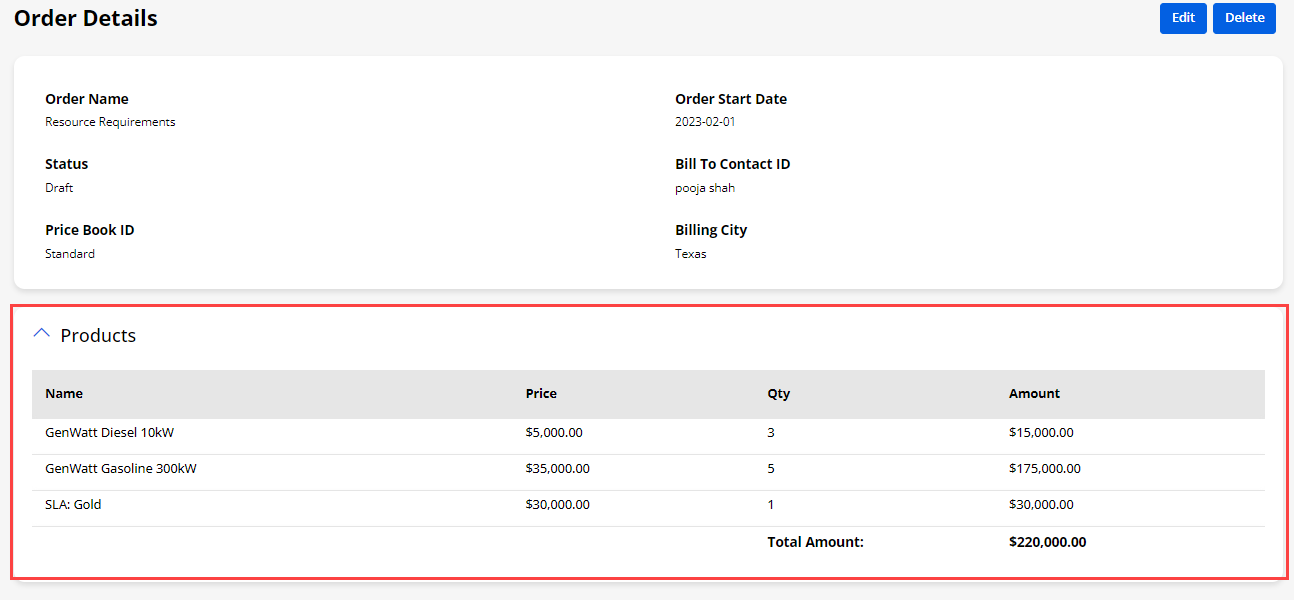
Progress Bar
-
If you have enabled the Progress Bar for the picklist type Field, the portal users will get the progress bar.
-
The portal users can change the value of the progress bar by clicking the stage displayed on the bar. The value of the field will be reflected according to the stage of the progress bar.
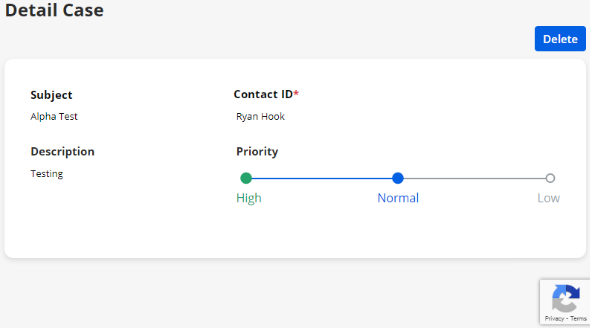
Edit/Detail Page Redirection
-
When the portal users are on the edit page or the detail page of any Object, they can ‘edit’ the Object record or ‘delete’ it as per requirement. Once they click on the Submit/Delete button, they will be redirected to the page as configured from the “Form Widget”(Redirection Settings)
-
From the Object listing page, the portal users can navigate to the edit page. When they delete the Object record, after success, they will be redirected to the page as selected for the “Delete Redirection” page.
-
But, if the portal users edit the form details and click on the Submit button, they will redirect to the page as selected for the “Submit Redirection” page.
-
Similarly, from the Object record’s detail page, the portal users are redirected to the page that has been set in the form widget for the Detail page.
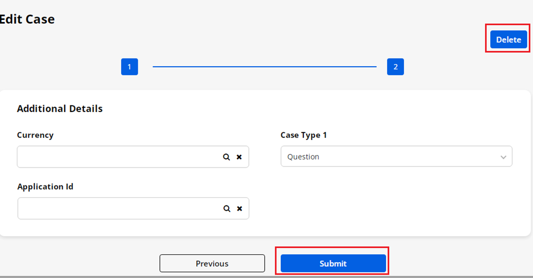
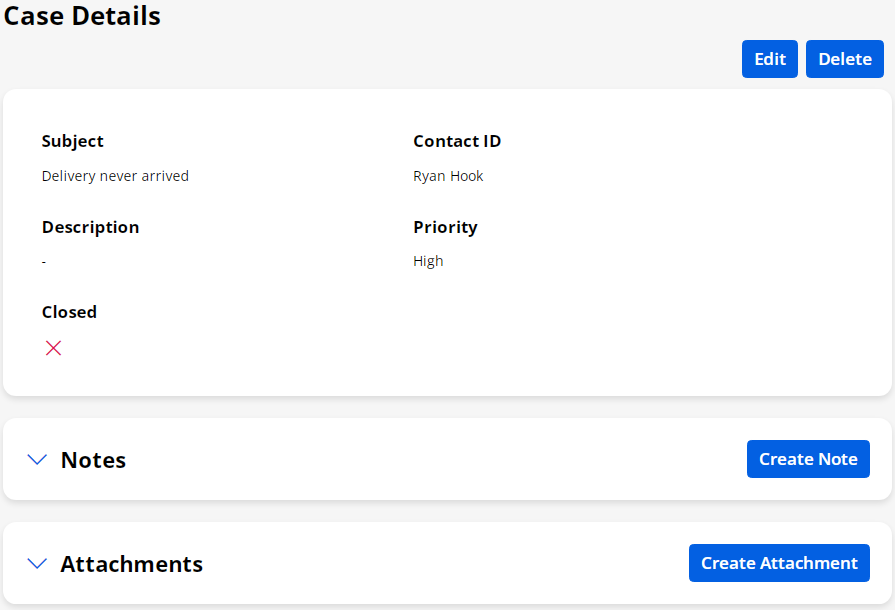
Multi-Step Form
-
If you have enabled the multi-step Form for the Add/Edit form (records), the portal users will get stepwise form filling. The steps are the section-wise details that are added in the form layout.
-
Once you fill in the details click on the “Next” button to navigate to the next details.
-
You cannot navigate to the next step until you fill in the current step details.
-
If you are editing the record (form), you will get the multi-step.
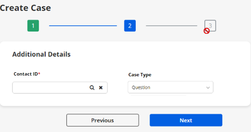
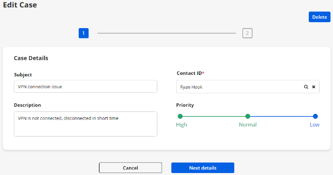
Case Deflection (Solutions)
-
Solution module in portal helps portal users to get probable solutions before generating any case.
-
The portal users will get the Case Deflection as per the Case Deflection widget that is configured from the Page Builder.
-
Portal Users can add queries or issues in the search solution box if they want to or they can also directly add a case. If they have searched and there is any appropriate solution related to that query, then the solution will get listed.
-
If no solution is found related to portal users queries or issues or they didn’t find which they are looking for then they can add a case by clicking on the + Create Case button. By clicking on it, the portal users will be redirected to the Create Case page as per the Case Deflection widget configuration.
Note: The display data will be gathered from the configured Object (Solution/Knowledge Article)
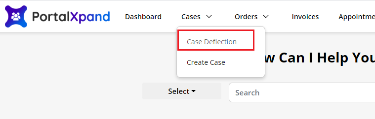
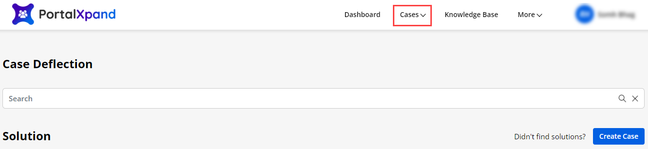
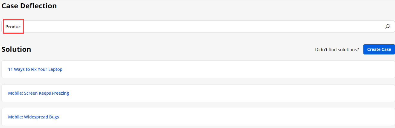
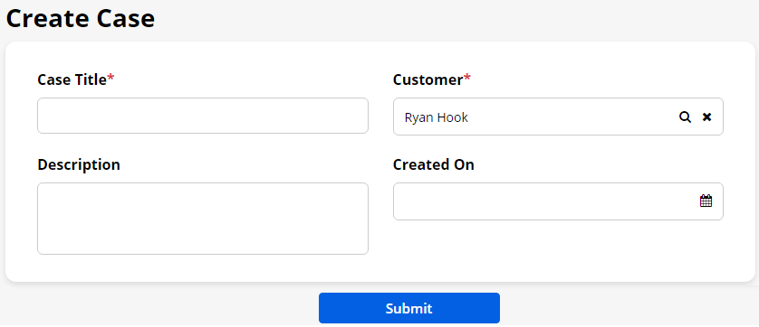
Panel Separation (Section-wise details)
-
If you have added multiple panels and added the layouts panel-wise in the form builder of any Object, the portal users can get that page panel-wise in the customer portal.
-
As you have added fields in the panels by inserting the ‘Title’ of the panel, the portal users will access the details.
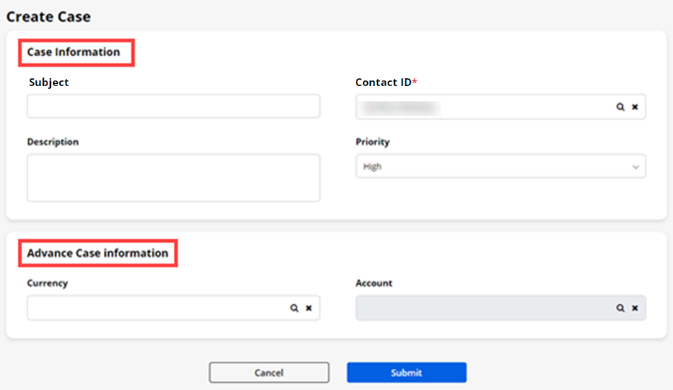
Sub Grid Support
-
The Portal users will get the Sub grids with related records as per configuration in the Form builder Object.
-
If global access is enabled then the front side user will get a filter option to show My Records or All Records.
– My Records : If My records is selected, then the user will get the data that he/she has created.
– All Records : If All records is selected, then the user will get all the data of that particular parent record.
- The portal users can perform actions such as Add (Create), Edit, and Delete as per the accessibility from the Form builder Sub Grid configuration.
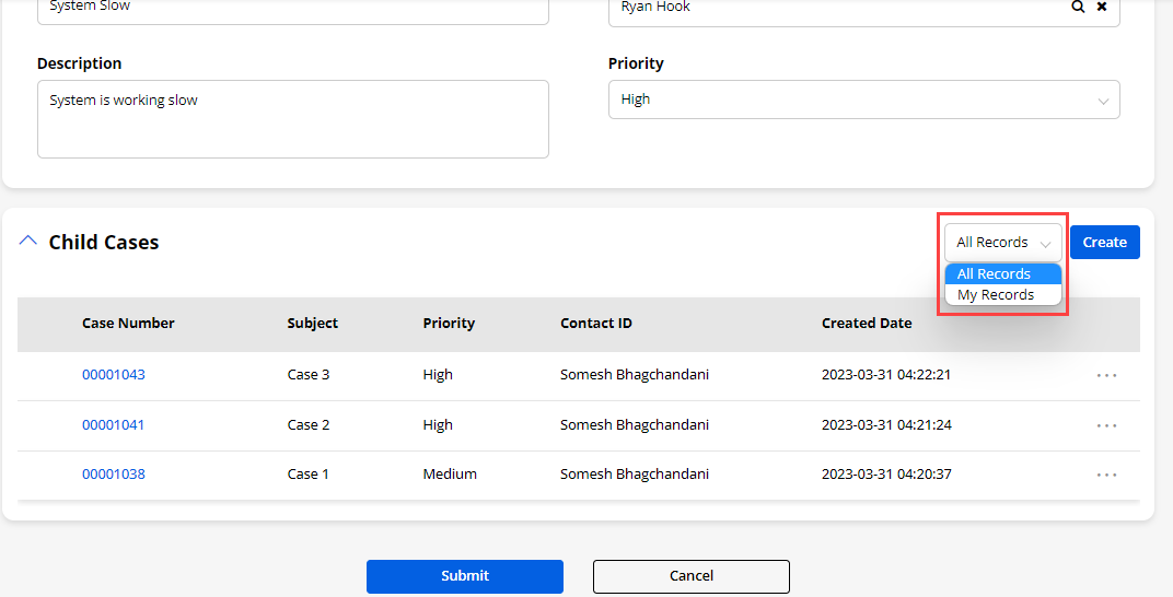
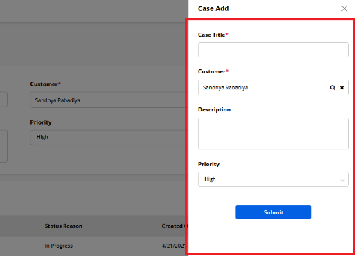
Show/Hide Fields
-
You can Show/Hide the fields to portal users based on condition match that is set and configured in the “Advance Field Management” in the “Form builder”.
-
When the portal users select a ‘Field’, which is set as Conditional Field Options, the fields which are selected in “Visibility Field” will appear in add/edit of any Object form.
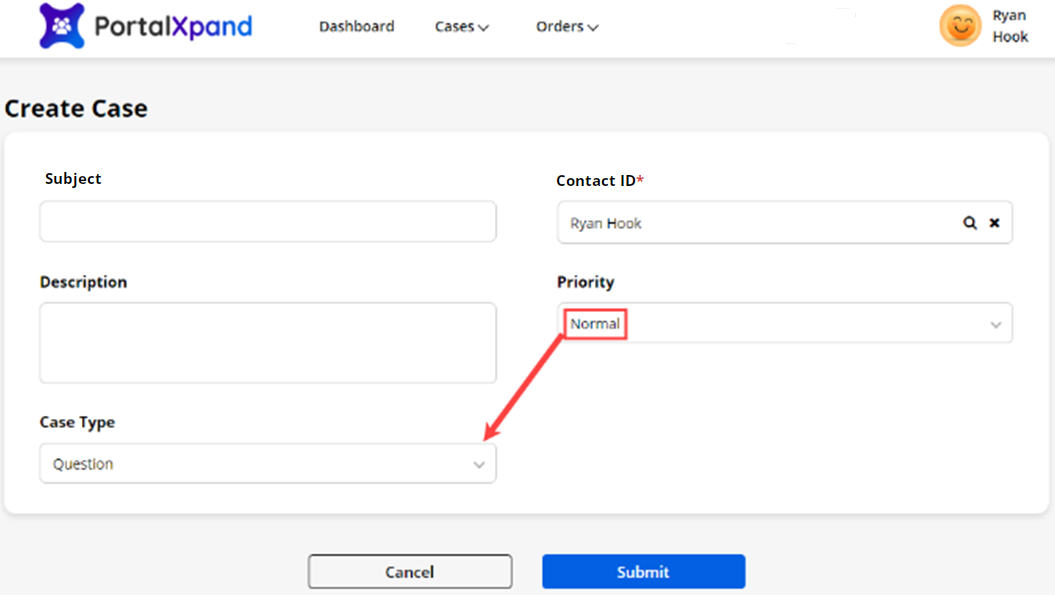
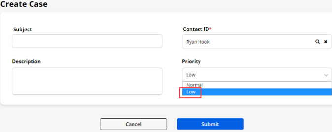
Hidden Fields/Default Value
-
You can hide the particular datatype field from the form using the “Hidden” checkbox available in the form builder
-
This field will be hidden in the front form and set the default value that you have set from the field setting.
-
For Edit Type form – This feature will work only if the field is null/empty and this feature will set the default value to it. It will not change your entered value.
-
You can see the Case type field was hidden in the form but it is visible in the list with the default value.
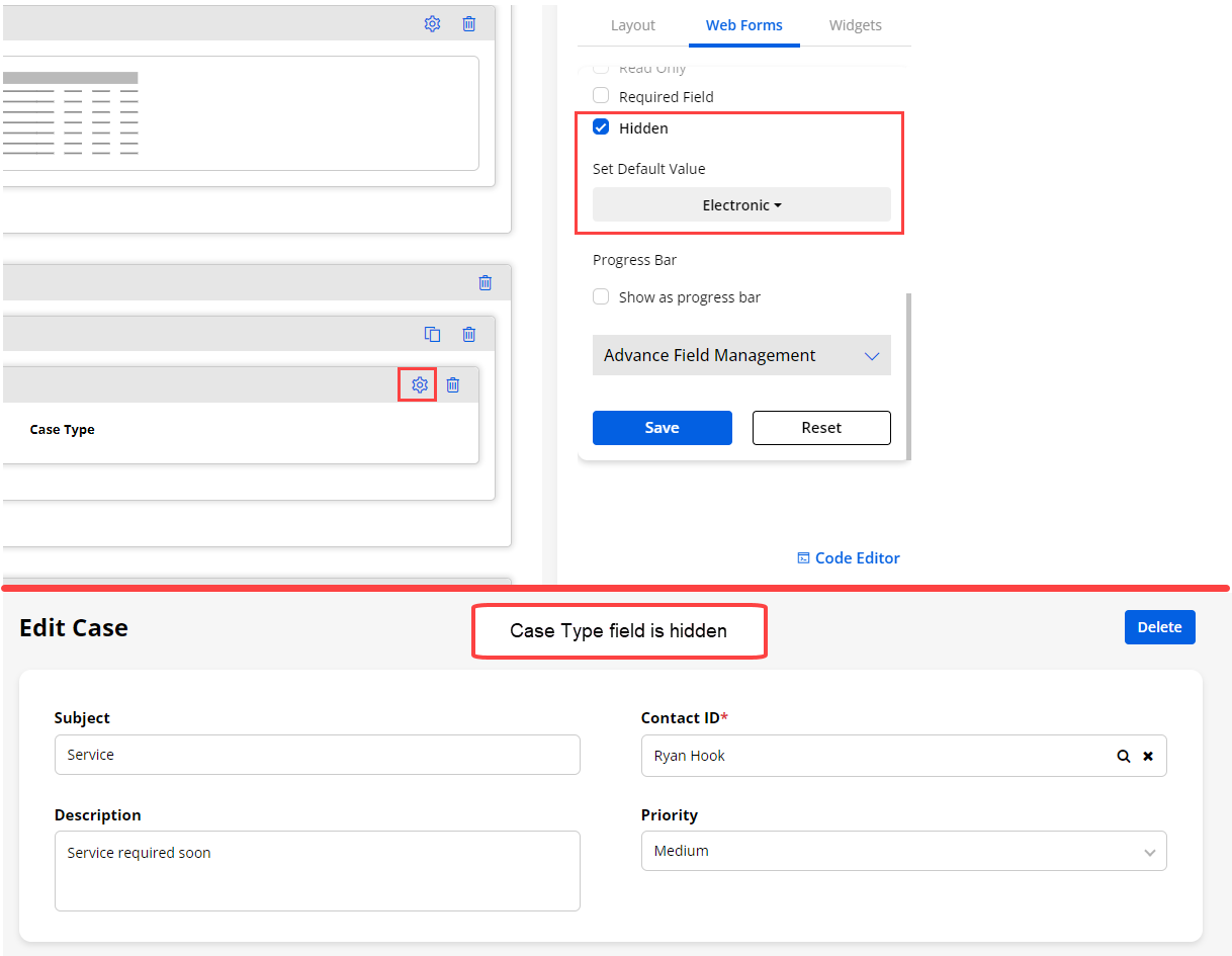
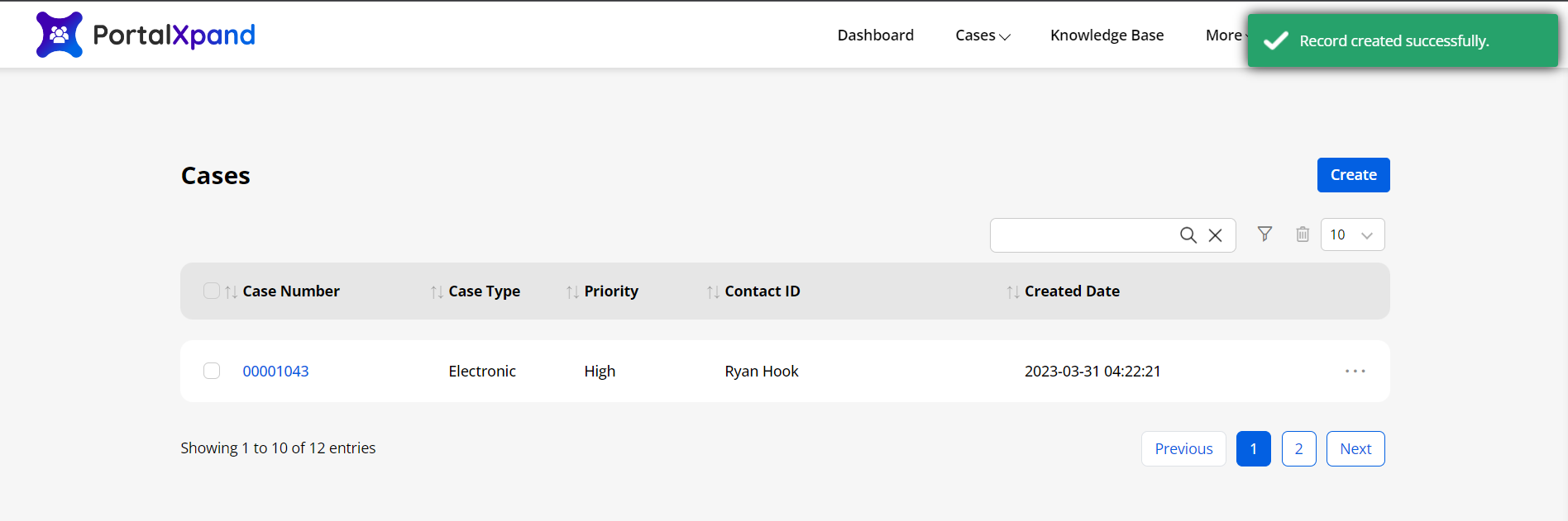
Parent-Child Identification
- If the identification is set for the Parent-Child form and the user enters the field value that is already existing in the CRM, it will not create a new record for the Parent Object. It will relate the child Object record with an already existing parent record.
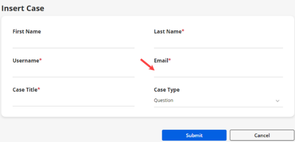
List view
-
By navigating to any Object, the portal users will be able to see the list of the records of that Object.
-
Here the users will get the Listing page appearance (Fonts & Background) as per the Theme configuration from the Admin portal settings.
-
The users will get the Listing details as per the configuration from the Object’s Page Builder and as per the configuration of the ‘List widget’.
-
You can search and filter the records from the list. If you have added the fields for the filter search, the portal users can filter the records by clicking the filter icon. By clicking on the Filter icon, the portal users can search the records based on the selected values.
-
The portal users can access the Object details and edit/delete the records as per the given rights.
Delete
- The portal users can also delete multiple records as you have given the delete rights. Portal users can select the Object records in bulk and by clicking on the Delete icon, the records will be removed.
CSV Export
-
The portal users can export the Object records in the CSV.
-
Select all or select required records to export in CSV and click on the CSV icon, it will export the CSV file of the selected records.
Note : This button will only work if admin user enables the CSV Export setting from the Admin side.
Filter & reCAPTCHA
-
If you have enabled the option for the Filter search (Advanced Filter) from the Field details of any list, the portal users will get the Filter search option in the list records in the customer portal.
-
By clicking on the ‘Filter’ icon, the portal users can filter the records by selecting the field’s value.
-
If you have enabled the reCAPTCHA V3, the portal users will get the reCAPTCHA icon at the bottom-right corner.
Show As Image
- If you have enabled the option for “Show As Image” from the Field details of any list, the portal users will get the selected field data as image in the list records in the customer portal.
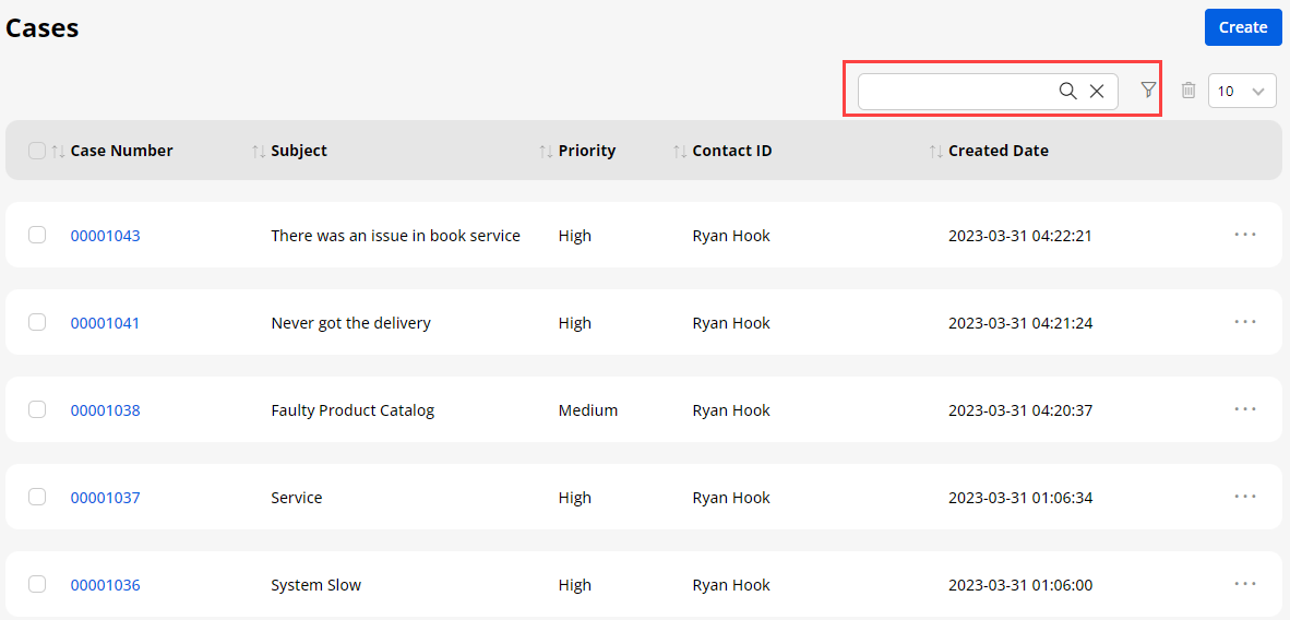
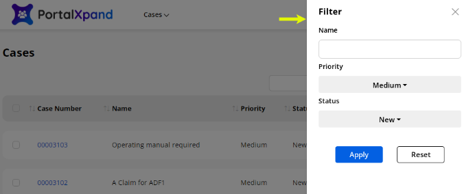
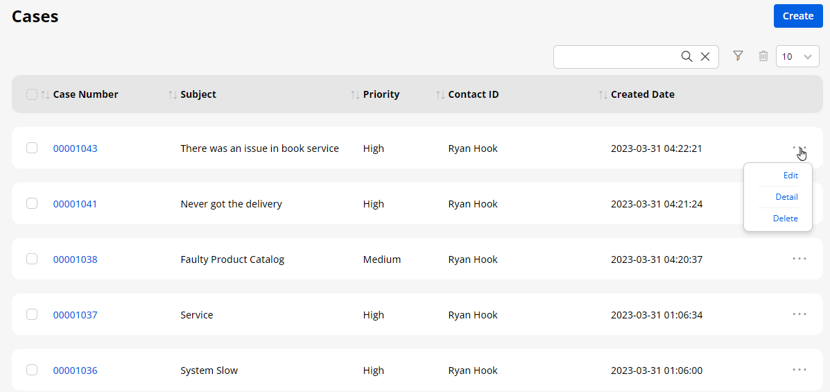
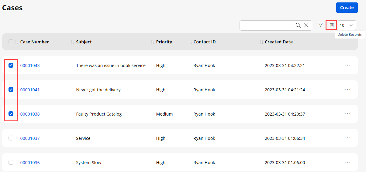
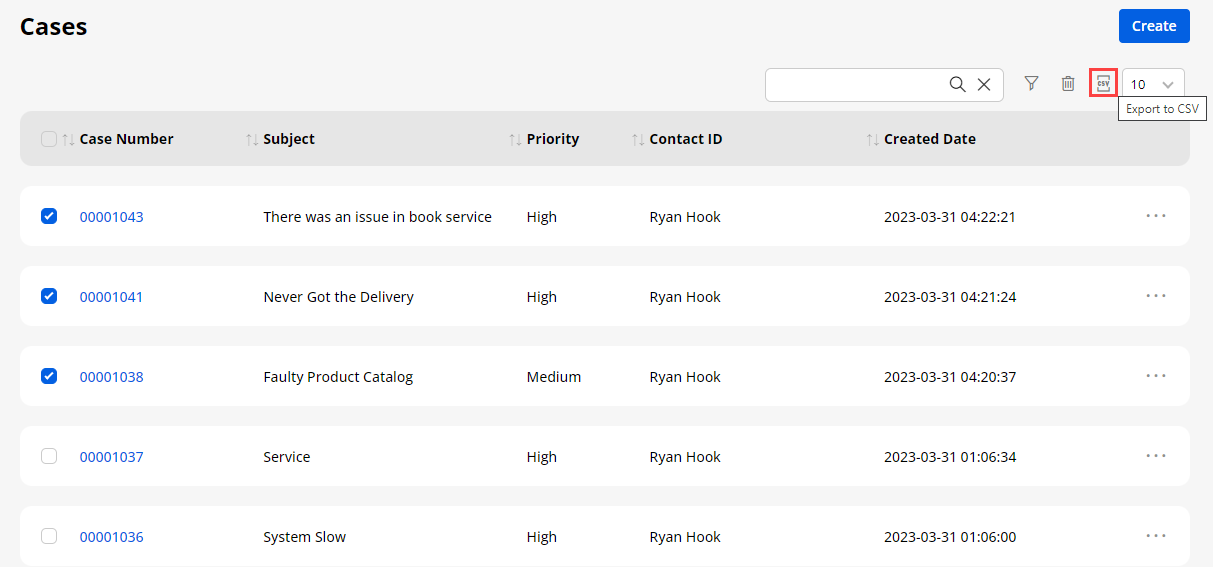
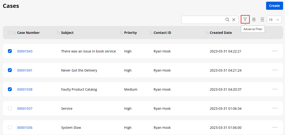
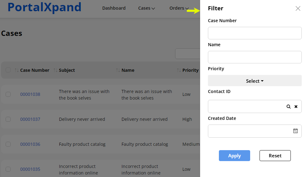
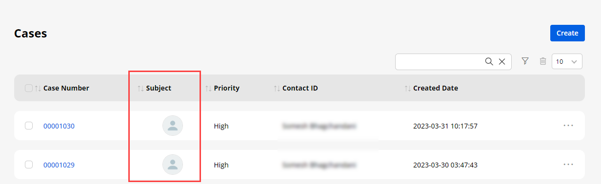
Data Card View
- If you have added a Data Card widget for any object, the portal users will get the records of the selected object in the data card (grid view).
Data Card Design -1
Data Card Design – 2
- Here the Order object’s records are shown in the Data Card view.
Delete Records
- The portal users can also delete multiple records as you have given the delete rights. Portal users can select the Object records in bulk and by clicking on the Delete Records button beside the Create button or Delete icon on the card.
CSV Export
- The portal users can export the Object records in the CSV. Select all or select required records to export in CSV and click on the Export CSV, it will export the CSV file of the selected records.
Note : CSV Export setting will only work if you have enabled it from the backend.
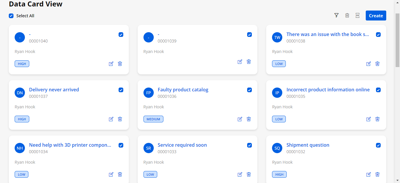
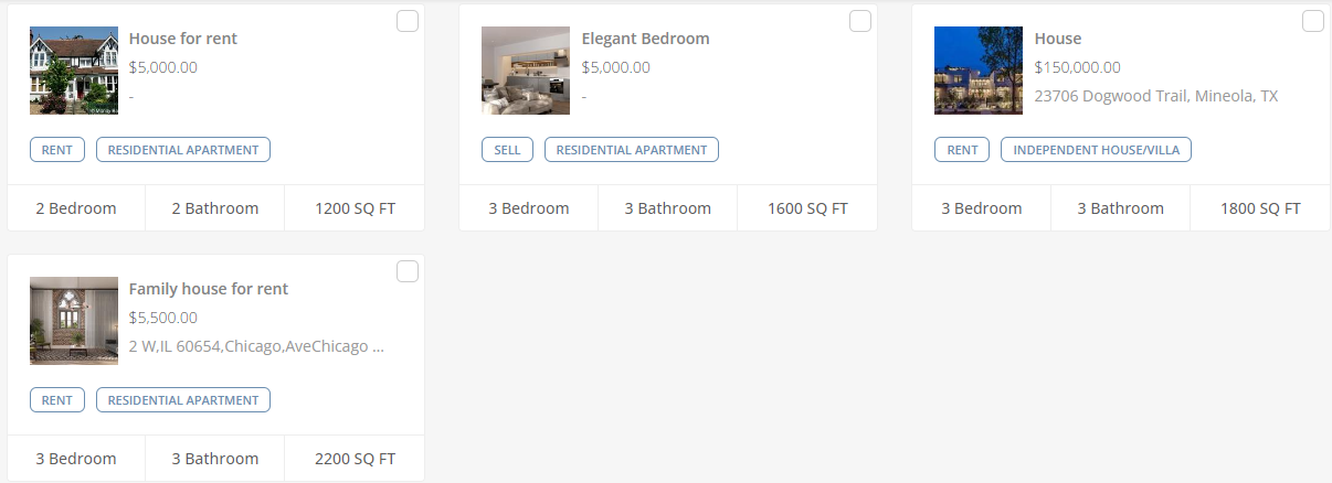
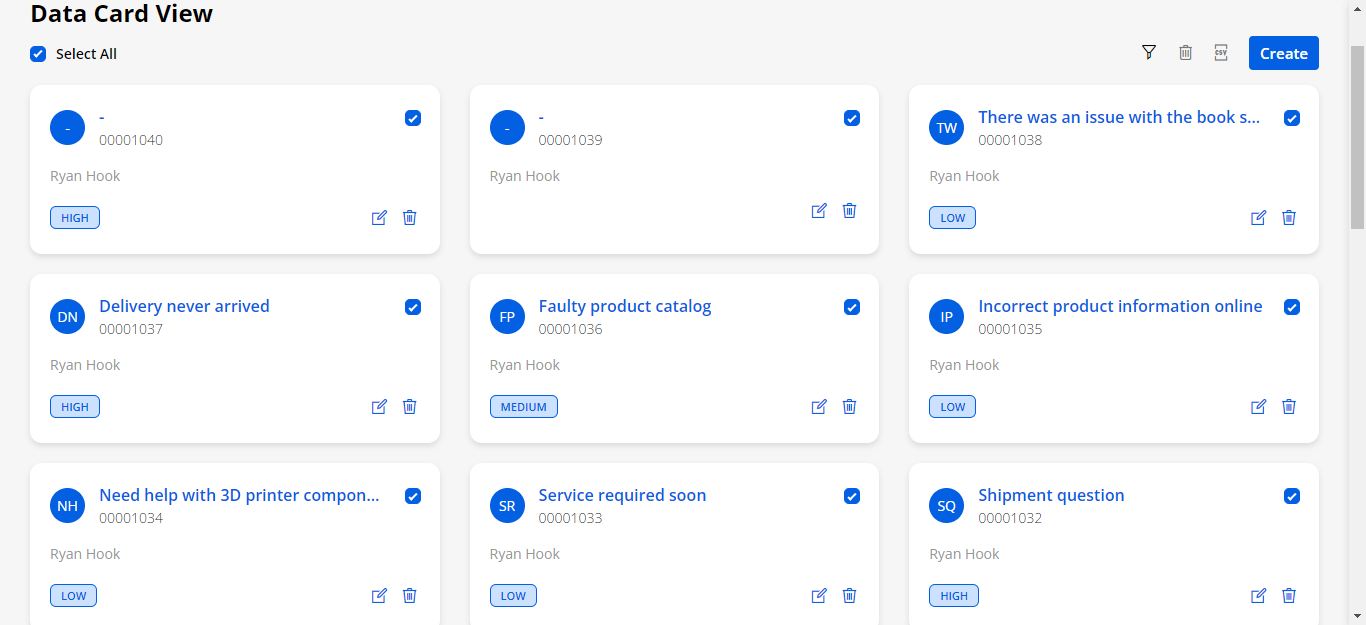
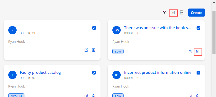
Advance Filter
- Portal users can also filter the records, if you have enabled the advance filter from the list view of the Data Card widget.
Edit Record
Portal users can also edit the records by clicking on the Edit icon, if you have given edit rights to them.
Show As Image
- If you have enabled the option for the “Show As Image” from the Field details of any list, also you have selected the field in image setting of data card then portal users will get the selected field data as image in the data card in the customer portal.
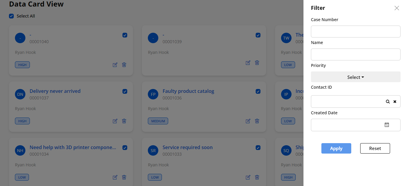
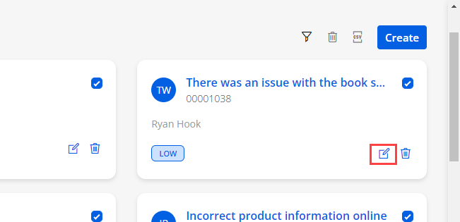
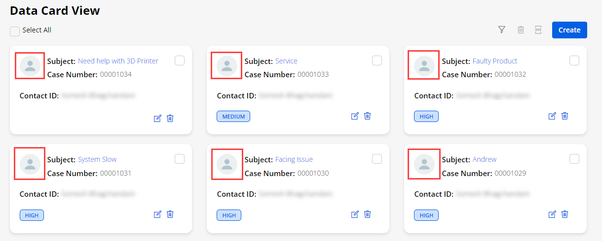
Notes
-
If you have enabled the “Notes” option in the detail page layout of any object form, the portal users can access the Notes.
-
From the detail page of the record, the portal users will see the “Notes” sections.
-
By clicking on the Create Note button, the portal users will get a popup where they can add a Subject and the Description to provide some issues, queries, details, or any instructions regarding the records (i.e., case details/technical issues).
-
After inserting the note-related details (Subject & Description), click on the Create button to add a note.
-
By clicking on the accordion icon of the “Notes”, you can show/hide the notes section. The “Notes” section contains the Title, Description, and Created On. The portal users also can delete any note by clicking on the ‘delete’ icon.
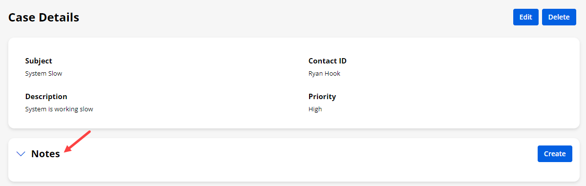
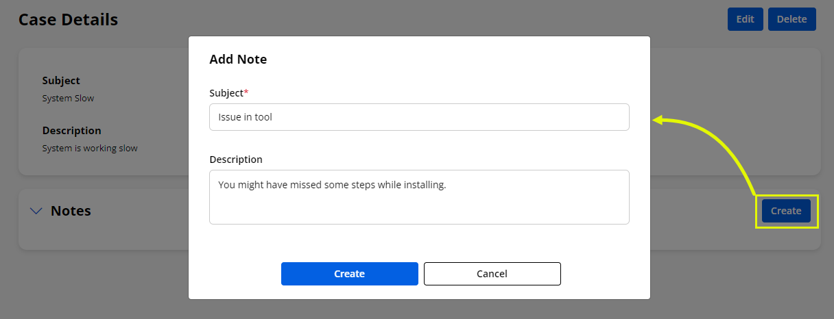
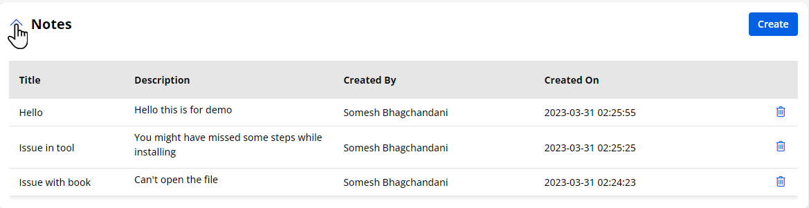
Attachments
-
If you have added the “Attachments” widget in the Edit/detail page layout of any object form, the portal users can access the Attachments.
-
From the edit/detail page of the record, the portal users will see the “Attachments” sections.
-
Based on access rights, users will get Create and Delete buttons.
-
By clicking on the Create button, the portal users will get a popup where they can “Attach a File” by browsing from the local system. Along with the file, the portal users can add a “Description” as well.
-
After attaching the file and adding the description, click on the Create button to add an attachment.
Note: The portal users can attach a file maximum of 5MB in size. All the file extensions of Salesforce CRM will be supported here.
-
By clicking on the accordion icon of the “Attachments”, the portal users can show/hide the attachment section.
-
If the description is too long in Attachments, the portal users can see it by clicking on the Read More text.
-
By clicking on the “Read More” caption, the portal users will see the whole description in the popup.
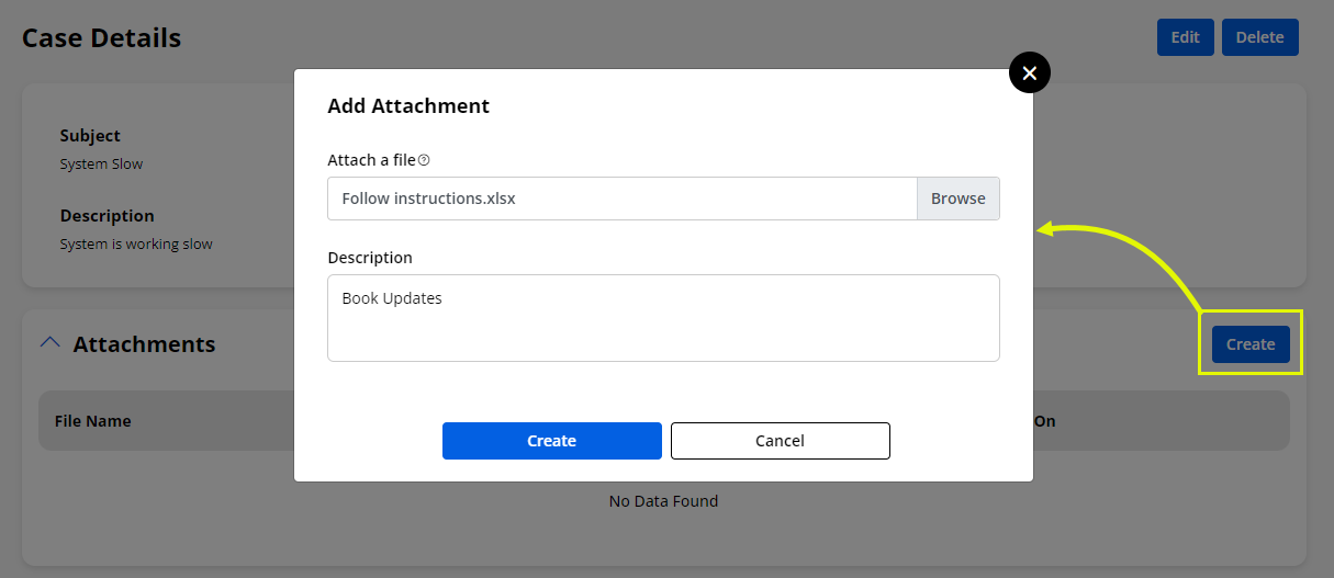
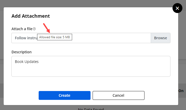
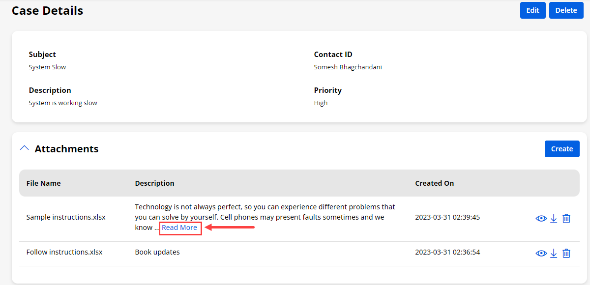
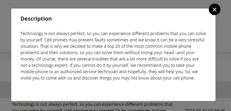
Conditional Based Data Access
Workflow Management
-
The portal users will get the object records and access rights (Edit, Detail, and Delete) as configured in the workflow for the specific object by setting up the condition(s).
-
Load Data
-
If you have set up the workflow to filter and sort the object records, the portal users will get the object records as per the condition that is set from the admin side.
Before Condition (workflow) applied:
- The portal users can see the whole records of the invoice entity.
After Condition (workflow) applied:
-
Now, as per the condition in the workflow for the Invoices entity, the portal users will see only those entity records that are set in the condition.
-
Here, as per the condition, the portal users will see only those entity records whose “Status Reason” is New.
-
You can also get the object records in the data card view and in the dashboard details (Count & Recent Activity) as per the condition.
-
User Access Rights
-
The portal users will get the accessibility of the Edit, Detail, and Delete rights as the conditions are set from the admin side.
-
From the admin side, the condition is set in the workflow that the entity records having the status of the “Complete” & “Cancelled”, will not get the Delete access rights.
While the entity records other than “Complete’ and “Cancelled” status will have the Delete rights as well.
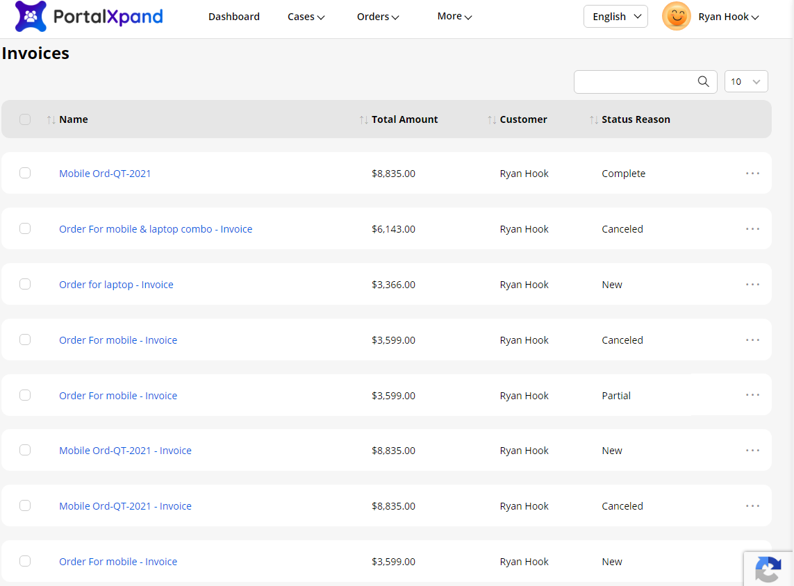
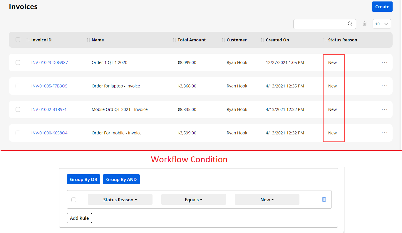
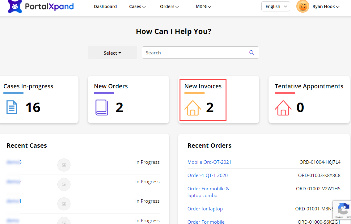
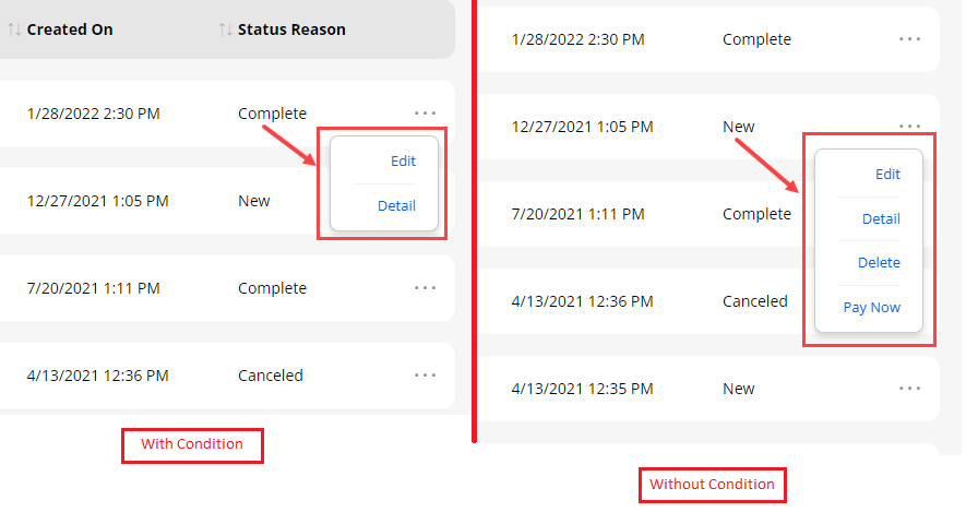
Editor Functionality
-
While on the portal side, if you are logged in to the CRMJetty Portal admin account then you will get the Edit functionality on every page.
-
By clicking on the Edit, you will be redirected to the edit view of the particular page in the admin side.
-
If you want to modify data level settings from any specific builder like List, DataCard, Form, Menu, Profile, and Register then you will get an editing shortcut. to redirect directly to the respective list, form, or menu details in the admin.
-
By clicking on the respective Edit icon, you will be redirected to the form/list/menu edit view in new tab.
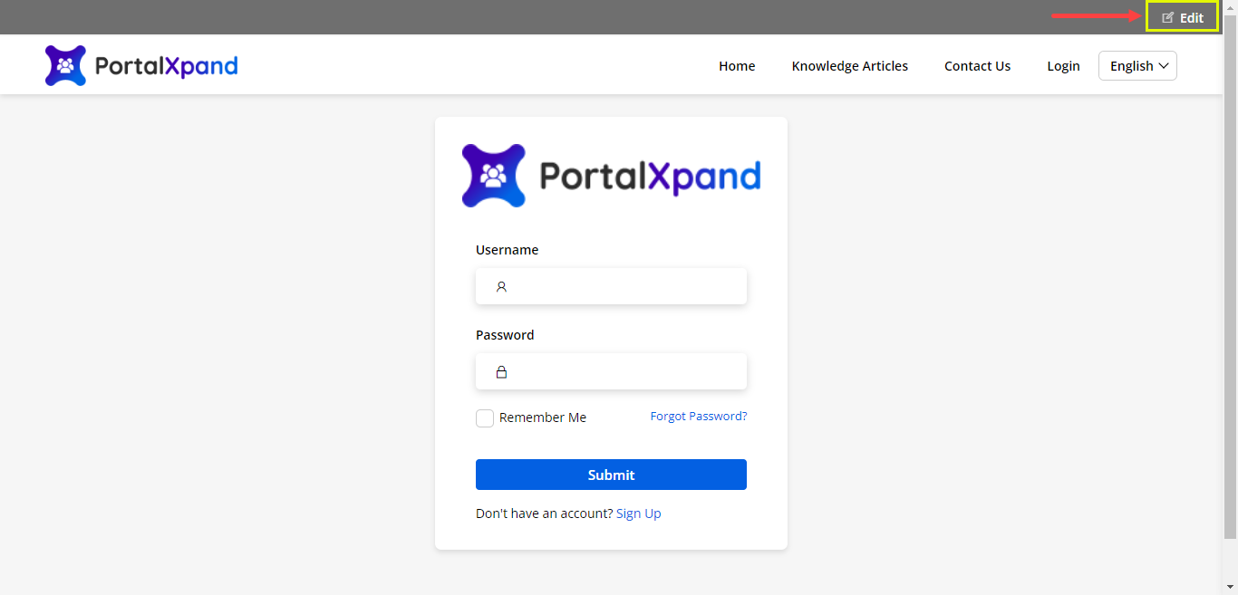
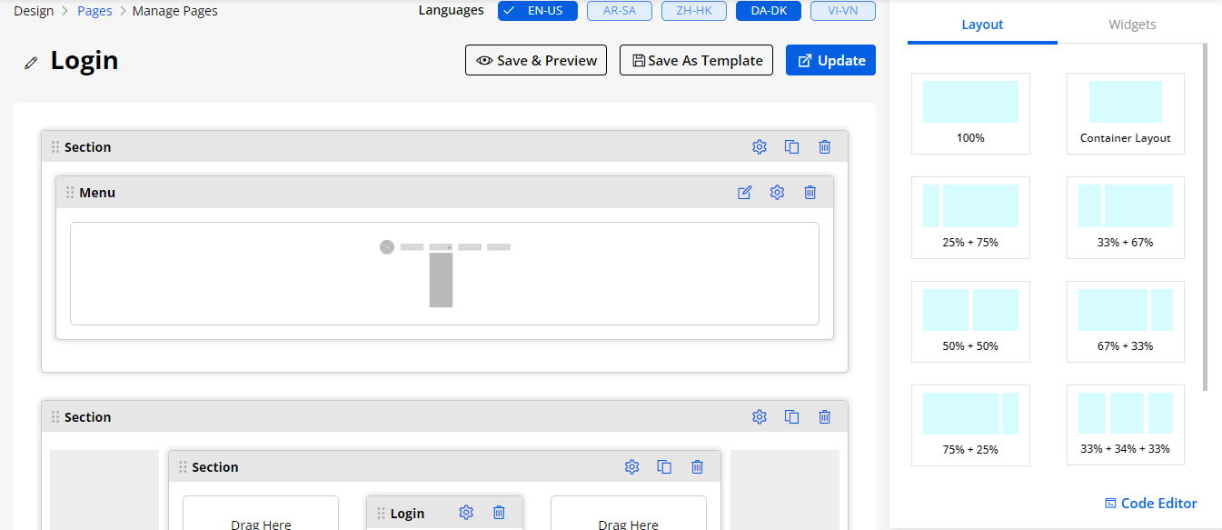
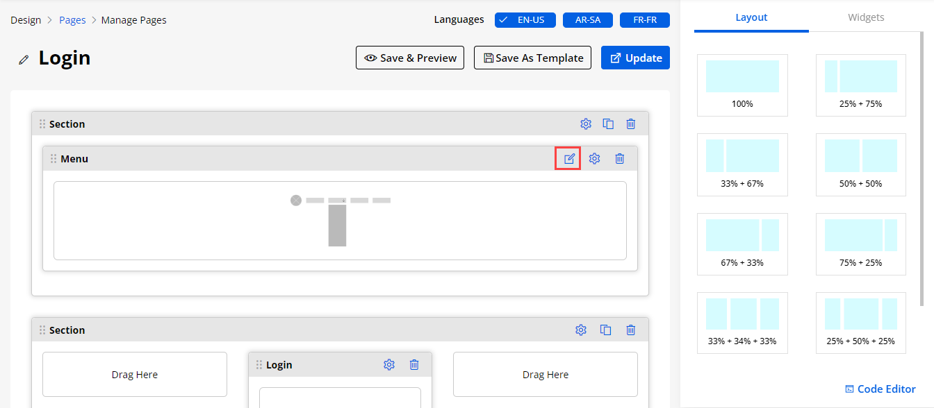
Email Respondent
- Email Respondent will enable for both: Before Login page form and After Login page form.
– Before Login: If you have enabled the Email feature for Before Login page, the portal users will get the form details to the email that is entered in the Email field of the form. So the Email field must be in the Form.
– After Login: If you have enabled the Email feature, the portal users get an email with the form details to the email that they used for the portal logged in.
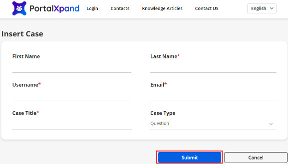
Add Record
-
If you have enabled the Email Respondent option from the Form widget configuration, the portal users will get the email along with details (as per the Email template).
-
By clicking on the Submit button to add a new record (add form), the portal users get an email with the form data.
-
The Email templates are according to the form object. In the case of the parent-child relationship form, the template and link of the record are according to the parent and child object.
-
The portal users will get the Email as per the new entity records submission (Add Form).
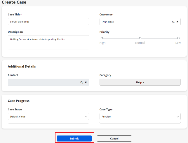
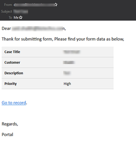
Payment Integration Support
-
If you have configured the “Payment Integrations” from the admin side and configure the Payment Settings from the List Builder, only then the portal users will get the Pay Now button for payment.
-
By clicking on the PayNow, there are two possible ways.
-
- if the user does not enable the page redirection from the payment configuration then the popup with the payment options will appear which are enabled from the payment integrations.
-
- Else the portal users will navigate to the Payment Page that is configured from the Design -> Page Builder by adding a Payment widget.
Note: If a user had set only one payment option then users will be redirected to the payment checkout page.
-
If you select the “PayPal” payment method, you will get the PayPal login credential page in the new tab.
-
If you have selected the “Stripe” payment method, the stripe form will appear where they can fill up the card details to make the payment.
-
You can return to the customer portal by clicking on the ← Back text caption shown in the screenshot.
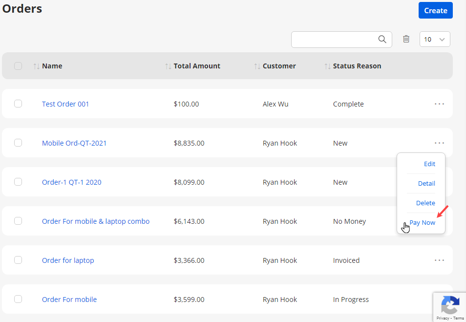
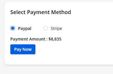
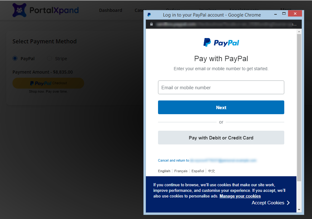
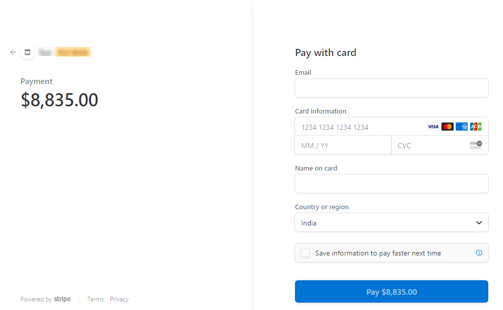
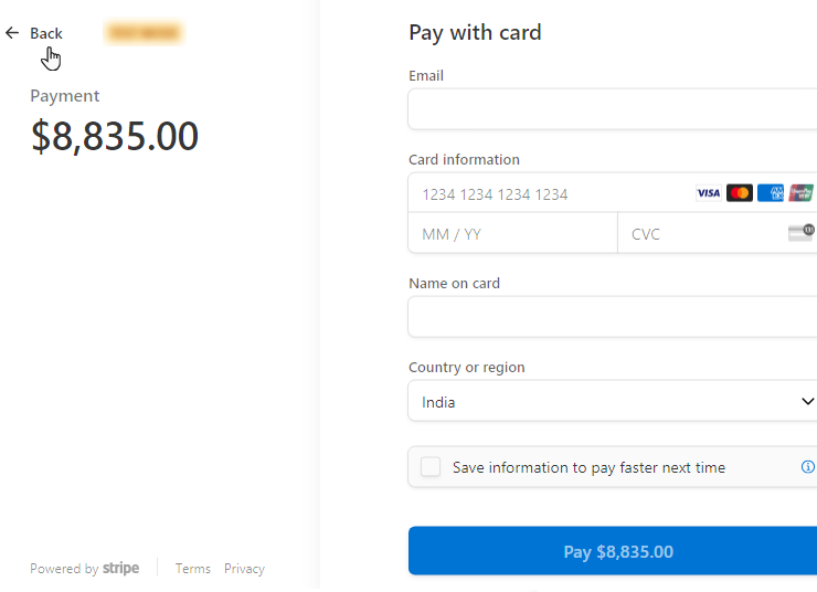
RTL (Right To Left) Support
- The portal users will get the RTL (Right to Left) content support. If the portal users select the RTL Language from the ‘Language’ option, the Portal content will convert into RTL- Right To Left.
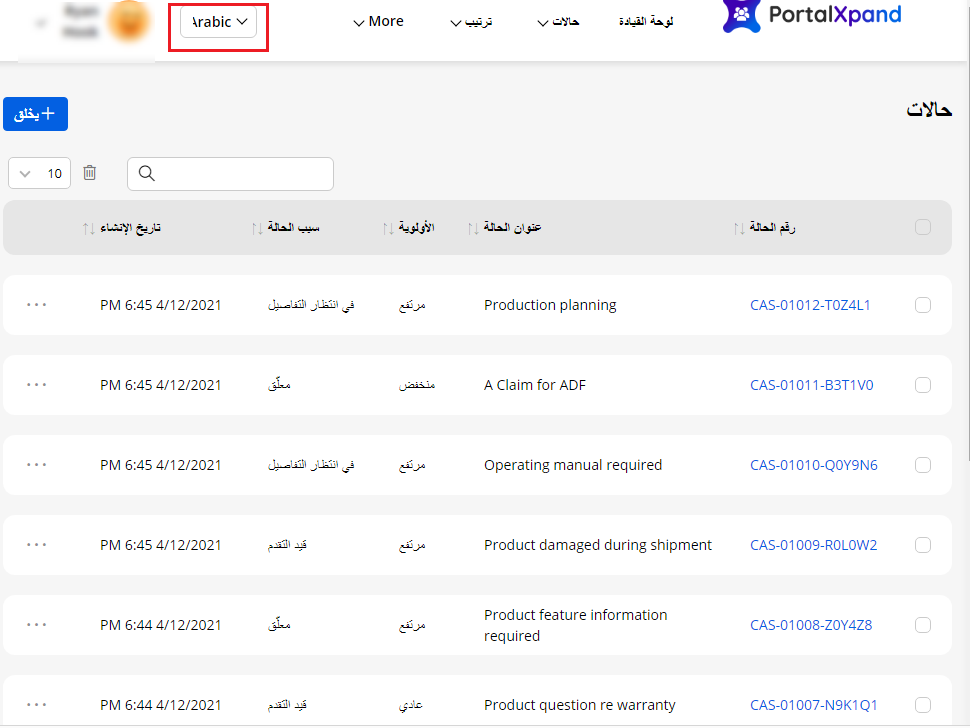
Site Under Maintenance
If you have enabled the portal site under the maintenance option from the “Portal General Settings”, the portal users will see the page that you have selected for the Site Under Maintenance.
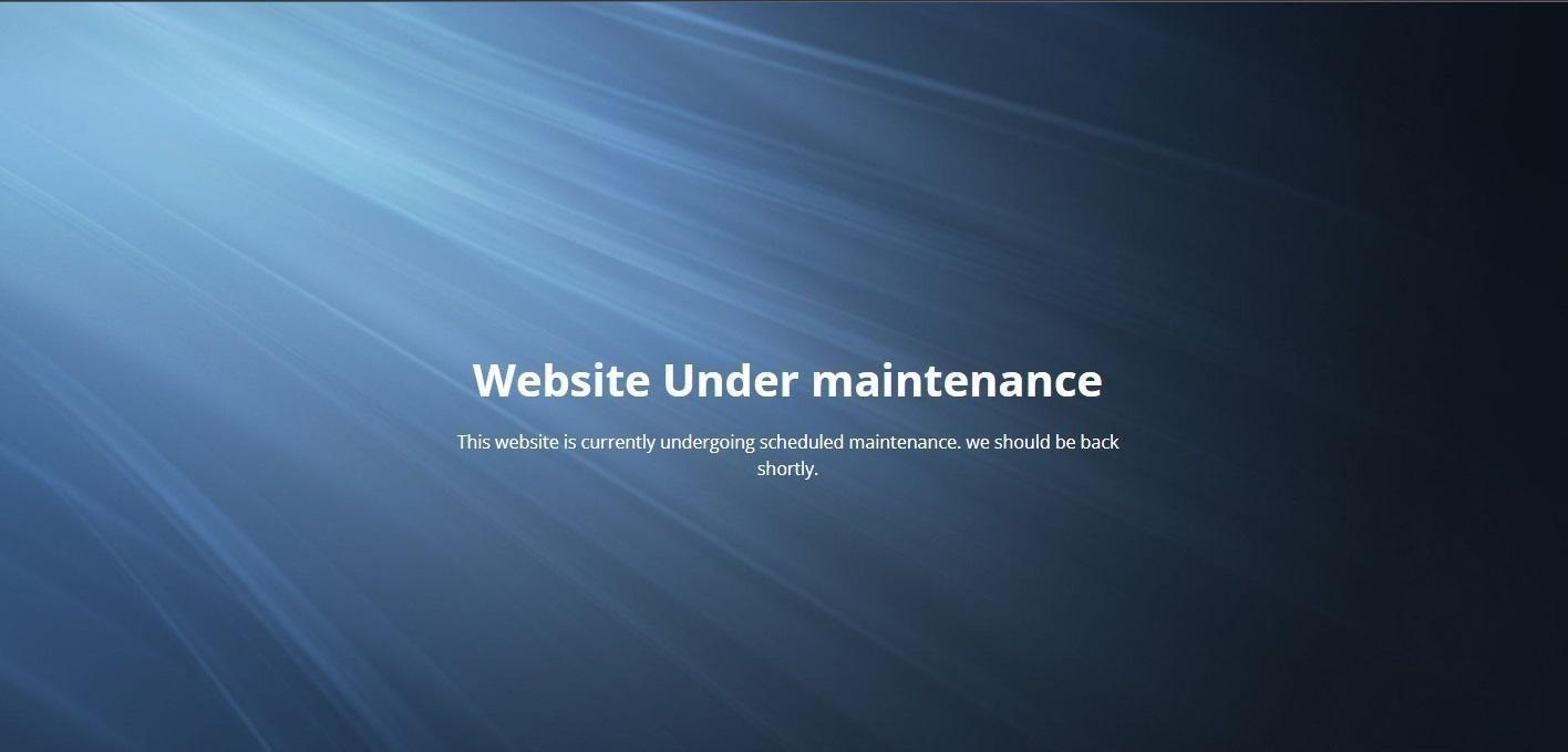
Customer Portal with Banners
- You can show the banner to the portal users by choosing the specific template on the customer portal main page (home page). When the portal users access the customer portal, they can see the customer portal banner as configured using the “Banner” widget from the portal admin side.
Banner with Content only
- You can choose the template that you want to show as the portal’s home page to the portal users. If you have chosen the content-specific template only, you just need to set the Banner’s Header Text and Sub Header Text only.
Banner with Image
-
You can choose the template with the image as well.
-
In the screenshot, the content is on the left and the image is on the right side as per the selected template. You can also choose the template, in that the image will be on the left side and the content will be on the right side.
Button for CTA
- If you have enabled the button from the portal admin side in the “Banner” widget, the portal users will get the button and navigate to the button events as configured. (Specific page of the portal or external URL)
Banner with the specific background
- You can set the banner’s background by setting the background color (solid/gradient), Image (uploading an image), or Video (uploading a video/external video URL) as per your requirement of the portal.
Banner with Gradient color background
- The banner is set as a gradient color background choosing the Primary, Secondary Color and setting the gradient degree.
Banner with Background Image
-
The banner is set as the background image. You can also configure the text color for the content that is displayed on the banner. (Header & Sub Header Text).
-
In this way, you can also show the banner with the background video.
Portal Login & Registration
-
The portal users who are authenticated from the admin side can directly log in to the portal using the credentials.
-
Here the portal users will get the login page widget as configured from the Design ? Page Builder admin side.
-
If reCAPTCHA is enabled, the portal user will get the reCAPTCHA option at the time of login.
Note: You can allow the portal users to access some of the menu/pages before login. On the login page, you will get the option from the header menu, as you have configured it as before the login page in the Page Builder.
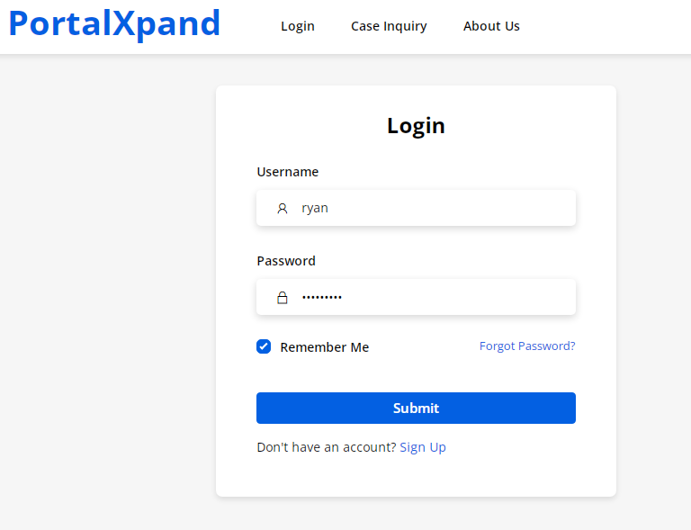
Two Factor Verification
-
If you have enabled the two-step verification from the ‘Login’ widget, the portal users will get the OTP in their registered Email ID that needs to be added here for successful login.
-
Here, the portal users will get the options to disable the two-factor authentication for their browser & Resend OTP to get the OTP in the registered Email id once again.
By clicking on the Verify button, the portal users will log in to the portal.
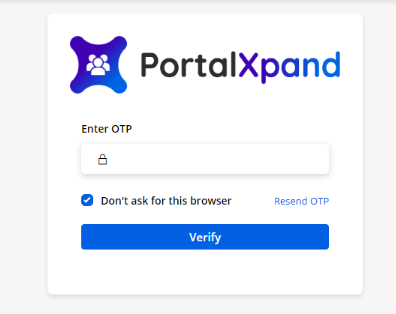
Password Lock
-
After configuring the password lock feature from backend here is how it will work on the portal.
-
After entering the wrong password, a message will appear showing the remaining attempts to enter the valid credentials.
-
Once the attempts are over timer will be clocking as per the backend configurations. Once the timer is over your portal user can log in again.
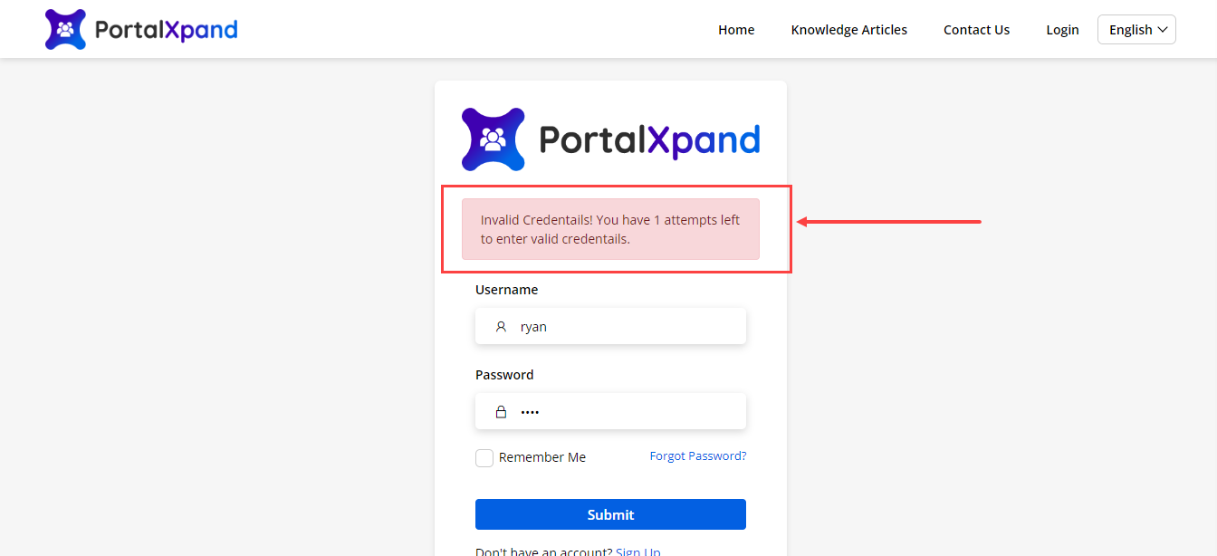
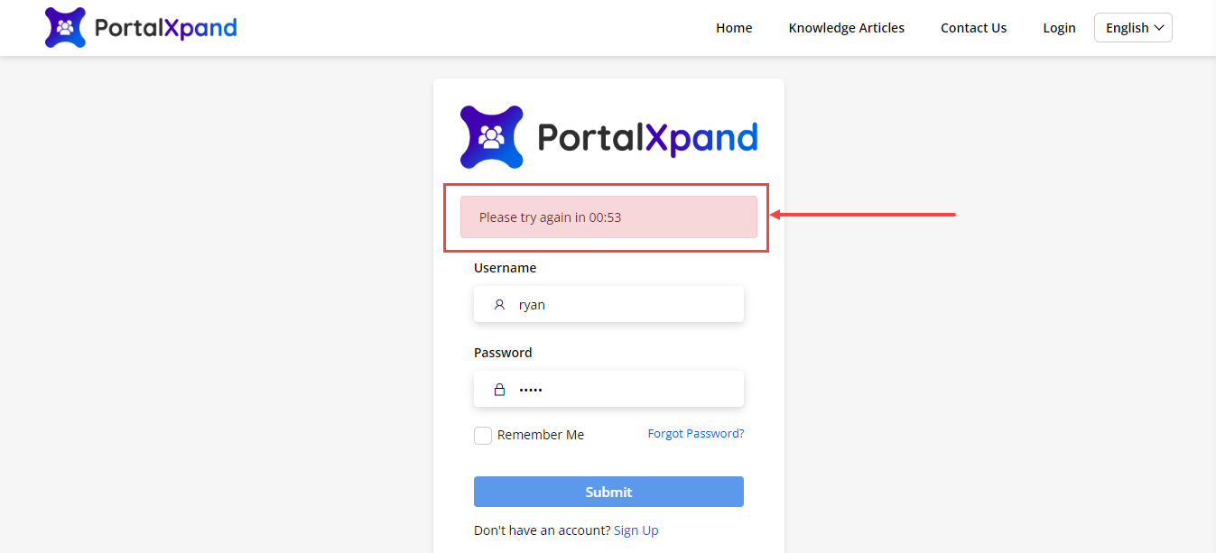
Forgot Password
- Portal users can retrieve their login password using the ‘ForgotPassword’ Option.
The portal users need to enter the email address and by clicking on the Send Reset Password link, they will receive a link in the registered mail to reset the password.
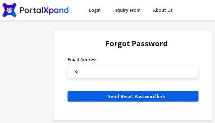
Signup
-
Any new customer can sign-up for the Portal by clicking on the ‘Sign Up’ link on the Login Page. Clicking on this link, it will redirect customers to the registration page.
-
The new customers will get the “Registration page” as designed and configured in the Forms Builder and Page Builder from the admin side.
Note: If you have enabled the options of “Verify Email” & “User Approval” from the Site Configuration, the new customers must verify their email and will require the user approval at the time of login.
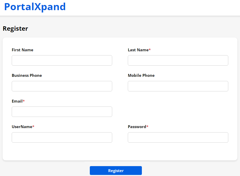
Login through the social media platform
-
The portal users can log in with any of three social media platforms if you have enabled the Customer Onboarding Setting from the Settings → Portal Settings and configured their keys individually. The portal users will get the social media buttons that are enabled.
-
By clicking on any social media button the portal users will be authenticated by the social media login if the portal user is not registered, they will be required to register first. So, the portal users can log in with user validation if you have enabled it from the Customer Onboarding User Validation settings.
Note: If any of the social logins do not have the Email field then the additional Email field section appears and the portal user needs to enter the Email.
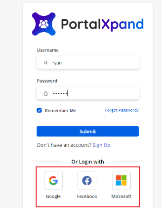
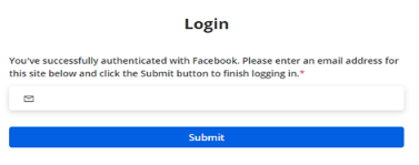
reCAPTCHA
-
The portal users will get the reCAPTCHA V2 or V3 as you have configured in the reCAPTCHA settings from “Portal General Settings”.
-
If you have enabled and configured the reCAPTCHA V2, the portal users will get the “I am not a robot” checkbox on the Login page as Google provides. The portal users need to be checked for the form submission.
-
If you have enabled and configured the reCAPTCHA V3, the portal users can see a captcha at the right corner of the screen. It will send the token automatically based on the portal user’s actions.
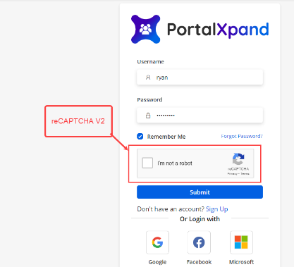
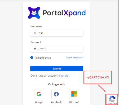
Public Access
Without Login (before login)
-
You can display any page (i.e., About Us,) to the portal users even before the login as public.
-
For that, you need to select the options “Public” and the “At Top” in Page Nesting at the time of creating the Page Builder of any Object/page.
-
If you have enabled any page by selecting the Form that needs to appear without Login (Before Login page), it will appear before the log-in page. So the users who are not registered yet can also connect with the organization by sharing details as per the Form.
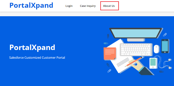
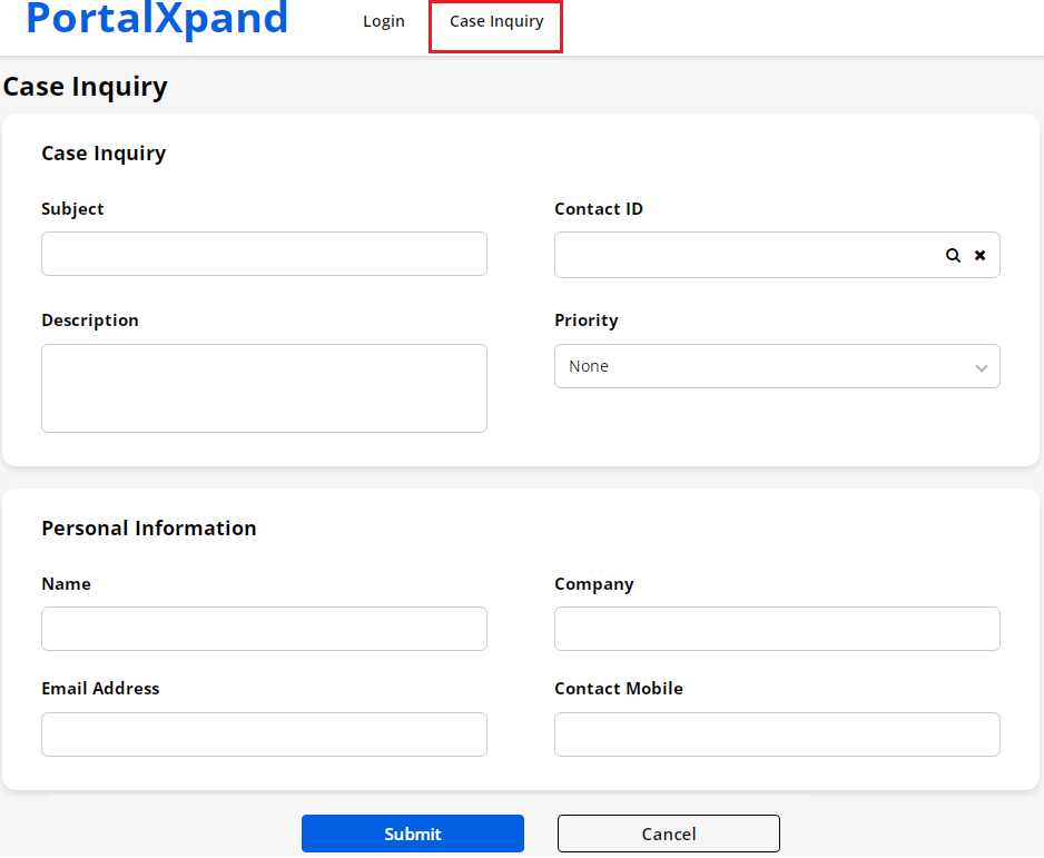
CRMJetty Portal User Portal Dashboard
-
Once the portal user logs into the portal, they will be redirected to that page which is set in the ‘Login Redirection URL’ of the Login Widget of Login page builder.
-
The details on the dashboard will appear as per the configuration and the Dashboard design layout in the “Page Builder” from the admin portal side. The counter will appear as per the “Counter” widget configuration.
-
The portal users can see the recent activity details in the tabular format and the details in the column will be displayed as sequences are managed from the “Recent Activity” widget.
-
If you have selected the redirection page (ViewAll), the portal users will be redirected to the selected page in the “Recent Activity” widget configuration.
-
By clicking on the specific record, the portal users will be redirected to the detail page as per the selection of the detail page from the widget configuration (Portal Backend).
-
Portal users will get the analytics in the charts. The charts will appear as per the Charts widget configuration.
-
They will get the widgets as per the configuration under the Page layout of the Page Builder.
Language Switcher
-
If the portal users have logged in by selecting another language, they will get the portal content in that translated language.
-
The portal users will get the Language Switcher in Before Login & After Login as you have configured.
-
The portal users will get the ‘Language Switcher’ on the Menu based on the configuration in the ‘Menu’ widget.
-
By clicking on it, they will get the enabled & configured language drop-down list, they can select any language to switch to their desired language.
-
By clicking on another language, the portal content will load & appear in that language.
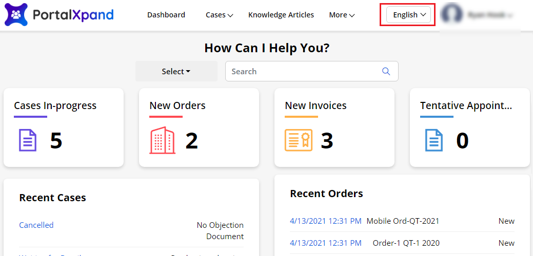
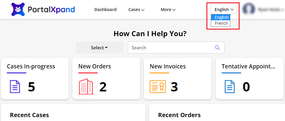
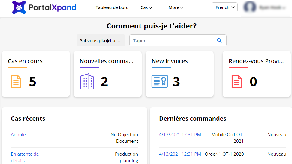
Menu Items
Menu & its Sub-menus
- If you have managed the menu in 3-level navigation from the Menu builder, the menu with the child menu & its sub-menu will appear in the customer portal.
Custom Link
- If you have added the custom link as menu items, the portal users can access.
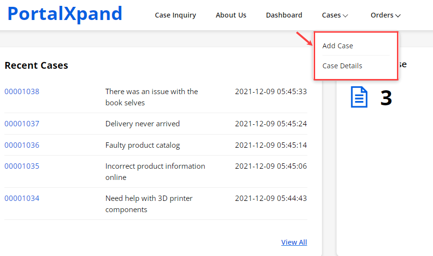
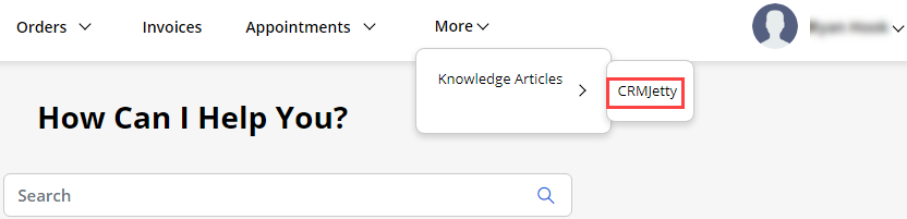
Vertical View
- If you have set the Menu location as “Vertical” from the Page builder, the portal users get the Customer portal in Vertical view.
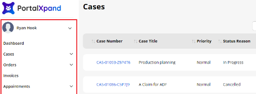
Recent Activity
- If you have added the Image Field for the “Recent Activity” widget, the portal users will see the images along with the records.
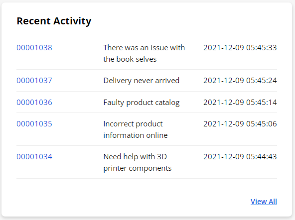
Sliders
- You can display some content, information, or feedback to the portal users in the customer portal.
Slider
-
If you have configured the “Slider” widget to any page, the portal users will see the information in the form of slides.
-
If you have enabled the “Auto Slides” option, the slides will be changed automatically as the timer was set. You can set the color background of the slides individually.
-
You can also enable the Navigation & Pagination settings for the “Slides”.
Content Slider
-
You can display the information as a slider to the portal users in the customer portal. The portal users will get the slides according to sequences of the content slider set.
-
You can set the Auto Slides, Navigation, and Pagination options as per your requirement. You can customize the individual slide’s content and make it more attractive slider.
Note: The template structure will be changed as per the width of the section. Suppose if you have set the 3-column template but the width is not enough to render, it could be reduced to 2 or 1 column structure.
Testimonial Slider
- You can display the customer’s review or feedback in your customer portal by configuring the “Testimonial” widget. If you have enabled navigation settings like enable arrow to navigate previous-next slides and pagination, the portal users can see in the customer portal.
Note: The template structure will be changed as per the width of the section. Suppose if you have set the 3-column template but the width is not enough to render, it could be reduced to 2 or 1 column structure.
Videos
- If you have configured the “Video” widget to any page, the portal users can view the video. Video will be played automatically if you have enabled the Auto-Play option while creating the widget.
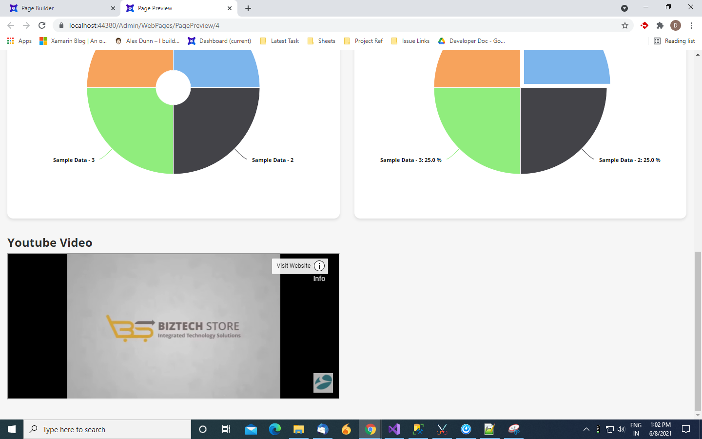
Contact Us
- We simplify your business, offer unique business solution in digital web and IT landscapes.
Customization:
If you would like to customize or discuss about additional features of CRMJetty Portal, please write to us at sales@crmjetty.com.