
How to Add a Banner to a Portal Page
A banner is a prominent block, usually at the top of a page, with a heading, a short message and an optional call-to-action button. Use the Banner widget to welcome portal users or highlight key information in your organization’s style.
Before you start
- You need access to the Design menu in the admin portal.
- Create the page, or know which page to edit. See How to Create Pages in CRMJetty Portal.
- If the banner button will link to a portal page, publish that page first.
Add the Banner widget
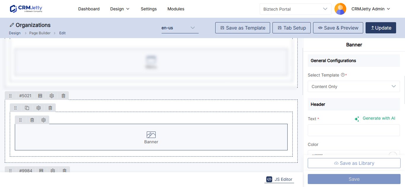
- Go to Design → Page Builder.
- Create a page, or select the three dots (…) next to a page and select Edit.
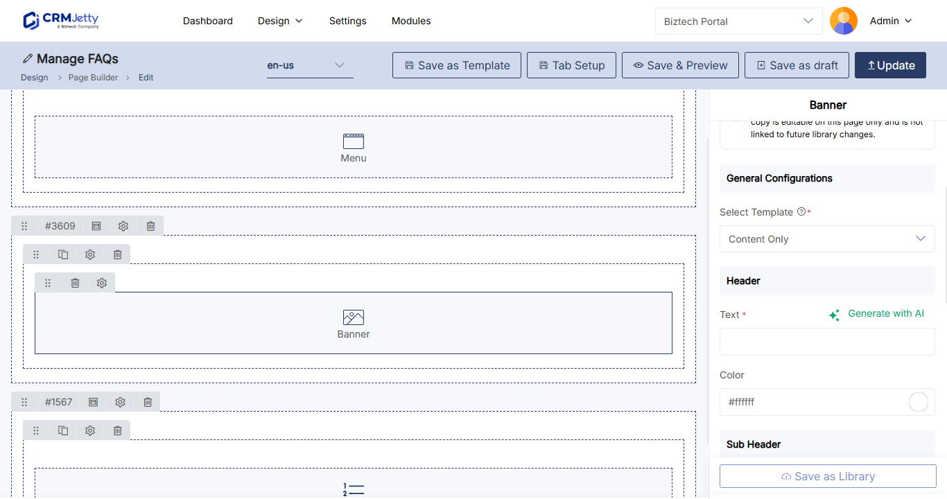
- Select the Banner widget.
- Select the Add Widgets area of the grid where the banner should go.
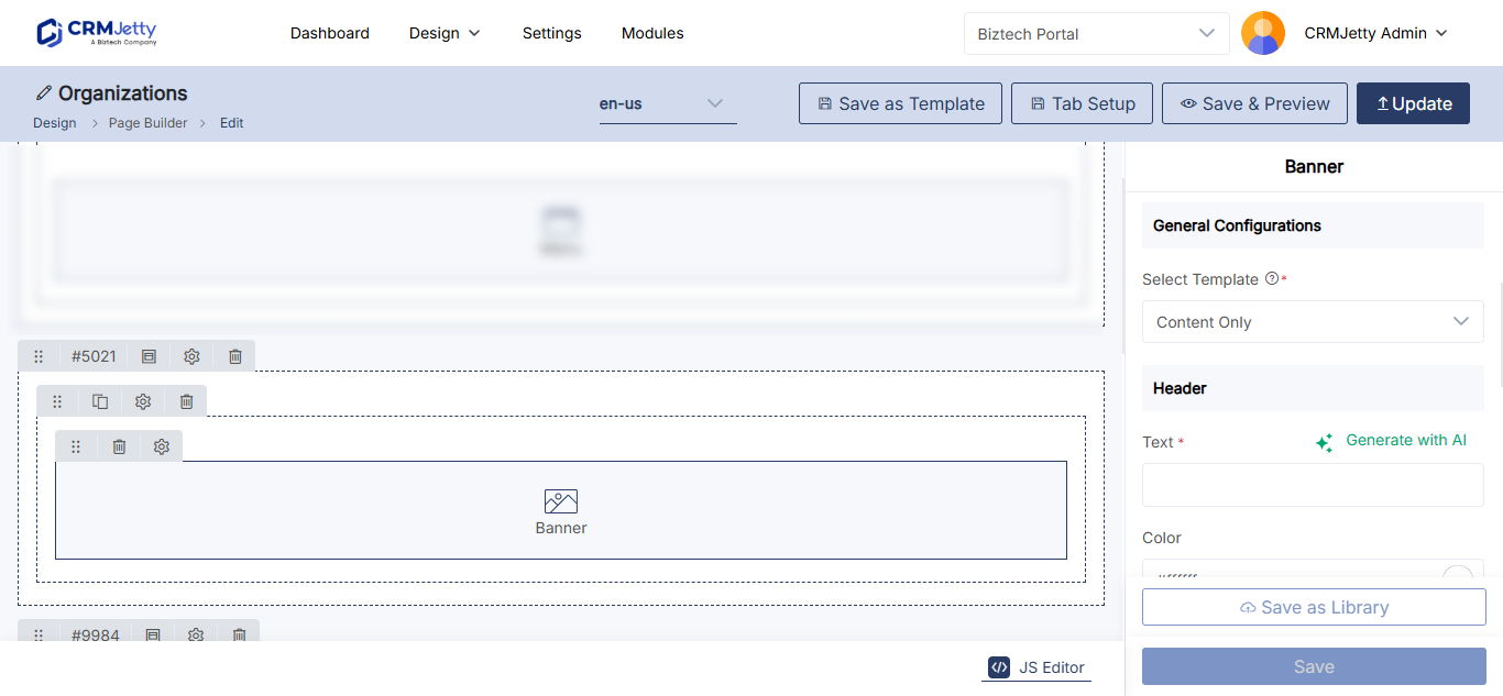
- Select the Settings icon on the Banner widget. The configuration panel opens.
Choose a banner template
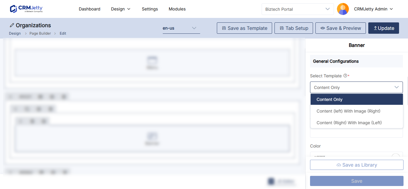
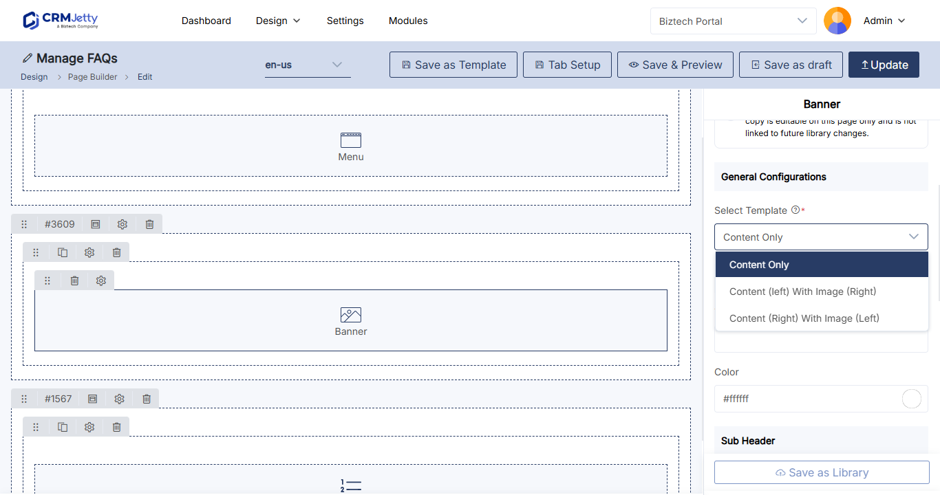
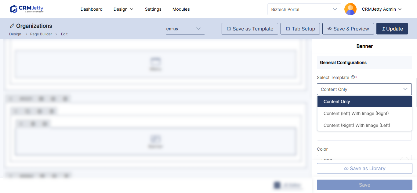
In Select Template, choose the layout of the banner. Selecting a template shows a preview.
| Template | Layout |
|---|---|
| Only Content | Text only. |
| Content (left) & Image (right) | Text on the left, an image on the right. |
| Image (left) & Content (right) | An image on the left, text on the right. |
If you choose a template with an image, upload the image in Upload Image and enter alternative text for it. Keep the file small and in a common web format such as PNG or JPG. If you enter alt text, it is used as the image’s alt and title attributes; if you leave it empty, the file name is used as the alt attribute.
Set the header and subheader
| Setting | What to enter |
|---|---|
| Banner’s Header → Text | The main heading of the banner. |
| Banner’s Header → Color | The heading color, from the color picker. |
| Banner’s Subheader → Text | A short line under the heading. |
| Banner’s Subheader → Color | The subheader color, from the color picker. |
Tip: Select Generate AI under a text box, enter a prompt such as “Write a title for an e-commerce website” and select Generate to draft the text. Generate again to replace it. The AI Content Generator uses your own AI key. See How to Generate Widget Content with the AI Content Generator.
Add a call-to-action button (optional)
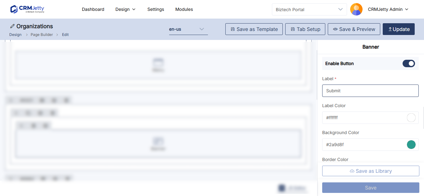
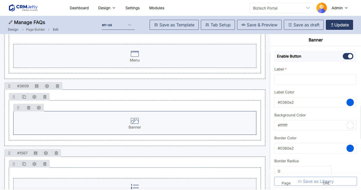
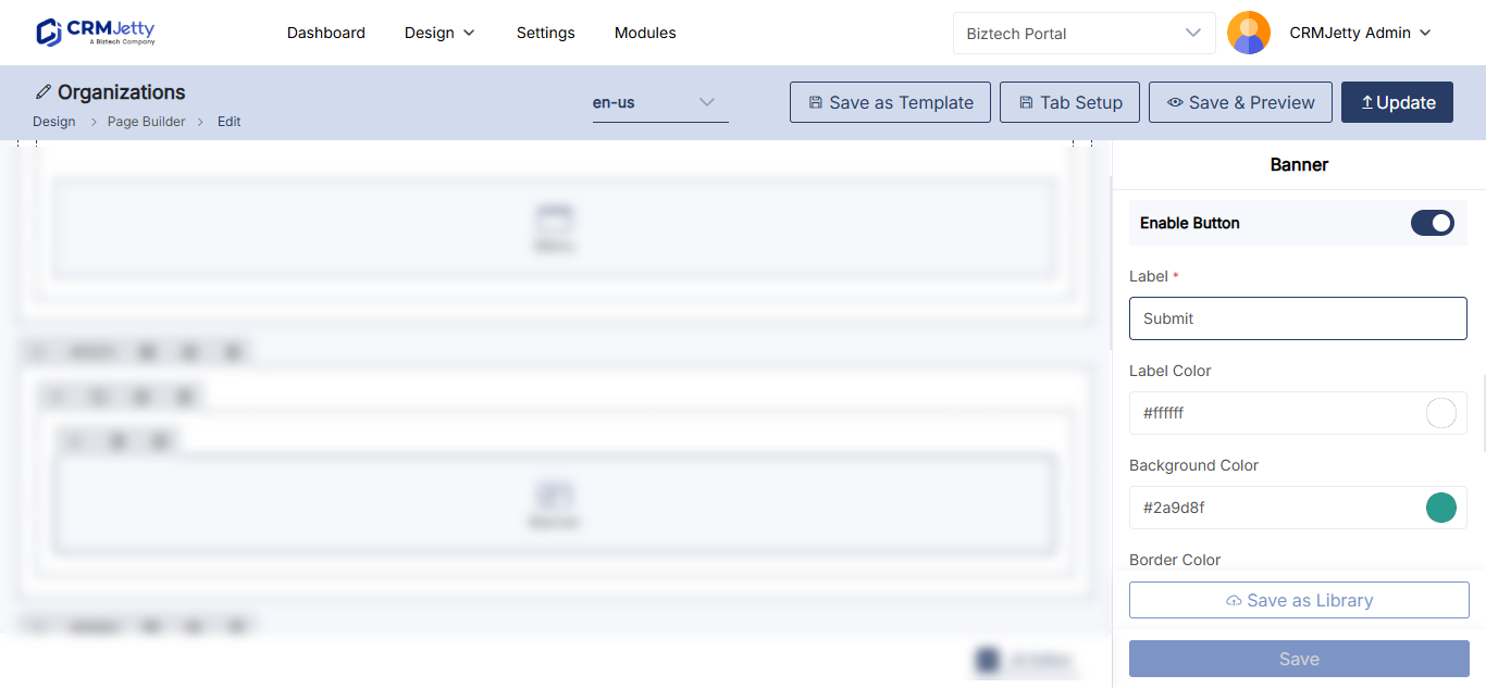
Select Enable Button to show a button on the banner, then fill in:
| Setting | What it does |
|---|---|
| Label | The text on the button. |
| Label Color | The color of the button text. |
| Background Color | The button’s fill color. |
| Border Color | The color of the button border. |
| Border Radius | How rounded the button corners are. |
| Redirect to | Where the button goes. Page: choose a portal page in Select Page. URL: enter an address in Enter URL. |
Set the background and height
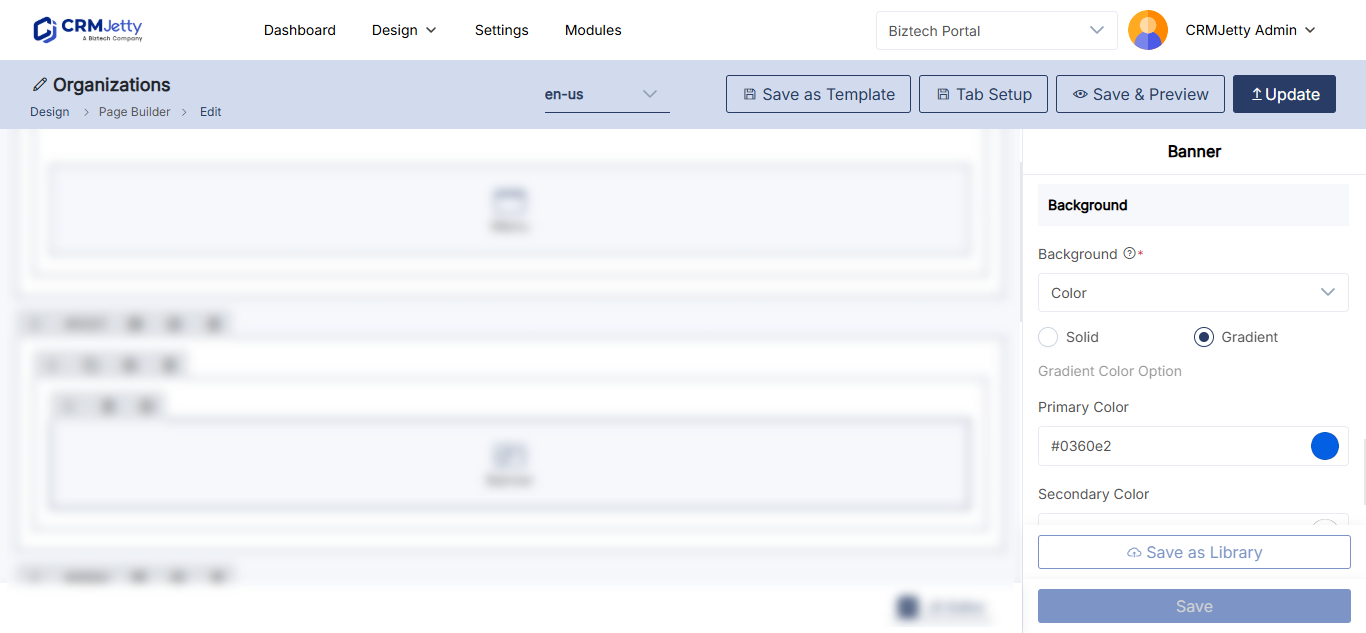
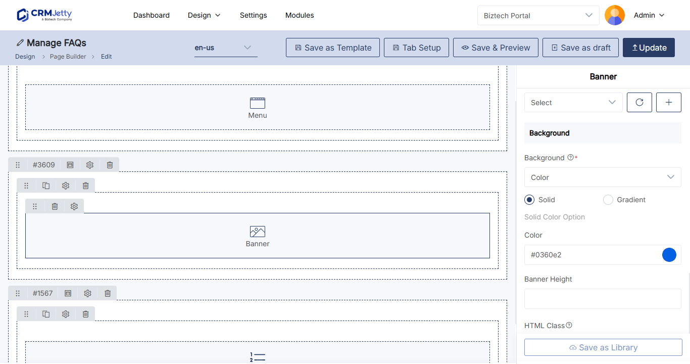
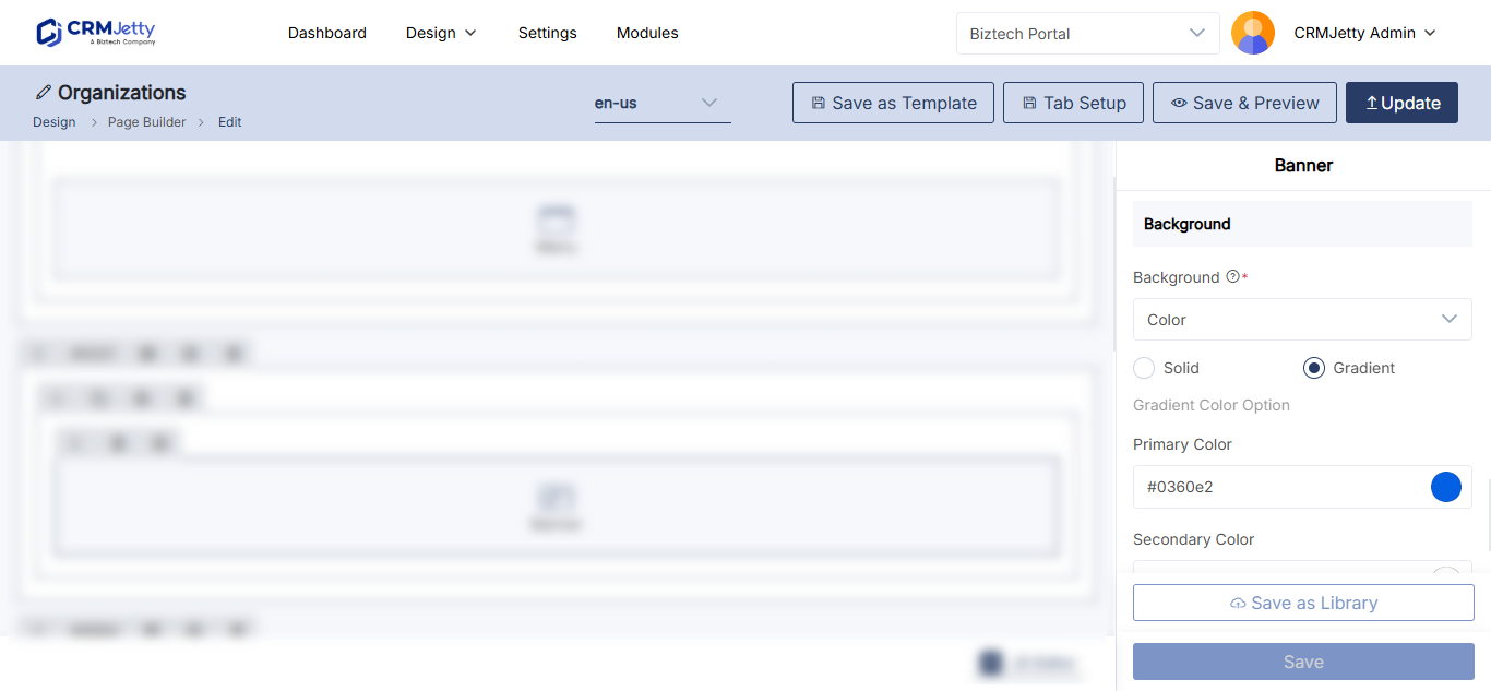
In the banner background setting, choose Color, Image or Video.
| Background | Options |
|---|---|
| Color | Solid: one color. Gradient: a primary and secondary color plus a degree from 0 to 360. |
| Image | Upload an image to fill the banner. |
| Video | Upload: a local video up to 2 MB, in MP4, M4V, MPG, WMV or MOV format. External Link: the URL of a video. |
Then enter the Banner Height (px).
Add a class, ID or card view (optional)
| Setting | What it does |
|---|---|
| HTML Class | Adds custom classes for styling or scripting. |
| HTML ID | Adds a unique ID. The portal adds the prefix custom-. |
| Card View | Shows the banner as a card for a compact look. |
See How to Add Custom HTML IDs and CSS Classes to Widgets.
Save and publish
- Select Save in the configuration panel.
- Publish the page to make the banner live.
To remove a banner, select the Delete icon on the widget, then publish the page.
Troubleshooting
The background video does not upload: The file is larger than 2 MB or not in a supported format. Compress it, or use External Link instead.
The banner button’s page is not in Select Page: The page is a draft. See Why a Portal Page Is Missing from Page Selection.
Related articles
- How to Add Buttons to a Portal Page
- How to Generate Widget Content with the AI Content Generator
- How to Add Sliders and Testimonials to Portal Pages
- How to Create Pages in CRMJetty Portal