
How to Show CRM Records as Cards in the Portal
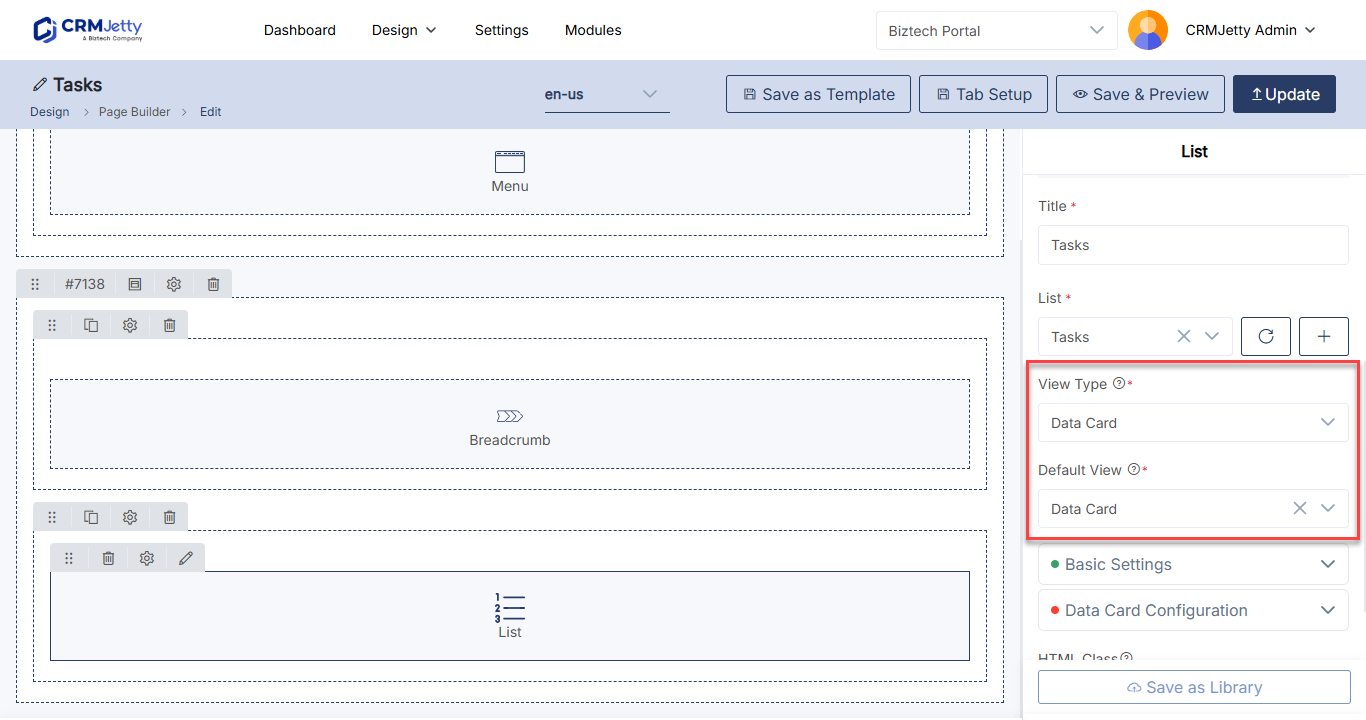
The Data Card widget shows CRM records as a grid of cards instead of a table. Each card can show a header, sub header, supporting text, an image, a rating and tags, with buttons to create, edit or open a record. Use it for records that read better at a glance, such as products, projects or open cases.
Before you start
- You need access to the Design menu in the admin portal.
- Create a list for the entity (Dynamics 365), object (Salesforce) or table (Business Central) you want to show. The widget takes its records and fields from that list. See How to Create List Views in CRMJetty Portal.
- To show an image on each card, add the image field to that list first. See How to Show Images in Portal List Views.
- To show a rating, enable the rating field in the list first. See Show a rating on each card.
- Create the pages that the create, edit and detail actions should open, if you want those actions.
Add the Data Card widget
- Go to Design → Page Builder.
- Open the page in edit mode, or select Create to start a new page.
- In a section, add a grid if there isn’t one yet.
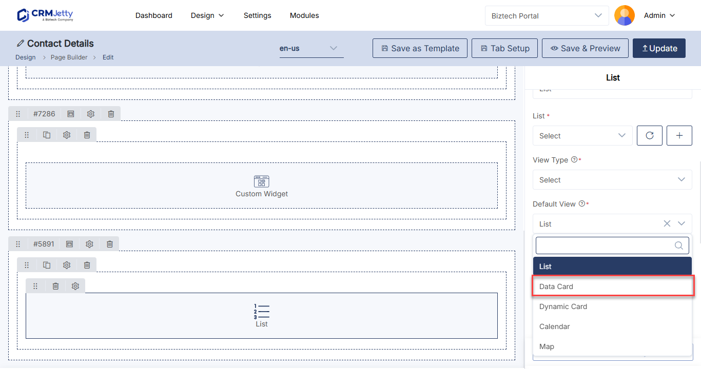
- Select the Data Card widget to add it to the grid, or drag it onto the grid.
- Select the Settings icon on the widget to open its configuration panel.
- Configure the settings described in the sections below.
- Select Save.
- Select Publish to show the cards in the portal.
For more on building pages, see How to Create Pages in CRMJetty Portal.
Choose the list and card content
| Setting | What to enter |
|---|---|
| Data Card Title | A title shown above the cards, for example My Projects. |
| Select Card View | The list whose records and fields the cards use. |
| Image | The image field shown on each card. Only image fields from the selected list appear. |
| Image Layout | Where the image sits on the card: Top Center, Left or Right. |
| Rating Field | The rating field shown on each card. |
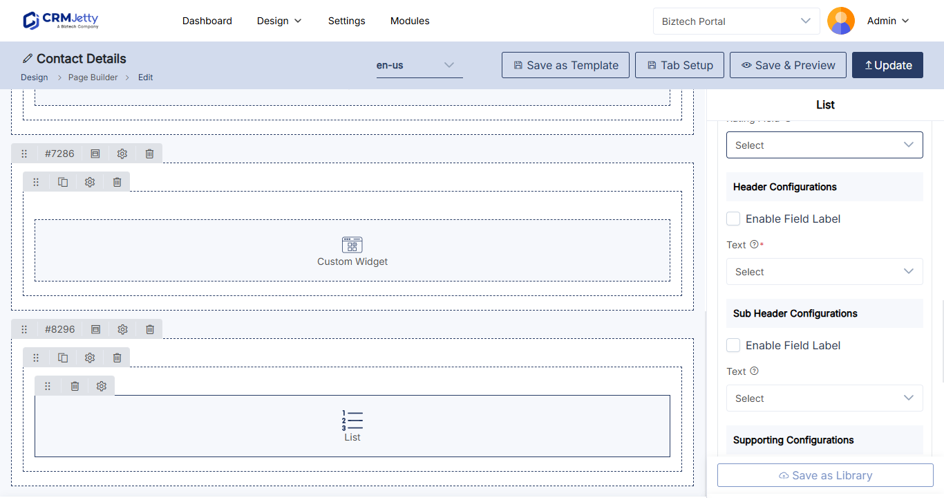
| Header Configurations | The Text for the card header, and Enable Field Label to show the field label next to it. |
| Sub Header Configurations | The Text for the sub header, and Enable Field Label to show its label. |
| Supporting Configurations | The Text for additional information, and Enable Field Label to show its label. |
| Tags | Fields shown as tags on each card, for example priority, status or reason. |
| Tabs Configurations | Select Tab Fields chooses the fields shown in tabs on the card. Enable Field Label shows their labels. |
Note: If the selected list has no image field, the image option is disabled. Add the image field to the list in Design → Lists, then come back to the widget.
Set the card actions
These settings decide where portal users go when they create, edit or open a record from a card.
| Setting | What to enter |
|---|---|
| Create Button Text | The label of the create button, for example Create. |
| Redirect To Page (create) | The page that opens when a portal user selects the create button. Usually a page with an add form. |
| Redirect To Page (edit) | The page that opens when a portal user edits a record. Usually a page with an edit form. |
| Redirect To Page (detail) | The page that opens when a portal user opens a record. Usually a page with a detail form. |
| Record Per Page | How many cards show on one page before paging. |
| Enable CSV Export | Lets portal users export the records to a CSV file. See How to Let Portal Users Export Records to CSV. |
The pages you select must be published. Draft pages do not appear in page selection. See Why a Portal Page Is Missing from Page Selection.
Filter records, downloads and styling
| Setting | What it does |
|---|---|
| Enable Global Access | Turns on global access for the Data Card widget. |
| Data Loading Workflow | A workflow that decides which records load into the cards. See How to Apply Workflows to Portal Widgets. |
| Update Assign Rights Workflow | A workflow that manages update rights on the records. Choose one workflow. |
| Enable Download | Lets portal users download an attachment from a card. In File, select the file they can download. |
| Enable Global Filter | Connects the cards to a global filter on the page. In Select Global Filter Field, choose the field to filter on. See How to Filter All Dashboard Widgets at Once. |
| HTML Class | Custom CSS classes to style the widget. |
| HTML ID | A unique ID for the widget. The portal adds the prefix custom-. |
| Card View | Shows the whole widget inside a card-style container. |
The Global Filter widget is available on selected plans. See How to Filter All Dashboard Widgets at Once.
Show a rating on each card
Ratings come from the list, not from the widget.
- Open the list in Design → Lists.
- Turn on Enable Rating for a number field (Integer, BigInt, Decimal or Double).
- Choose the icon (stars or thumbs) and color, and publish the list.
- In the Data Card widget, select that field in Rating Field.
Note: While a field is used as the rating in a Data Card widget, you can’t delete it or turn off its rating in the list. Portal users see the rating but can’t change its icons or colors.
Troubleshooting
The image option is disabled: The list selected in Select Card View has no image field. Add one to the list, publish the list, then select it again in the widget.
A page is missing from Redirect To Page: The page is still a draft. Publish it first.
Portal users see no cards: Check that the page is published, that the list in Select Card View returns records for that portal user, and that a data loading workflow is not filtering out every record.
Related articles
- How to Create List Views in CRMJetty Portal
- How to Show Images in Portal List Views
- How to Apply Workflows to Portal Widgets
- How to Build a Customer Portal Dashboard