
Guides / Widgets
How to Add Buttons to a Portal Page
Short answerIn Design → Page Builder, open the page, add the Button widget to a grid and select its Settings icon. Enter the label, choose alignment and icon, set Select URL Type to Internal or External, select Save and publish the page.
Use the Button widget to send portal users to another portal page or to an external website, for example “Raise a case” or “Visit our help center”. You set the label, alignment, icon and where the button goes.
Before you start
- You need access to the Design menu in the admin portal.
- Create the page, or know which page to edit. See How to Create Pages in CRMJetty Portal.
- If the button will link to a portal page, publish that page first.
Add the Button widget
- Go to Design → Page Builder.
- Create a page, or select the three dots (…) next to a page and select Edit.
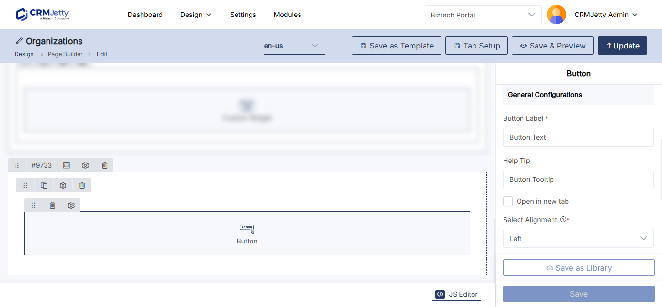
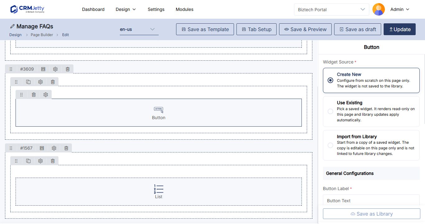
- Select the Button widget. It is added to the grid.
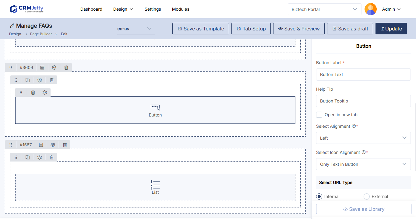
- Select the Settings icon on the Button widget. The configuration panel opens.
Configure the button
| Setting | What it does |
|---|---|
| Button Label | The text on the button. |
| Help Tip | A short description that tells portal users what the button does. |
| Open in a New Tab | Opens the link in a new tab. Leave it clear to open the link in the same tab. |
| Select Alignment | Places the button on the left, center or right. |
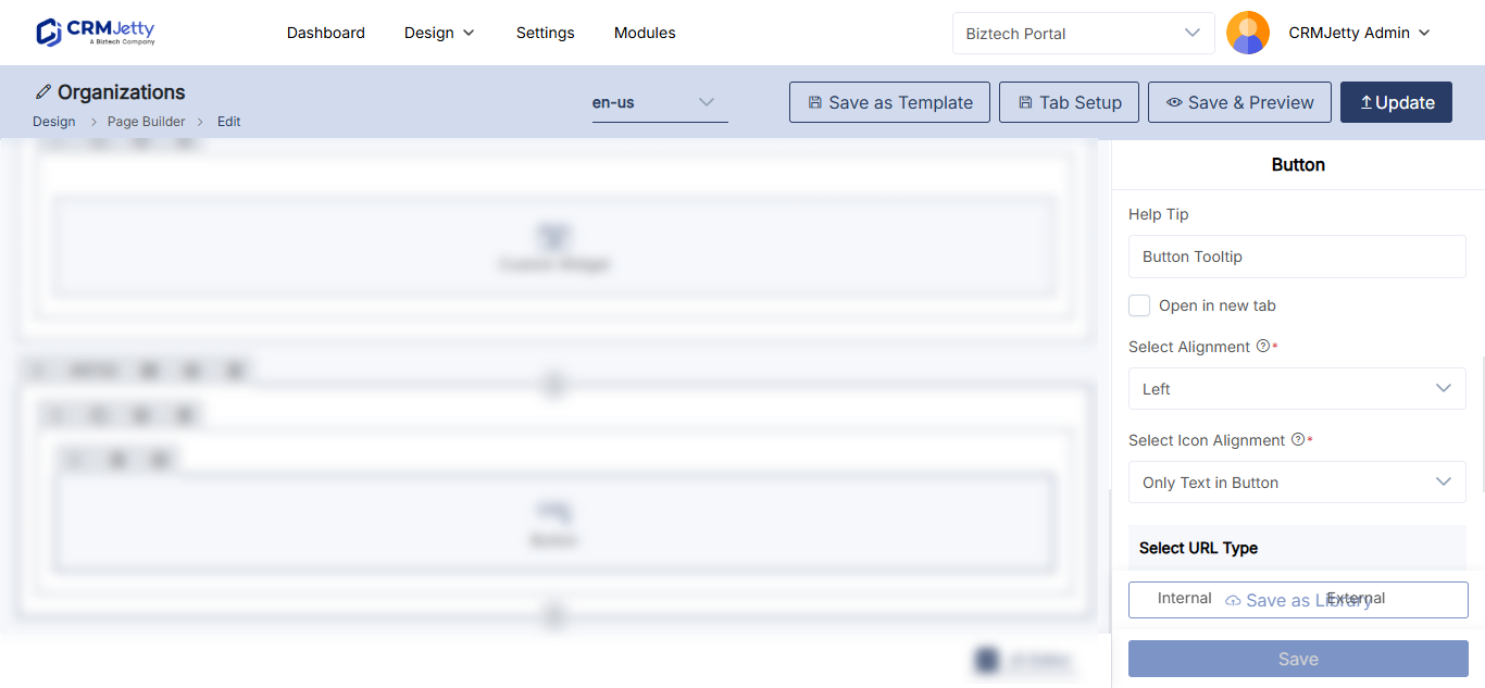
| Select Icon Alignment | Only Text in Button, Button with Text on Right and Icon on Left, or text on the left with the icon on the right. |
| Pick an Icon | Opens a pop-up where you choose the button icon. |
Choose where the button goes
In Select URL Type, choose one option:
| URL type | What to enter |
|---|---|
| Internal | In Select Page, choose a page created in Page Builder. |
| External | In External Links, type or paste the full URL of another website, for example https://www.example.com. |
Tip: For external links, select Open in a New Tab so portal users keep the portal open.
Add a class, ID or card view (optional)
| Setting | What it does |
|---|---|
| HTML Class | Adds custom CSS classes. Separate several classes with commas. |
| HTML ID | Adds a unique ID. The portal adds the prefix custom-. |
| Card View | Shows the button in a card layout. |
See How to Add Custom HTML IDs and CSS Classes to Widgets.
Save and publish
- Select Save in the configuration panel.
- Publish the page to make the button live.
To remove a button, select the Delete icon on the widget, then publish the page.
Tip: To place a button on a banner instead, use Enable Button in the Banner widget. See How to Add a Banner to a Portal Page.
Troubleshooting
The page you want is not in Select Page: The page is a draft. Publish it first. See Why a Portal Page Is Missing from Page Selection.
Related articles
- How to Add a Banner to a Portal Page
- How to Create Pages in CRMJetty Portal
- How to Add External Links to the Portal Menu
- How to Add Custom HTML IDs and CSS Classes to Widgets
Did this solve it?No, contact support